Healthcare Software Specialist Reviews Website Template
Triage is a bold, modular healthcare help desk landing page template built for teams that need to prove platform competence fast. It leads with a live interactive dashboard preview, stat-forward card modules, and a sticky app download bar. Every section is designed to move hospital IT leaders, clinic managers, and health system executives from skeptical to sold.
by Rocket studio
Quick summary
Triage is a single-page, card-grid landing page template for a healthcare help desk and ticketing platform. It opens with a functioning interactive dashboard preview and drives visitors toward an app download through a wall of stat-backed proof modules. The design is Bold Brutalist with a Teal Catalyst color system built for clinical authority.
Who this template is for
This template is built for healthcare operations and technology teams that need to close the gap between incoming requests and resolved tickets. It speaks directly to the people carrying that weight every day.
- Hospital IT directors managing untracked support email chains across multiple departments
- Clinic office managers juggling phone lines, fax requests, and unresolved billing disputes simultaneously
- Health system Chief Operating Officers accountable for ticket resolution times measured in double-digit days
What problem this template solves
Healthcare support teams lose time, credibility, and patient trust when requests fall through the cracks. This template addresses the specific communication and workflow chaos that grows inside large clinical environments.
- Requests routed by memory or habit instead of a structured system cause delays and duplicate work
- No single view of ticket status means escalations arrive late and resolution timelines stretch to eleven days or more
- Demonstrating platform value to skeptical decision-makers requires more than a feature list; it requires evidence
What you get with this template
You get a fully structured, single-page card-grid layout that proves platform value before asking for commitment. Every section is a deliberate step in a conversion argument.
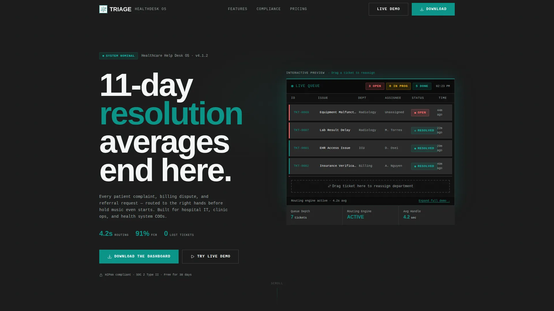
- An interactive browser-rendered dashboard preview in the header, with a live ticket queue and a draggable reassignment card
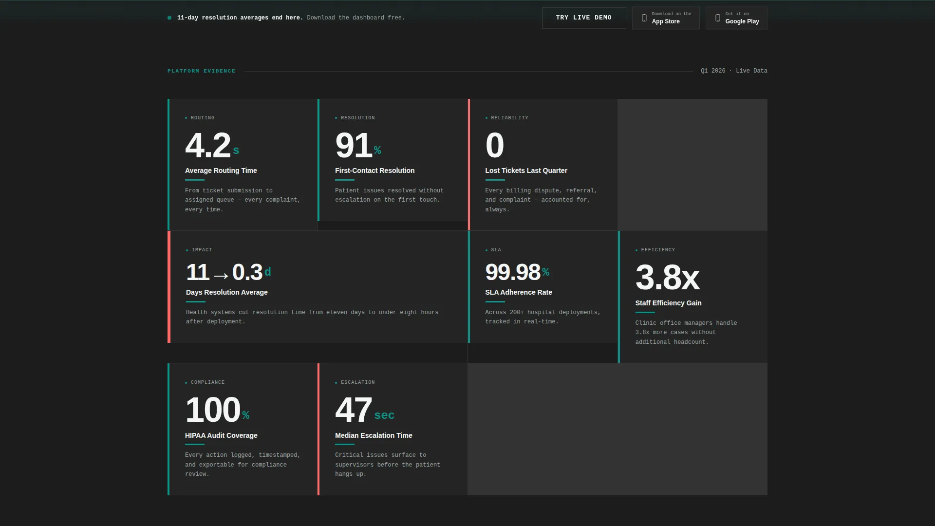
- A modular stat-card grid where every proof point leads with an oversized number and a one-sentence explanation in monospaced type
- A sticky bottom bar with App Store and Google Play download buttons, plus a secondary guided demo path that captures only a work email
Feature list
This template is designed around one idea: earn the download before you ask for it. Each feature below serves that purpose directly.
Interactive Header Dashboard
The header renders a miniature, functioning dashboard directly in the browser. Anonymized ticket entries trickle in live, status chips flip from red to yellow to green, and visitors can drag a ticket card to reassign a department and watch the queue rebalance in real time.
Stats-First Card Grid
Every card module leads with a massive oversized number before any descriptive text. Stats like "4.2s" average routing time, "91%" first-contact resolution, and "0" lost tickets last quarter are formatted with a thick teal left-border and a single monospaced explanation line beneath each figure.
Progressive Proof Architecture
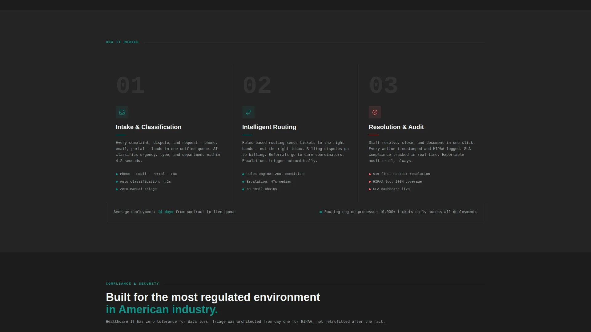
The card grid shifts focus as visitors scroll deeper. Early cards present platform performance metrics. Mid-page cards surface customer outcome data. Later cards address compliance benchmarks such as Health Insurance Portability and Accountability Act audit logs and service-level agreement adherence rates.
Sticky App Download Bar
A persistent bottom bar appears after the visitor scrolls past the interactive preview. It anchors the primary call to action, "Download the Dashboard," with paired App Store and Google Play buttons always in view without interrupting the reading flow.
Guided Demo Entry Path
A secondary call to action, "Try the Live Demo," expands the header preview into a full guided simulation. Access requires only a work email address, keeping the friction low while still qualifying the lead.
Brutalist Modular Layout
The Bold Brutalist card-grid structure means every module is visually self-contained. There are no decorative elements. Each card earns its place by conveying a status, a stat, or a next action, making the layout scannable for time-pressed healthcare executives.
Page sections overview
| Section | Purpose |
|---|---|
| Interactive Header Preview | Renders a live ticket queue and draggable card to demonstrate platform behavior immediately |
| Brutalist Headline Block | Delivers the core value statement in heavy condensed type below the dashboard preview |
| Platform Metrics Grid | Displays oversized routing-time, resolution-rate, and lost-ticket stats as teal-bordered proof cards |
| Customer Outcomes Grid | Shifts from internal metrics to real-world results achieved by platform users |
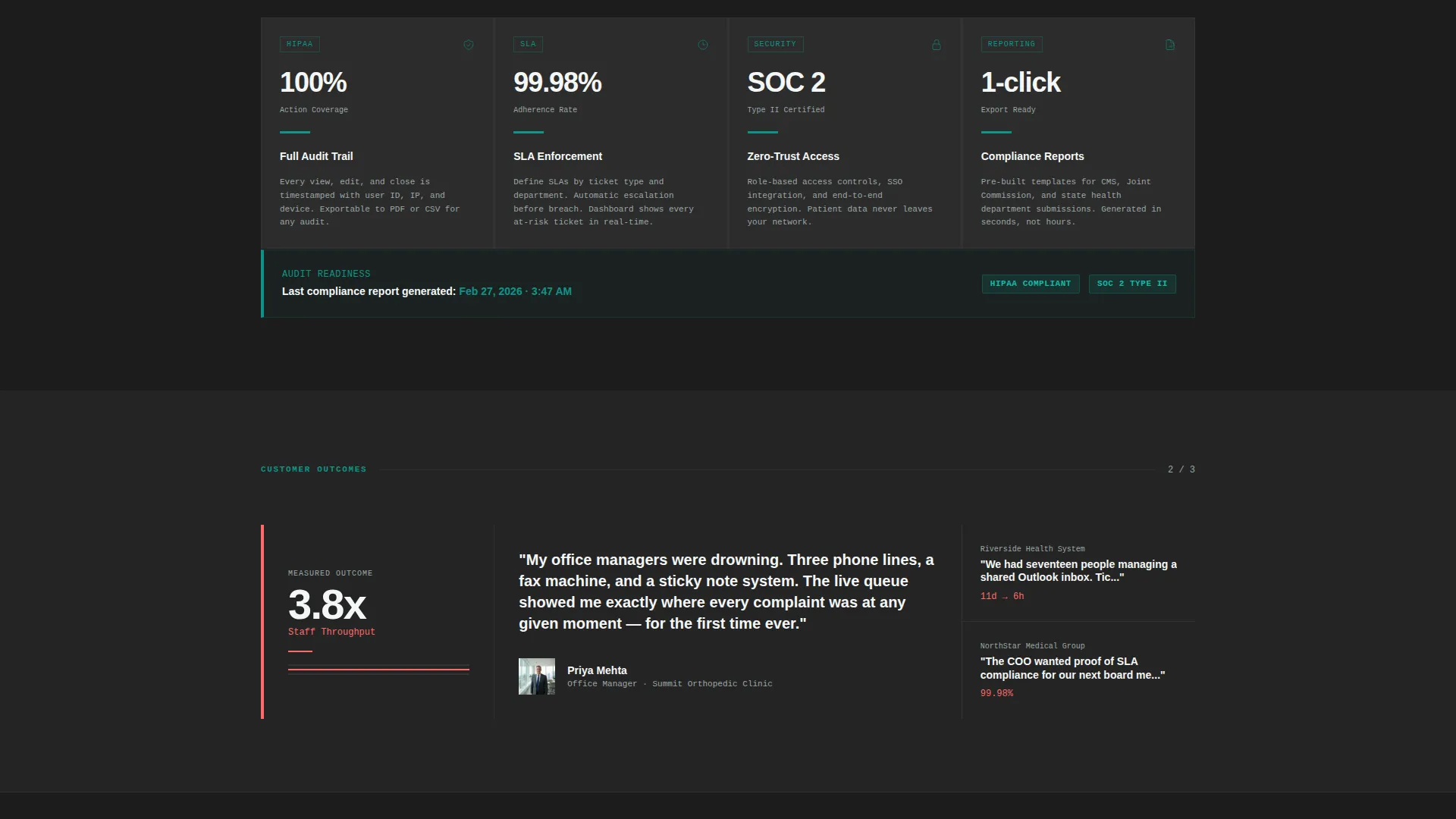
| Compliance Benchmarks Grid | Covers audit log readiness and service-level adherence data for regulated healthcare environments |
| Sticky Download Bar | Anchors the primary app download call to action and secondary demo entry path |
Design & branding system
The visual identity follows a Bold Brutalist theme anchored by the Teal Catalyst color system. Every color choice is functional and tied directly to information status.
- Surgical teal (#0D9488) drives all primary actions, borders, and status indicators; charcoal slab (#1C1C1C) fills card backgrounds and section dividers to create contrast without distraction
- Antiseptic white (#F4F7F6) provides breathing room between grid modules, while alert coral (#FF6B6B) is reserved exclusively for stat callouts and urgency indicators
- Typography uses heavy condensed type for headlines and monospaced type for card-level data, reinforcing the clinical, stripped-back aesthetic throughout the page
Mobile & speed optimization
The card-grid structure is inherently suited to smaller screens because each module is self-contained and independently readable. The layout does not rely on wide horizontal elements that break on mobile viewports.
- The modular grid reflows naturally for tablet and phone screen widths without losing the stat-card hierarchy
- The sticky bottom bar is designed to remain visible and functional across device sizes, keeping the download call to action accessible at all times
- The interactive header preview is browser-rendered rather than image-based, which avoids large static screenshot assets in the above-the-fold section
How this template helps you convert
This template is structured around earning trust before requesting action. The conversion path is deliberate and sequential.
- The interactive header preview creates an immediate proof-of-competence moment; visitors see the platform working before they read a single marketing claim
- The stat-card grid builds a cumulative evidence wall, with each scrolled module adding another reason to download, moving visitors from curiosity to conviction
- The sticky download bar and low-friction demo path give visitors two commitment levels to choose from, reducing drop-off for buyers who are not yet ready for full installation
Other information about this template
This template is designed to serve a regulated industry, and the content architecture reflects that context. A few additional notes for buyers evaluating fit.
- The compliance benchmarks section is built to surface Health Insurance Portability and Accountability Act audit log readiness and service-level agreement data, which are common requirements in healthcare procurement conversations
- The "Try the Live Demo" path is intentionally low-friction; it captures only a work email, making it suitable for reaching hospital IT directors and clinical operations leaders who are early in an evaluation process
- The template style is Card Grid (Modular), which means individual sections can be reordered or removed to match a specific product's available proof points without breaking the overall layout logic
- The alert coral accent is used sparingly and only for urgency indicators, keeping the visual language consistent with how clinical environments use color to signal status
Theme
Bold Brutalist
Creative direction
Stats-First Impact
Color system
Teal Catalyst
Style
Card Grid (Modular)
Direction
App Download
Page Sections
Interactive Browser-rendered Dashboard Header
Stats-first Modular Card Grid
Progressive Proof Sequencing
Sticky App Download Bottom Bar
Low-friction Demo Entry Path
Bold Brutalist Visual System
Related questions
Who is this landing page template designed for?
What makes the header different from a standard screenshot?
Can I use this template if my platform does not yet have all the listed stats?
What is the primary call to action on this page?
What does the compliance benchmarks section cover?



