Software & SaaS Professional Website Template
Signal is a bento grid landing page template built for revenue intelligence platforms. It follows a Problem-to-Solution Arc, opening with a full-viewport product screenshot and a stark headline. The Monochrome Steel palette and Startup Velocity theme give it the cold precision of a trading terminal. A two-step freemium sign-up flow and sticky call to action bar are built in to drive conversions.
by Rocket studio
Quick summary
Signal is a single-page bento grid landing page template designed for revenue intelligence software. It opens with an edge-to-edge product screenshot, walks visitors through a sharp Problem-to-Solution Arc, and closes with a low-friction two-step sign-up flow. The Monochrome Steel color system and Startup Velocity theme give every section the visual weight of a precision tool.
Who this template is for
This template is built for SaaS founders, product marketers, and go-to-market teams launching a revenue intelligence platform. It speaks directly to the people their buyers trust: VP of Sales, Revenue Operations managers, and founders who live inside pipeline data.
- Sales-led SaaS teams promoting AI-powered deal tracking or forecasting tools
- Revenue Operations professionals who need a page that addresses real pipeline pain
- Early-stage startups preparing a high-converting freemium or free-trial launch
What problem this template solves
Most software landing pages describe features. Signal's template shows the buyer their own problem first. Revenue leaders visiting the page recognize the chaos immediately: blank CRM fields, last-quarter dashboards, and reps calling dead deals solid. The template structures that recognition into demand.
- It replaces generic feature lists with a visual before-and-after contrast that lands harder
- It removes friction from the sign-up path so high-intent buyers convert without hesitation
- It gives enterprise buyers a secondary path to a live demo without cluttering the primary flow
What you get with this template
You get a complete, ready-to-customize bento grid landing page structured around a proven conversion arc. Every section is a self-contained proof point. The layout, copy structure, and interactive elements are all mapped to a single goal: turn a skeptical pipeline leader into an active trial user.
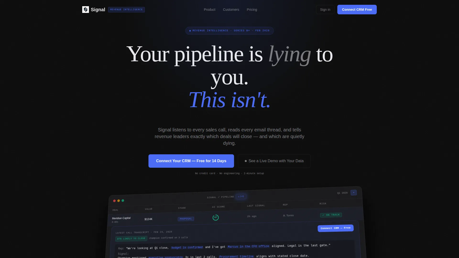
- A full-viewport product screenshot header with an expanded deal card, confidence score, and AI-generated deal health visuals
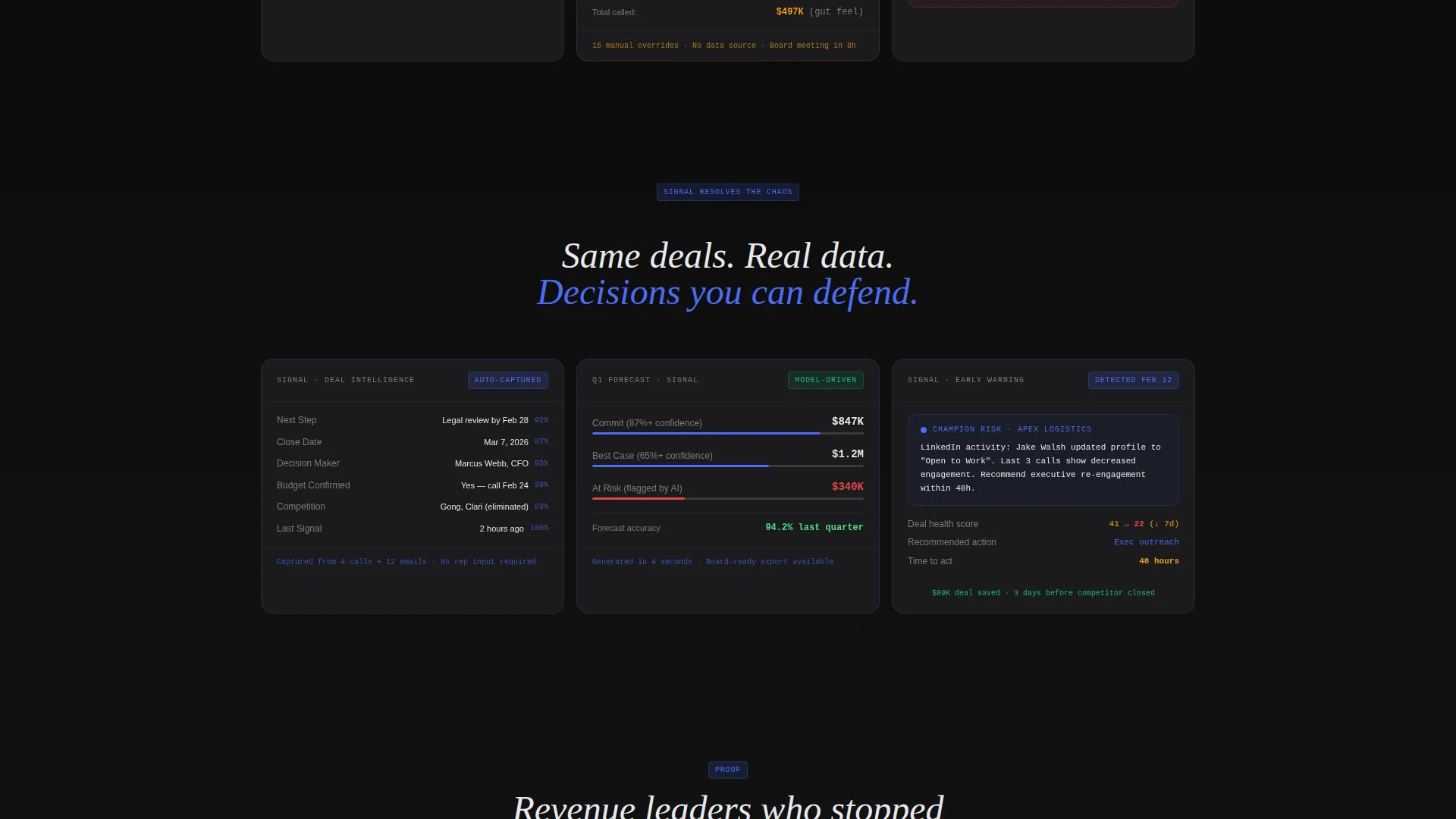
- A Problem-to-Solution bento grid with micro-animations, showing the same three pain scenarios resolved inside the product interface
- A sticky bottom call to action bar, a two-step sign-up modal, and a secondary enterprise demo path
Feature list
This section covers the core built-in capabilities of the Signal template as defined in the source brief.
Edge-to-Edge Product Screenshot Header
The header stretches the deal board across the full viewport. Twelve opportunity tiles display AI-generated health scores, last-contact timestamps, and risk flags in amber and red. One expanded card shows a call transcript snippet with key phrases highlighted and a confidence score reading "87% likely to close." The screenshot sits on a slight Z-axis rotation with a soft shadow, creating a tactile depth effect above the carbon background.
Problem-to-Solution Bento Arc
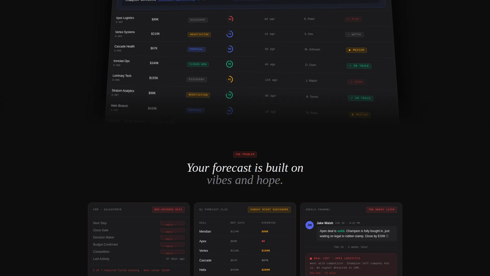
Three pain cards open the scroll experience below the fold. Each shows a recognizable failure mode: rep-entered CRM data, a Sunday-night forecast spreadsheet, and a Slack thread next to a churned account. A pulsing ignition-blue divider line separates the problem grid from the solution grid, where the same three scenarios reappear resolved inside the platform interface.
Two-Step Freemium Sign-Up Flow
The primary call to action reads "Connect Your CRM - Free for 14 Days." Clicking opens a two-step modal. Step one selects a CRM from icon buttons. Step two asks only for a work email. No phone number, no company size field, no extra friction. The flow is designed to remove every reason to delay.
Sticky call to action Bottom Bar
After the third scroll section, a sticky bar locks to the bottom of the viewport. It keeps the primary call to action visible without interrupting the reading experience. The bar disappears cleanly on upward scroll and reappears on downward scroll to stay useful without becoming annoying.
Enterprise Demo Path
A secondary call to action reads "See a Live Demo with Your Data." It sits alongside the primary call to action and targets buyers who will not self-serve. This path gives revenue leaders a way to engage at a higher commitment level without removing the low-friction option from the page.
Escalating Proof Point Tiles
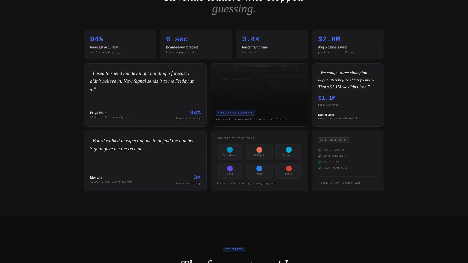
Each bento tile below the fold mixes product user interface, a customer metric, and a one-line testimonial from a real buyer title. The sequence escalates across sections: bigger deals saved, faster ramp times, and board-ready forecasts generated in seconds. Every tile is a self-contained argument for the product.
Page sections overview
| Section | Purpose |
|---|---|
| Full-Viewport Header | Anchors the page with a live-feel deal board and the primary headline |
| Pain Cards Grid | Shows three failure modes that revenue leaders recognize immediately |
| Blue Divider Break | Marks the transition from problem framing to solution framing |
| Solution Grid | Rebuilds the same three scenarios resolved inside the platform |
| Escalating Proof Tiles | Delivers deal wins, ramp metrics, and forecast proof in sequence |
| Sticky call to action Bar | Keeps the primary conversion action visible after the third section |
| Two-Step Sign-Up Modal | Reduces sign-up friction to CRM selection and work email only |
| Enterprise Demo call to action | Captures high-intent buyers who prefer a guided experience |
Design & branding system
The Monochrome Steel palette is built around five values that work like a hierarchy. Carbon black holds the backgrounds. Gunmetal provides section contrast. Zinc and aluminum carry all body text. Ignition blue appears only on interactive and data-alive elements.
- Colors: carbon black (#0D0D0D), brushed gunmetal (#3A3A3C), cool zinc (#7C7C82), bright aluminum (#E8E8ED), ignition blue (#4A6CF7) for calls to action, active graphs, and data highlights only
- Typography and spacing follow the Startup Velocity theme: tight, terminal-inspired, and built for fast scanning under pressure
- Backgrounds alternate between carbon and gunmetal per section to create rhythm without adding visual warmth or decoration
Mobile & speed optimization
The bento grid layout is structured to reflow cleanly at smaller viewport widths. The sticky call to action bar and two-step modal are both designed for thumb-friendly interaction on mobile screens.
- Bento grid tiles stack vertically on smaller screens, preserving the Problem-to-Solution Arc without breaking the visual logic
- The sticky bottom call to action bar stays accessible on mobile without obscuring critical content
- The two-step modal keeps its minimal input structure on all screen sizes, so the low-friction sign-up experience holds on mobile as well as desktop
How this template helps you convert
The conversion strategy works because the page earns trust before it asks for anything. By the time a visitor reaches the call to action, they have already seen their own pain named, visualized, and resolved.
- The header screenshot shows the product working at full fidelity before any marketing copy appears, so the visitor's first impression is the product itself rather than a claim about it.
- The Problem-to-Solution Arc recreates three scenarios that VP Sales and RevOps professionals live inside every week, so the emotional resonance drives scroll depth and purchase intent organically.
- The two-step sign-up flow strips the conversion moment down to two inputs, removing the hesitation that multi-field forms typically create at the final step.
Other information about this template
This template is categorized under Technology, specifically Software and SaaS, with a niche focus on revenue intelligence platforms. It is built as a single-page bento grid layout following a Startup Velocity theme and ships with a defined Monochrome Steel color system ready for customization.
- The template style is Bento Grid and the creative direction is Problem-to-Solution Arc, making it suitable for any SaaS product that converts on contrast between pain and resolution
- The landing page direction is Freemium and Trial, meaning the page architecture prioritizes low-friction sign-up over feature-heavy education
- The header concept is Product Screenshot, which positions the platform's interface as the first and most persuasive element on the page
Theme
Startup Velocity
Creative direction
Problem→Solution Arc
Color system
Monochrome Steel
Style
Bento Grid
Direction
Freemium/Trial
Page Sections
Edge-to-edge Product Screenshot Header
Problem-to-solution Bento Arc
Two-step Freemium Sign-up Flow
Sticky Call to Action Bottom Bar
Escalating Proof Point Tiles
Enterprise Demo Secondary Path
Related questions
Who is this landing page template best suited for?
Can I adapt the bento grid layout for a different SaaS product?
What does the two-step sign-up flow include?
Does the template include the sticky call to action bar out of the box?
Is there a path for enterprise buyers who prefer a guided evaluation?



