Senior Care Software & SaaS Professional Website Template
Beacon is a card grid landing page template built for a senior care mobile app. It leads with a live-metrics hero, a zip code search bar, and a modular grid of data-driven insight cards. The layout guides families, discharge planners, and caregivers from national facility data down to a personal download tap, using Electric Indigo and warm amber to balance clinical precision with genuine warmth.
by Rocket studio
Quick summary
Beacon is a single-page app download landing page for a senior care directory app. It opens with an animated stats dashboard, moves through choropleth map and insight grid sections, and closes with a full-width call-to-action card. The design feels like a trusted industry report, not a product brochure, making data the primary reason to download.
Who this template is for
This template is built for teams launching or marketing a senior care mobile app that connects families with licensed care facilities. It suits products where real data, scale, and search utility are the main selling points.
- Mobile app teams in the senior care software space who need a high-credibility download page
- Healthcare product marketers targeting adult family caregivers and hospital discharge planners
- Founders positioning a senior care directory app against cluttered, low-trust alternatives
What problem this template solves
Families searching for senior care face a painful information gap. They have urgent timelines, no clear map of local options, and no reliable way to compare facilities before committing to a phone call. This template solves the trust problem at the awareness stage.
- Visitors arrive skeptical; the front-loaded metrics dashboard immediately signals scale and reliability
- Families need proof before they act; the insight card grid surfaces real data that earns the download tap
- The page structure moves users from feeling overwhelmed to feeling informed, reducing friction at every scroll
What you get with this template
The template delivers a complete, structured landing page with distinct visual sections that build a clear narrative arc from macro data to personal action. Every section is purposeful and modular.
- An animated hero dashboard with four live-counter metrics and a zip code search bar with a pulsing amber call-to-action button
- A modular card grid including a choropleth map card, data insight finding tiles, and three flip-card workflow sections
- A closing full-width card restating headline metrics, plus a sticky mobile bottom bar and OS-detecting download link routing
Feature list
This template is built around six functional design components that work together to earn visitor trust and drive app downloads.
Animated Stats Hero Panel
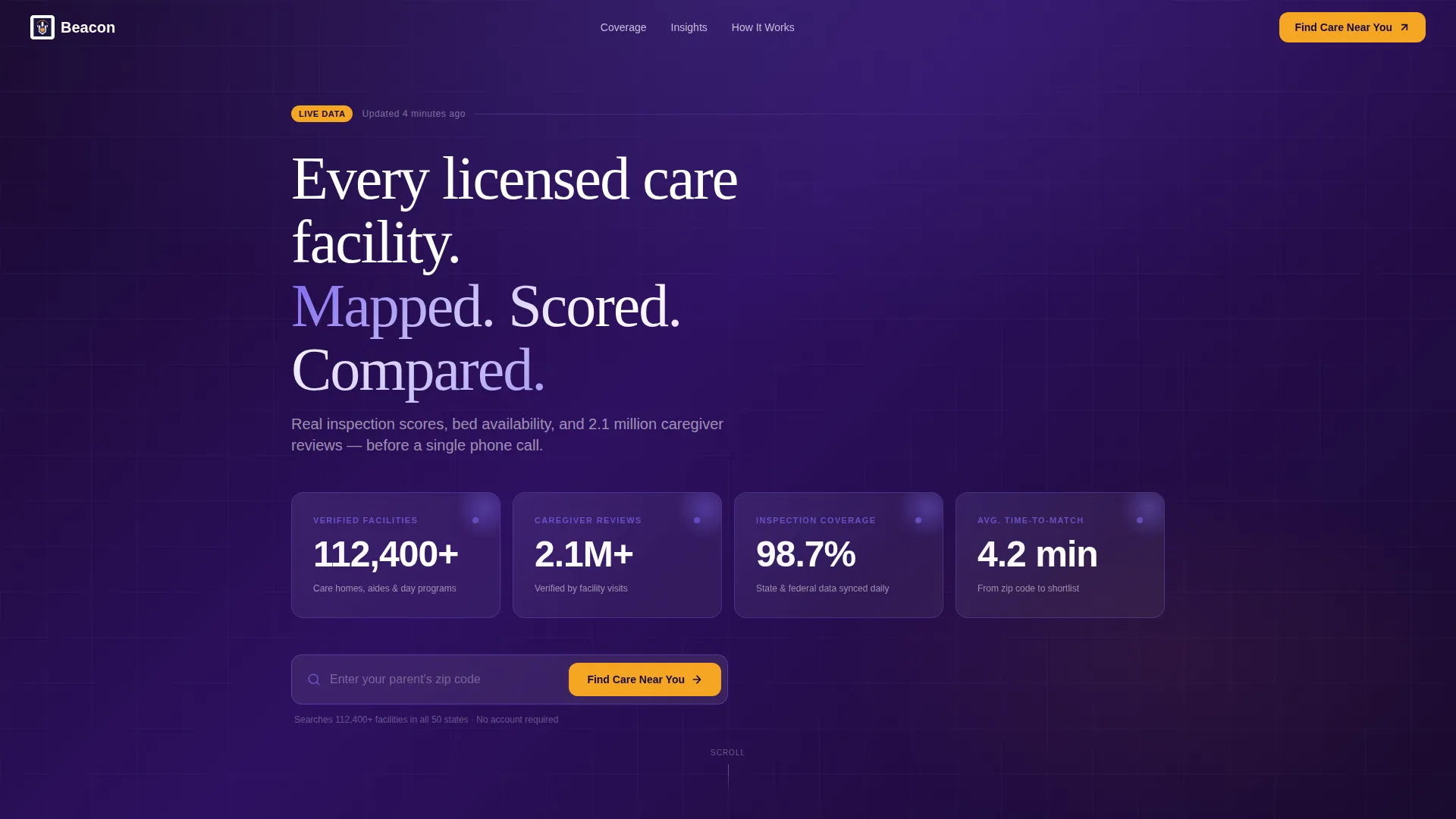
The dark indigo hero section displays four large animated counters that tick upward on page load. Metrics include verified facility count, caregiver review volume, inspection data coverage, and average time-to-match. The live-counter effect signals data freshness and platform credibility instantly.
Zip Code Search Bar
A prominent single-field search bar sits below the counters with ghost text reading "Enter your parent's zip code." A pulsing amber button anchors the primary call to action. This component sets user intent immediately without requiring registration.
Choropleth Map Card
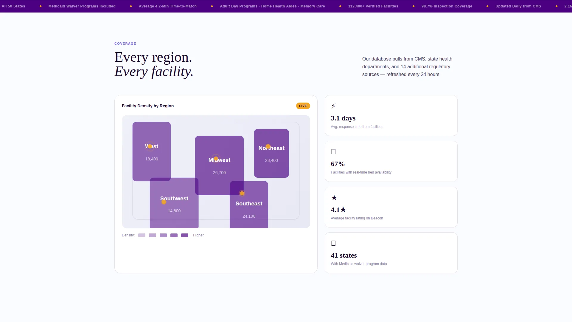
Section one features a tap-inviting map card showing facility density by region. It gives visitors a geographic frame of reference and reinforces the app's national data coverage before any personal search begins.
Modular Insight Card Grid
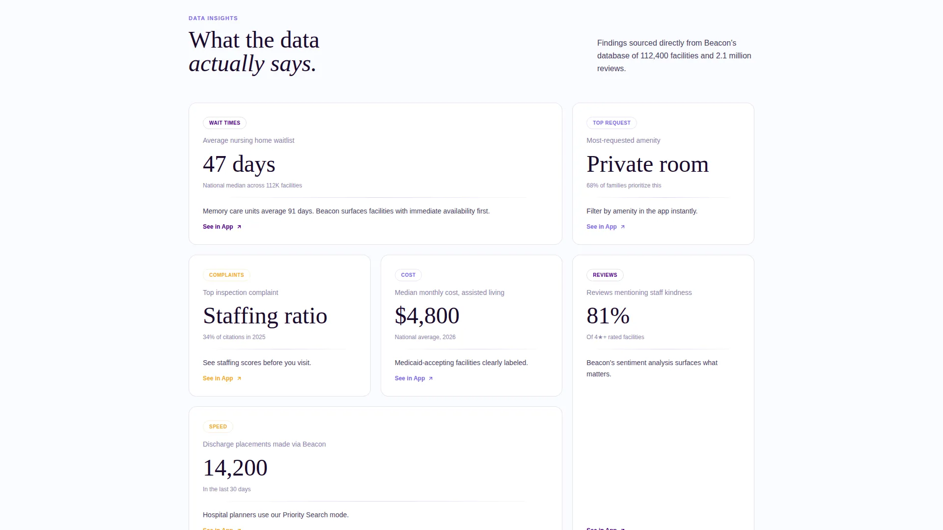
Section two presents a grid of "Finding" cards, each surfacing one data insight from the app's own dataset. Topics include average wait-list length, most-requested amenities, and top complaint categories. Each card includes a "See in App" link to connect the insight to the download action.
Flip-Card Workflow Section
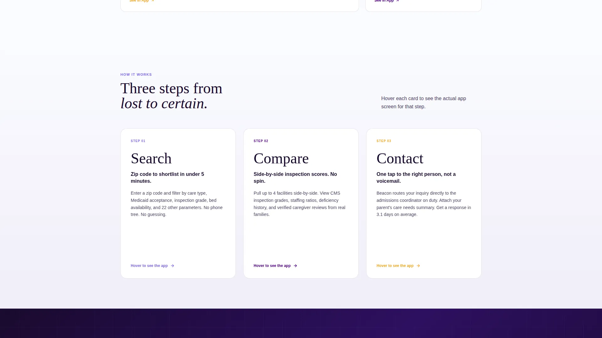
Section three uses three oversized cards representing the app's core workflows: Search, Compare, and Contact. Each card flips on hover to reveal a phone-screen mockup of the feature. The interaction makes abstract app capabilities tangible and specific.
OS-Detecting Download Call to Action
The primary call-to-action button detects the visitor's operating system and routes to the appropriate app store. A secondary text link opens a single-field SMS form so visitors can send a download link directly to their phone.
Page sections overview
| Section | Purpose |
|---|---|
| Animated Metrics Hero | Establishes scale and data credibility with live counters |
| Zip Code Search | Sets personal search intent and anchors primary call to action |
| Choropleth Map Card | Shows facility density by region, invites exploration |
| Data Insight Grid | Surfaces real findings to inform and build urgency |
| Workflow Flip Cards | Demonstrates Search, Compare, Contact features visually |
| Closing call to action Card | Restates key metrics and drives final download action |
| Sticky Mobile Bar | Keeps the download call to action visible throughout mobile scroll |
Design & branding system
The visual identity uses an Electric Indigo color system that feels precise and trustworthy without being cold. The palette deliberately pairs clinical structure with human warmth.
- Deep data-ink indigo (#4B0082) for primary headings and navigation; soft iris (#7B68EE) for card hover states and active filter highlights; clinical white (#FAFBFF) for card faces and background fields
- Warm signal amber (#F5A623) reserved exclusively for ratings stars, alert badges, and all call-to-action buttons, creating a clear and consistent visual signal for action
- The overall aesthetic follows an Industry Report creative direction: typeset, structured, and data-forward, so the page reads like a trusted white paper rather than a promotional app store listing
Mobile & speed optimization
The template is built with a mobile-first layout to serve the primary use case: a family member searching for care options from a phone, often under time pressure. Every component adapts to smaller screens without losing hierarchy.
- The sticky bottom bar keeps the "Find Care Near You" call-to-action button visible at all times during mobile scroll, removing the need to scroll back up
- The card grid reflows cleanly into single-column stacks on mobile, preserving the reading rhythm and data hierarchy across screen sizes
How this template helps you convert
The page is structured as a deliberate escalation from macro proof to personal action. Each section earns the next scroll before asking for a tap.
- The animated metrics dashboard front-loads credibility so visitors arrive at the call-to-action already trusting the platform's scale and data coverage
- The insight card grid creates informed urgency by connecting national data patterns to the visitor's specific situation, making downloading feel like accessing information they already need
- The OS-detecting call to action button and SMS download link option reduce the steps between intent and install, meeting visitors wherever they are in the decision
Other information about this template
This template is categorized under Technology, specifically within the Senior Care Software and SaaS subcategory. It is purpose-built for the senior care mobile app niche and carries a high intersection match score for teams operating at that niche-category-subcategory cross point.
- The template style is Card Grid (Modular), making individual sections easy to reorder or extend as the app's feature set grows
- The Directory and Discovery theme means the page prioritizes data browsing and information retrieval over storytelling or lifestyle imagery; no stock photography of smiling seniors is included by design
- The header concept is Stats and Metrics, a deliberate choice to lead with proof rather than promise, which aligns well with audiences who are making high-stakes care decisions under time pressure
Theme
Directory & Discovery
Creative direction
Industry Report
Color system
Electric Indigo
Style
Card Grid (Modular)
Direction
App Download
Page Sections
Animated Metrics Hero Dashboard
Zip Code Search Bar with Amber Call to Action
Choropleth Map Discovery Card
Data Insight Finding Card Grid
Flip-card Workflow Feature Showcase
Os-detecting Download Call to Action
Related questions
Who is this landing page template designed for?
Can I update the metrics and data numbers in the hero section?
Does the call-to-action button work for both iOS and Android users?
Is there a way to capture leads from visitors who are not ready to download yet?
What makes this template different from a standard app landing page?



