Unlock Telecom Insights Landing Page Template
Signal is a modular card-grid landing page template built for telecom intelligence membership platforms. It combines a live interactive directory preview, scroll-driven discovery sections, and a focused click-through conversion path. The deep-indigo and arc-flash-cyan design system delivers a dark-dashboard aesthetic that earns trust instantly with analysts, procurement managers, and broadband consultants.
by Rocket studio
Quick summary
Signal is a single-page landing page template designed for B2B telecom intelligence membership platforms. It puts a live, filterable carrier directory front and center, then walks visitors through layered discovery sections before driving them toward a free trial click. The Electric Indigo color system and card-grid layout make dense data feel navigable, not overwhelming.
Who this template is for
This landing page is built for founders and marketing teams launching a subscription-based telecom intelligence product. It speaks directly to professional buyers who need proof before they commit, not a brochure before they browse.
- Telecom analysts who price competitive landscapes and evaluate carrier bids daily
- Enterprise procurement managers and boutique broadband consultants comparing services across regions
- Municipal broadband planners and mergers-and-acquisitions advisors in the telecom industry
What problem this template solves
Telecom operators generate massive amounts of data every second from call detail records, billing systems, network equipment, mobile apps, and customer interactions. Turning that volume into actionable intelligence is slow, expensive, and fragmented across spreadsheets and call centers. A generic landing page cannot communicate the depth of a research platform that solves this problem at speed.
- Visitors cannot gauge platform depth from static screenshots alone, so they leave without converting
- Decision-makers in B2B telecom prioritize data security and return-on-investment driven insights before signing up
- Standard landing pages dilute customer trust by failing to demonstrate the product before asking for commitment
What you get with this template
This landing page template gives you a complete, conversion-focused single page built around the Signal intelligence platform concept. Every section is interactive by design. Nothing is decorative filler.
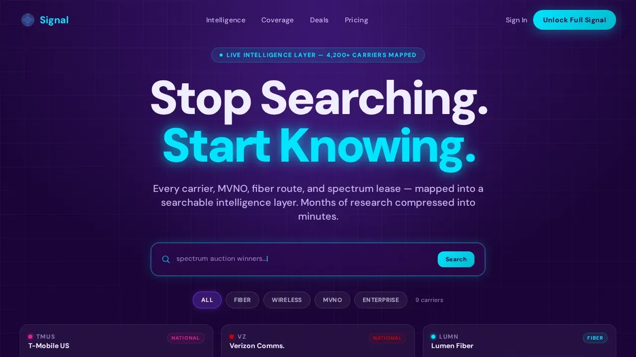
- A hero section with a live modular card grid, cycling search ghost text, filter chips, and frosted membership lock overlays
- A scroll-driven discovery path covering a coverage heatmap, a carrier comparison table, and a deal-flow timeline
- A sticky bottom bar, modal sample profile, and full-width closing module all wired to the primary "Unlock Full Signal" call to action
Feature list
This landing page template is built around six distinct functional layers. Each one earns visitor confidence before asking for a click.
Live Interactive Card Preview Hero
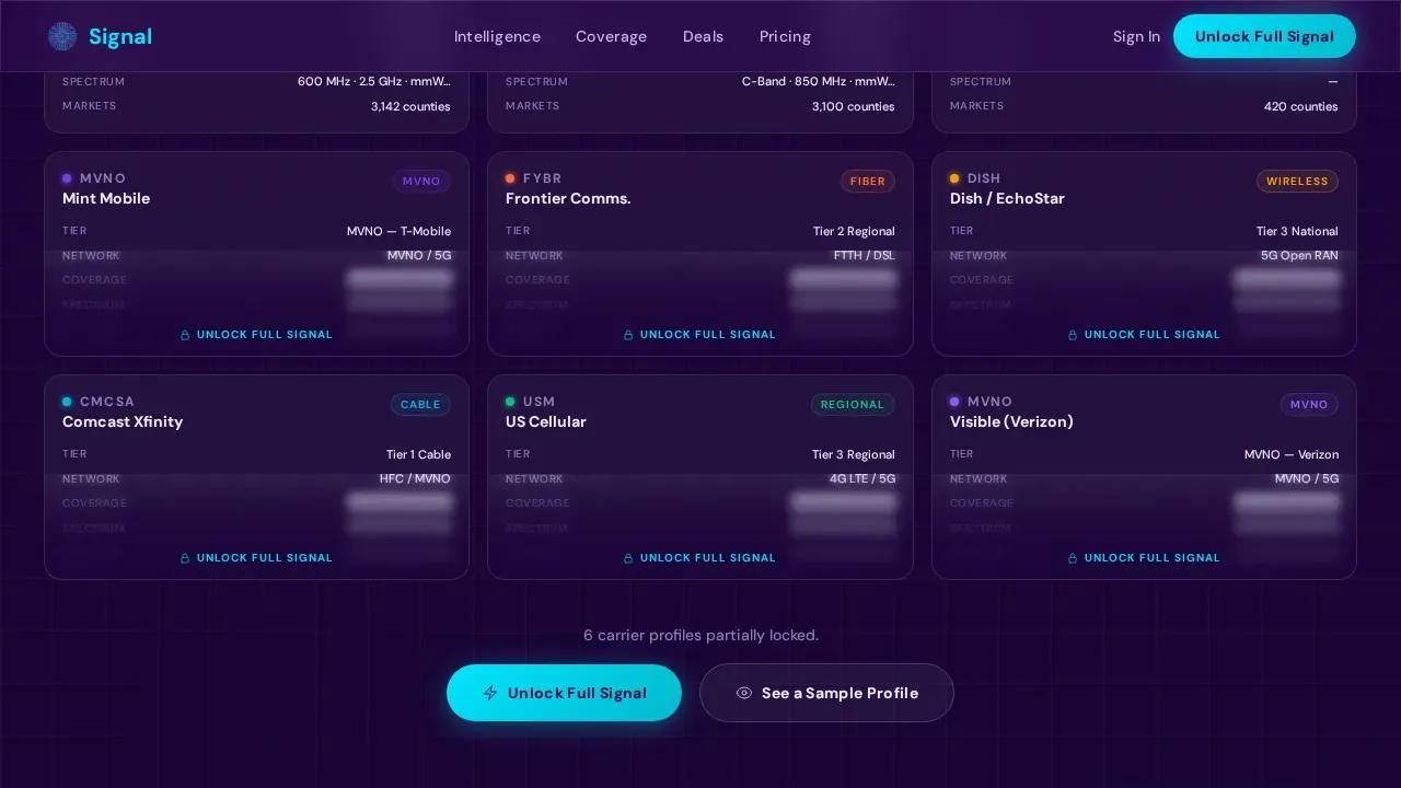
The header is not a static banner. It renders a functioning micro-directory in the viewport, with three rows of modular cards showing carrier logos, coverage badges, spectrum holdings, market tier, and network type. A search bar pulses with cycling ghost text drawn from real-world queries. Visitors can tap filter chips, Fiber, Wireless, MVNO, Enterprise, and watch cards shuffle in real time. Half the data on each card is visible; the rest blurs behind a frosted-glass membership lock, creating immediate informational hunger.
Scroll-Driven Discovery Explorer
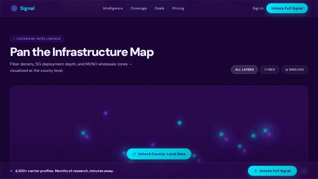
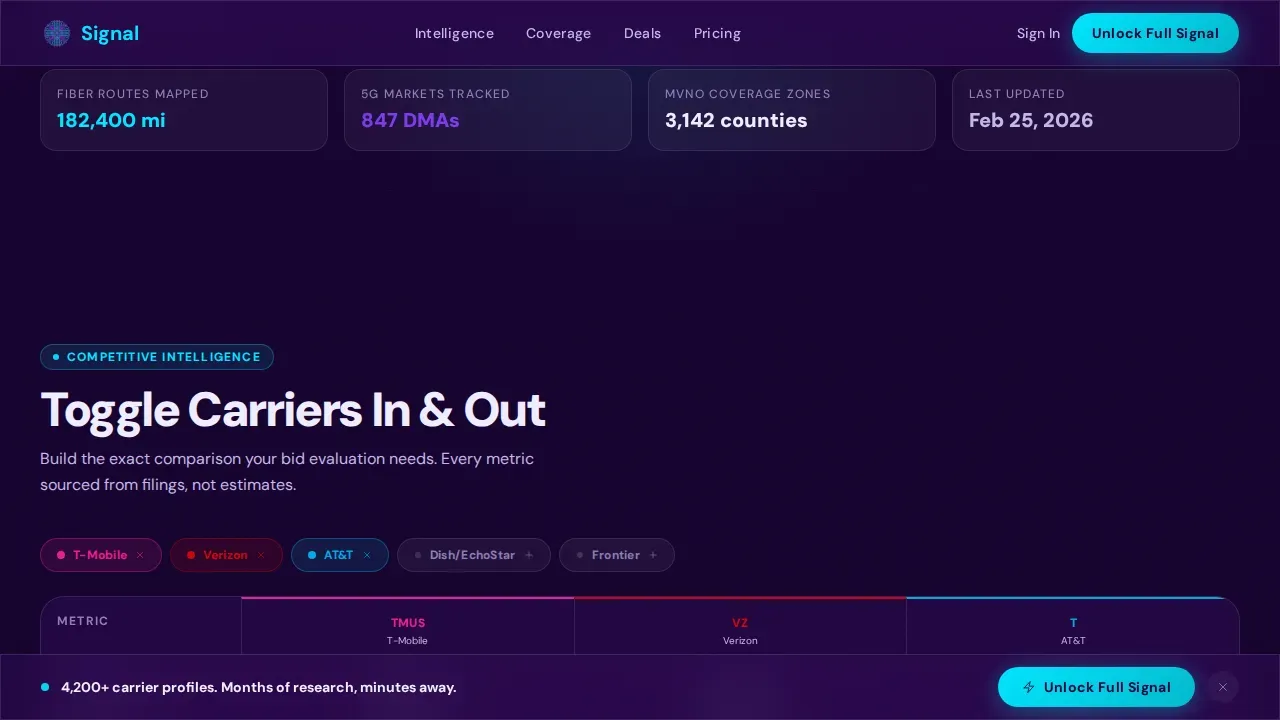
Below the hero, each scroll section introduces a new dimension of the platform. A pan-able coverage heatmap lets visitors explore fiber and wireless density layers across the United States. A toggle-carrier comparison matrix lets users add and remove operators to compare services side by side. A deal-flow timeline displays recent mergers, acquisitions, and spectrum auction cards with expandable detail panels. Every layer escalates from browsing to analyzing, proving data density without giving everything away.
Frosted-Lock Conversion Architecture
The primary call-to-action "Unlock Full Signal" appears three times across the landing page: first as a frosted overlay on blurred card data in the hero, then anchored in a sticky bottom bar after the second scroll section, and finally as the dominant element in a full-width closing module. There are no form fields on this page. The click carries intent, allowing users to proceed directly to free trial activation on the next page.
Sample Profile Modal
A secondary conversion path "See a Sample Profile" opens a modal revealing one fully unlocked carrier card. This gives prospective customers a complete view of platform depth before requiring users to commit. It is the most effective way to reduce hesitation among analysts who need to justify a purchase to stakeholders. The modal approach keeps the landing page clean while still delivering proof.
Membership Pricing Tiers Module
The membership section presents tiered pricing with a clear comparison table that distinguishes between access levels. Offering a discounted rate for annual commitments is built into the tier structure, which can drive higher immediate value for customers and improve customer lifetime value metrics. The "Unlock Full Signal" call to action dominates this section as the primary high-contrast button.
Modular Card Grid Layout
The entire landing page uses a card-grid system where each card is a discrete node of data. Cards float on the deep-indigo background like lit windows in a switchboard. The modular structure makes the layout easy to adapt, extend, or rearrange without breaking the visual hierarchy. Marketing teams can update card content, filter labels, and data fields independently across the page.
Page sections overview
| Section | Purpose |
|---|---|
| Hero Card Preview | Live directory grid with filter chips, cycling search text, and frosted lock overlays |
| Coverage Heatmap Explorer | Pan-able US fiber and wireless density map layer |
| Carrier Comparison Table | Toggle-driven matrix for side-by-side carrier evaluation |
| Deal-Flow Timeline | Expandable M&A and spectrum auction cards with detail panels |
| Membership Pricing Tiers | Tiered plan comparison and dominant Unlock Full Signal call to action |
| Footer | Horizontal flow footer with navigation and compliance links |
Design & branding system
The visual identity follows a Directory and Discovery theme powered by the Electric Indigo color system. The aesthetic is a dark intelligence dashboard, precise, luminous, and built to signal authority to technical buyers. Every color decision has a functional role, not just a decorative one.
- Deep transmission indigo (#2E0854) as the primary background, live-wire violet (#7C3AED) for hover states and active filters, cathode-ray white (#F0EEFF) for card surfaces and body text
- Arc-flash cyan (#00E5FF) applied to calls to action and data highlights to guide the eye toward conversion points
- DM Sans typography used at bold weight throughout, keeping messaging crisp and technically precise without feeling cold
Mobile & speed optimization
This landing page is desktop-first by design, built to serve analyst workflow contexts where screen real estate matters. Responsive mobile fallback is included so the landing page remains fully functional across devices. Animations use CSS and Intersection Observer to keep the tech stack lean.
- Responsive design includes large tappable buttons for users on mobile devices, following best practices for touch navigation on mobile apps
- Scroll-linked reveals and card shuffle animations rely on CSS transitions rather than heavy libraries, keeping the page performant and reducing bounce rate risk
- The sticky bottom bar and modal are both mobile-compatible, ensuring the primary conversion path works regardless of device
How this template helps you convert
A well-optimized landing page significantly boosts conversion rates by eliminating distractions and guiding visitors toward a single goal. This template is engineered specifically for that outcome. It lets visitors touch the product before asking for commitment, which is the most reliable way to build customer trust in a B2B context.
- The frosted-lock mechanic creates informational hunger by showing visitors exactly what they are missing, which drives engagement more effectively than benefit copy alone. Tracking key metrics like time-on-section and scroll depth can confirm which locked data types generate the most click intent.
- The "No Credit Card Required" free trial model removes hesitation for customers evaluating multiple services, improving conversion rates by lowering the perceived cost of entry. Risk-free calls to action are proven to improve customer experience at the decision moment.
- The sample profile modal delivers personalized proof at the individual-record level, addressing the specific customer expectations of analysts who need to see data quality before they invest. This proactive approach to demonstrating value before sign-up shortens the sales cycle and supports revenue growth.
Other information about this template
This template is built to serve the growing market where telecom analytics connects financial performance, customer behavior, and operational metrics into one structured view. The landing page addresses the full range of professional pain points in this space: reducing revenue leakage, supporting regulatory compliance, and giving teams clear visibility into competitive data. Here is additional context to help you assess fit before you build.
- Telecom data analytics helps identify areas where service disruption, fraud detection gaps, or revenue leakage are costing operators money. The landing page communicates these pain points through its interactive layers, building customer loyalty by showing that the platform understands the audience's real problems at a granular level.
- The template supports messaging that highlights predictive analytics capabilities, machine learning models for pattern recognition, and the ability to detect anomalies in billing or traffic patterns. These themes engage the target audience of analysts who evaluate tools against operational complexity and service quality benchmarks.
- Marketing teams using this template can connect the landing page to downstream tools such as Google Analytics for traffic measurement, feedback forms for post-visit research, and booking confirmations for trial onboarding. The template itself does not include these integrations, but its clean single-call to action structure keeps administrative overhead low and reduces the need for manual intervention in the conversion flow.
- Customer engagement strategies on this landing page are designed to increase average revenue per seat by converting high-intent visitors into paying members. Customer lifetime value improves when the platform demonstrates that it can help professionals reduce churn risk, improve performance analysis, and deliver personalized offers to their own customers downstream.
- The landing page positions the platform as the natural choice for professionals who have outgrown spreadsheets. It speaks to customer satisfaction by showing that the tool eliminates the slow, fragmented research process that frustrates analysts, procurement leads, and consultants alike. Customer usage patterns data can be surfaced through the deal-flow timeline and comparison table sections, giving businesses a clear view of how the intelligence layer drives decisions.
- Healthcare providers, call centers, and enterprises managing multiple services across regions also face similar data fragmentation problems. While Signal is telecom-specific, the landing page template structure can be adapted for adjacent verticals where a searchable intelligence directory would drive engagement and improve customer experience.
- Subscription-based models for platforms like this often include free trials and tiered pricing plans. Offering a discounted rate for annual commitments is already built into the pricing tier section, allowing businesses to increase average revenue while rewarding customer loyalty. The Signal Unlock Telecom Intelligence Membership Landing Page Template is the most complete starting point available for this specific niche.
Theme
Directory & Discovery
Creative direction
Interactive Explorer
Color system
Electric Indigo
Style
Card Grid (Modular)
Direction
Click-Through
Page Sections
Live Interactive Hero Directory
Scroll-driven Discovery Sections
Triple-placement Call to Action Architecture
Sample Profile Modal
Tiered Membership Pricing Module
Electric Indigo Card Grid System
Related questions
Who is this landing page template built for?
Does the template include real carrier data or placeholder content?
Can I use this template without coding experience?
How does the frosted-lock mechanic support conversion rates?
Is there a way to demonstrate data quality before visitors sign up?



