Outdoor & Adventure Education Specialist Professional Website Template
Belay is a modular card-grid landing page built for rock climbing gyms and instruction programs. It guides visitors through a numbered six-step climber journey, presents a low-friction free-trial signup form, and offers a secondary PDF download for undecided visitors. The Community Hearth visual theme and Slate & Sky color palette make the page feel inviting before a single word is read.
by Rocket studio
Quick summary
Belay is a single-page, card-grid landing page designed for rock climbing instruction programs. It walks visitors through six sequential lesson cards, each flipping on hover to reveal content and timing. Two conversion paths keep every visitor moving forward: a free Saturday class signup or a downloadable "First 5 Moves" PDF. The warm Community Hearth design feels approachable from the first scroll.
Who this template is for
This template suits any climbing gym or instructor who wants to turn curious browsers into paying members. It works especially well for programs that serve mixed-experience audiences and need to earn trust before asking for a commitment.
- Climbing gyms running weekend beginner and intermediate sessions
- Independent climbing coaches offering structured progression programs
- Gym marketing teams building a focused trial-class acquisition page
What problem this template solves
Most climbing gym pages overwhelm visitors with class schedules, membership tiers, and waiver forms before the visitor feels ready. Nervous first-timers click away. The Belay template removes that friction by showing the journey first and the ask second.
- Visitors leave before signing up because the page feels too complicated
- No clear progression story makes all skill levels feel uncertain about fit
- A single hard-sell call to action alienates visitors who need a lower-stakes entry point
What you get with this template
You get a fully structured, section-led landing page with every key component already in place. The layout is modular, so individual cards and sections can be updated without reworking the whole page.
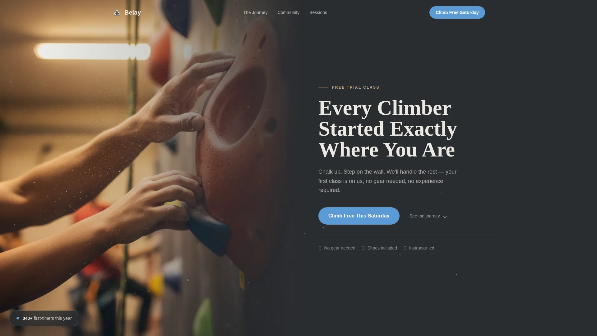
- A half-page photo-and-text split header with headline, subline, and primary call to action button
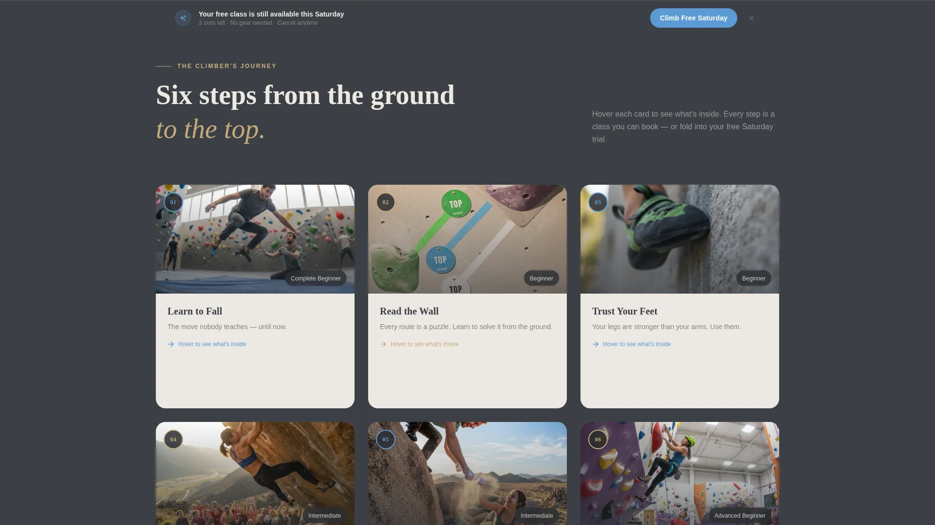
- A six-card step-by-step journey grid with hover-flip interactions revealing lesson details
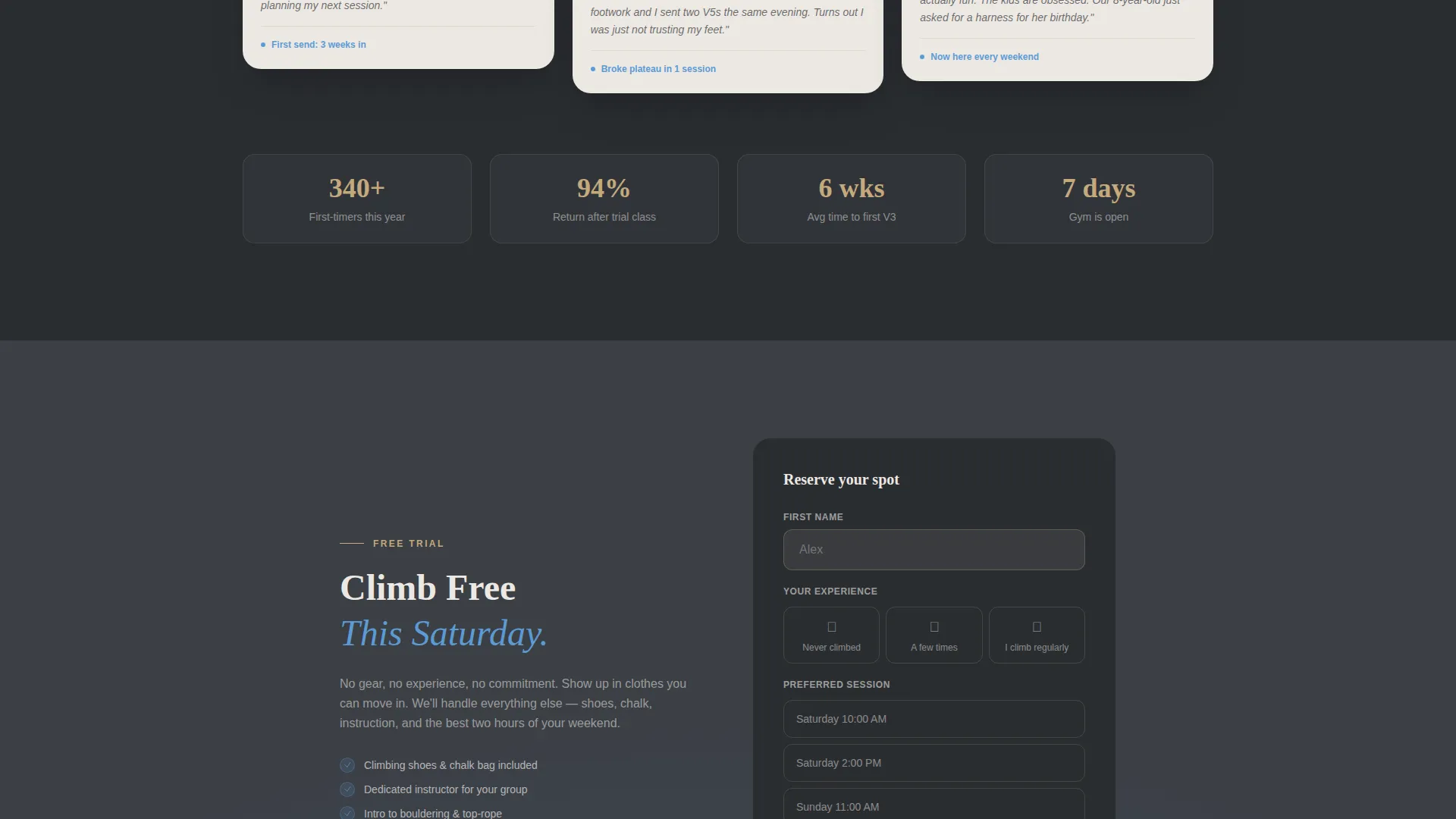
- A minimal three-field signup form and a secondary PDF download call to action for softer conversion
Feature list
This template includes a focused set of components built specifically for trial-class conversion in a climbing instruction context.
Half-Page Split Header
The header divides into two equal halves. The left side holds an atmospheric close-up photograph of an instructor adjusting a student's chalk-dusted grip. The right side carries a bold headline, a short subline naming the free trial class, and a single sky-blue call-to-action button.
Numbered Journey Card Grid
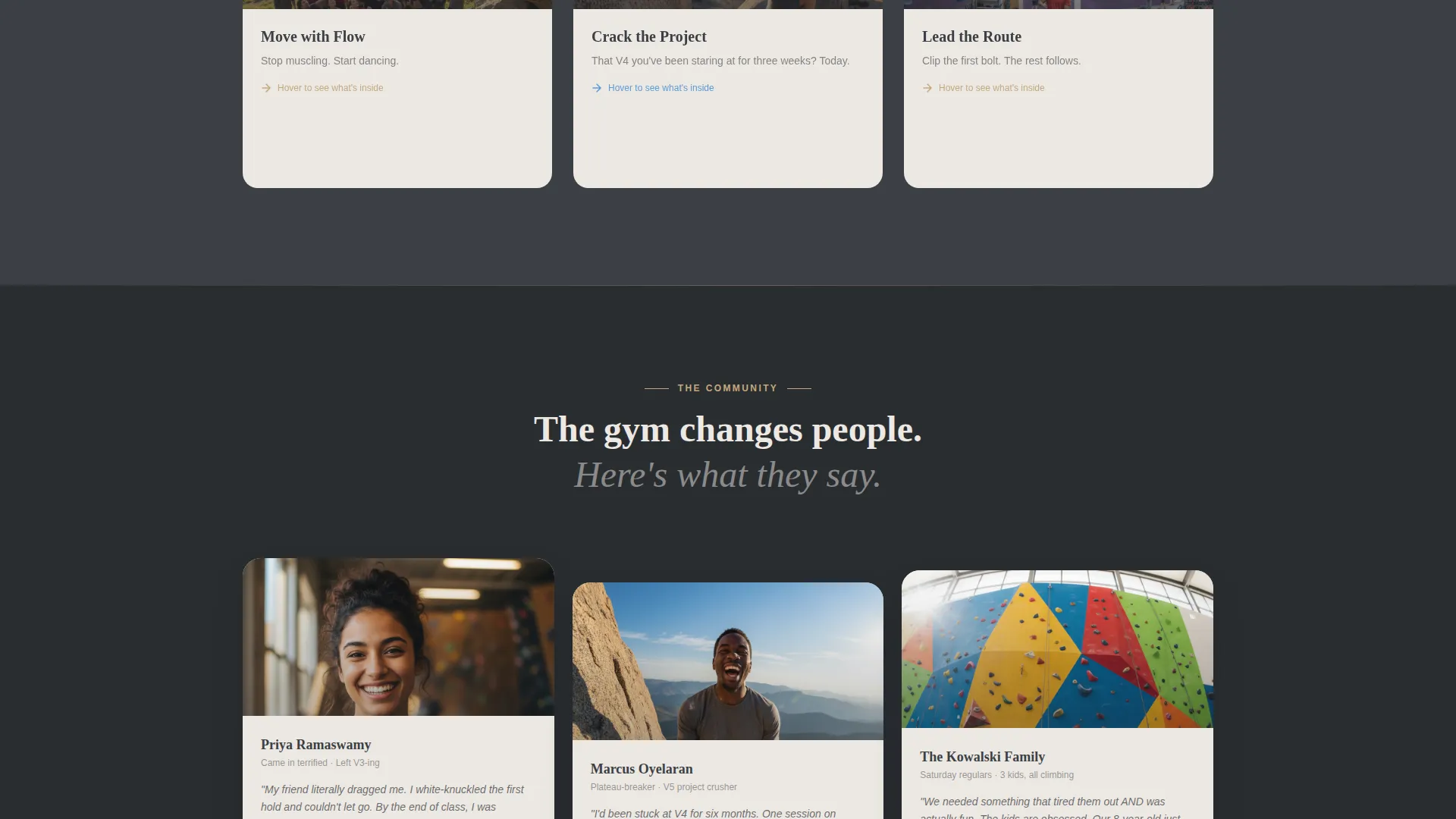
Six modular cards map the climber's progression from "Learn to Fall" through increasingly confident techniques. Each card is numbered and sequential, building a sense of earned progress as the visitor scrolls. Cards flip on hover to reveal what the lesson covers and how long it takes.
Hover-Flip Card Interactions
Every card in the grid has a front face showing the lesson title and a supporting photograph. The reverse face appears on hover and lists the specific skills covered and the session duration. This keeps the page visually clean while rewarding engaged visitors with detail.
Sticky Bottom Conversion Bar
A sticky bar appears after the visitor scrolls past the third card. It repeats the primary "Climb Free This Saturday" call to action. The bar stays visible during continued scrolling, keeping the offer present without interrupting the content.
Minimal Three-Field Signup Form
The signup form asks only for a first name, experience level (never climbed, a few times, or regular), and a preferred session time from three weekend slots. Fewer fields lower the barrier to submission and reduce drop-off on the conversion step.
Secondary PDF Download Path
Visitors who are not ready to commit to an in-person session can download a free "First 5 Moves" PDF. This secondary path keeps those visitors engaged with the brand and provides a natural follow-up touchpoint.
Page sections overview
| Section | Purpose |
|---|---|
| Split header panel | Introduce the gym and present the primary call to action |
| Journey card grid | Guide visitors through the six-step lesson progression |
| Hover-flip card detail | Reveal lesson content and timing on card interaction |
| Sticky bottom bar | Persist the free class offer throughout page scroll |
| Trial signup form | Collect first name, experience level, and session time |
| PDF download call to action | Offer a low-commitment entry point for undecided visitors |
Design & branding system
The Slate & Sky color system gives the page a grounded, outdoor-crag atmosphere. Every color choice connects to a physical sensation, making the design feel lived-in rather than generic.
- Deep granite gray (#3B3F45) for primary backgrounds, worn chalk white (#EDE8E3) for card surfaces, open-sky blue (#5B9BD5) on buttons and progress indicators, and warm rope-tan (#C4A97D) for borders and secondary highlights
- Typography uses a heavy, grounded sans-serif for headlines to convey physical confidence, with readable body text for card detail and form labels
- The Community Hearth theme keeps the overall mood warm and welcoming, like arriving at a familiar gym on a cold evening
Mobile & speed optimization
The card grid layout is modular by design, which makes it straightforward to reflow from a multi-column desktop grid to a single-column mobile stack without losing the numbered progression logic.
- Cards resize and reorder cleanly for smaller screens, preserving the step-by-step sequence
- The sticky bottom bar and form remain accessible on mobile without obscuring card content
How this template helps you convert
The page is structured so that trust is built before the ask is made. By the time a visitor reaches the signup form, they have already absorbed six clear steps of a climbing journey and feel familiar with the program.
- The numbered card grid creates a sense of earned progress, so the free class offer feels like a natural next step rather than a cold pitch.
- Two distinct conversion paths, the in-person trial class and the PDF download, mean almost every visitor has an action they are comfortable taking, regardless of how ready they feel.
Other information about this template
This template is built within the Education and Training category, specifically for the Outdoor and Adventure Education subcategory and the Rock Climbing Instruction niche. It is designed as a single-page, card-grid layout with a Freemium and Trial conversion direction, meaning the primary goal is to get a visitor into a free session rather than directly into a paid membership.
- The template style is Card Grid (Modular), meaning sections can be added, removed, or reordered to match a specific gym's program structure
- The creative direction follows a Step-by-Step Guide format, which is especially effective for audiences who are anxious about trying something new
- The header concept is a Half-Page Photo and Text split, a format well-suited to visual-first niches like climbing where atmosphere sells as much as the curriculum
Theme
Community Hearth
Creative direction
Step-by-Step Guide
Color system
Slate & Sky
Style
Card Grid (Modular)
Direction
Freemium/Trial
Page Sections
Half-page Split Header
Six-card Journey Grid
Hover-flip Card Detail
Sticky Conversion Bar
Minimal Trial Signup Form
Secondary PDF Download Call to Action
Related questions
Can I use this template if my gym offers more or fewer than six lesson types?
What information does the signup form collect?
Who is the secondary PDF download path designed for?
Does this template work for both beginner and intermediate climbers?
Can I update the color palette to match my gym's existing brand?



