Franchise Vertical SaaS Cost Calculator Website Template
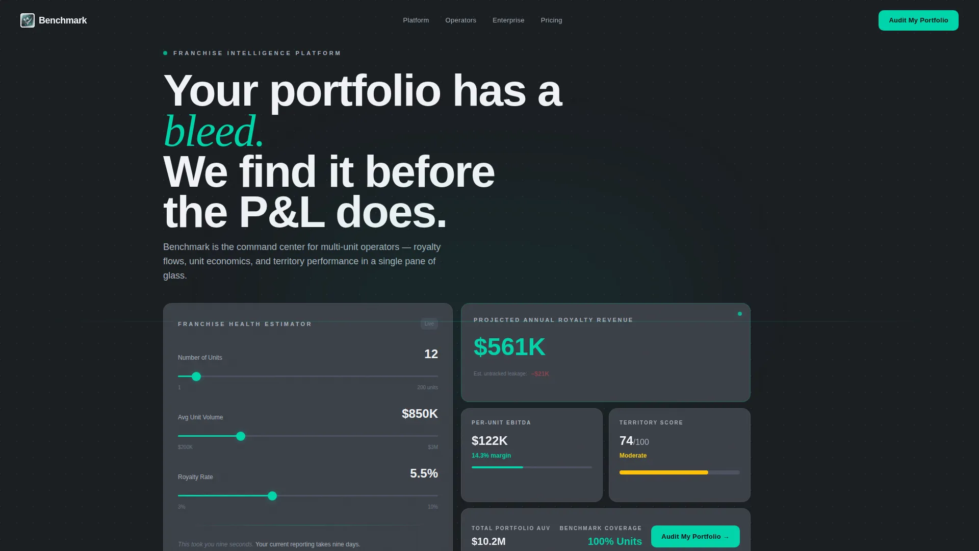
Benchmark is a bento grid landing page template built for franchise analytics dashboards. It opens with a live franchise health estimator, then guides visitors through data-dense scroll sections that showcase unit economics, royalty flows, and territory performance. The dark Monochrome Steel design system and electric teal accents give it the precision feel of a professional-grade reporting cockpit.
by Rocket studio
Quick summary
Benchmark is a single-page, bento grid landing page template designed for franchise analytics dashboards. It combines an interactive estimator header, scroll-triggered micro-animations, and a progressive lead capture flow. The Monochrome Steel color system and Stats-First creative direction make every section feel like live data, not a sales pitch.
Who this template is for
This template is built for teams that sell or operate franchise analytics software at scale. It speaks directly to buyers who live inside complex, multi-unit reporting environments every day.
- Franchise development directors managing portfolios of 200 or more units who need a credible, data-forward first impression
- Multi-unit operators running locations across multiple states who want to see unit economics reflected back at them immediately
- Private equity-backed holding companies running franchise roll-ups that require diligence-grade analytics presented with authority
What problem this template solves
Most franchise software landing pages describe their product. Benchmark performs it. Visitors arrive already skeptical, already drowning in spreadsheets, and already short on time. A generic feature list does not close that gap.
- Franchise operators cannot feel the value of a reporting tool from bullet points alone; they need to interact with something real above the fold
- Scattered unit data, royalty leakage, and territory variance are invisible problems until a tool surfaces them visually, and this template simulates that reveal in real time
- Lead capture forms that ask for everything upfront kill conversion; a progressive three-step flow removes that friction at exactly the right moment
What you get with this template
You get a fully structured, single-page bento grid landing page ready to adapt to a franchise analytics product. Every section is purposeful, every interaction is tied to a conversion goal, and the visual system is pre-built and internally consistent.
- An interactive franchise health estimator with three sliders (number of units, average unit volume, royalty percentage) that animate a bento card cluster in real time
- A Stats-First scroll journey that opens each section with an oversized data point before unpacking meaning through card-level detail
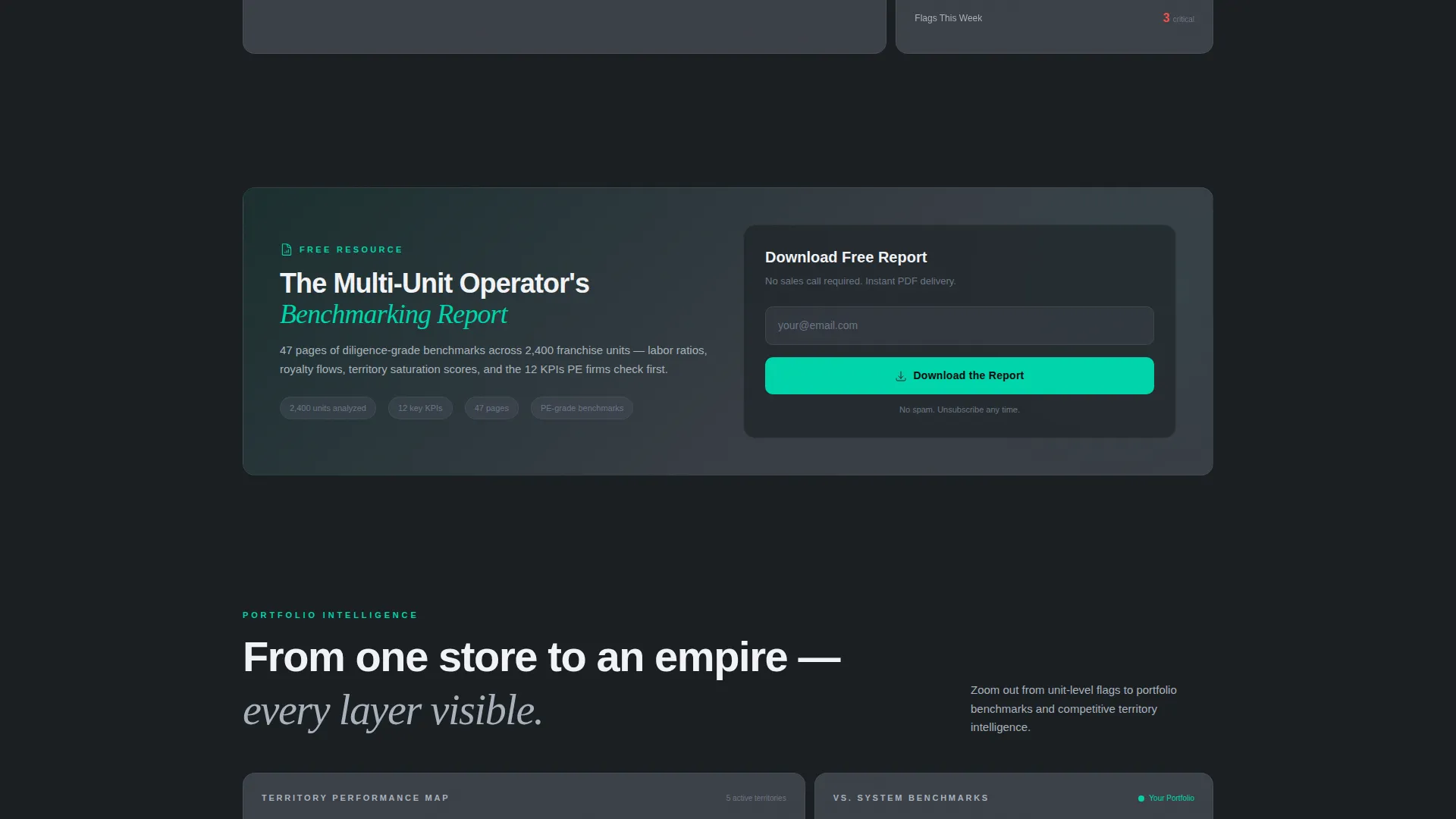
- A progressive three-step lead capture flow and a secondary mid-page email gate for the benchmarking report download
Feature list
This section covers the core functional and design capabilities built into the Benchmark template as described in the source brief.
Live Franchise Health Estimator
An interactive calculator sits above the fold with three input sliders: number of units, average unit volume, and royalty percentage. As a visitor drags any slider, the right-side bento card cluster animates in real time, showing projected annual royalty revenue, per-unit EBITDA (earnings before interest, taxes, depreciation, and amortization) margin, and a territory heat score. Teal accents pulse on positive thresholds, making the data feel personal before the visitor scrolls.
Bento Grid Layout System
The page is structured around a bento grid, a mosaic of cards that vary in size and density. Cards grow more interconnected as the visitor scrolls deeper, mimicking the experience of zooming from a single store view out to a full portfolio. The layout is purpose-built for data-heavy content that needs to feel organized, not overwhelming.
Stats-First Scroll Sections
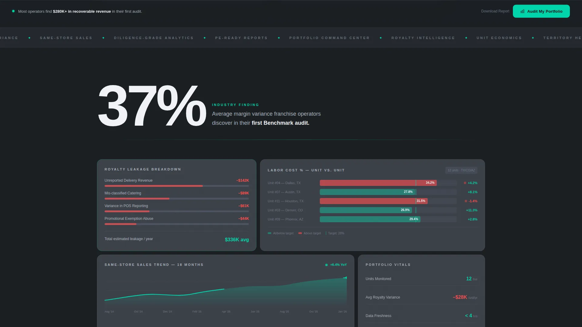
Each scroll depth opens with a bold number before any narrative text. The first below-the-fold section leads with "37%" in oversized white type, representing the average margin variance franchise operators find in their first audit. Subsequent sections escalate from unit-level metrics to portfolio benchmarks to territory intelligence, raising stakes with each scroll.
Scroll-Triggered Micro-Animations
Bar charts fill on entry, rankings shuffle into place, and red flags surface as the visitor scrolls. These animations are not decorative. They simulate the experience of a live dashboard responding to real data, reinforcing the product's core value proposition without a single word of explanation.
Progressive Three-Step Lead Capture
The primary call to action is "Audit My Portfolio" in electric teal, pinned to a slim bottom bar that appears after the visitor interacts with the estimator. The form runs three steps: franchise unit count and brand name, current reporting tool via dropdown, then name, email, and preferred demo window. Each step is lightweight enough to feel effortless.
Mid-Page Secondary Conversion Gate
Between the unit economics section and the territory intelligence section, a secondary conversion path offers a downloadable multi-unit operator benchmarking report gated behind email-only capture. It catches engaged visitors who are not yet ready for a sales conversation but are willing to trade an email for something useful.
Page sections overview
| Section | Purpose |
|---|---|
| Health Estimator Header | Interactive sliders animate royalty, margin, and territory data above the fold |
| Estimator Tagline | Cold silver one-liner contrasting nine-second estimator with nine-day reporting |
| Margin Variance Hook | Opens below the fold with "37%" in oversized type to anchor the stakes |
| Royalty Leakage Cards | Bento cards break down royalty leakage at unit and portfolio level |
| Labor Cost Comparison | Side-by-side unit labor cost cards reveal variance across locations |
| Same-Store Sales Trends | Trend line cards show same-store sales movement over time |
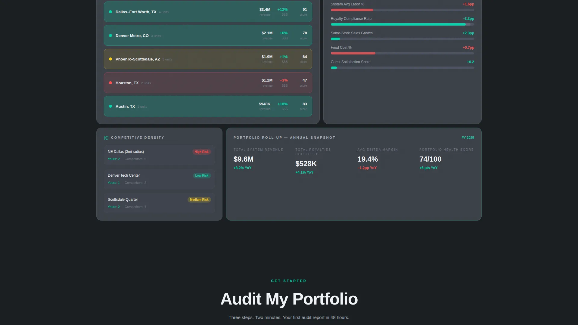
| Unit Economics Section | Deeper bento grid unpacks per-unit performance metrics |
| Mid-Page Report Gate | Email-only download offer for the multi-unit benchmarking report |
| Territory Intelligence | Competitive territory data visualized across the portfolio grid |
| Portfolio Benchmarks | Portfolio-wide benchmark cards connect individual units to the whole |
| Pinned call to action Bar | Sticky bottom bar with "Audit My Portfolio" teal call to action after estimator interaction |
Design & branding system
The visual identity follows a Dashboard Pro theme built on a Monochrome Steel color system. Every color decision serves a functional purpose, not decoration. The palette recalls a Bloomberg terminal crossed with a precision instrument cluster, where restraint is the design choice.
- Background and surface colors stay in the gunmetal-to-steel range: deep gunmetal (#1B1F23) as the primary background and brushed steel (#3A3F47) for card surfaces
- Typography alternates between cold silver (#A8B2BD) for secondary text and axis lines and bright white (#F0F2F5) for primary data, maintaining clear visual hierarchy throughout
- Electric teal (#00D4AA) appears exclusively on positive deltas, active states, and the call to action, used sparingly so every appearance commands immediate attention
Mobile & speed optimization
The bento grid layout and interaction-heavy components are structured to remain functional and readable across screen sizes. Scroll-triggered animations are tied to viewport entry, keeping the experience intentional rather than distracting on smaller displays.
- Bento grid cards are designed to reflow cleanly, preserving hierarchy and readability on mobile viewports without losing the data-dense feel
- The pinned call to action bar and progressive form steps are compact by design, reducing tap friction on mobile and keeping the conversion path accessible at any scroll depth
How this template helps you convert
Benchmark is engineered around two conversion paths, not one. Every interaction on the page nudges a visitor closer to one of those paths without pressure.
- The live estimator creates immediate personal relevance before the visitor has read a single marketing claim, making the "Audit My Portfolio" call to action feel like a natural next step rather than an interruption
- The mid-page benchmarking report download captures engaged but sales-resistant visitors with a low-friction email-only gate, keeping them in the funnel between the unit economics and territory intelligence sections
Other information about this template
Benchmark is a Technology category template filed under the Franchise Vertical SaaS subcategory, purpose-built for the franchise analytics dashboard niche. It was designed with an Intersection Match Score of 13, meaning the template style, theme, color system, creative direction, header concept, and lead generation direction all align tightly to one specific use case.
- The template style is Bento Grid, the theme is Dashboard Pro, and the color system is Monochrome Steel, all working together as a coherent system rather than interchangeable parts
- The creative direction is Stats-First Impact, meaning data leads every section and narrative follows, which is the opposite of most software landing page conventions
- The header concept is a Calculator/Estimator, a deliberate choice to replace passive hero copy with an active, personalized interaction that qualifies intent before any form is shown
Theme
Dashboard Pro
Creative direction
Stats-First Impact
Color system
Monochrome Steel
Style
Bento Grid
Direction
Lead Generation
Page Sections
Live Franchise Health Estimator
Stats-first Scroll Sections
Scroll-triggered Micro-animations
Progressive Three-step Lead Capture
Mid-page Secondary Conversion Gate
Monochrome Steel Design System
Related questions
Who is this template designed for?
Can I adapt the estimator sliders to match my product's actual metrics?
What is the purpose of having two separate conversion paths?
Does the bento grid layout work on mobile screens?
How does the Stats-First creative direction shape the page experience?



