Port & Terminal Vertical SaaS Directory Website Template
Berth is a split-screen landing page template built for port and terminal analytics platforms. It pairs dark-glass user interface panels, a phosphor-and-cyan color system, and an industry-report scroll structure to turn complex operational data into a compelling lead generation page. Terminal managers, port directors, and logistics VPs are the target audience.
by Rocket studio
Quick summary
Berth is a single-page landing page template designed for port and terminal analytics dashboards. It uses a 50/50 split-screen layout, a dark radar-scope visual identity, and an industry-report scroll cadence to guide decision-makers from global congestion pain points straight to a lead capture form.
Who this template is for
This template is built for vertical SaaS teams selling into the maritime and port operations sector. It speaks directly to the people who carry operational responsibility for terminal performance.
- Terminal operations managers who monitor berth windows and crane cycles around the clock
- Port authority directors who need data-backed evidence when defending capital expenditure decisions
- Logistics vice presidents at shipping lines who require dwell-time proof before renegotiating stevedore contracts
What problem this template solves
Port and terminal analytics platforms are hard to sell on a generic SaaS landing page. The product is dense, the buyer is skeptical, and the decision cycle is long. This template solves the credibility gap by framing the product as an operational command center rather than a software subscription.
- Generic templates cannot communicate real-time data density or operational urgency to a technical maritime audience
- Buyers arrive needing industry-specific proof before they will book a demo or share contact details
- A single unfocused call to action wastes high-intent traffic from terminal directors and port authority buyers
What you get with this template
You get a fully structured, single-page lead generation layout purpose-built for a port analytics product. Every section is pre-framed and ready to populate with your platform's data and messaging.
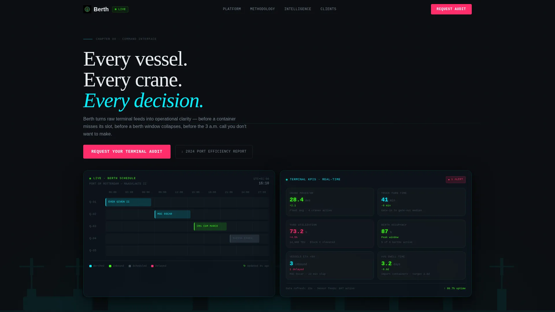
- A hero header with two dark-glass user interface panels displaying a berth occupancy timeline and a live KPI cluster
- Three chapter-style scroll sections that escalate from macro industry pain to product-level proof
- A primary lead form collecting terminal name, annual TEU volume, primary pain point, and work email
Feature list
This template delivers a focused set of layout and interaction features grounded in the source brief. Each element earns its place in the page.
Split-Screen Hero with Dark Glass Panels
The header divides into two frosted-glass user interface cards floating over an animated satellite view of a container terminal at night. The left card shows a real-time berth occupancy timeline with vessel silhouettes in colored blocks. The right card displays a KPI cluster with gently easing number animations for truck turnaround, crane moves per hour, and yard utilization.
Industry Report Scroll Structure
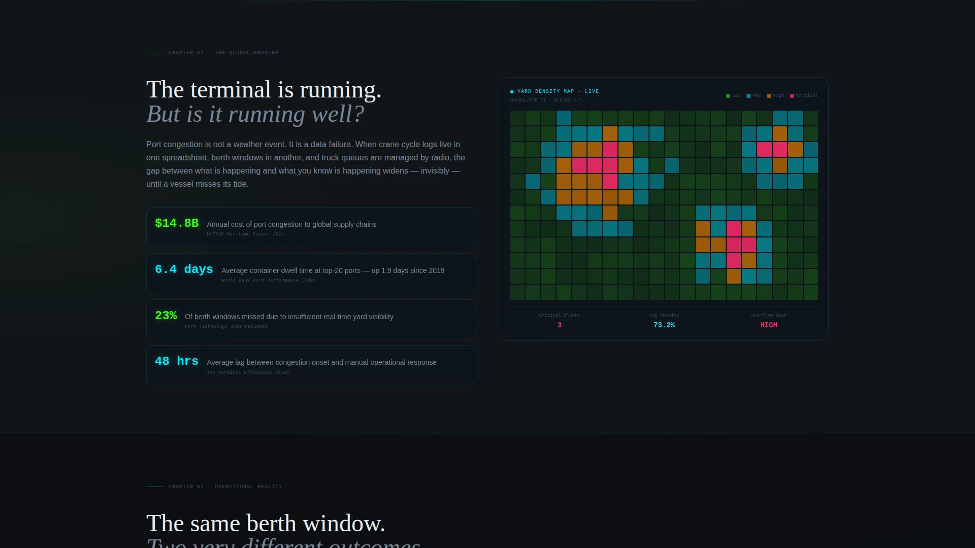
Each scroll section is framed as a chapter from a port performance whitepaper. The cadence moves from a global congestion and dwell-time statistics section, through a before-and-after operational timeline, to a predictive berth scheduling visualization. This structure builds a logical, escalating case with every scroll step.
Dual Conversion Path Design
The template supports two conversion routes simultaneously. The primary call to action invites visitors to request a terminal audit. A secondary path offers a gated port efficiency report download behind an email-only form, giving data-focused buyers a lower-friction entry point.
Signal Magenta Alert System
The Acid Digital color system reserves signal magenta (#FF2D6B) exclusively for alerts and primary call-to-action elements. This means the "Request Your Terminal Audit" button and any urgent interface highlights stand out clearly against the void-black background without competing with data surfaces.
Gantt-Style Vessel Queue Animation
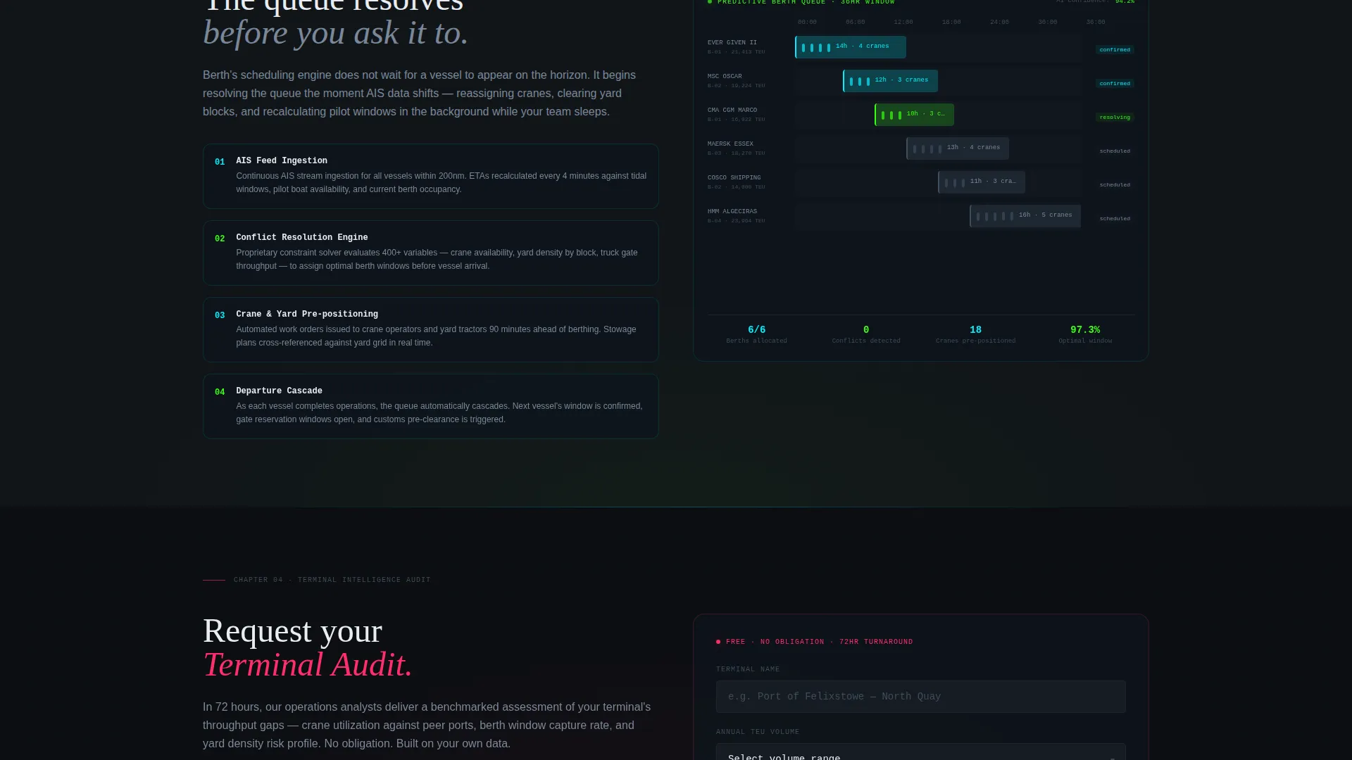
Section three includes a right-panel animation of a Gantt-style vessel queue resolving in real time. This visual demonstrates predictive berth scheduling methodology and gives the product a concrete, believable proof point at the moment buyers are most engaged.
Four-Field Low-Friction Lead Form
The primary form collects only four fields: terminal name, annual TEU (twenty-foot equivalent unit) volume via a dropdown range, primary pain point from a preset list, and work email. No phone number is required. This keeps friction low while still qualifying leads by scale and need.
Page sections overview
| Section | Purpose |
|---|---|
| Hero Header Panels | Display live-style KPI and berth occupancy user interface cards to establish product credibility immediately |
| Primary call to action Block | Present the "Request Your Terminal Audit" form directly after the hero to capture high-intent visitors early |
| Global Problem Chapter | Frame industry-wide congestion and dwell-time benchmarks alongside a yard density heat map |
| Operational Timeline Chapter | Show a before-and-after throughput comparison to make productivity gains concrete |
| Berth Scheduling Chapter | Animate a Gantt-style vessel queue to demonstrate predictive scheduling methodology |
| Secondary Gated Offer | Offer the port efficiency report download behind an email-only form for earlier-stage buyers |
| Final call to action Section | Repeat the "Request Your Terminal Audit" call to action to recapture visitors who scrolled the full page |
Design & branding system
The visual identity follows the Acid Digital color system within a Dashboard Pro theme. Every color choice carries a defined operational meaning, mirroring the logic of real terminal instrumentation.
- Void black (#0B0E11) forms all backgrounds, keeping data surfaces readable and urgent
- Phosphor green (#39FF14) and electric cyan (#00F0FF) surface data, timelines, and active interface elements
- Signal magenta (#FF2D6B) fires only on alerts and primary calls to action, so it always means something must happen
Mobile & speed optimization
The template is designed to carry its visual weight without compromising load performance on the devices decision-makers actually use. Dark-mode layouts and minimal decorative imagery support leaner page builds.
- No decorative photography is included; the interface panels act as the hero visual, reducing asset bloat
- Animated elements use gentle easing rather than heavy video, keeping motion purposeful and lightweight
- The 50/50 split-screen layout is structured for clean reflow on narrower viewports without losing panel hierarchy
How this template helps you convert
The conversion architecture is deliberate. Every scroll step moves the visitor closer to one of two forms, with no dead ends.
- The hero KPI panels establish product credibility before the visitor reads a single headline, lowering resistance to the first call to action that follows immediately below.
- The chapter-by-chapter scroll structure builds a logical evidence trail from industry pain to product proof, so the final "Request Your Terminal Audit" button arrives at the moment trust is highest.
- The secondary gated download gives skeptical or early-stage buyers a way to convert without committing to a demo, expanding the total number of leads the page can capture.
Other information about this template
This template sits at the intersection of the Dashboard Pro theme and the Industry Report creative direction. It is purpose-built for the port and terminal analytics niche within vertical SaaS technology products.
- The template style is Split Screen (50/50), making it well-suited for platforms that need to show interface and narrative side by side
- The header concept is Dark Glass Panels, a treatment that positions the product as instrumentation rather than software marketing
- The landing page direction is Lead Generation, with dual conversion paths optimized for both demo-ready and research-stage visitors
- The Acid Digital color system is applied with strict rules: magenta for action, phosphor and cyan for data, void for structure

Theme
Dashboard Pro
Creative direction
Industry Report
Color system
Acid Digital
Style
Split Screen (50/50)
Direction
Lead Generation
Page Sections
Split-screen Hero with Dark Glass Panels
Industry Report Scroll Structure
Dual Conversion Path Design
Signal Magenta Alert System
Gantt-style Vessel Queue Animation
Four-field Low-friction Lead Form
Related questions
Who is this landing page template designed for?
What conversion actions does the page support?
What does the lead form collect?
Does the template include any photography?
Can this template be adapted for a different industry?



