Construction Proposal & Quote Landing Page Template
Bid is a construction proposal and quote landing page template built around a side-by-side comparison table. It speaks directly to contractors and estimators who lose jobs to slow, messy quotes. The layout guides visitors from recognizing their pain to seeing a clean solution, ending with a clear call to action that drives signups.
by Rocket studio
Quick summary
Bid is a single-page landing page template for a construction proposal and quote platform. It uses a Problem to Solution narrative structure, a bold comparison table, and an interactive proposal preview to show contractors exactly what better estimating looks like. The design is precise, dark, and modern, built to convert skeptical visitors into confident first-time users.
Who this template is for
This template is made for construction software platforms that need to convince busy, practical professionals to change how they estimate. It speaks the language of people who live inside job costs and client deadlines.
- General contractors managing multiple takeoffs at the same time
- Specialty subcontractors pricing complex scopes under time pressure
- Growing construction firms rebuilding their estimating process after losing key staff
What problem this template solves
Estimating platforms often struggle to explain their value quickly. A generic feature list does not close the gap between a visitor's chaotic current workflow and a cleaner alternative. This template makes that gap visible and undeniable.
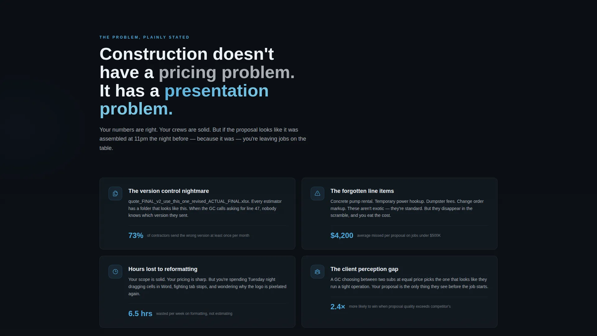
- Contractors waste hours reformatting proposals in Word or patching spreadsheets with inconsistent markups
- Missed line items and forgotten change orders quietly erode margins and client trust
- Proposals that look unprofessional lose jobs before the pricing is even reviewed
What you get with this template
You get a fully structured, single-page layout that moves visitors through a deliberate narrative arc. Every section has a job to do, and each one hands off cleanly to the next.
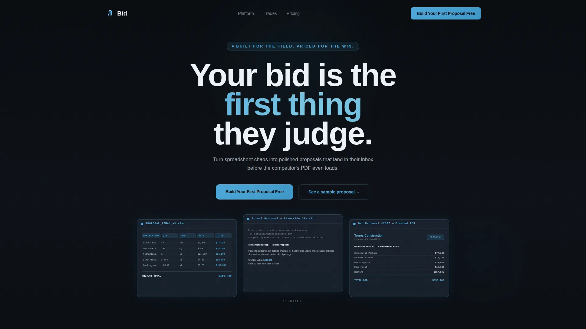
- A cinematic Dark Glass Panels header with animated construction document transformations
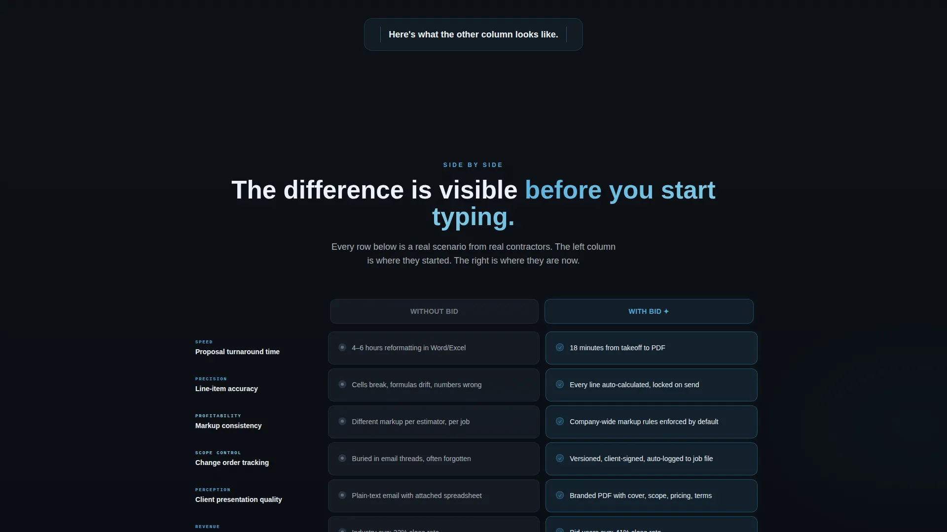
- A core comparison table contrasting "Without Bid" against "With Bid" across rows like turnaround time, accuracy, and client perception
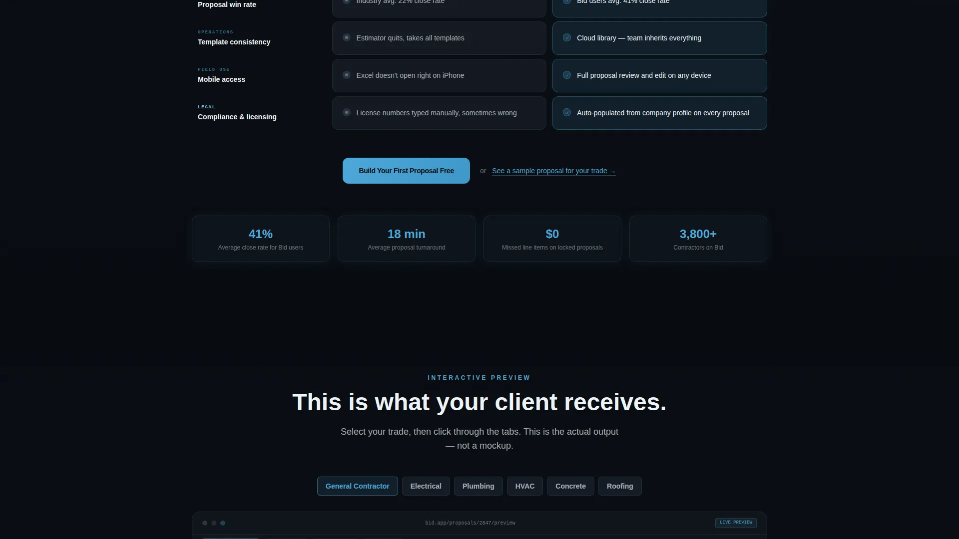
- An interactive proposal preview with tabbed navigation showing cover page, scope breakdown, pricing schedule, and terms
Feature list
This template includes purpose-built components that work together to move a skeptical contractor from recognition to action.
Dark Glass Panels Header
Three translucent frosted-glass rectangles float against a near-black background. Each panel holds a ghosted construction document. On page load, the panels sharpen, numbers align, and a branded proposal emerges. A single headline fades in over the center panel, setting the tone immediately.
Animated Comparison Table
The core section places "Without Bid" beside "With Bid" in a structured side-by-side layout. Each row animates on scroll, with the left column rendered in dull slate and the right column lighting up in sky blue. The table covers rows like proposal turnaround time, line-item accuracy, win rate, and client perception.
Interactive Proposal Preview
Below the comparison table, visitors can click through a tabbed proposal preview. Tabs include cover page, scope breakdown, pricing schedule, and terms. The preview is styled in the same glass-panel design language, making the output feel real and immediately desirable.
Anchored Primary Call to Action
The "Build Your First Proposal Free" button is placed in the top navigation, repeated beneath the comparison table, and repeated again beneath the interactive preview. No form appears on this page. Each button routes directly to a signup flow.
Secondary Trade-Select Link
A text link reading "See a sample proposal for your trade" lets hesitant visitors self-select by trade type. This reduces friction for visitors who are not yet ready to commit, and keeps them engaged with relevant content instead of bouncing.
Problem-to-Solution Scroll Arc
The page opens with a pain-naming section that calls out inconsistent markups, lost change orders, and hours spent reformatting. It then pivots hard into the comparison table and resolves with the interactive preview. The narrative arc mirrors a job walkthrough, which feels natural to the construction audience.
Page sections overview
| Section | Purpose |
|---|---|
| Dark Glass Header | Opens with animated document transformation and headline |
| Pain Naming Section | Names specific estimating problems with brutal clarity |
| Comparison Table | Side-by-side contrast of old workflow versus platform |
| Interactive Proposal Preview | Tabbed preview of real proposal output by section |
| Primary call to action Block | Repeated signup prompt beneath table and preview |
| Trade-Select Link | Secondary path for visitors to explore by trade type |
Design & branding system
The visual identity uses a Tech Glass theme built on the Slate and Sky color system. Every color choice reinforces a feeling of precision, capability, and controlled confidence.
- Deep structural slate (#1E2A38) and polished gunmetal (#3B4D61) anchor the dark background panels
- Open-sky blue (#4DA8DA) is used for interactive highlights, toggle states, and the active right column of the comparison table
- Clean glass white (#EDF2F7) fills table cells and creates breathing room between dense content sections
Mobile & speed optimization
The layout is structured for clean rendering across device sizes. Scroll-triggered animations and tabbed components are designed to work within the single-page flow without requiring page reloads.
- The comparison table is built to reflow clearly on smaller screens so row contrasts remain readable
- Tabbed proposal preview navigation is touch-friendly, supporting swipe-style interaction on mobile devices
- Anchored call-to-action placement means the primary button remains accessible throughout the scroll experience
How this template helps you convert
Every design and copy decision in this template is built to reduce hesitation and move visitors toward a single action.
- The comparison table does the selling before the visitor consciously decides anything. By the time they reach the call to action, they have already seen their own workflow in the left column and the cleaner alternative glowing on the right.
- The interactive proposal preview removes abstraction. Visitors can see an actual proposal output, not a feature description, which makes the platform's value concrete and immediate.
- The no-form approach keeps the path to signup frictionless. One click on the primary button moves visitors directly into the onboarding flow without any intermediate barrier.
Other information about this template
This template is built specifically for the construction proposal and quote software category. It is designed to support platforms in the construction software space where trust and clarity are the primary conversion levers.
- The template style is Comparison Table, which is particularly effective for platforms competing against manual workflows rather than other software products
- The creative direction follows a Problem to Solution Arc, a format that works well for audiences who are practical and skeptical of marketing language
- The header concept, Dark Glass Panels, is distinct within the construction technology category and helps the platform stand out visually from generic SaaS templates
- The landing page direction is Click-Through, meaning the page is optimized to route qualified visitors to a signup flow rather than collect leads on-page
Theme
Tech Glass
Creative direction
Problem→Solution Arc
Color system
Slate & Sky
Style
Comparison Table
Direction
Click-Through
Page Sections
Animated Comparison Table
Dark Glass Panels Header
Interactive Proposal Preview
Anchored Call-to-action Button
Trade-select Secondary Link
Problem-to-solution Scroll Arc
Related questions
What type of page is this template?
Does this template include a lead capture form?
Can I customize the comparison table rows?
Who is this landing page template designed for?
What makes this template different from a generic SaaS template?



