Advanced Consulting Firm Software Cost Estimator Website Template
Billable is a hub and spoke landing page template built for consulting firm accounting software. It leads with a live revenue leakage calculator above the fold, uses a dark Acid Digital color system, and drives leads through a dual-path conversion model. The layout is designed for firms losing billable hours across timesheets, expenses, and retainer balances.
by Rocket studio
Quick summary
Billable is a single-page, anchor-nav landing page template for consulting firm accounting software. The header opens with an interactive revenue leakage calculator. Every section below deepens financial urgency while presenting the product as the fix. The design runs on void black, electric chartreuse, and cold white, sharp, data-forward, and built to convert.
Who this template is for
This template is built for software teams and founders selling billing or financial operations tools to professional service firms. It speaks directly to the frustration of unbilled hours and fragmented spreadsheets.
- Operations managers at small-to-mid strategy consulting firms who reconcile billing data across multiple spreadsheets every week
- Solo fractional chief financial officers managing many client accounts simultaneously from a single workspace
- Managing partners who discover significant revenue leakage only during quarterly reviews
What problem this template solves
Consulting firms regularly lose revenue through unbilled or undercaptured hours. Generic software landing pages fail to make that cost feel real or personal before asking for a commitment.
- Visitors leave without understanding how much unbilled time is costing them specifically
- Standard page layouts bury the value proposition below the fold, reducing urgency
- Conversion paths that ask for contact details before delivering value see lower trust and lower form completions
What you get with this template
You get a fully structured, single-page layout with a sticky anchor navigation bar, a live calculator section at the top, and a series of focused spoke sections below. Every piece is designed around a single goal: turning the pain of revenue leakage into a reason to act.
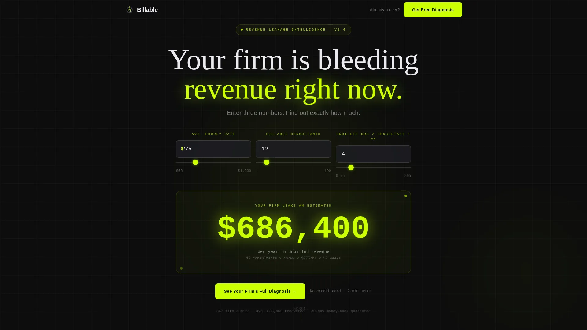
- A header calculator block that outputs a personalized annual leakage figure in large chartreuse type before the visitor scrolls
- Five hub and spoke content sections, each answering a natural follow-up question triggered by the calculator result
- A dual-path conversion model with a primary lead form and a persistent bottom bar booking prompt
Feature list
This template is built around a small number of high-impact components. Each one earns its place by moving a skeptical buyer closer to a decision.
Revenue Leakage Calculator Header
The page opens with an above-the-fold estimator. It collects average hourly rate, number of consultants, and estimated unbilled hours per week. The result renders as a large, pulsing chartreuse figure, a personalized annual revenue loss that is uncomfortable to ignore.
Hub and Spoke Anchor Navigation
A sticky navigation bar locks to the top of the page after the header. Each nav item links to a dedicated spoke section that answers a specific question: where leakage comes from, how the product captures it, and what changes after adoption. The architecture keeps visitors oriented without requiring them to scroll blindly.
Leakage Source Spoke
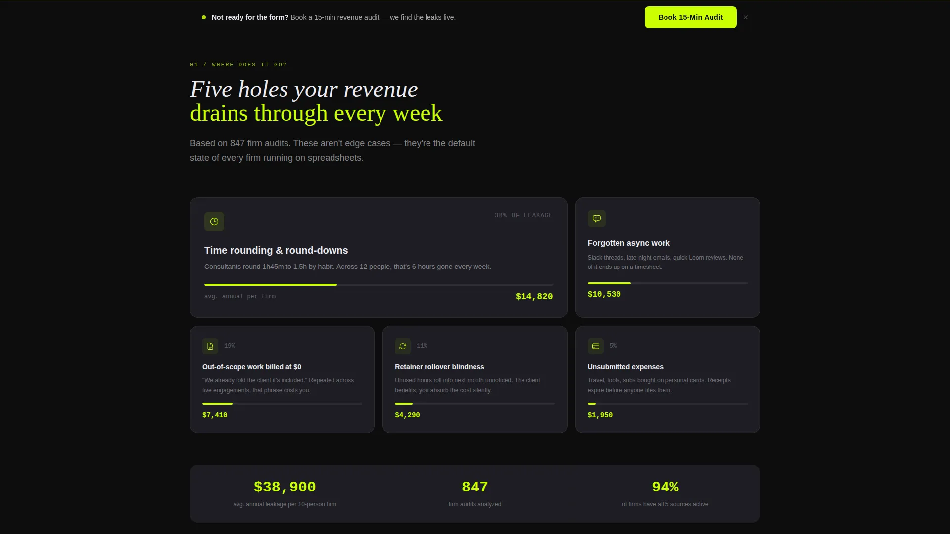
The first spoke section maps where billable time disappears. It answers the immediate "where does it go?" question triggered by the calculator number, using structured layout to make the sources of loss concrete and recognizable.
Automated Capture and Categorization Spoke
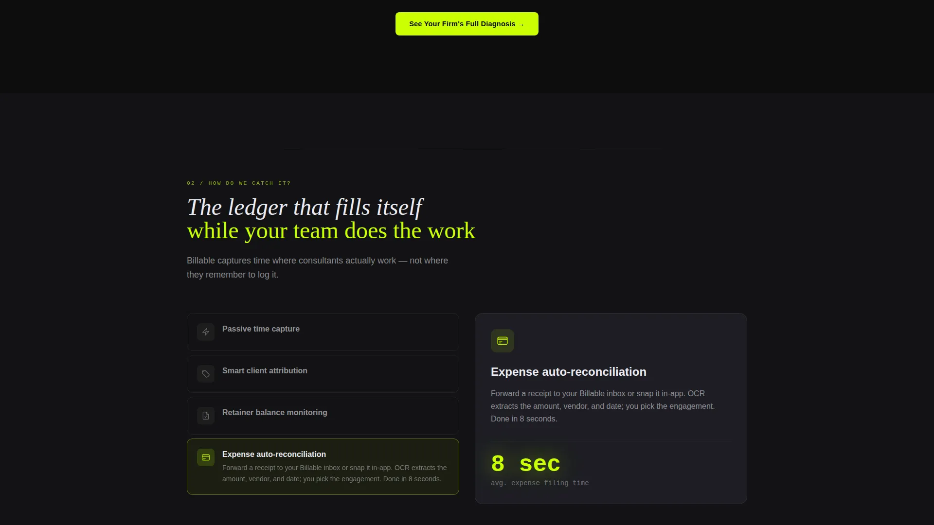
The second spoke walks through how the product catches unbilled time automatically. It covers timesheet automation and smart expense categorization, showing the mechanism behind the fix without requiring a product demo first.
Before and After Dashboard Spoke
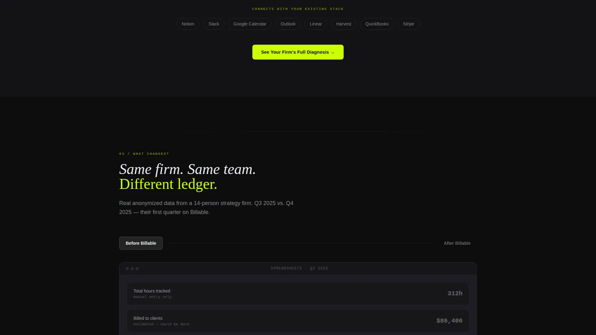
The third spoke presents a side-by-side comparison using real anonymized firm data. It shows the operational state before and after using the platform, making the product outcome tangible rather than theoretical.
Dual-Path Conversion Model
The primary call to action, "See Your Firm's Full Diagnosis," appears directly below the calculator result and repeats at the close of each spoke. It opens a short lead form asking for firm name, consultant count, current accounting tool, and work email. A persistent bottom bar offers a secondary path: booking a fifteen-minute revenue audit for visitors who skip the form.
Page sections overview
| Section | Purpose |
|---|---|
| Calculator Header | Deliver a personal leakage figure above the fold |
| Anchor Nav Bar | Keep spoke sections accessible from any scroll position |
| Leakage Source Spoke | Map where unbilled hours disappear |
| Capture Method Spoke | Show how the product catches missed billing |
| Dashboard Comparison Spoke | Prove the before and after outcome with data |
| Primary Lead Form | Collect firm details after calculator result |
| Persistent Bottom Bar | Offer a booking path for visitors who skip the form |
Design & branding system
The visual identity follows a Startup Velocity theme with an Acid Digital color palette. The overall effect is a dark-mode environment where data and actions feel sharp and immediate.
- Void black (#0D0D0D) forms the page background; scanner-line gray (#1E1E24) structures card surfaces and section dividers; cold terminal white (#EAEAF0) is reserved for headlines and data figures
- Electric chartreuse (#CAFF04) owns every interactive element, every hover state, and every number that moves, including the calculator output, call-to-action buttons, and spoke nav indicators
Mobile & speed optimization
The layout is structured to remain functional and readable at any viewport width. The anchor navigation and calculator inputs are designed to work without horizontal scrolling or layout collapse on smaller screens.
- The sticky anchor nav adapts to compact display so spoke links remain accessible on mobile without crowding the viewport
- The calculator block and lead form inputs are sized and spaced for comfortable use on touch screens
How this template helps you convert
The conversion strategy is built around making inaction feel expensive before the visitor encounters a single call to action. Every layout decision serves that sequence.
- The calculator delivers a specific, personal dollar amount in the first viewport, creating financial urgency before any product claim is made, this earns the click on the primary call to action
- Each spoke section closes with the same primary call to action, reinforcing the prompt at the exact moment a new layer of pain has been revealed, while the persistent bottom bar ensures a lower-commitment path remains visible for hesitant visitors
Other information about this template
This template is category-matched to the consulting firm software space and is suitable for any billing or financial operations product targeting professional service teams. It is built as a lead generation page, not a product tour or documentation site.
- The page type is a single-page hub and spoke landing page with anchor navigation, not a multi-page website
- The template style is classified under the Startup Velocity theme with Acid Digital visual direction, making it a strong fit for fintech-adjacent or operations software products
- No stock photography or illustration is used; the visual language relies entirely on typography, color, and structured data layout
- The dual-path conversion model is designed to capture both high-intent visitors ready to share firm details and lower-intent visitors willing only to book a short call
Theme
Startup Velocity
Creative direction
Calculator/Tool First
Color system
Acid Digital
Style
Hub & Spoke (Anchor Nav)
Direction
Lead Generation
Page Sections
Above-the-fold Revenue Leakage Calculator
Sticky Hub and Spoke Anchor Navigation
Spoke Sections with Escalating Urgency
Before and After Dashboard Comparison
Dual-path Lead Generation Conversion Model
Related questions
Who is this landing page template built for?
Can the calculator inputs and output be customized?
What makes this conversion model different from a standard lead form page?
Does this template include more than one conversion path?



