Medical & Healthcare Training Careers Website Template
Compound is a hub-and-spoke pharmacy technician program landing page built for career-changers ready to earn a healthcare credential in twelve months. A free-trial header drops visitors into real lessons immediately. Case study narratives follow real students from enrollment to employment, while a persistent anchor nav and a single low-friction form keep the path to starting clear and welcoming.
by Rocket studio
Quick summary
Compound is a single-page, anchor-nav landing page for a twelve-month pharmacy technician training program. The header puts visitors inside a live course preview before they commit. Four narrative spokes walk through curriculum, exam prep, job placement, and salary data using real student stories. The primary call to action is always one click away: start the first lesson free, no credit card required.
Who this template is for
This template is built for pharmacy technician training programs that want to convert career-changers, not just inform them. It speaks directly to adults who are weighing a practical healthcare credential against the cost and time of a longer degree.
- Career-change educators marketing to single parents, retail workers, and medical assistants ready to move up
- Healthcare training programs that rely on a free-trial or freemium offer to earn enrollment trust
- Program operators who need a page that handles both ready-to-enroll visitors and cautious browsers in one flow
What problem this template solves
Most training program pages list features and ask for money before the visitor has seen anything real. That gap between "this sounds promising" and "I trust this enough to pay" kills conversions, especially for adult learners carrying financial and family pressure.
- Visitors arrive skeptical and leave without acting because there is no low-stakes entry point
- Career-changers need proof the program fits their schedule and actual life before they commit
- Programs lose warm leads who want more information but are not ready to enroll right now
What you get with this template
You get a fully structured, section-led landing page that leads with product proof and earns the conversion. Every layout decision serves the freemium enrollment flow described in the brief.
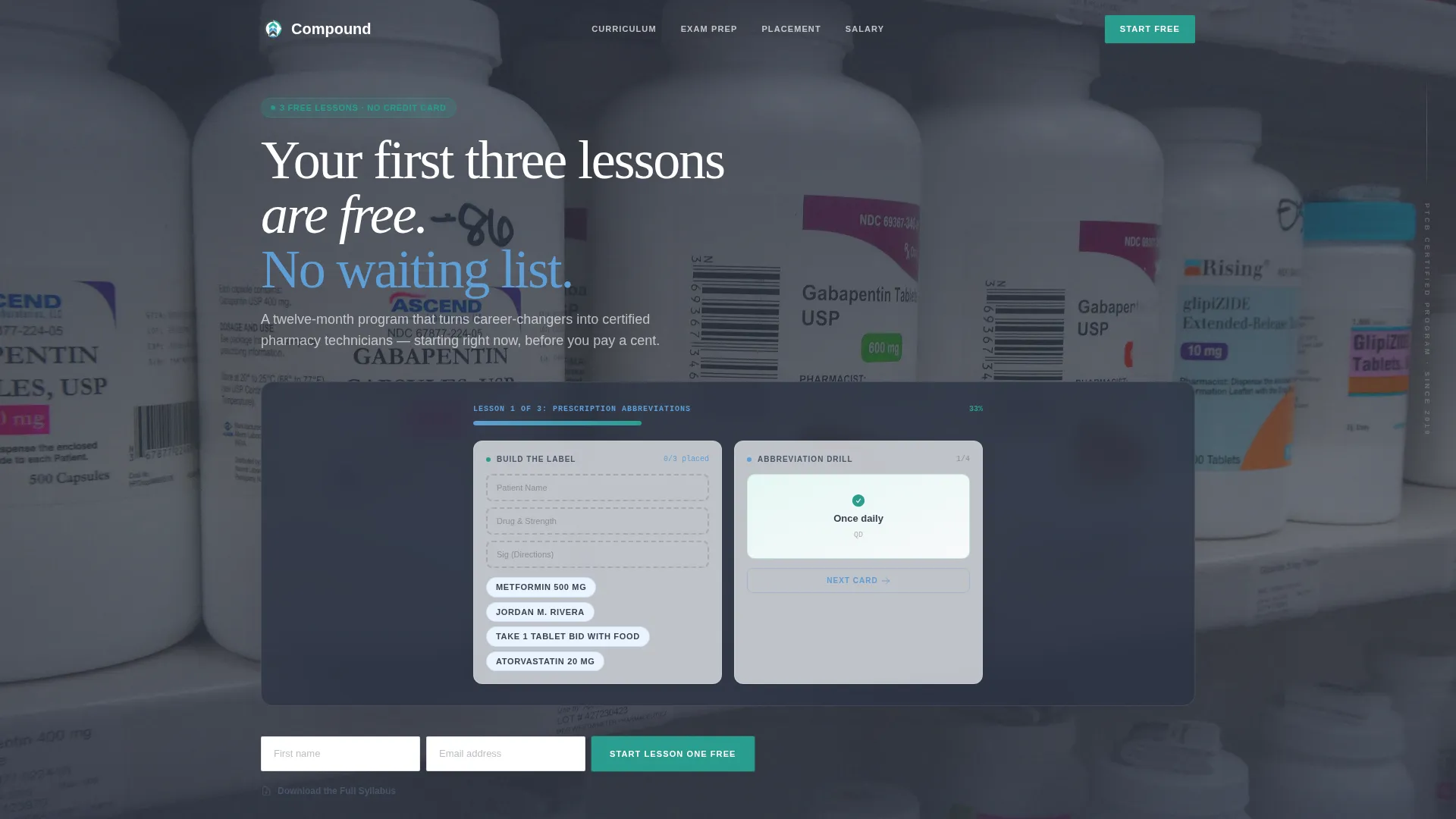
- A header course-preview module showing a drag-and-drop prescription label exercise, pill identification flashcards, and a lesson progress bar
- Four anchor-nav spokes, each built around a real student case study that escalates from curriculum depth through to salary outcomes
- Two conversion paths: a primary "Start Lesson One Free" form asking only for first name and email, and a secondary "Download the Full Syllabus" PDF gate for visitors who need more time
Feature list
This section covers the core components built into the Compound template and what each one does for your program.
Live Course Preview Header
The header opens on an in-progress free trial module. Visitors see a drag-and-drop prescription label exercise, half-flipped pill identification flashcards, and a progress bar reading "Lesson 1 of 3: Prescription Abbreviations." A headline fades in above: "Your first three lessons are free. No credit card. No waiting list." The visitor experiences the product before reading a single feature bullet.
Hub-and-Spoke Anchor Navigation
A persistent anchor nav sits at the top of the page and includes a visible "Start Lesson One Free" button at all times. Each nav link corresponds to one of four case study spokes. Visitors can jump to the section most relevant to them without losing their place in the page flow.
Case Study Narrative Spokes
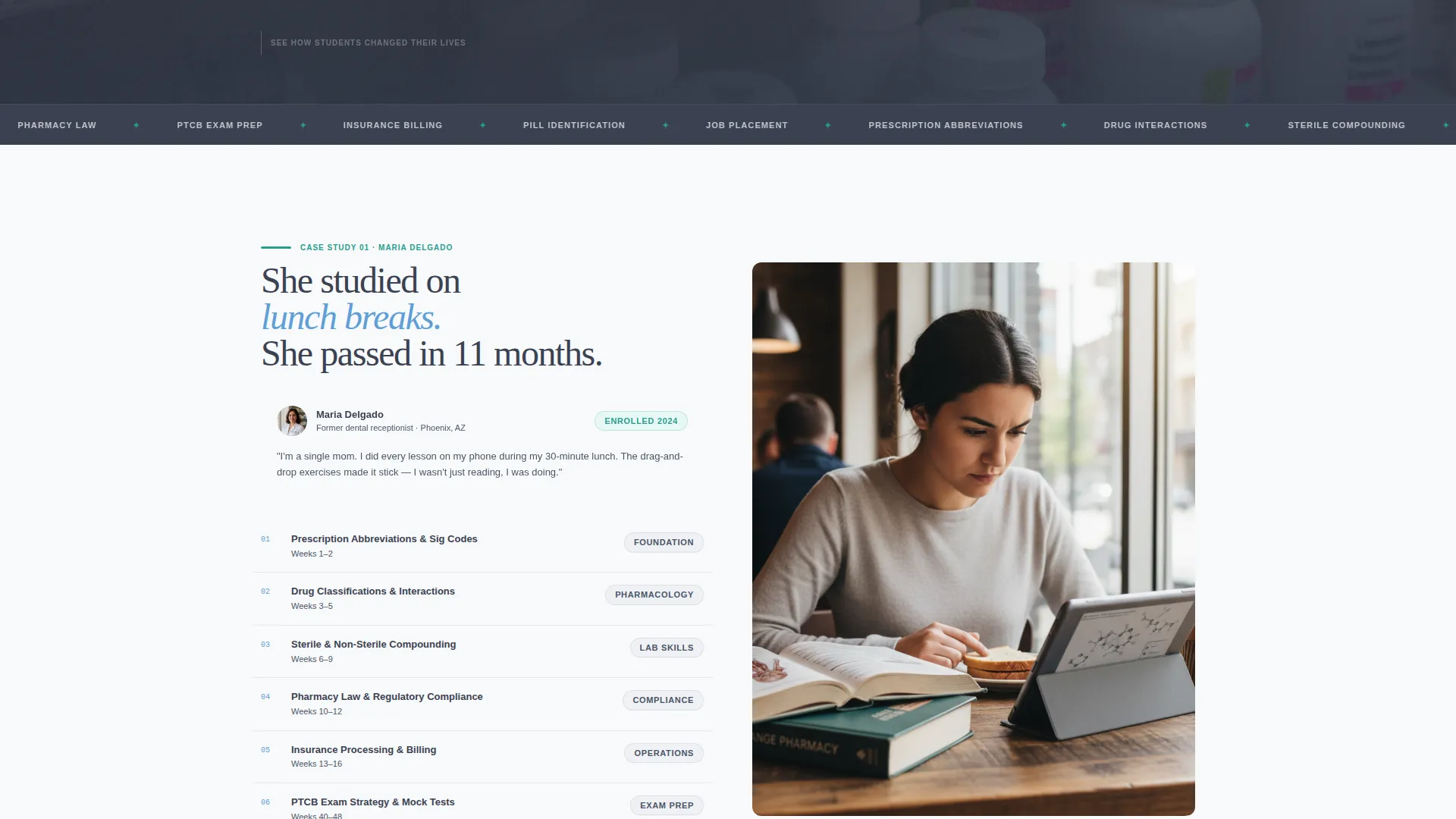
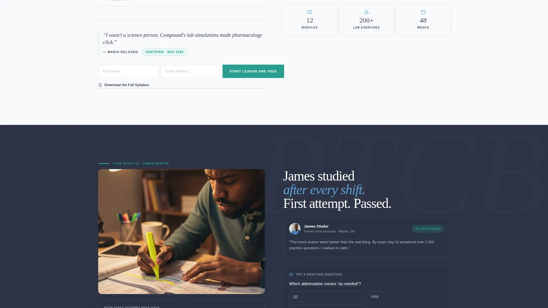
Four spoke sections follow real students through the program. Maria, a dental receptionist who studied on lunch breaks, and James, a retail worker who passed the pharmacy technician certification exam on his first attempt, anchor the storytelling. Each spoke escalates the stakes: curriculum depth, exam prep intensity, job placement, and salary data. The result is a page that reads like a time-lapse of a life changing.
Dual Conversion Path Layout
The primary call to action, "Start Lesson One Free," appears in the header module, at the end of each case study spoke, and as a persistent anchor nav button. A secondary path, "Download the Full Syllabus," serves visitors who are browsing but not yet ready to start. The trial form asks only for first name and email, then delivers the visitor directly into the interactive lesson.
Corporate Precision Visual System
The Slate and Sky color system uses institutional charcoal, pharmaceutical white, clinical sky blue, and alert teal reserved for calls to action and progress indicators. The palette is described in the brief as a well-organized pill tray under fluorescent light: sterile but not cold, exact but not intimidating. Every visual choice reinforces professional credibility without feeling distant.
PDF Syllabus Gate
A secondary conversion module offers the full program syllabus as a downloadable document. This gate captures leads who are not ready to start the free trial but are willing to explore the curriculum. It extends the program's reach to comparison shoppers and careful planners without interrupting the primary enrollment flow.
Page sections overview
| Section | Purpose |
|---|---|
| Free Trial Header | Drop visitor into live course preview immediately |
| Anchor Navigation Bar | Persistent nav with primary call to action button always visible |
| Case Study Spoke 1 | Curriculum depth through Maria's enrollment story |
| Case Study Spoke 2 | Exam prep intensity through James's certification journey |
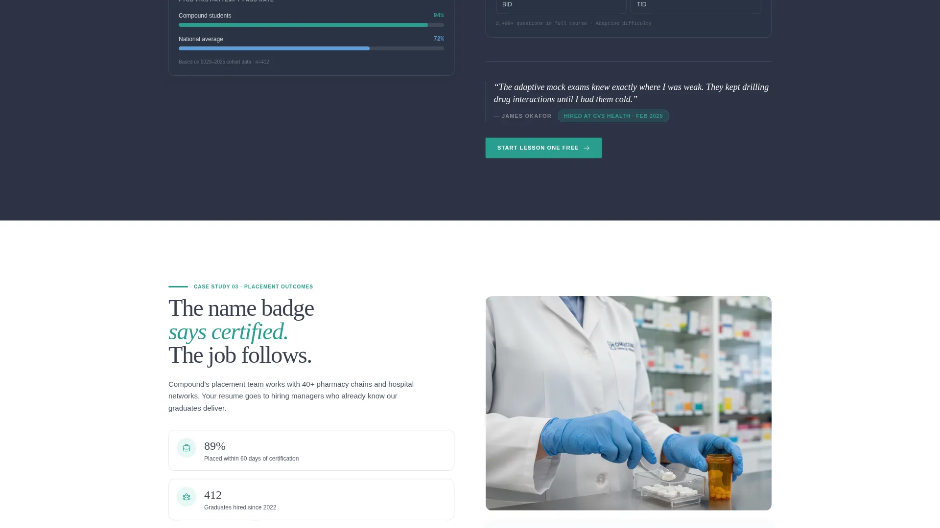
| Case Study Spoke 3 | Job placement outcomes through a real graduate narrative |
| Case Study Spoke 4 | Salary data and career trajectory after certification |
| Syllabus Download Gate | Secondary PDF lead capture for cautious visitors |
Design & branding system
The Corporate Precision theme keeps the page feeling like a professional healthcare environment. Colors, spacing, and typography all signal that this program is organized, serious, and built for real outcomes.
- Slate and Sky palette: institutional charcoal (#3B4252), pharmaceutical white (#F8F9FB), clinical sky blue (#5E9ED6), and alert teal (#2A9D8F) used exclusively for calls to action and progress indicators
- Visual tone mirrors a well-organized pill tray: clean, purposeful, and approachable rather than clinical and cold
- The "clean lab coat" aesthetic runs through every section, reinforcing the feeling that the visitor is one step closer to a certified name badge
Mobile & speed optimization
Adult learners often research programs on phones during breaks, after bedtime, or between tasks. The template layout is designed to remain scannable and functional at smaller screen sizes.
- The anchor navigation and persistent call-to-action button remain accessible as visitors scroll through each case study spoke on mobile
- The course-preview header, including the progress bar and flashcard animation references, is structured to display clearly on smaller viewports without requiring horizontal scrolling
How this template helps you convert
The entire page is engineered around the freemium principle: let the product earn trust before asking for commitment. Every structural choice reduces friction and answers the visitor's unspoken question, "Is this really worth my time?"
- The header puts visitors inside a real lesson before they read a headline, removing the mental gap between "curious" and "engaged" in the first three seconds of the visit
- The case study spokes build cumulative conviction by following recognizable people through the full program arc, so skeptical adult learners can see their own situation reflected and believe the outcome is achievable for them too
- The dual conversion path means no warm lead is lost: ready visitors start the trial immediately, while cautious visitors download the syllabus and stay in the program's orbit until they are ready
Other information about this template
This template is purpose-built for the pharmacy technician training niche and reflects the specific enrollment psychology of adult career-changers. A few additional details worth noting:
- The twelve-month program structure is woven into the narrative from the first section, setting clear expectations for time commitment without making it feel like a burden
- The page references the pharmacy technician certification exam as a milestone, which aligns with how prospective students research and compare programs before enrolling
- Story-led layouts like this one work especially well for programs that compete on outcomes rather than price, because the narrative format lets real results speak louder than feature lists
- The template supports two distinct visitor mindsets in one page: the visitor ready to act now and the visitor who needs one more reassuring data point before they commit
Theme
Corporate Precision
Creative direction
Case Study Narrative
Color system
Slate & Sky
Style
Hub & Spoke (Anchor Nav)
Direction
Freemium/Trial
Page Sections
Live Course Preview Header
Hub-and-spoke Anchor Navigation
Case Study Narrative Spokes
Dual Conversion Path Layout
Corporate Precision Visual System
Syllabus PDF Gate Module
Related questions
Who are the student personas referenced in this template?
What does the free trial experience look like in the header?
How many conversion entry points does the template include?
Can this template work for programs with a different length or focus?
What information does the sign-up form collect?



