Bold Brutalist Preschool & Daycare Landing Page Template
Blocks is a Bold Brutalist landing page template built for daycare and preschool providers who want to stand out. It uses a modular card grid to present key program specs side by side with industry averages, so parents can compare at a glance. The dark full-bleed header, monochrome steel palette, and safety-vest yellow calls to action make a powerful first impression.
by Rocket studio
Quick summary
Blocks is a single-page daycare and preschool contact landing page built around a Spec Sheet creative direction. Modular cards present program data the way an engineering spec would. A ghosted "Industry Average" column makes every comparison immediate. The Bold Brutalist design and Monochrome Steel palette cut through the pastel noise of every competing childcare site.
Who this template is for
This template is built for preschool and daycare operators who are tired of looking like every other childcare provider online. It works best when the program has strong, specific numbers to stand behind.
- Daycare owners and directors who want to lead with facts, not feelings
- Preschool programs serving dual-income families with demanding, time-pressed schedules
- Childcare providers targeting relocating families searching online at any hour
What problem this template solves
Most daycare landing pages look identical: soft pastels, stock photos of smiling children, and vague warmth that tells parents nothing useful. Busy parents need data, not charm. They are comparing programs the way they would compare car safety ratings, and this template is built for exactly that moment.
- Parents cannot quickly find the specific details that matter most to them
- Generic childcare pages fail to differentiate programs with strong, verifiable specs
- Standard contact forms ask for too much information and kill conversions early
What you get with this template
You get a fully structured, single-page landing page that puts program transparency at the center of its design. Every section is built to earn trust through disclosure rather than persuasion.
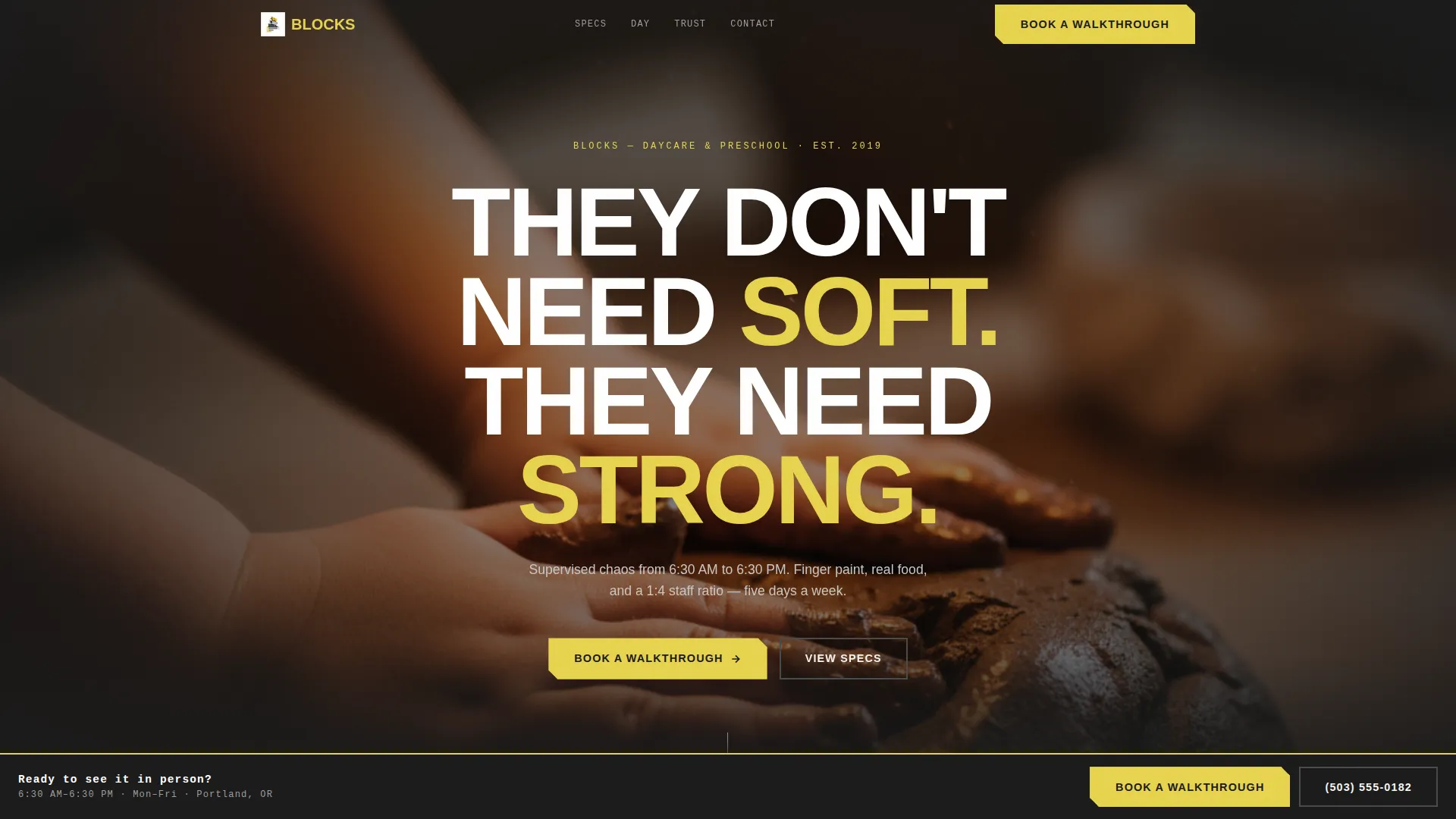
- A dark full-bleed header with bold oversized typography and a warm Edison-bulb glow effect
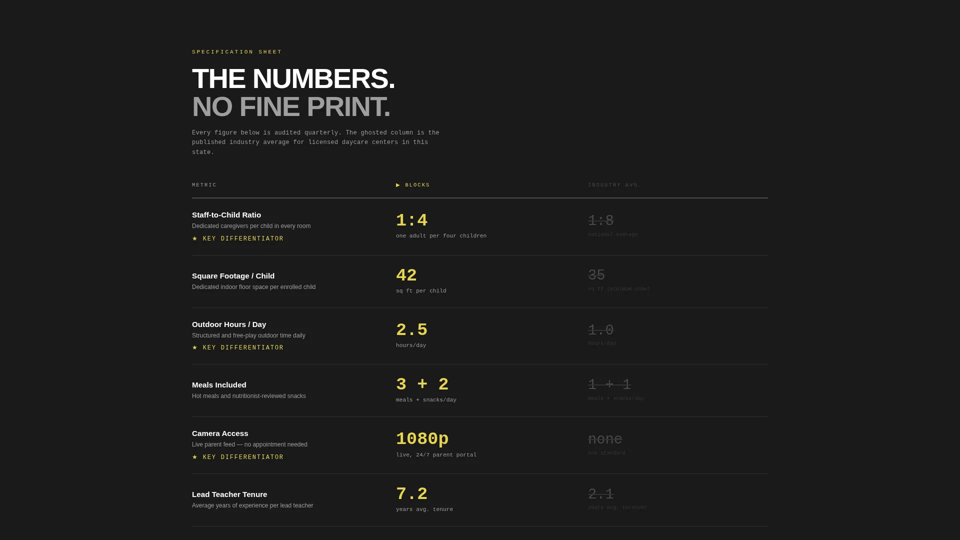
- A modular card grid displaying individual program specs alongside a ghosted Industry Average column
- A sticky "Book a Walkthrough" call-to-action bar and a lean PDF gate for a secondary conversion path
Feature list
This template delivers a focused set of components drawn directly from the Blocks brief. Each one is purposeful and positions the program against the competition without a single soft sell.
Dark Full-Bleed Header with Glow Effect
The header fills the entire viewport with a low-lit, shallow-depth-of-field photograph. Small hands pressing into clay on a steel table anchor the visual. Overhead Edison bulbs cast warm halos that bleed softly at the edges. Bold, oversized sans-serif typography punches through the center with a direct brand statement.
Spec Sheet Modular Card Grid
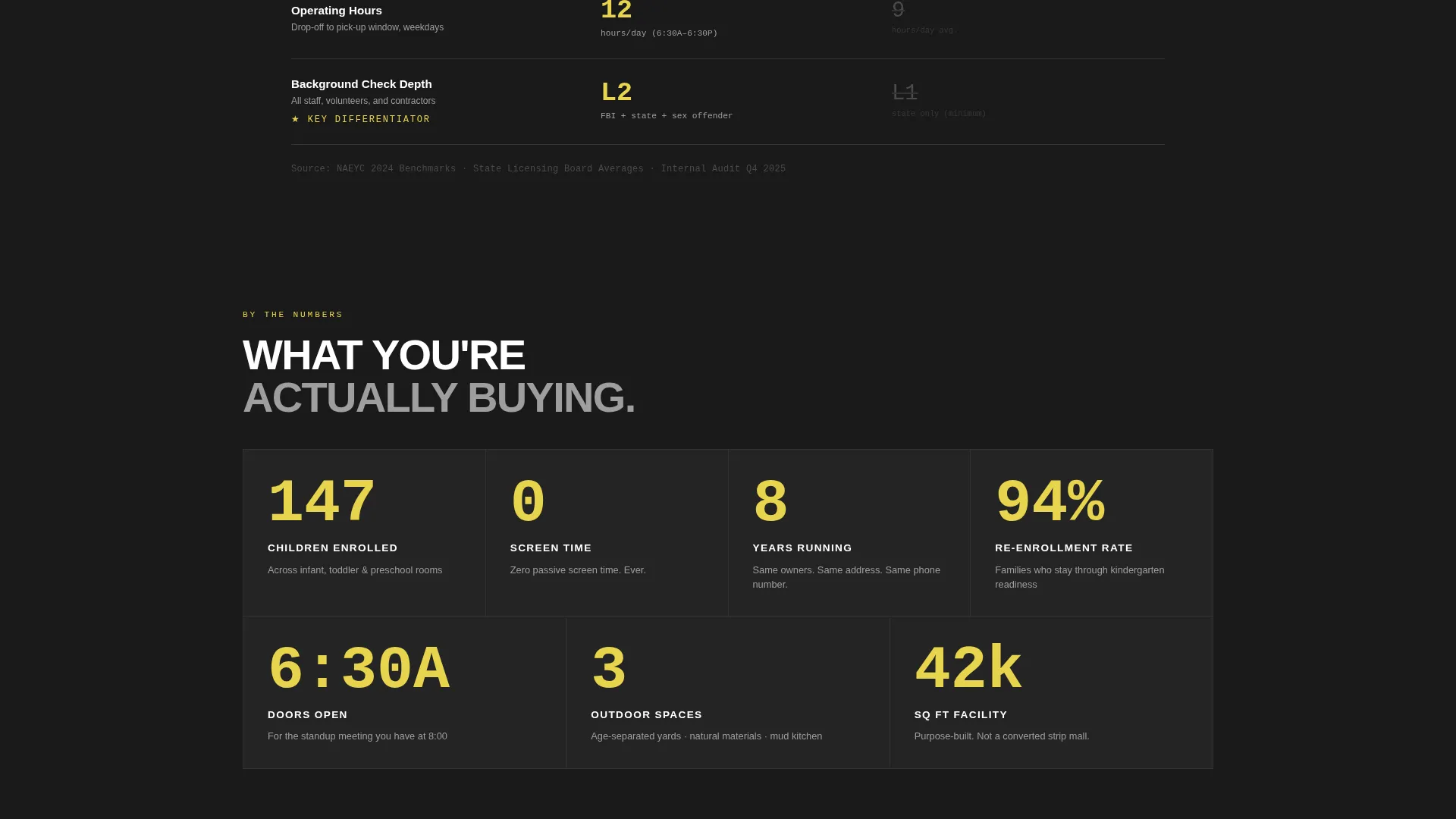
Each card presents a single comparable data point: staff-to-child ratio, square footage per child, outdoor hours per day, meals included, camera access, and certifications held. Cards sit in a scannable grid so parents can evaluate the program the way they would read an appliance specification sheet.
Ghosted Industry Average Column
Every spec card includes a side-by-side Industry Average figure rendered in lighter concrete gray. The comparison is structural and immediate. Parents do not need to leave the page to know how the program measures up.
Sticky "Book a Walkthrough" call to action Bar
The primary call-to-action is rendered in safety-vest yellow and anchors as a sticky bar. It appears after the third card row, once the parent has absorbed enough data to feel informed and ready to act.
Lean PDF Gate Form
A secondary conversion path lets parents download a full spec sheet as a document. The form requires only a first name and an email address. No phone number, no child's age, and nothing invasive is asked.
Bold Brutalist Visual Identity
The Monochrome Steel color system uses forge black, brushed gunmetal, poured concrete, and a single safety-vest yellow accent. Typography is bold and oversized. The design feels like a construction site hoarding wrapped around a playground: raw, unapologetic, and impossible to ignore.
Page sections overview
| Section | Purpose |
|---|---|
| Full-Bleed Header | Owns the viewport with bold typography and a warm photographic glow |
| Program Spec Grid | Displays individual data cards in a comparable, scannable modular layout |
| Industry Average Column | Provides ghosted benchmark figures alongside every spec card |
| Sticky call to action Bar | Keeps the "Book a Walkthrough" action accessible after the third card row |
| PDF Gate Form | Captures first name and email in exchange for the downloadable spec sheet |
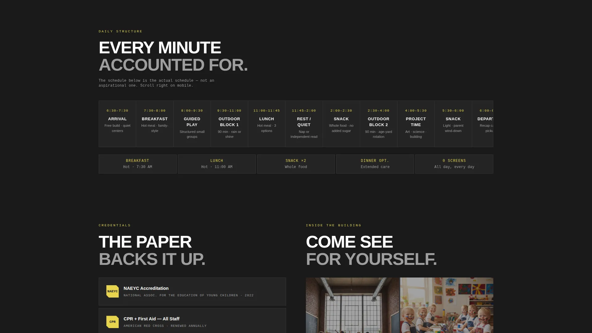
| Certifications Block | Highlights held credentials as individual spec cards within the grid |
Design & branding system
The visual identity is rooted in Bold Brutalism: heavy type, raw textures, and zero decorative softness. Every color decision is deliberate and tied to a specific function in the layout.
- Forge black (#1A1A1A), brushed gunmetal (#4A4A4A), and poured concrete (#9E9E9E) form the full neutral range
- Safety-vest yellow (#E8D44D) is reserved exclusively for calls-to-action, hover states, and key data points
- Typography is bold, oversized, and sans-serif throughout, with no script or decorative fonts anywhere in the layout
Mobile & speed optimization
The modular card grid is structured to reflow naturally on smaller screens. Parents searching for childcare on a phone at midnight will still be able to scan every spec without pinching or zooming.
- Card columns collapse to a single-column stack on narrow viewports for easy thumb scrolling
- The sticky call to action bar remains anchored at the bottom of the screen on mobile, keeping the walkthrough booking action always within reach
- The lean two-field PDF gate form is fully usable on a phone without keyboard frustration
How this template helps you convert
The conversion strategy in this template is built on informed action rather than persuasion. Parents arrive skeptical and leave with enough data to decide.
- The spec card grid and Industry Average column earn trust before any call-to-action appears, so the sticky bar lands when the parent is already sold on the numbers.
- The PDF gate offers a low-commitment second path for parents who are not ready to book a walkthrough, capturing their contact details with minimal friction.
Other information about this template
This template is categorized under Daycare and Preschool Website Templates in the Technology category, making it suitable for operators building or refreshing a childcare web presence. The Blocks template sits at the intersection of a strong niche and a distinctive visual approach that has no direct equivalent in the soft-aesthetic childcare space.
- The landing page is designed as a contact and comparison page, not a full multi-page website, so it pairs well with an existing site or works as a standalone campaign page
- The program hours shown in the brief (6:30 AM to 6:30 PM, five days a week) can be surfaced as a spec card alongside ratio and square footage data
- A Saturday enrichment option is also noted in the brief as a relevant program detail that can be featured as an additional card in the grid
- The template style is Card Grid (Modular) with a Comparison/Versus landing-page direction, meaning the layout is built from the ground up for side-by-side evaluation
Theme
Bold Brutalist
Creative direction
Spec Sheet
Color system
Monochrome Steel
Style
Card Grid (Modular)
Direction
Comparison/Versus
Page Sections
Dark Full-bleed Header
Spec Sheet Modular Card Grid
Ghosted Industry Average Column
Sticky Call to Action Bar in Safety-vest Yellow
Lean Two-field PDF Gate
Related questions
Is this template suitable for a small home daycare?
Can I use this template as a standalone page or does it need a full website?
What is the ghosted Industry Average column and how does it work?
How does the PDF gate form work?
Can I change the accent color from safety-vest yellow to match my brand?



