Architectural Maternity Fashion Landing Page Template
Bloom is a masonry-style maternity fashion landing page built for an architectural womenswear brand that celebrates the pregnant body. The template combines a collage-style header, a cinematic scroll sequence, and a shoppable grid to guide visitors toward a guided capsule-wardrobe builder. It is designed to convert style-forward clients into committed buyers.
by Rocket studio
Quick summary
Bloom is a masonry landing page template built for a maternity fashion brand with a bold editorial identity. The layout opens with a scrapbook-style collage header, unfolds into a shoppable grid organized by lifestyle chapters, and closes with a guided capsule builder. Every visual and functional element is built to position the brand as high-fashion, not just functional.
Who this template is for
This template is built for maternity fashion founders, independent designers, and boutique brand owners who sell structured, style-first clothing for pregnant women. It suits brands whose clients are professional women who refuse to pause their style during pregnancy.
- Maternity fashion brands with a polished editorial identity
- Independent designers selling curated capsule wardrobes for pregnant professionals
- Fashion-forward boutiques targeting creative directors, attorneys, and career women in their second and third trimesters
What problem this template solves
Most maternity fashion pages present clothing as a practical compromise. They list garments without story, and they hide the body instead of celebrating it. Bloom fixes this by treating maternity style as a creative statement.
- Generic product grid layouts that strip the garments of context and emotion
- Landing pages that talk to "expecting mothers" as a demographic, not as individuals with taste and professional lives
- The lack of a guided buying path that helps a visitor translate a full editorial aesthetic into a real, personal wardrobe
What you get with this template
You get a full single-page layout that moves like an editorial magazine spread. The template is built around a narrative scroll experience, a shoppable masonry grid, and a bundle-builder flow designed to increase order value.
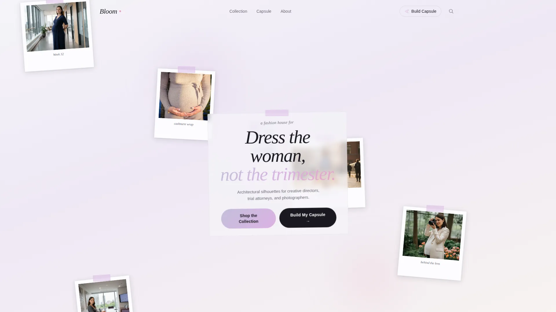
- A collage header with overlapping polaroid-style frames at slight angles, each showcasing a different garment and a different trimester
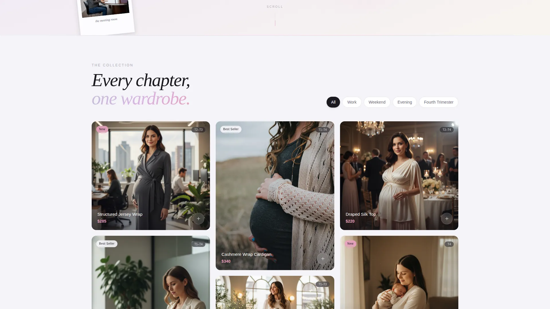
- A masonry grid with cascading tile animations, chapter-based organization (Work, Weekend, Evening, Fourth Trimester), and hover-state second-image reveals
- A "Build Your Capsule" bundle builder with trimester, lifestyle, and size selection, a fifteen percent discount on five-piece sets, and a sticky bottom bar that tracks the capsule total in real time
Feature list
The Bloom template delivers a focused set of layout and interaction features. Each one is built to serve the editorial identity of the brand and the practical buying journey of the visitor.
Collage Scrapbook Header
The header layers overlapping polaroid-style photo frames at slight angles across the full viewport. Each frame holds a different woman in a different trimester wearing a piece from the collection. Handwritten-style script reading "Dress the woman, not the trimester" is styled to look taped on and slightly crooked, giving the composition energy and warmth.
Cascading Masonry Grid
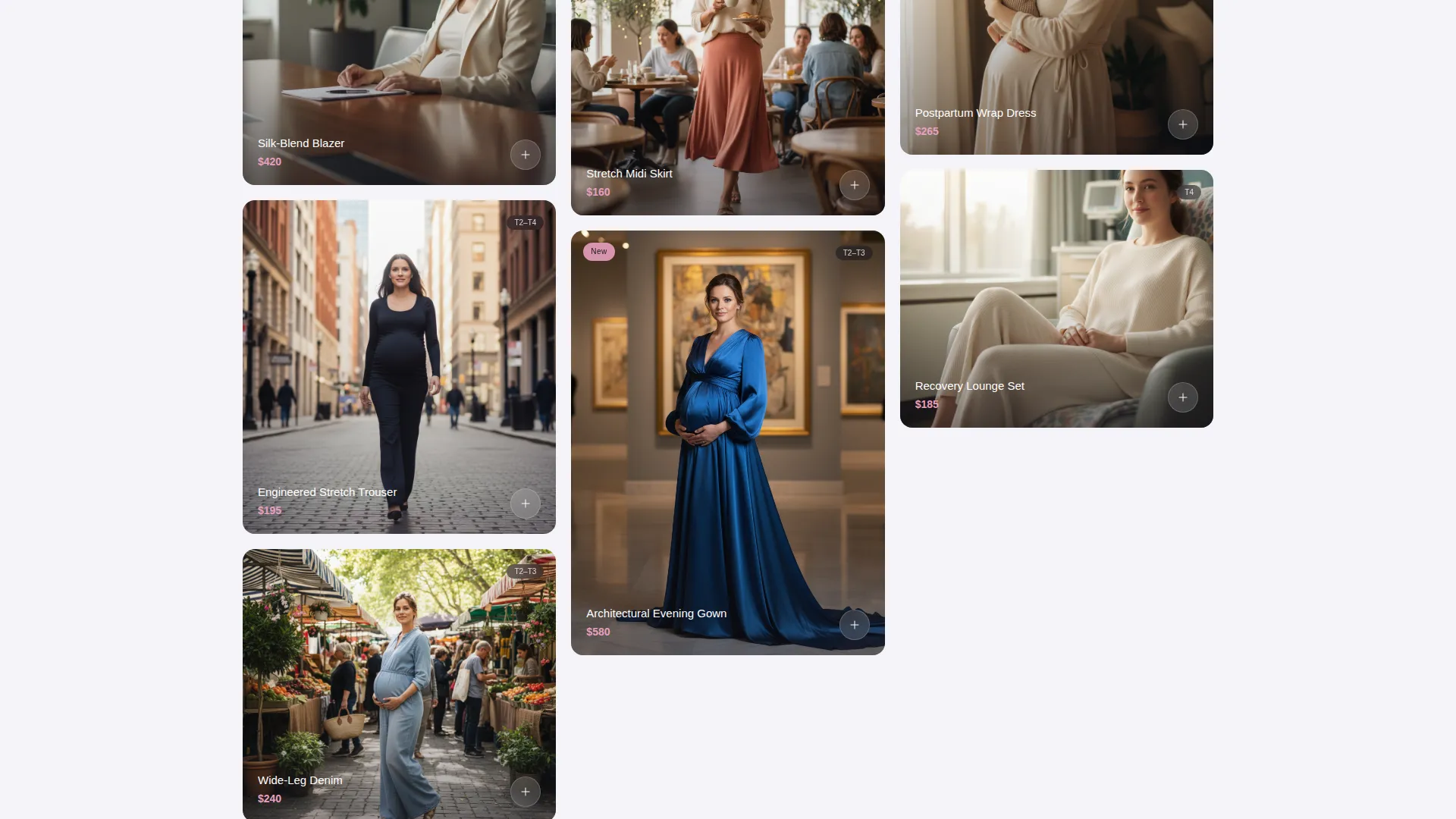
The shoppable product grid loads in a cinematic cascade, left column first then right. Tiles are grouped into four lifestyle chapters: Work, Weekend, Evening, and Fourth Trimester. Each row introduces a new chapter, so the scroll feels like moving through a curated editorial story rather than browsing a catalogue.
Hover-State Dual Image Reveal
Each product tile surfaces a second image on hover. The second image shows the same garment on a different body and at a different point in pregnancy. This interaction communicates fit range, versatility, and brand depth without requiring extra copy.
Cinematic Video Interruption
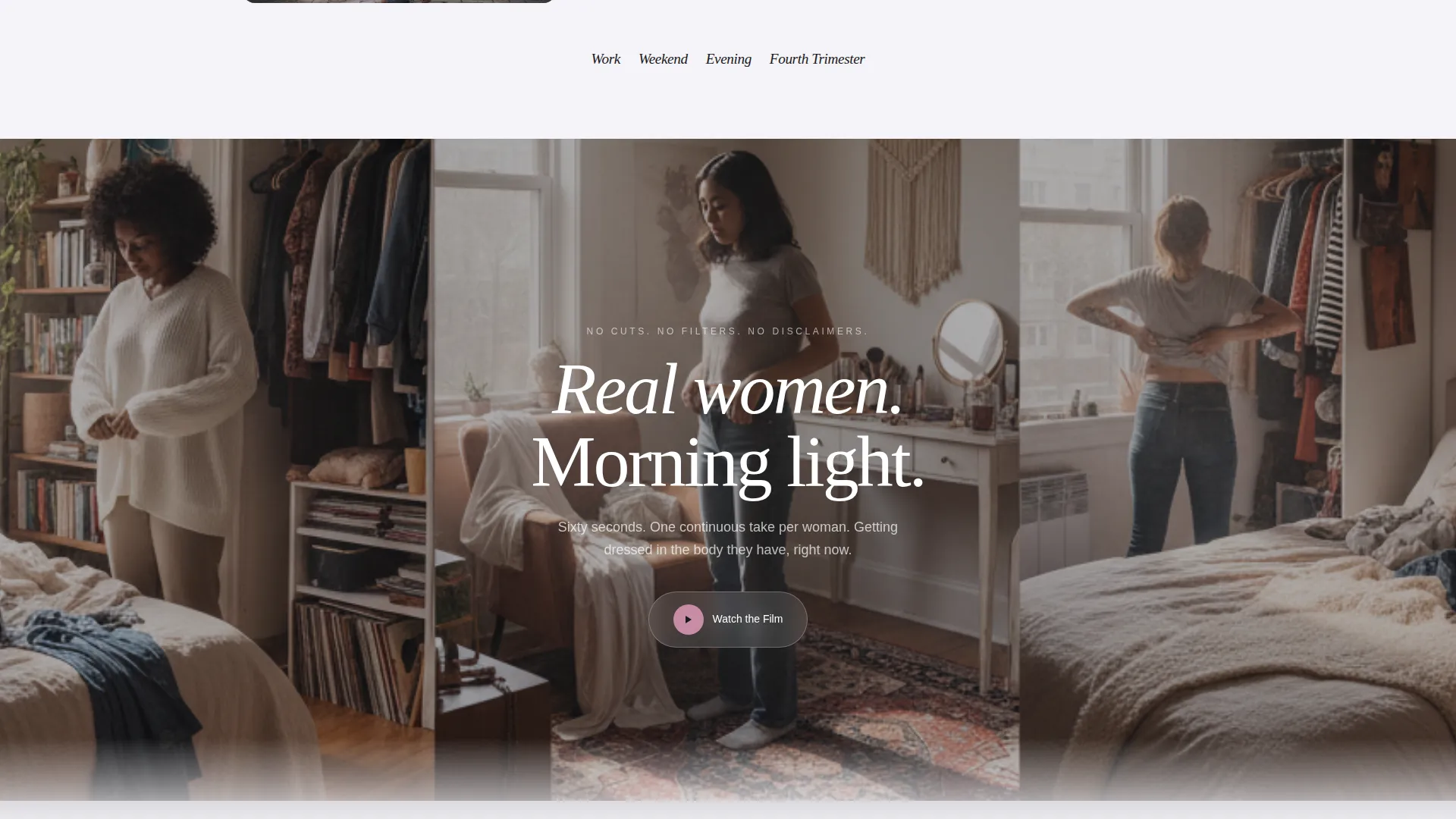
A full-width video section breaks the masonry grid at the midpoint. The sixty-second film shows real women getting dressed in real bedrooms, shot in a single continuous take per woman with natural morning light. The video adds authenticity and pace variation to the scroll.
Guided Capsule Bundle Builder
The primary call to action opens a step-by-step bundle builder. Visitors select their trimester, lifestyle category (corporate, creative, or casual), and size. The result is a curated five-piece capsule at fifteen percent off the individual item price. A sticky bottom bar tracks the running total throughout the selection process.
Full Arc Upgrade Path
A secondary conversion path offers the "Upgrade to Full Arc" option, a nine-piece collection that spans pregnancy through postpartum. This tier is positioned as the complete wardrobe solution and unlocks free alterations plus a personal styling session for the buyer.
Page sections overview
| Section | Purpose |
|---|---|
| Collage Scrapbook Header | Opens the page with overlapping polaroid frames and handwritten brand tagline |
| Masonry Product Grid | Displays shoppable looks organized into four lifestyle chapters |
| Hover Dual Reveal | Shows a second garment image on hover to communicate fit range |
| Cinematic Video Break | Full-width mid-page film of real women dressing in natural light |
| Capsule Bundle Builder | Guides visitors through trimester, lifestyle, and size to build a five-piece set |
| Sticky Capsule Bar | Tracks the capsule total in real time as visitors build their selection |
| Full Arc Upgrade | Secondary offer presenting a nine-piece pregnancy-to-postpartum collection |
Design & branding system
The template uses a Holographic Chrome color system that reads as iridescent and sophisticated without leaning into predictable pastels. The palette shifts slightly depending on context, mimicking the way light bends through a reflective surface.
- Core palette: liquid silver (#C0C0D8), prismatic lilac (#D8B4E2), and soft titanium (#E8E8F0) form the base across backgrounds, cards, and type containers
- Accent usage: a shifting rose-gold (#E8A0BF) appears on hover states, price tags, and cart icons, creating a moment of warmth inside an otherwise cool palette
- Typography: handwritten-style script is used for brand voice moments, while the grid and product sections use clean, structured type to balance editorial feel with legibility
Mobile & speed optimization
The Bloom template is designed with a vertical scroll experience in mind, which naturally adapts to mobile viewing. The masonry layout, sticky bar, and bundle builder are all structured for compact screen use.
- The cascading tile animation is paced for scroll-based viewing on portrait-oriented screens
- The sticky bottom capsule bar remains visible throughout mobile scrolling, keeping the purchase path accessible at all times
- Hover interactions on desktop translate to tap-reveal behavior on touch devices, preserving the dual-image reveal functionality
How this template helps you convert
The entire page is structured around two conversion paths that work together. The editorial experience builds desire, and the guided builder removes the friction of deciding what to buy.
- The "Build Your Capsule" flow reduces decision fatigue by narrowing choices to a curated five-piece set based on the visitor's own trimester, lifestyle, and size, then applies a fifteen percent discount to reward commitment.
- The "Upgrade to Full Arc" path captures higher-intent buyers by offering a nine-piece postpartum-inclusive collection with added-value perks like free alterations and a personal styling session.
Other information about this template
The Bloom template is built within a Marketplace Grid theme, meaning the layout logic is rooted in grid-based browsing familiar to shoppers from editorial fashion platforms. The Cinematic Sequence creative direction means sections are intentionally paced to feel like frames in a film, not just stacked content blocks. The Collage/Scrapbook header concept and the Upsell/Upgrade landing-page direction are baked into the template's default structure. No additional configuration is needed to activate these design modes.
- Template style: Masonry/Pinterest grid with chapter-based organization
- Theme: Marketplace Grid with cinematic pacing and editorial sequencing
- Category fit: Fashion and Lifestyle, specifically the maternity fashion brand niche within the Plus-Size and Inclusive Fashion subcategory
- The scrapbook-to-grid dissolve transition is built into the scroll sequence and does not require custom scripting to enable
Theme
Marketplace Grid
Creative direction
Cinematic Sequence
Color system
Holographic Chrome
Style
Masonry/Pinterest
Direction
Upsell/Upgrade
Page Sections
Collage Scrapbook Header
Cascading Masonry Product Grid
Hover Dual Image Reveal
Guided Capsule Bundle Builder
Full Arc Upgrade Offer
Cinematic Mid-page Video Section
Related questions
Can I change the four chapter names in the masonry grid?
Does the capsule builder discount apply automatically?
Can I use this template if my brand sells fewer than nine pieces?
Is the cinematic video section required?
Who is the typical customer this template is designed to reach?