Agriculture Software & SaaS Specialist Professional Website Template
Harvest is a dark-user interface dashboard landing page template built for agriculture staff scheduling platforms. It pairs a Void and Violet color system with a Stats-First Impact layout to show ops metrics, crew maps, and shift-fill data in one commanding view. It is designed to convert farm operations managers and ag staffing dispatchers into app downloads.
by Rocket studio
Quick summary
Harvest is a single-page dashboard template built for agriculture staff scheduling apps. It opens with a live-styled metrics header, scrolls through proof-stacked feature sections, and closes on a dual app-download call to action. The dark Void and Violet palette makes every data point stand out, giving operations managers an immediate read on what the platform delivers.
Who this template is for
This template is built for teams selling scheduling software to the agricultural labor market. The design language and section flow speak directly to people who live inside shift data.
- Farm operations managers coordinating H-2A visa crews across multiple ranch locations
- Vineyard supervisors managing harvest surges with large temporary worker pools
- Agricultural staffing agency dispatchers covering early-morning and overnight shifts
What problem this template solves
Agricultural labor scheduling is brutally time-sensitive. A single unfilled shift at dawn can mean a full field goes unpicked by noon. Most generic scheduling app landing pages do not reflect that urgency, so potential buyers scroll past without recognizing the fit.
- Visitors cannot quickly see whether the platform handles real ag-sector complexity, such as weather-driven crew changes and compliance tracking
- Generic hero sections fail to earn the trust of experienced ops managers who have seen too many tools overpromise
- No guided demo path means high-intent buyers leave without booking time
What you get with this template
You get a complete, single-page landing page built around a Stats-First Impact scroll rhythm. Every section opens with a key metric before revealing the feature behind it. The layout is designed to accumulate proof as visitors scroll, so the app download call to action feels earned rather than premature.
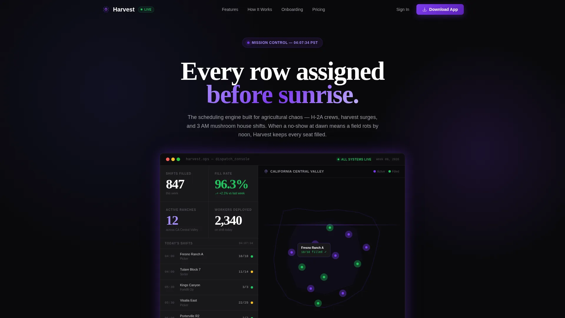
- A live-styled stats header with animated counters, fill-rate figures, active ranch counts, and a pulsing crew location map
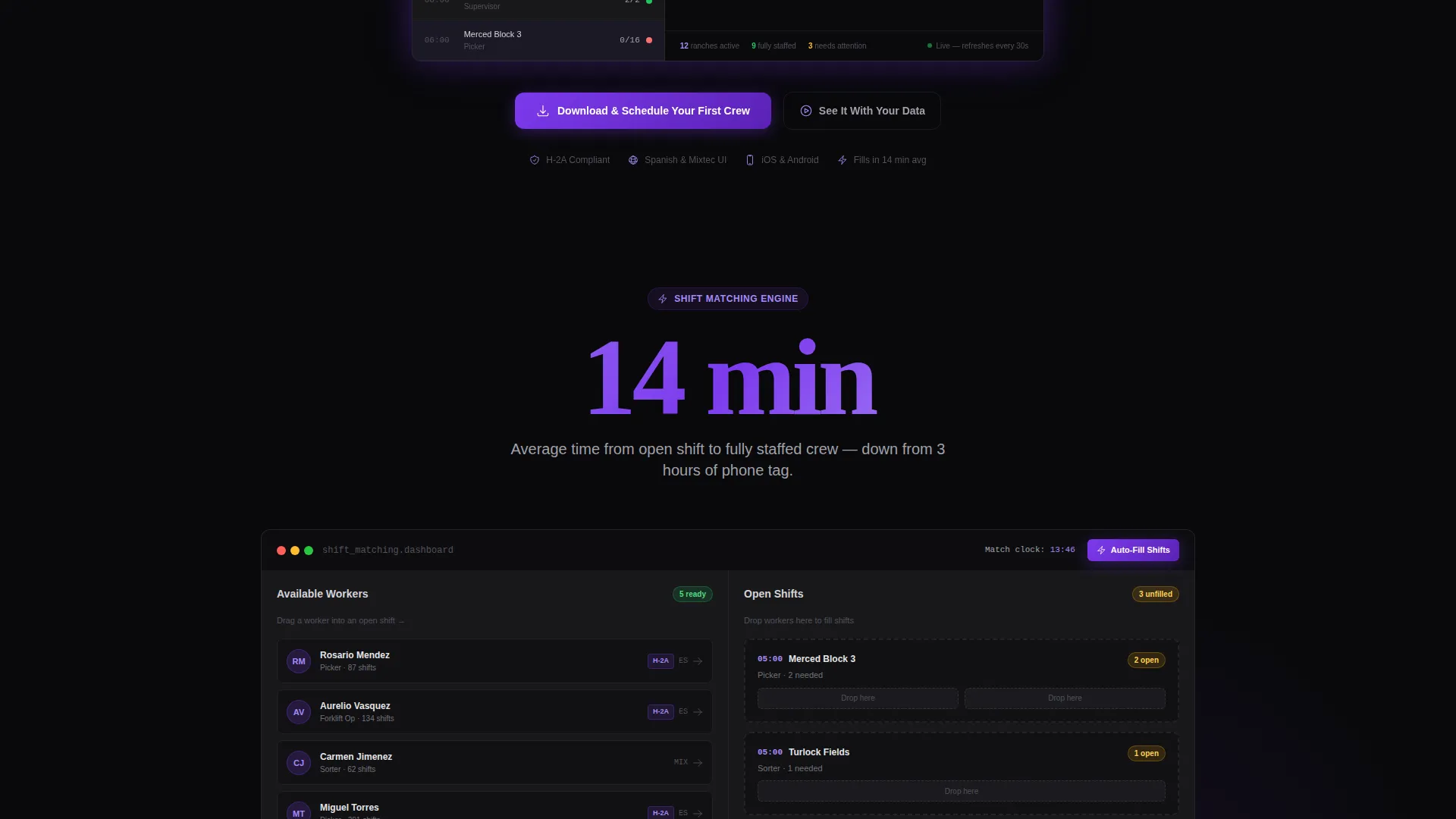
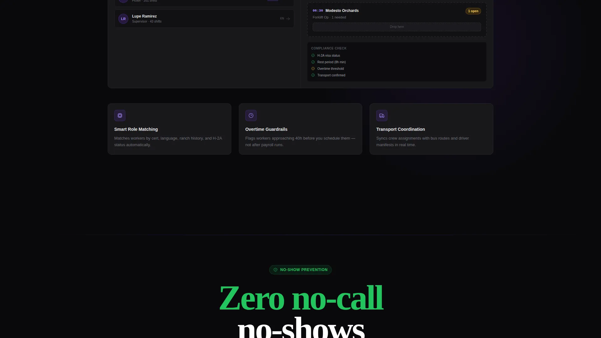
- Embedded mini-dashboard sections that show sample data grids with draggable worker slots and real-time compliance flag resolution
- A dual call-to-action close with App Store and Google Play badges alongside a guided demo booking form capturing crop type, crew size, and number of locations
Feature list
This template includes a focused set of purpose-built sections and interactive display components. Each one is grounded in the operational reality of ag labor scheduling.
Animated Stats Header
The hero section opens with a dark user interface frame displaying four core metrics: 847 shifts filled this week, a 96.3 percent fill rate, 12 active ranches, and a real-time crew map. Numbers animate upward on page load like a live ticker, giving operations managers an immediate sense of live platform activity.
Stats-First Section Rhythm
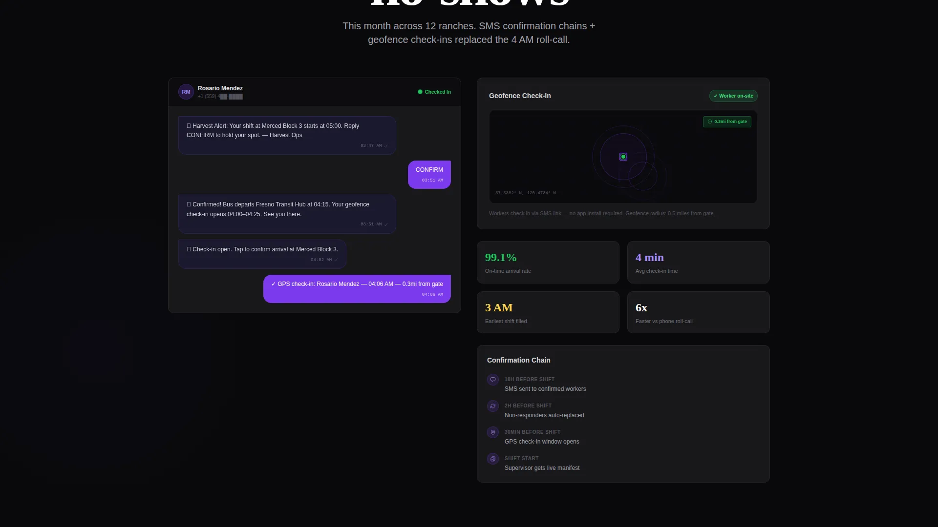
Each feature section leads with one oversized metric before the supporting explanation appears. Examples include "14 minutes" introducing automated shift-matching, "Zero no-call no-shows this month" leading into the SMS confirmation and geofence check-in feature, and "3x faster onboarding" revealing the multilingual worker profile builder with document scanning.
Interactive Mini-Dashboards
Embedded data grid panels let visitors drag workers into open shift slots and watch compliance flags resolve inside the sample view. This hands-on interaction makes the platform's core value tangible before any download or sign-up step.
Dual App Download Call to Action
The primary closing section pairs an App Store badge and a Google Play badge, both styled in electric violet. The headline reads "Download and Schedule Your First Crew" to keep the action specific and low-friction.
Guided Demo Booking Form
A secondary conversion path sits beside the download section. It collects crop type, average crew size, and number of locations so prospects receive a demo calibrated to their actual operation rather than a generic walkthrough.
Crew Location Map Display
A visual map panel inside the header shows violet-dot markers pulsing across a geographic region to represent active crew locations. Green status indicators confirm filled shifts and on-time arrivals, giving the map immediate operational meaning.
Page sections overview
| Section | Purpose |
|---|---|
| Stats Metrics Header | Opens with animated KPIs and a live crew map to establish platform credibility instantly |
| Shift Matching Feature | Leads with a "14 minutes" metric to introduce automated shift-matching capability |
| SMS Confirmation Feature | Leads with a zero no-show metric to present geofence check-in and SMS confirmation chain |
| Worker Onboarding Feature | Leads with a "3x faster" metric to showcase multilingual profile builder and document scanning |
| Interactive Data Grid | Lets visitors drag workers into shifts and see compliance flags resolve in sample dashboards |
| App Download Section | Presents primary call to action with App Store and Google Play badges in electric violet |
| Demo Booking Form | Offers a secondary path to a guided demo with crop, crew, and location input fields |
Design & branding system
The color system is called Void and Violet. It is built around four core values that create a mission-control aesthetic at every scroll depth. The result is a dark-screen interface that makes data feel active and authoritative rather than decorative.
- Absolute void black (#09090B) as the base background, deep space indigo (#1E1B4B) for layered panels, and electric violet (#7C3AED) on active elements and hover states
- Crop-row green (#22C55E) reserved exclusively for positive status indicators such as filled shifts and on-time arrival confirmations
- A Startup Velocity theme drives the overall energy: sharp edges, high-contrast type, and pulsing violet accents that suggest a platform running live around the clock
Mobile & speed optimization
The template is built with a mobile-first layout so dispatchers and supervisors can review the page from a phone in a field office or a crew bus parking lot. Key interactive elements scale cleanly across screen sizes.
- Metric counters and data grid panels reflow into single-column stacks on smaller viewports without losing visual hierarchy
- App Store and Google Play badges remain tap-friendly and visually prominent on mobile, keeping the primary conversion path accessible at any screen size
How this template helps you convert
The page is structured to stack proof before asking for any commitment. By the time a visitor reaches the download section, they have already processed seven distinct metrics tied to real operational pain points.
- Animated header metrics create an immediate credibility signal by showing specific, recognizable numbers that ops managers can benchmark against their own operations
- The Stats-First scroll rhythm means each section earns attention with a data point before making a feature claim, reducing skepticism and building cumulative trust
- The dual-path close lets ready buyers download immediately while undecided visitors book a personalized demo, capturing both intent levels without friction
Other information about this template
This template sits in the Agriculture Software and SaaS subcategory under the broader Technology category. It is designed specifically for the agriculture staff scheduling niche, where scheduling complexity is tied to seasonal labor law, multilingual worker pools, and multi-location ranch operations.
- The template style is Dashboard and Data Grid, meaning the visual language prioritizes structured data display over illustrative imagery
- The creative direction is Stats-First Impact, a scroll pattern where proof accumulates section by section until the call to action feels like a logical next step rather than a sales push
- No stock photography of farm workers is used; the visual story is told entirely through data, maps, and status indicators
Theme
Startup Velocity
Creative direction
Stats-First Impact
Color system
Void & Violet
Style
Dashboard/Data Grid
Direction
App Download
Page Sections
Animated Metrics Hero Header
Stats-first Scroll Architecture
Interactive Data Grid Panels
Dual App Download Close
Guided Demo Booking Form
Crew Location Map Display
Related questions
Who is the target audience for this template?
Can I update the metrics and data shown in the header?
Does the template include both app download and demo booking paths?
Is this template designed as a dark-themed experience?
What makes this different from a generic SaaS landing page template?



