Premium Childcare Landing Page Template
Sprout is a split-screen landing page template built for daycare and preschool enrollment. It leads with a live comparison calculator, a draggable age-range slider, and an animated daily schedule timeline. The Void & Violet color system gives every data point bold visual weight. Busy parents get clear answers fast, and the layout guides them toward reserving a spot.
by Rocket studio
Quick summary
Sprout is a single-page enrollment landing page for daycares and preschools. It opens with a side-by-side comparison calculator and an animated classroom schedule. Every scroll section deepens the evidence with data-driven versus panels. The page is built to convert parents who are comparing options at odd hours and need clarity before they commit.
Who this template is for
This template is designed for early childhood programs that compete on quality, not just proximity. It speaks directly to parents who research carefully before making a decision.
- Daycare and preschool operators running active enrollment seasons
- Center directors who want to lead with curriculum data and teacher credentials
- Admissions teams targeting dual-income families, first-time parents, and families relocating to a new city
What problem this template solves
Most preschool pages bury the key facts parents actually need. Families comparing multiple programs are left guessing about ratios, pricing, and curriculum depth. Sprout puts that data front and center so the page does the persuasion before anyone picks up the phone.
- Parents cannot easily compare your program to their current care or other options
- Generic enrollment forms collect contact details without filtering for fit or urgency
- Enrollment pages often ask for commitment before building enough trust to earn it
What you get with this template
You get a fully structured, single-page layout that leads with interactive tools and closes with a low-friction enrollment form. Every section is designed to replace hesitation with confidence.
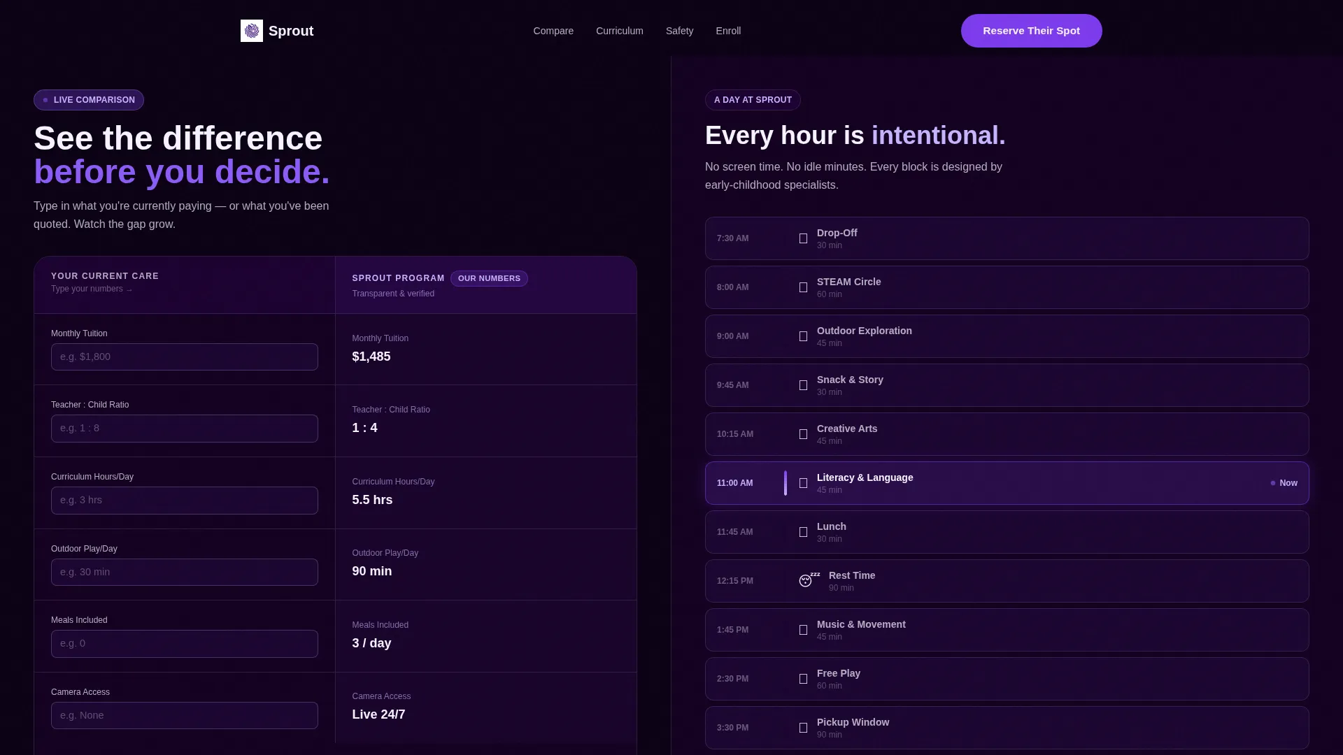
- A 50/50 split-screen header with a live comparison calculator on the left and an animated daily schedule timeline on the right
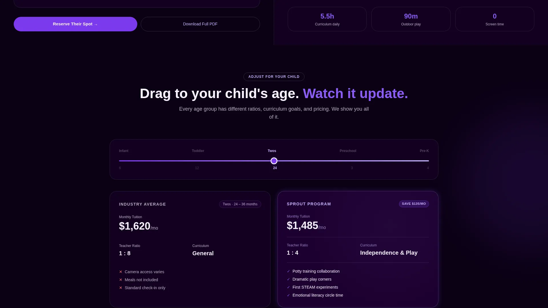
- A draggable age slider that updates curriculum details, teacher-to-child ratios, and pricing in real time
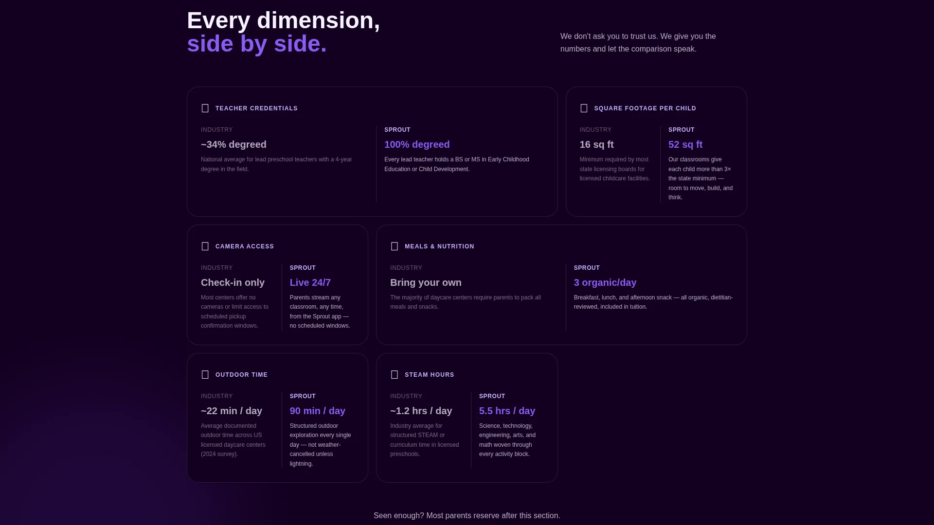
- A multi-row versus section that compares teacher credentials, square footage per child, and camera access against industry benchmarks
- A base enrollment form collecting the child's first name, birthdate, preferred start date, and a single priority dropdown
- A secondary conversion path offering a downloadable comparison PDF in exchange for a first name and email only
Feature list
This section covers the key interactive and structural components included in the Sprout template.
Live Comparison Calculator Header
The header splits the screen into two equal panels. The left panel displays a pre-filled comparison table covering tuition, teacher-to-child ratio, curriculum hours, outdoor play minutes, and included meals. Parents type their current program's numbers into the left column while your program's figures stay visible on the right. The data is the visual hero; no stock photography is used.
Animated Daily Schedule Timeline
The right panel of the header plays a looping micro-animation showing the classroom day as a sleek timeline. Each block, from drop-off through STEAM circle, snack, outdoor exploration, nap, and pickup, glows violet as it activates. Parents see the structure of their child's day before reading a single paragraph.
Draggable Age-Range Slider
Below the header, a draggable slider lets parents move between infant and pre-K age groups. As the slider moves, curriculum details, ratios, and pricing update in real time across both columns. This keeps the comparison relevant to the specific child a parent has in mind.
Progressive Versus Scroll Sections
Each scroll section introduces a new comparison dimension: credentialed teachers versus industry average qualifications, square footage per child versus state minimums, and camera access versus standard check-in policies. The left side always shows evidence; the right side reflects the parent's potential experience. The rhythm builds a visual case that compounds with every section.
Enrollment Form with Smart Age Routing
The base form collects the child's first name and birthdate. The birthdate field auto-slots the child into the correct age group, removing ambiguity. Parents also select a preferred start date and choose one priority from a dropdown covering safety cameras, organic meals, STEAM curriculum, and flexible pickup.
Anchored and Repeated Primary call to action
The "Reserve Their Spot" call-to-action button appears in electric violet, pinned to the bottom of the right panel. It repeats after every third comparison row throughout the page. This pattern keeps the conversion action visible without interrupting the data flow.
Page sections overview
| Section | Purpose |
|---|---|
| Split-Screen Header | Launches comparison calculator and animated schedule side by side |
| Age Slider Panel | Lets parents filter curriculum and pricing by their child's age group |
| Teacher Credentials Row | Compares credentialed staff ratios against industry averages |
| Square Footage Row | Contrasts space per child against state minimum requirements |
| Camera Access Row | Shows transparency features versus standard check-in policies |
| PDF Download call to action | Captures mid-research parents with a low-friction name and email form |
| Base Enrollment Form | Collects child details and parent priorities to qualify intent |
| Repeated Spot call to action | Reinforces the primary action after every third comparison block |
Design & branding system
Sprout uses the Void & Violet color system under a Startup Velocity theme. The palette is intentionally high-contrast to make data panels easy to read at a glance.
- Deep void black (#0B0014) anchors all backgrounds and section dividers, giving the layout a focused, immersive feel
- Electric violet (#7C3AED) drives every button, progress bar, and interactive highlight so every action state stands out clearly
- Soft nebula lilac (#C4B5FD) washes over cards and secondary panels, softening the contrast without weakening the hierarchy
- Lunar white (#F5F3FF) carries body text and open space, keeping the reading experience clean and unhurried
Mobile & speed optimization
The 50/50 split-screen layout is built with a mobile-first stacking approach. On smaller screens, each panel reflows into a single-column layout so the comparison data remains readable without horizontal scrolling.
- The comparison calculator columns collapse to a vertical card stack on mobile, preserving all data fields
- The animated schedule timeline and interactive slider are designed to work with touch input on smaller screens
- Lunar white space and short text blocks keep each mobile section fast to scan between interactions
How this template helps you convert
Sprout is structured around the principle that transparent data converts faster than persuasive copy. Every layout decision moves a hesitant parent closer to a definite action.
- The header calculator builds immediate credibility by showing your program's numbers alongside the parent's own, turning comparison anxiety into visible proof before a single scroll
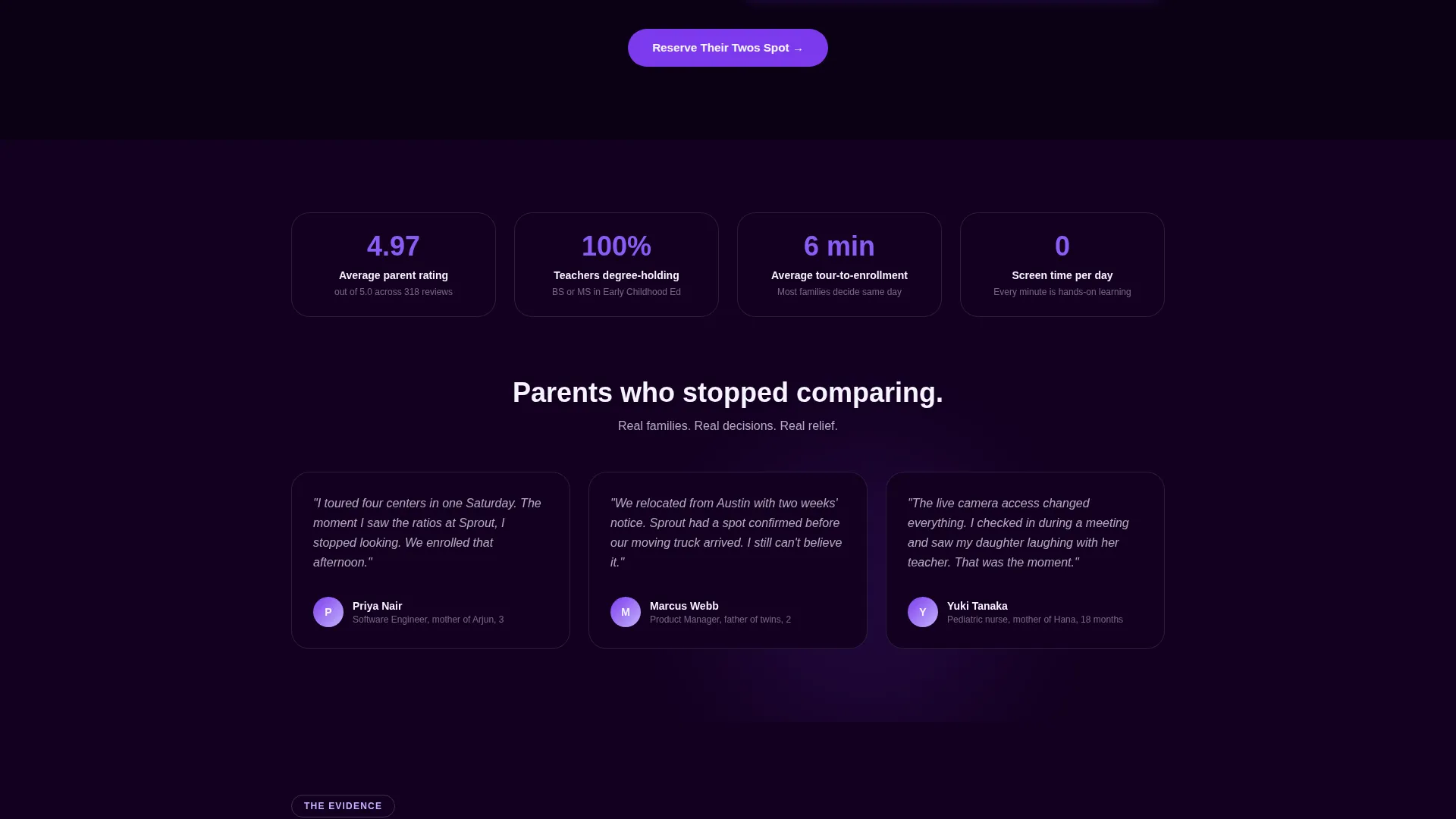
- The repeated "Reserve Their Spot" button placed after every third comparison row catches parents at the exact moment the data tips their decision, reducing the gap between intention and action
- The low-friction PDF download path captures parents who are not yet ready to commit, giving the page a second conversion layer that works for both early-stage and late-stage researchers
Other information about this template
Sprout sits within the Daycare and Preschool Website Templates subcategory and is specifically designed for the thank-you and enrollment conversion moment in the daycare and preschool niche.
- The template style is Split Screen (50/50), suited to comparison-led storytelling where two data sets need equal visual weight
- The creative direction is Calculator and Tool First, meaning interactive components appear before any persuasive copy or testimonials
- The header concept is Dashboard Preview, drawing on the visual language of modern data tools to signal transparency to tech-savvy parents
- The landing-page direction is Comparison and Versus, structuring every scroll section as a direct side-by-side data narrative
- The theme is Startup Velocity, giving the template an edge that stands out from the typical pastel-heavy preschool aesthetic
- This template is well suited for programs that wish to attract families from technology industry backgrounds or urban dual-income households who respond to data-forward presentations
Theme
Startup Velocity
Creative direction
Calculator/Tool First
Color system
Void & Violet
Style
Split Screen (50/50)
Direction
Comparison/Versus
Page Sections
Live Side-by-side Comparison Calculator
Animated Classroom Schedule Timeline
Draggable Age-range Slider
Progressive Versus Scroll Sections
Smart Enrollment Form with Age Routing
Repeated Anchored Call to Action Button
Related questions
Can I edit the comparison calculator fields to match my program's actual numbers?
Does the age slider work if my center only serves one or two age groups?
What is the PDF download option on this landing page for?
Can I update the animated daily schedule timeline to match my center's actual routine?
Is this template suitable for a preschool that does not use a comparison-style pitch?



