Quality Daycare Landing Page Template
Sprout is a dynamic, card-grid landing page template built for daycare and preschool case study pages. It opens with an interactive savings calculator and flows into a modular grid of real family stories, measurable outcomes, and aggregate data cards. The Electric Indigo color system and spring-physics animations give the page joyful momentum that builds trust and drives app downloads.
by Rocket studio
Quick summary
Sprout is a single-page, card-grid landing page template designed for daycare and preschool case study presentations. It leads with a parent-facing savings calculator, then builds an evidence wall of family stories and program outcome data. The Electric Indigo palette and Dynamic Motion theme make every scroll feel alive, while the layout guides parents toward downloading the provider's app.
Who this template is for
This template is built for daycare and preschool providers who want to turn real program outcomes into a compelling, high-energy landing page. It suits programs that have measurable results, parent testimonials, and an app they want families to adopt.
- Daycare and preschool operators launching or promoting a parent engagement app
- Childcare marketing teams that have real case study data and want to present it visually
- Early childhood programs targeting dual-income families, single parents, and first-time caregivers
What problem this template solves
Parents researching childcare options face an overwhelming mix of vague promises and generic website copy. They need evidence, not just warmth. This template bridges that gap by pairing emotional storytelling with hard outcome data in a single scrollable flow.
- Childcare providers struggle to convert warm interest into committed app downloads or waitlist sign-ups
- Case study content is often buried in PDFs that parents never open
- Trust is built slowly, but this layout accelerates it by stacking real family proof and aggregate metrics side by side
What you get with this template
You get a fully structured, single-page landing page with a modular card grid at its core. Every section is purpose-built to move a parent from curiosity to confident action without friction.
- An interactive calculator header, a staggered family case study grid, and a data aggregate section all in one cohesive layout
- A sticky mobile call to action bar and a desktop-closing grid card both pointing toward the app download
- A secondary PDF gate for parents who want the full case study before committing
Feature list
This template packs a focused set of interactive and visual components, each grounded in the Dynamic Motion design theme and the goal of driving app downloads.
Interactive Savings Calculator Header
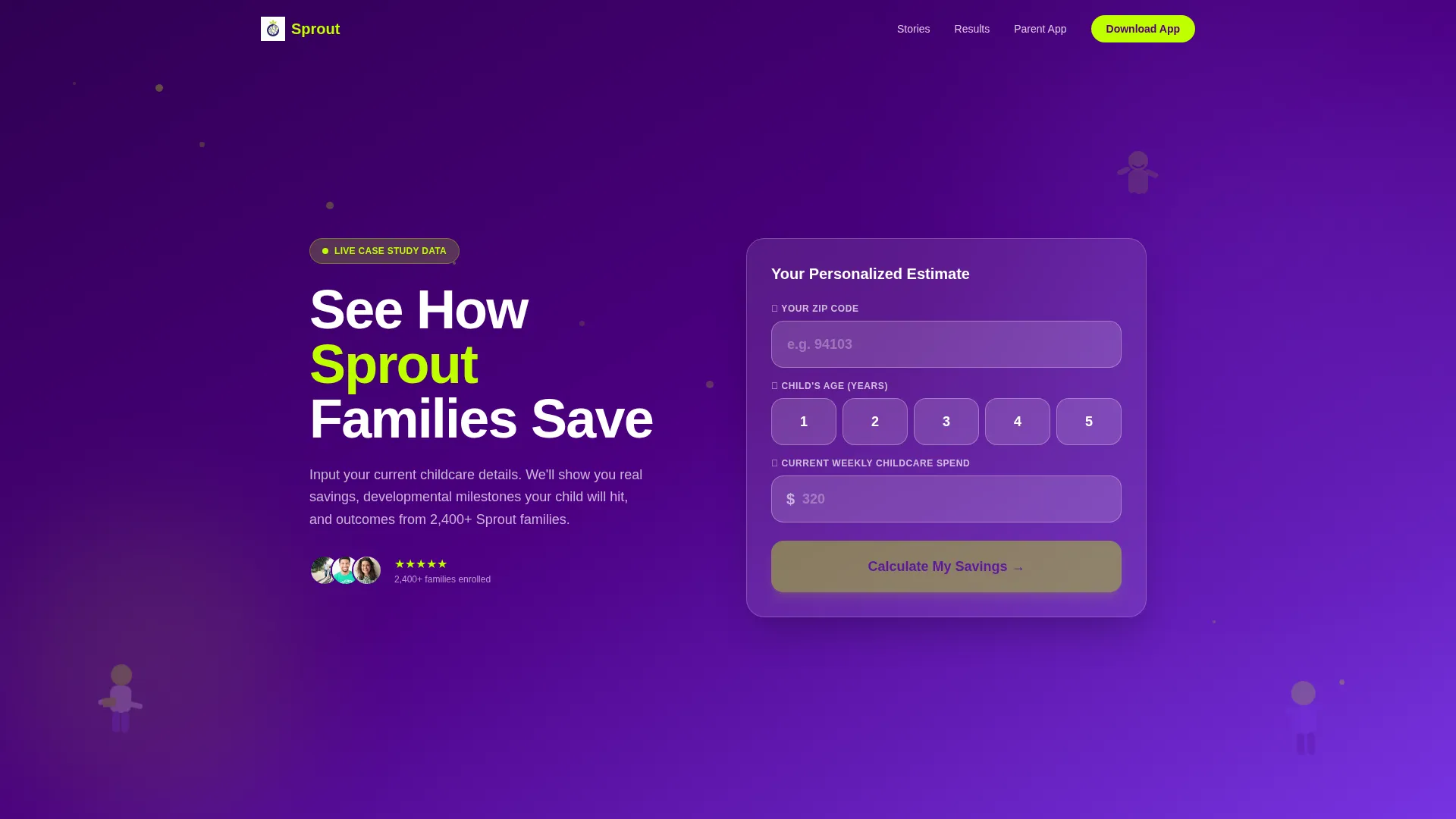
The header is a full-width calculator titled "See How Sprout Families Save." Parents enter their zip code, child's age, and current weekly childcare spend. Each input field is oversized and rounded with a subtle bounce animation on interaction. The result card slides up to show estimated annual savings, age-relevant developmental milestones, and a parent satisfaction percentage drawn from case study data. A soft in-result call to action invites parents to get their personalized savings report inside the app.
Staggered Family Case Study Grid
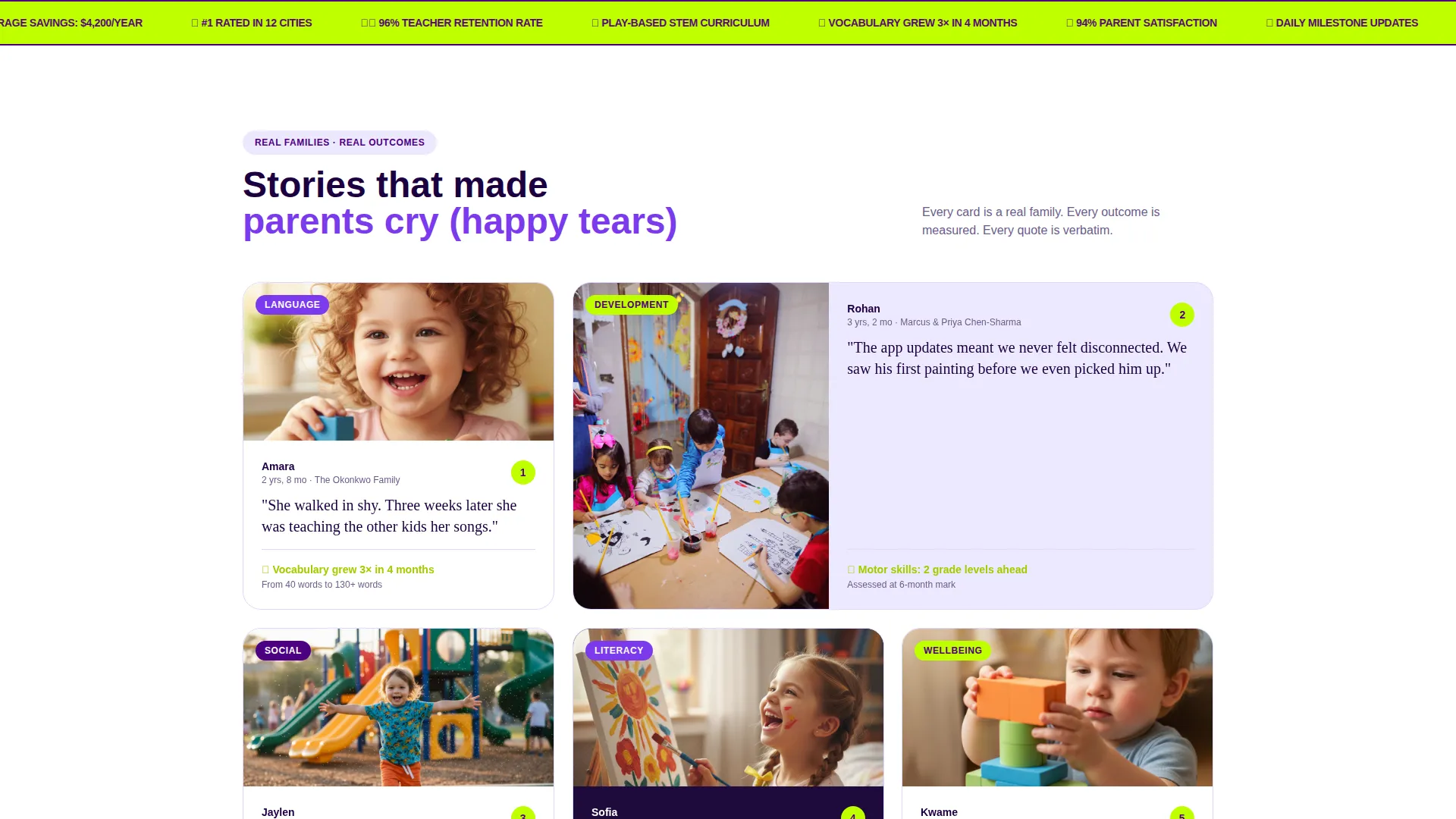
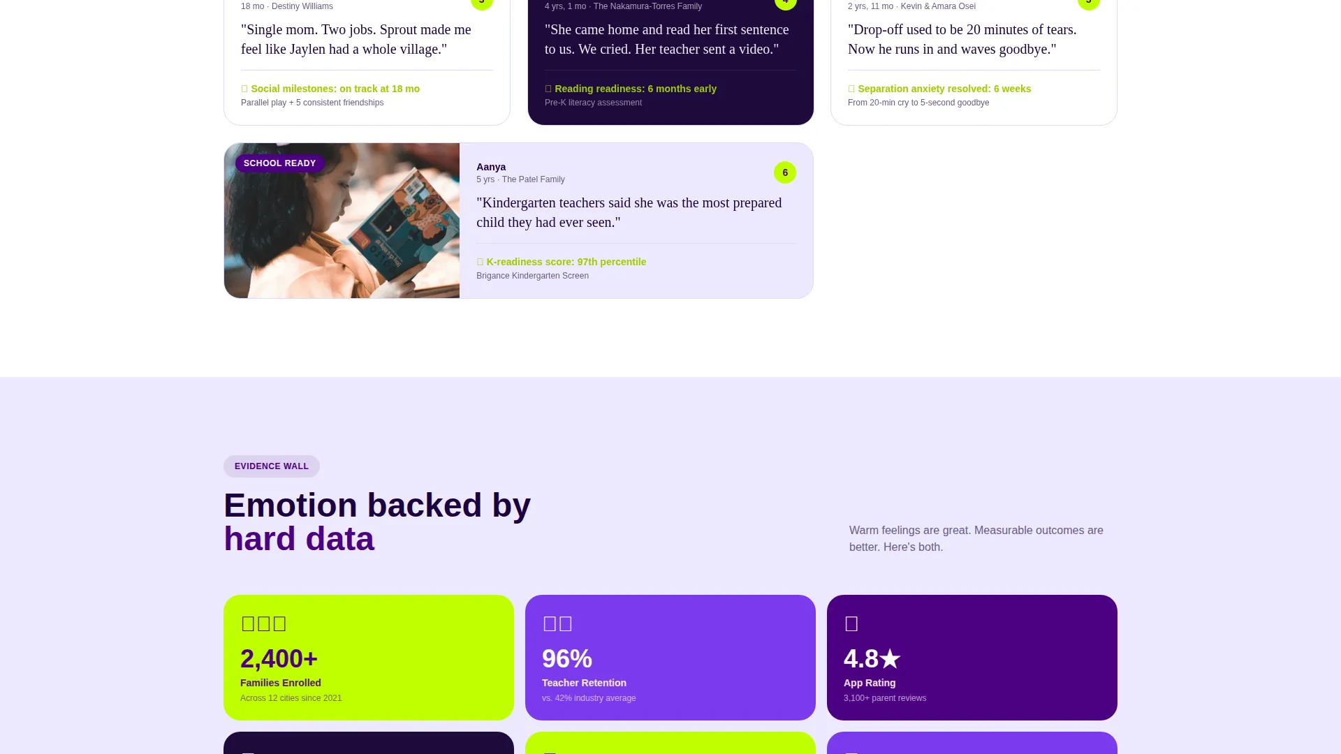
Below the fold, modular cards each tell one family's story. Each card shows a real family photo, the child's age at enrollment, a single pull-quote in handwritten font, and a measurable outcome such as vocabulary growth. Cards animate into view with spring-physics stagger timing, arriving one beat after the last for a rhythmic, energetic scroll experience.
Aggregate Data Card Section
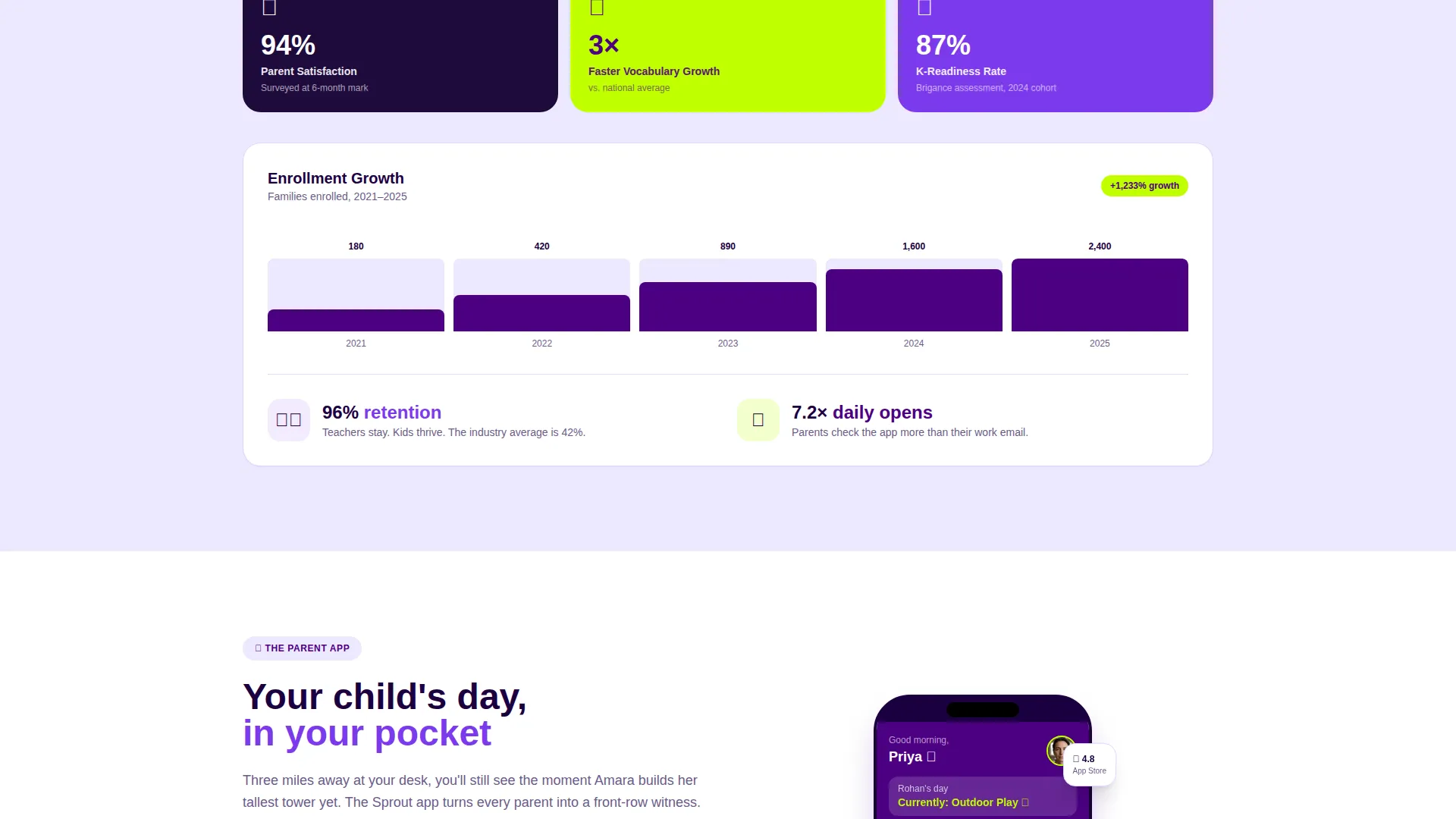
As the user scrolls further, individual family cards transition into data cards showing enrollment growth charts, teacher retention rates, and app engagement metrics. This shift from emotional storytelling to rational evidence builds an evidence wall that gives parents the confidence to act.
Kinetic Yellow-Green call to action System
The primary call to action, "Download the Parent App," uses kinetic yellow-green (#BFFF00) against deep indigo. It appears as a sticky bottom bar on mobile and as the final card in the desktop grid. This dual placement ensures the action is always reachable without feeling pushy.
PDF Gate for Full Case Study
A secondary conversion path offers the full case study as a downloadable PDF. Parents provide only a first name and email address to unlock it. This lighter ask captures leads who are not yet ready to download the app but are clearly interested in the program.
Illustrated Background Animation
The calculator section features illustrated children animating in the background as parents interact with the inputs. One child climbs, one reads, and one is mid-laugh. These illustrations reinforce the brand personality and keep the header section feeling alive rather than static.
Page sections overview
| Section | Purpose |
|---|---|
| Calculator Header | Lets parents estimate savings and see milestone data interactively |
| Illustrated Background | Adds animated personality behind the calculator inputs |
| Result Slide-Up Card | Delivers personalized savings output with an in-context app call to action |
| Family Case Study Grid | Presents individual family stories with quotes and measurable outcomes |
| Aggregate Data Cards | Shifts tone to program-level evidence with charts and retention metrics |
| App Download Card | Closes the desktop grid with the primary app download call to action |
| Sticky Mobile call to action Bar | Keeps the app download action visible throughout the mobile scroll |
| PDF Gate Section | Offers the full case study download behind a lightweight email form |
Design & branding system
The Electric Indigo color system gives Sprout a visual identity that feels energetic but trustworthy. Deep indigo anchors the layout, while the kinetic yellow-green makes every action feel unmissable.
- Color palette: deep indigo (#4B0082) as the primary brand anchor, vivid violet (#7C3AED) for hover and active card states, soft lavender mist (#EDE9FE) for section backgrounds, and kinetic yellow-green (#BFFF00) for calls to action and progress indicators
- Typography: pull-quotes use a handwritten font style to echo authentic family voices, while body and data copy stays clean and readable
- Motion design: spring-physics card animations, bounce feedback on calculator inputs, and illustrated background movement create the Dynamic Motion theme throughout
Mobile & speed optimization
The template is designed with mobile parents in mind. Drop-off and pickup windows are short, and parents make decisions on their phones between meetings and school runs.
- The sticky bottom bar on mobile keeps the app download call to action in reach at every scroll position without interrupting the reading flow
- Oversized, rounded input fields in the calculator are built for thumb-friendly interaction on small screens
- The card grid uses a modular layout that adapts naturally to narrower viewports, keeping family stories and data cards legible and tappable
How this template helps you convert
Every section in this template is arranged to move a parent closer to downloading the app or submitting their email. The flow respects the emotional journey a parent goes through when evaluating childcare.
- The calculator header delivers immediate, personalized value before asking for anything. Parents feel understood, not sold to. The in-result soft call to action then frames the app as a natural next step rather than a cold ask.
- The case study grid builds trust through real family proof. Measurable outcomes like vocabulary growth and age-at-enrollment details make each card feel credible. By the time a parent reaches the aggregate data section, emotional confidence has become rational confidence.
- The dual call to action system, a sticky mobile bar and a closing desktop grid card, ensures the app download action is always present but never overwhelming. The PDF gate catches parents who need one more nudge, keeping them in the funnel.
Other information about this template
Sprout is categorized under Technology, specifically within Daycare and Preschool Website Templates, with a niche focus on the case study page use case. This placement reflects the template's data-forward design and its app-download conversion goal rather than a traditional enrollment form flow.
- The template style is Card Grid (Modular), making it straightforward to add, remove, or reorder case study cards as your program grows
- The creative direction is Launch Energy, meaning the visual and motion language is intentionally high-momentum to reflect program confidence and parent enthusiasm
- The header concept is a Calculator or Estimator, a format that works well for childcare audiences because it gives parents something useful before making any ask
- The primary landing page direction is App Download, making this template a strong fit for programs that have already built a parent-facing app and need a dedicated page to drive adoption
Theme
Dynamic Motion
Creative direction
Launch Energy
Color system
Electric Indigo
Style
Card Grid (Modular)
Direction
App Download
Page Sections
Interactive Savings Calculator Header
Staggered Family Case Study Grid
Aggregate Data Evidence Wall
Dual-placement App Download Call to Action
PDF Gate for Full Case Study
Illustrated Background Animation
Related questions
Can I customize the case study cards with my own family stories and photos?
Do I need real outcome data to use this template effectively?
How does the PDF gate section work?
What if my program does not have a parent app yet?
What makes the calculator header more effective than a standard hero section?



