Advanced Material Science Hub Landing Page Template
Codex is a glassmorphic landing page template built for interior design knowledge bases. It uses a 50/50 split-screen layout, a deep charcoal background, frosted glass user interface components, and an animated gradient sweep to turn raw material data into an elegant, searchable design tool. It suits professional designers and procurement teams who need fast, structured material lookups mid-project.
by Rocket studio
Quick summary
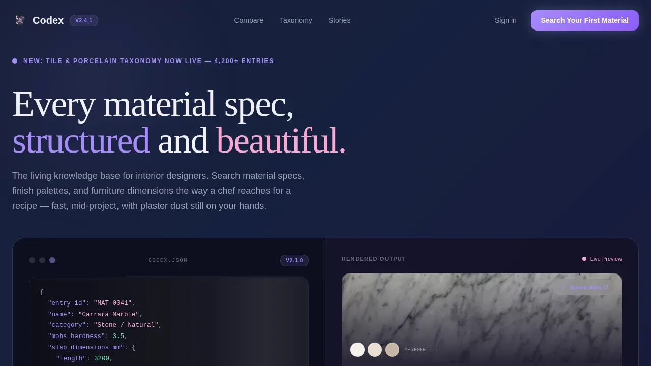
Codex is a single-page glassmorphic landing page template for interior design knowledge base products. The layout splits the viewport 50/50, pairing structured data on the left with beautiful rendered output on the right. Frosted glass cards float over a deep charcoal background, and an animated gradient sweep fires on load, creating a sense of arrival that matches the tool's ambition.
Who this template is for
This landing page is built for teams launching a material intelligence platform or design knowledge base. It speaks directly to the professionals who use these tools daily, and it earns their trust before asking for a sign-up.
- Junior interior designers assembling mood boards under deadline pressure
- Senior stylists verifying textile fire ratings before commercial sign-off
- Procurement managers tracking lead times and sourcing for large-scale projects
What problem this template solves
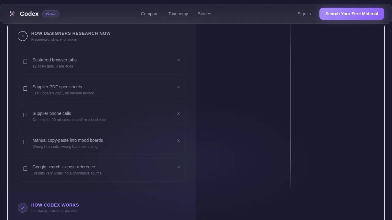
Most design research today is fragmented. Designers juggle scattered browser tabs, printed PDF spec sheets, and supplier phone calls just to confirm one material detail. This landing page frames that problem clearly, then shows the solution in real time.
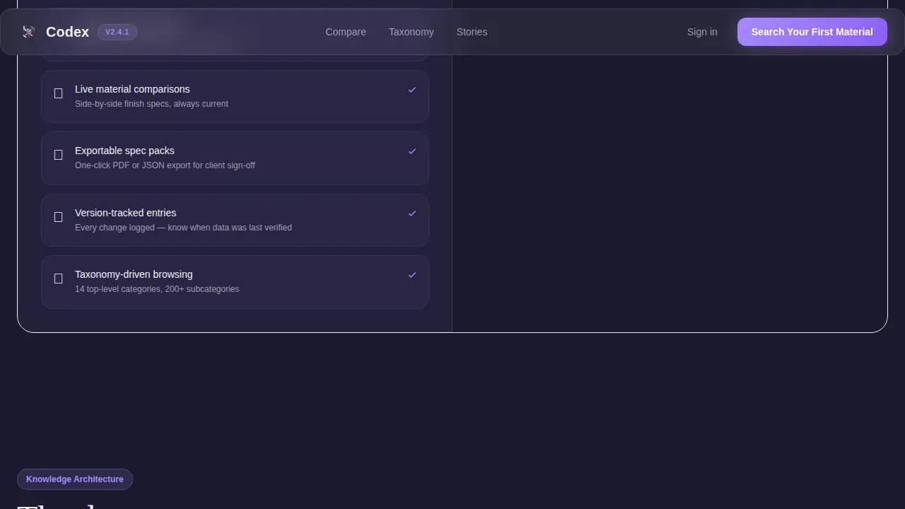
- Visitors see "how you research now" versus "how Codex works" in a direct side-by-side comparison
- The inline search field lets visitors type a real query and watch a live result render before any account is required
- The page converts skeptics by delivering value first, creating a sense of trust that a static brochure never could
What you get with this template
The template ships as a complete, section-led landing page with every layout block pre-built. All components follow a consistent glassmorphism design language, so the visual system stays cohesive from the hero all the way to the footer.
- A 50/50 split-screen hero with a syntax-highlighted JSON code block on the left and a rendered material card on the right
- A bento grid knowledge-depth section, a testimonial block, and a full-width inline search call-to-action section
- A Vercel horizontal-flow footer pattern and scroll-triggered reveal animations throughout
Feature list
This landing page is built around six core front end components and interaction patterns that work together to create a cohesive glassmorphic experience.
50/50 Split-Screen Hero with Live Code Display
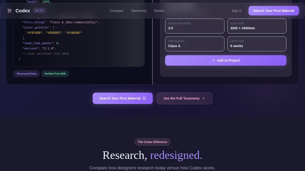
The hero divides the viewport into two equal panels. The left panel displays a styled JSON-like block showing a knowledge entry for Carrara Marble, with nested fields for Mohs hardness, slab dimensions, sourcing region, and a color-match hex array. Syntax highlighting uses lavender and blush against the dark substrate, making structured data look like design. The right panel mirrors that data as a rendered material card with a tactile marble swatch, a sourcing badge, and an "Add to Project" button.
Animated Gradient Sweep on Load
A confetti-thin animated gradient line sweeps across the header the moment the landing page loads. This launch-energy effect signals that something new just arrived. It sets the tone for a page that rewards scrolling with progressively more powerful demonstrations of the knowledge base.
Comparison Section with Tab Switching
A dedicated comparison block pits scattered legacy research methods against the Codex approach. Left side shows the old world: browser tabs, PDF spec sheets, supplier calls. Right side shows the new approach: instant structured search, live material comparisons, and exportable spec packs. Tabs switch between states, giving the user an interactive feel without leaving the landing page.
Bento Grid Knowledge Depth Section
A bento grid layout showcases the taxonomy breadth of the knowledge base. Cells cover materials, finishes, dimensions, and fire ratings. Each cell is a frosted glass card with a border, a subtle box-shadow for depth, and a hover state that glows in blush. The grid makes the full collection of data feel tangible and browsable.
Inline Search with Live Auto-Suggest
The primary call-to-action section features a full-width inline search field. As visitors type, auto-suggest entries appear in real time. This interactive front end component delivers immediate value, allowing visitors to confirm the tool works before committing to an account. A secondary path offers a "See the Full Taxonomy" link for power users who prefer to browse before searching.
Role-Specific Social Proof Block
The testimonial section displays designer quotes tied to specific roles, firms, and use cases. Version badges and an entry count stat add credibility. Frosted glass cards with refined borders keep the aesthetic consistent with the rest of the landing page, ensuring social proof feels native rather than bolted on.
Page sections overview
| Section | Purpose |
|---|---|
| Hero split screen | Introduces the product with a JSON code block and a rendered material card side by side |
| Comparison block | Shows legacy research versus the Codex approach using tab-switching panels |
| Knowledge depth grid | Bento grid cells display taxonomy breadth across materials, finishes, and dimensions |
| Social proof block | Role-specific testimonials with version badges confirm real-world credibility |
| Inline search call to action | Full-width search field with live auto-suggest drives the primary conversion action |
| Footer pattern | Vercel horizontal flow footer closes the landing page with navigation and secondary links |
Design & branding system
The design system is built entirely around glassmorphism, a visual style that mimics the appearance of frosted glass by combining transparency and background blur with soft layering to create depth and hierarchy. The term glassmorphism was coined by designer Michal Malewicz in 2020, and it has since become a serious design language in modern web interfaces.
- Color palette: deep charcoal substrate (#1A1A2E), frosted card white (rgba 255 255 255 at 0.08), soft lavender highlight (#A78BFA) for interactive elements, and warm blush (#F9A8D4) for hover states and active search indicators
- Typography: DM Sans for body text across all user interface components, Fraunces for display headlines, creating an elegant contrast between geometric clarity and editorial warmth
- Core glassmorphism properties applied throughout: backdrop-filter blur for frosted panels, rgba background overlays, border-radius on every card, subtle border values for panel separation, and box-shadow for depth
Mobile & speed optimization
The template is desktop-first by design, built for large-screen use mid-project. It includes a mobile fallback layout so the landing page remains functional on smaller screens. Animations are handled through client components only, keeping the static hero fast to paint.
- Scroll-triggered reveals and staggered card entries are applied only where they add meaning, not as decoration across every element
- The backdrop-filter property is GPU-intensive, so blur is applied carefully and limited to the components where the glassmorphism effect matters most
- For optimal performance, the number of blurred elements is deliberately controlled to prevent slow scrolling on mid-range devices
How this template helps you convert
This landing page is engineered around a single conversion goal: get the visitor to type their first material search. Every section earns that click through progressive proof, not pressure.
- The hero delivers immediate value by showing real structured data and a rendered output side by side, confirming the product concept before the visitor scrolls
- The comparison block removes objections by framing the pain of legacy research and positioning the knowledge base as the obvious upgrade, with tabs that let visitors actively explore
- The inline search call to action closes the loop by allowing the visitor to experience the product directly on the landing page, making the decision to create an account feel natural rather than forced
Other information about this template
This section covers additional context relevant to designers, front end developers, and teams evaluating this template for their projects.
- Glassmorphism is particularly relevant in contemporary web design trends supported by modern GPUs and browsers, making it a strong choice for design-tool landing pages targeting tech-forward audiences
- The core CSS properties essential for glassmorphism include backdrop-filter: blur(), background with rgba() transparency, border-radius, subtle border values, and box-shadow for depth; all of these are applied consistently across the template's components
- The glassmorphism effect works especially well for navigation bars, cards, and overlays, which is why those elements are front and center in this template's layout
- Strong, well-chosen backgrounds are crucial to making glassmorphism shine, because soft gradients or animated scenes provide the visual energy that frosted panels diffuse; the deep charcoal substrate in this template does exactly that
- Refined borders are essential in glassmorphism, providing crisp separation for translucent layers; the template uses subtle border values so cards never melt into the background
- Accessibility has become a key talking point in glassmorphism design, emphasizing the need for contrast compliance and controlled motion; designers building on this template should test blur and translucency effects against their own content for legibility
- Online tools like CSS Glass and user interface Glass Generator output production-ready code using backdrop-filter, rgba overlays, and subtle shadows, which can assist teams customizing this template's glassmorphism components
- Figma's native effects and community files provide ready-made components and styles for glassmorphism that can be integrated into design systems, making it straightforward to extend this template's visual language
- The original Glassmorphism CSS Generator by Hype4 Academy allows users to interactively adjust blur, opacity, color, borders, and shadows, then copy clean CSS tailored for modern browsers, which is useful when experimenting with alternative blur or opacity values
- Platforms like Dribbble and Behance showcase glassmorphic dashboards, apps, and websites, providing inspiration when building on or adapting this template
- LandingGo offers both free and PRO glassmorphic components, and all glassmorphic components on that platform are fully customizable, confirming the broader ecosystem of resources available to teams extending this template
- Apple's Liquid Glass interface has pushed glassmorphism to a serious design language embedded across its ecosystem, adding further cultural weight to the aesthetic choice made in this template
- The GitHub account structure for this template follows standard front end project conventions, making it straightforward for development teams to fork, version, and push changes
Theme
Directory & Discovery
Creative direction
Launch Energy
Color system
Glassmorphic
Style
Split Screen (50/50)
Direction
Comparison/Versus
Page Sections
Split-screen Hero with JSON Code Display
Animated Gradient Sweep on Load
Comparison Block with Tab Switching
Bento Grid for Knowledge Taxonomy
Inline Search with Live Auto-suggest
Role-specific Testimonial Block
Related questions
Who is this landing page template designed for?
What makes the glassmorphism design feel premium here?
Can the colors and typography be customized?
How does the inline search component work on the landing page?
Is this a single landing page or a multi-page website?



