Blueprint - Curated Architecture Landing Page Template
Blueprint is a weekly email newsletter landing page built for architecture studios. It transforms link-heavy project roundups, material discoveries, and design inspiration into a structured, editorial format. With a split-screen layout, curated module sections, and a clear freemium conversion path, it helps studios send newsletters that look as considered as the work they share.
by Rocket studio
Quick summary
Blueprint is a single-page, split-screen landing page template for an architecture email newsletter. It targets studios and solo practitioners who curate weekly project roundups, material finds, and design inspiration. The page walks visitors through a Problem-to-Solution arc, showing raw email drafts transformed into polished, sectioned newsletters, then converts them with a low-friction free test issue offer.
Who this template is for
This template is built for people in the architecture and design field who send regular email content to an engaged audience. It speaks directly to the frustration of assembling a thoughtful newsletter inside tools that were never built for editorial work.
- Solo architecture practitioners who hunt for specification sources and share curated weekly finds
- Studio founders who send internal knowledge digests and want a repeatable, professional format
- Architecture media editors who publish link-heavy roundups and need the content to feel edited, not dumped
What problem this template solves
Generic email tools treat every newsletter the same. For architecture professionals, that means project thumbnails misalign, material links pile into unformatted lists, and the final send looks nothing like the care that went into assembling it. The result is a weekly frustration that quietly erodes the sender's professional credibility.
- Raw links and wall-of-text formatting make curated content feel accidental rather than intentional
- Broken mobile rendering turns carefully selected project images into a visual mess
- No repeatable structure forces studios to rebuild layout from scratch every single week
What you get with this template
The template delivers a fully structured landing page that demonstrates the newsletter product through a live before-and-after visual experience. Every section is a purpose-built module that handles a specific type of architecture content.
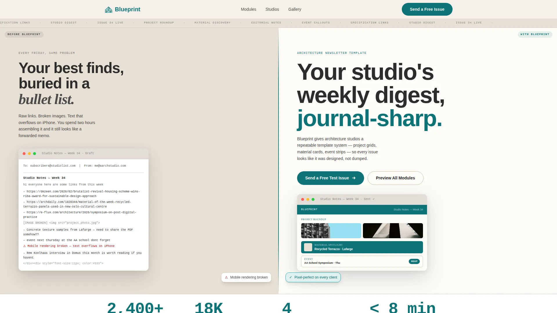
- A pixel-sharp split-screen header showing an unstyled email draft on the left and the Blueprint template on the right, rendered at actual email-client scale with a real subject line
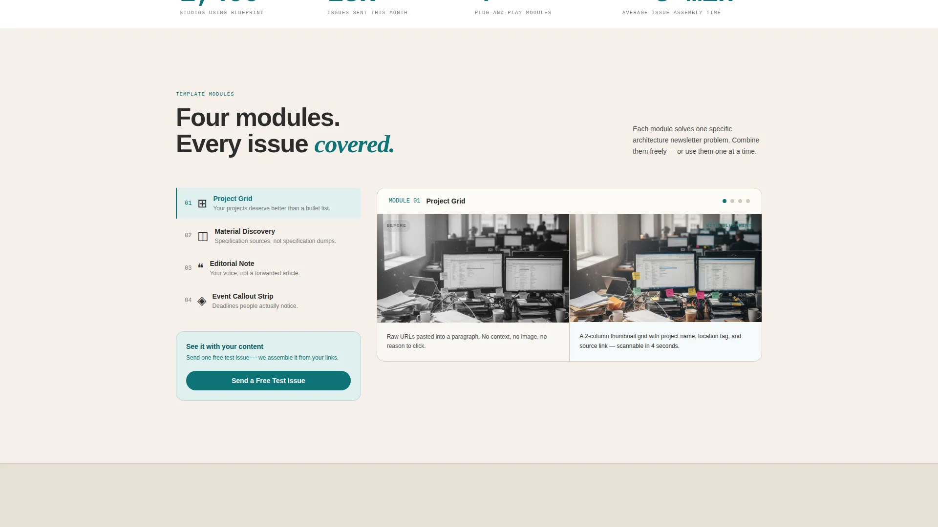
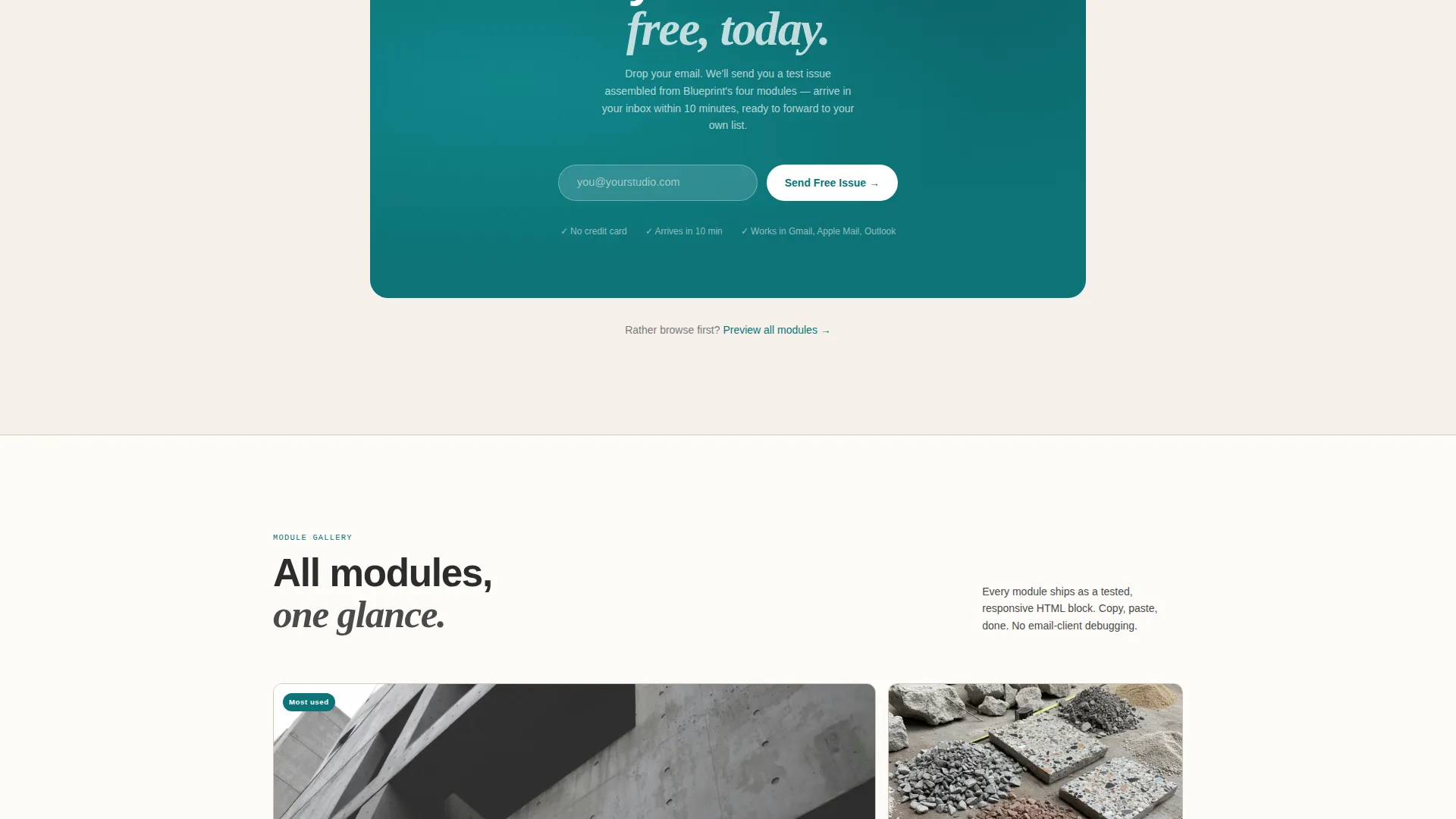
- Four revealed template modules: the project grid, the material discovery card, the editorial note block, and the event callout strip
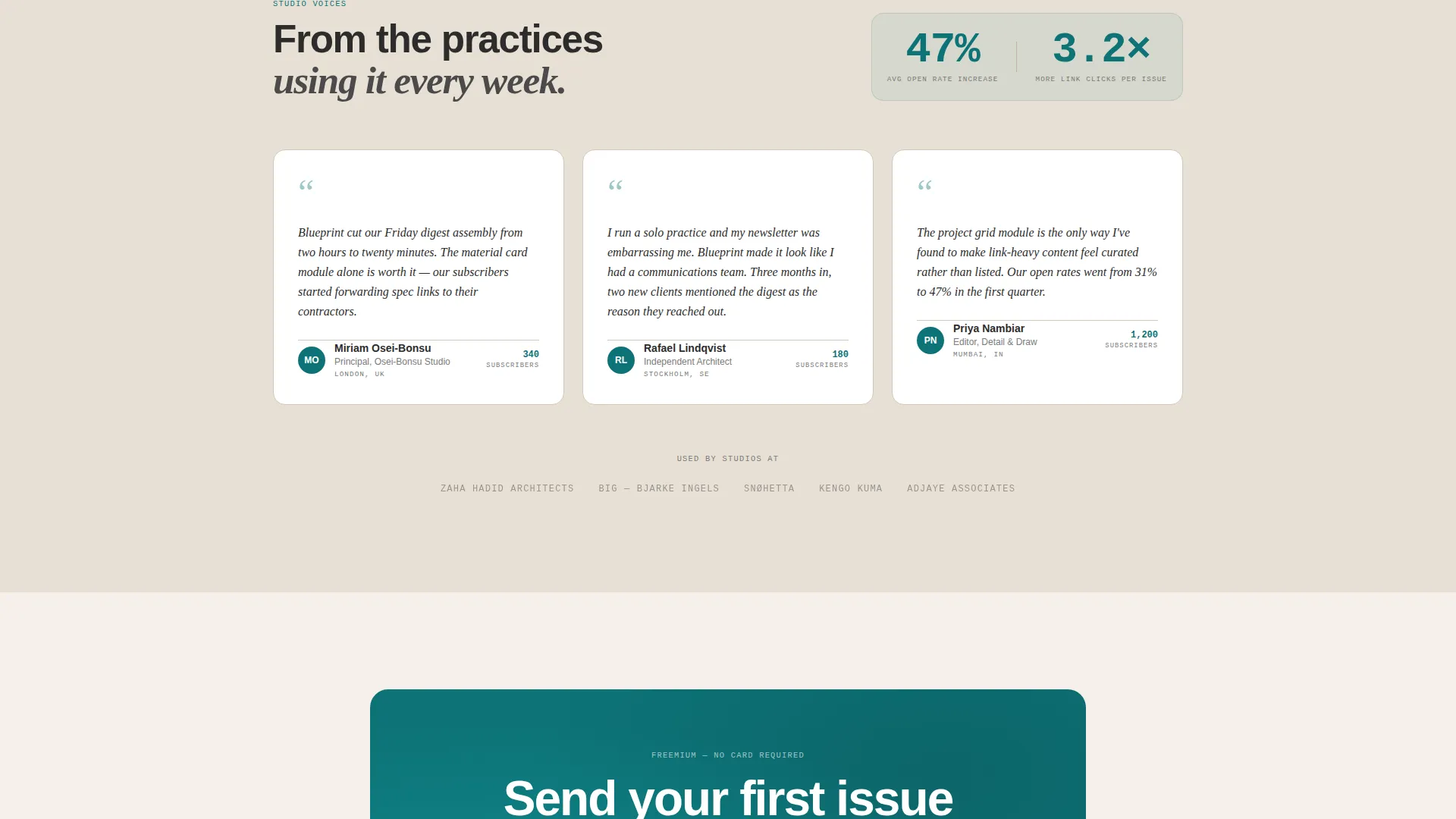
- A primary call to action asking only for an email address to send a free test issue, plus a secondary path to preview all modules in an interactive gallery
Feature list
This landing page template is organized around a clear creative direction and a set of purpose-designed components drawn directly from the source brief.
Split-Screen Problem-Solution Header
The header divides the screen 50/50. The left panel shows a cluttered, unstyled email draft with raw links, misaligned images, and unformatted text. The right panel shows the identical content inside the Blueprint template: sectioned grids, thumbnail project cards, typographic hierarchy, and a curated material spotlight block. It renders at actual email-client scale inside a mail app frame.
Sequential Module Reveal Sections
As the visitor scrolls, each newsletter module is introduced individually. The project grid module, the material discovery card, the editorial note block, and the event callout strip each appear in a split view showing the raw problem state alongside the solved template state.
Escalating Stakes Copy Arc
The page copy follows a Problem-to-Solution arc that moves from cosmetic frustration to professional reputation. Early sections address visual disorder; later sections raise the stakes with the message that the work itself deserves better presentation than a bullet list.
Freemium Conversion Flow
After the third module reveal, the page presents a primary call to action to send a free test issue, requiring only an email address. A secondary call to action below the fold opens an interactive template gallery so visitors can preview all modules before committing.
Editorial Visual Identity System
The color palette, typography, and surface treatment are calibrated to feel like a printed architecture monograph. Deep drafting teal functions as the single accent color, warm concrete tones cover the background, and card surfaces stay bright white to make template previews pop cleanly against the page.
Directory and Discovery Theme
The overall layout follows a Directory and Discovery theme, organizing information the way a well-edited architecture journal organizes spreads. Each section has exactly one primary idea, reducing cognitive load and making every scroll feel purposeful.
Page sections overview
| Section | Purpose |
|---|---|
| Split-screen header | Show raw versus styled email side by side |
| Project grid module | Demonstrate structured project roundup layout |
| Material discovery card | Show how material finds are formatted cleanly |
| Editorial note block | Present the personal studio voice section |
| Event callout strip | Display event and deadline formatting module |
| Free test issue call to action | Capture email with a zero-risk conversion offer |
| Preview all modules | Offer secondary path to explore full template gallery |
Design & branding system
The visual identity is built on the Teal Catalyst color system, designed to feel like an architecture monograph printed on matte uncoated stock. Every color choice reinforces the editorial credibility of the newsletter product being sold.
- Deep drafting teal (#0D7377) is the primary action color used for buttons, links, and accent moments; warm concrete (#E8E0D5) covers background surfaces to mimic uncoated paper; charcoal graphite (#2C2C2C) handles body text at a density that feels editorial rather than digital
- Card surfaces and template preview areas use bright catalyst white (#FFFFFF) so the newsletter modules read sharply against the warmer page background
- Typography and layout follow the logic of a printed architecture journal: one focal idea per spread, generous whitespace, and a typographic hierarchy that guides the eye without decoration
Mobile & speed optimization
The split-screen layout is designed to scale responsibly across viewport sizes. The before-and-after comparison that drives the page's core argument must remain legible on smaller screens to convert mobile visitors effectively.
- The 50/50 split-screen sections are structured to reflow cleanly so both problem and solution states remain readable without horizontal scrolling
- Module reveal sections are built as discrete, self-contained blocks, which keeps the scroll experience predictable and the layout stable on both desktop and mobile viewports
How this template helps you convert
The page earns the conversion by making the transformation concrete before asking for anything. A visitor who has scrolled through four module reveals has already imagined their own studio content inside the Blueprint template.
- The split-screen header creates immediate recognition by showing the exact problem the visitor is living with, making the solution on the right side feel personally relevant rather than generic
- The escalating module sequence builds confidence section by section, so that by the time the free test issue call to action appears, the visitor has seen enough evidence to act without hesitation
Other information about this template
This template fits within the Architecture Digital Presence subcategory under the broader Technology category. It is designed for studios and practitioners who already produce regular newsletter content and need a format that matches the editorial quality of their work.
- The template is positioned on a freemium model, meaning the free test issue call to action is the primary entry point and requires no payment commitment upfront
- The Directory and Discovery theme makes the layout useful beyond a single campaign; the module structure supports repeatable weekly sends without rebuilding layout from scratch
- The landing page is a single-page, section-led experience with no multi-page navigation, keeping the visitor focused on the conversion path from first scroll to email submission
Theme
Directory & Discovery
Creative direction
Problem→Solution Arc
Color system
Teal Catalyst
Style
Split Screen (50/50)
Direction
Freemium/Trial
Page Sections
Split-screen Before-and-after Header
Sequential Newsletter Module Reveals
Escalating Problem-to-solution Copy
Freemium Conversion with Dual Call to Action Paths
Teal Catalyst Editorial Design System
Related questions
Who is the Blueprint template designed for?
What does the free test issue offer involve?
Can I use this template for a weekly newsletter format?
Does the landing page show what the actual email looks like?
What is the secondary conversion path on the page?



