Architecture Firm Professional Website Template
Blueprint is a dashboard-style landing page template built for architecture firms publishing serious long-form thinking on computational design, parametric facades, and generative AI. Its data-grid header, bento article layout, and iridescent Tech Glass visual identity make visitors feel like they have accessed an internal analytics dashboard. Two built-in conversion paths drive app downloads and email sign-ups.
by Rocket studio
Quick summary
Blueprint is a single-page landing page template designed for architecture firms running a high-concept blog. It leads with live-style metrics, tiles article cards in a bento grid, and uses a void black and iridescent color system to create an immersive, data-first reading experience. Two clear conversion paths push app downloads and newsletter sign-ups.
Who this template is for
This template is built for architecture practices and studios that produce serious editorial content rather than portfolio showcase pages. It suits teams whose writing circulates among professionals working in computational design, parametric facades, and generative AI research.
- Junior architects seeking long-form thinking beyond day-to-day project work
- Studio leads evaluating AI tools for early concept phases
- Competition-focused designers looking for an editorial edge in their research
What problem this template solves
Most blog landing pages for architecture firms feel like generic CMS themes dropped onto a black background. Blueprint solves the problem of a content-rich practice having no visual language that matches the sophistication of its thinking.
- Readers arrive and immediately understand the scale and credibility of the publication
- The stats-first layout stops scroll hesitation before a single article is opened
- Two conversion paths capture both committed app users and casual newsletter readers
What you get with this template
Blueprint delivers a fully structured single landing page focused on content discovery and reader conversion. Every section is purpose-built around an editorial architecture firm audience.
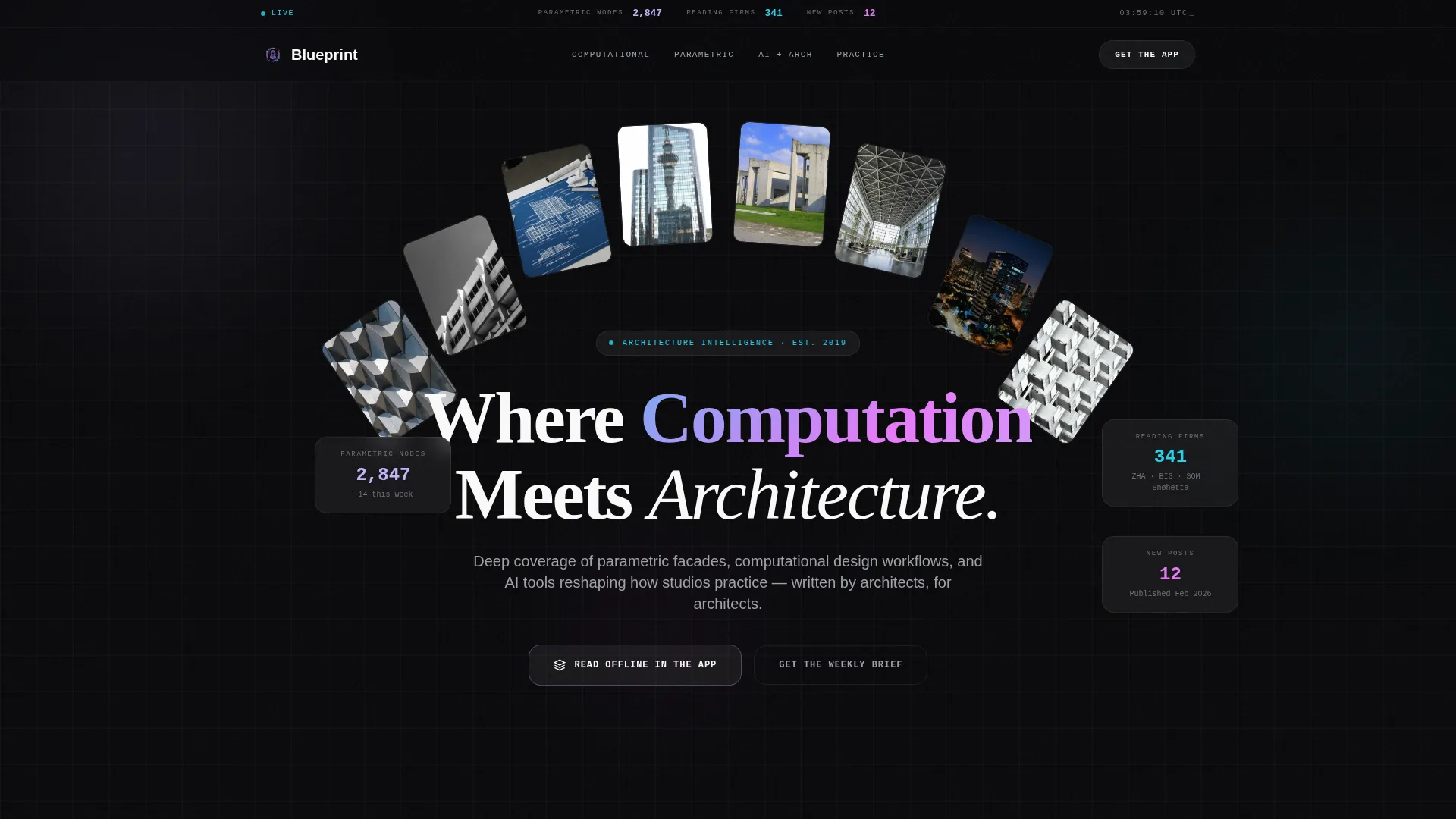
- A dashboard-style header with large monospaced metric displays and a bento article grid
- A floating app-download call to action that appears after the second scroll
- A full-width interstitial conversion block with a two-field sign-up form placed after the third article card
Feature list
Blueprint packages a set of focused, editorial-first components that work together to create an immersive landing page experience for an architecture firm blog.
Stats-First Dashboard Header
The header replaces a conventional hero image with an enormous data grid. Metrics such as parametric nodes generated, firms reading this week, and new posts on diffusion-model workflows are displayed in a monospaced typeface. Numbers glow faintly iridescent against a void black background, making the data itself the visual centrepiece.
Bento Article Grid
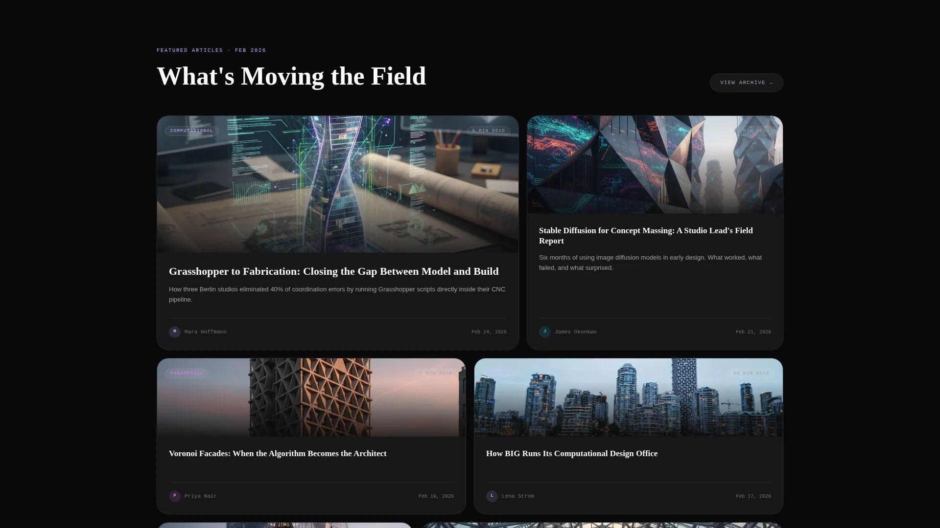
Article cards tile below the dashboard header in a bento grid layout. Each card features a wireframe render thumbnail with a glassmorphic overlay that surfaces read time and category tags at a glance. The grid gives readers an instant map of available content without requiring a scroll-heavy list format.
Scroll-Triggered Stats Reveals
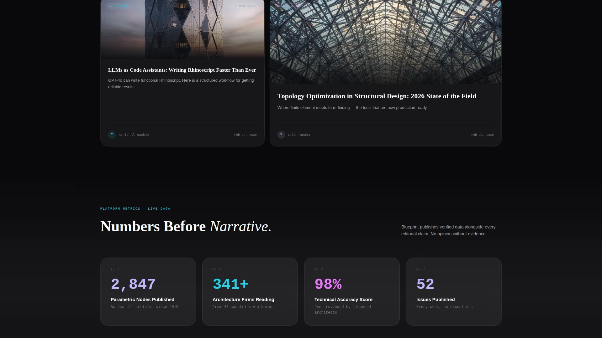
Every major scroll depth opens with a hard number before the content it describes is shown. A figure like "89% of competition-winning entries now use AI in concept phase" appears first, then the full editorial piece unfolds beneath it. This pulse-then-breathe rhythm creates a dopamine hit followed by satisfying editorial depth.
Floating App Download Pill
A persistent floating pill call to action reading "Read Offline in the App" appears after the second scroll event. It stays visible without blocking content, giving motivated readers a constant low-friction path to download the app at any point during their session.
Full-Width Interstitial Conversion Block
After the third article card, a full-width interstitial interrupts the scroll with a focused conversion moment. Tapping or clicking opens a two-field form asking for an email address and a platform toggle between iOS and Android. This placement targets readers who are already engaged by the content before asking them to commit.
Secondary Email Capture Path
A secondary conversion path lets visitors subscribe to a weekly editorial brief using email alone. This option sits alongside the app download flow and captures readers who are not yet ready to install the app but are already engaged by the content and metrics on screen.
Page sections overview
| Section | Purpose |
|---|---|
| Dashboard Header Grid | Displays live-style blog metrics in large monospaced type as the visual hero |
| Bento Article Cards | Tiles article previews with glassmorphic overlays showing read time and tags |
| Stat Reveal Block | Opens each scroll depth with a hard number before the supporting editorial content |
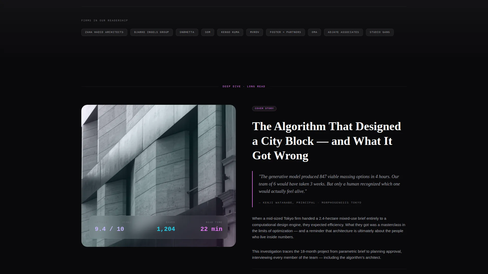
| Editorial Spread | Full-width section pairing parametric illustrations with long-form article content |
| Floating App Pill | Persistent call-to-action pill for app download, visible after second scroll |
| Interstitial Sign-Up | Full-width conversion block with two-field form after the third article card |
| Weekly Brief Capture | Secondary email-only sign-up for readers not ready to install the app |
Design & branding system
Blueprint uses a Tech Glass visual identity built around the AI Iridescent color system. The palette feels clinical at rest and suddenly alive with spectral color the moment the interface responds to interaction.
- Void black (#09090B) forms the base, frosted glass panels use white at 6% opacity over a blur, and iridescent lilac (#C4B5FD) and shifting cyan (#22D3EE) define the primary accent range
- Hot magenta (#E879F9) is reserved exclusively for live data pulses and hover states, keeping it visually potent
- Typography is monospaced for all metric displays, reinforcing the dashboard aesthetic and separating data from editorial prose
Mobile & speed optimization
The landing page layout is built with a single-column scroll flow that translates naturally to smaller screens. The bento grid and floating pill components are designed to reflow cleanly without losing the dashboard character of the desktop experience.
- The glassmorphic overlays and iridescent accent treatments are applied in a way that keeps the layout legible on mobile viewports
- The floating app download pill remains usable on touch screens without obscuring content below it
How this template helps you convert
Blueprint is structured to move readers from passive browsing to active sign-up through a sequenced conversion architecture built into the page flow.
- The stats-first header establishes authority instantly, so readers trust the publication before they read a single article, reducing early exit rates
- The floating app pill and full-width interstitial appear at precisely the moments when reader engagement is highest, giving both committed and casual visitors a relevant conversion offer at the right time
Other information about this template
Blueprint is a strong fit for architecture firm blogs that want a landing page reflecting the same level of conceptual rigour as their published writing. It sits comfortably in the architecture firm website templates category and carries clear signals for the computational design and generative AI audience.
- The template falls under the Technology category with a subcategory focus on architecture firm website templates
- The niche is architecture firm blog pages, making it a focused choice rather than a general-purpose portfolio or firm homepage
- The page type is a single landing page, not a multi-page website, so it is best deployed as a dedicated blog hub or content index page
- Teams looking for inspiration from studios known for pushing the boundaries of digital design and parametric architecture will find the visual language immediately familiar and credible
Theme
Tech Glass
Creative direction
Stats-First Impact
Color system
AI Iridescent
Style
Dashboard/Data Grid
Direction
App Download
Page Sections
Stats-first Dashboard Header
Bento Article Grid Layout
Scroll-triggered Stat Reveals
Floating App Download Pill
Full-width Interstitial Form
Secondary Weekly Brief Sign-up
Related questions
Is Blueprint designed for a single landing page or a full website?
Can I update the metric numbers shown in the dashboard header?
What are the two conversion paths built into this template?
Does the template come with article content and parametric illustrations?
What kind of architecture firm is this template best suited for?



