Architecture Firm Software Provider Directory Website Template
Blueprint is a single-page comparison landing page built for architecture firm social media management services. It features a feature matrix that stacks the service against in-house effort and generic agencies, a product screenshot hero, and a click-through conversion flow. The Slate & Sky color system and Directory & Discovery theme give it the sharp, organized feel of a well-kept plan drawer.
by Rocket studio
Quick summary
Blueprint is a focused comparison table landing page designed for architecture firm social media management services. It uses a structured feature matrix, a product screenshot header, and a two-stage call-to-action flow to move visitors from curiosity to click. The design speaks the language of architecture: precise, layered, and intentionally composed.
Who this template is for
This template is built for service providers who market directly to architecture firms and design studios. It works best when the audience already understands design thinking but needs a clear reason to choose your service over alternatives.
- Studio principals at architecture firms who manage their own social presence
- Marketing coordinators at mid-size firms juggling client deadlines alongside content output
- Emerging practices with strong project photography but no consistent social media strategy
What problem this template solves
Architecture firms often produce exceptional work that never reaches the right audience online. The challenge is not a lack of content; it is the absence of a system that translates design expertise into platform-ready posts.
- Generic social media agencies do not understand construction timelines, award submissions, or design community hashtags
- In-house teams lack the tools and bandwidth to repurpose project photography consistently
- Visitors arriving at a service page need evidence, not promises, before they will click toward pricing
What you get with this template
You get a single landing page that does its persuasion work through structure rather than copy volume. The layout is clean, the comparison is honest, and the conversion path is direct.
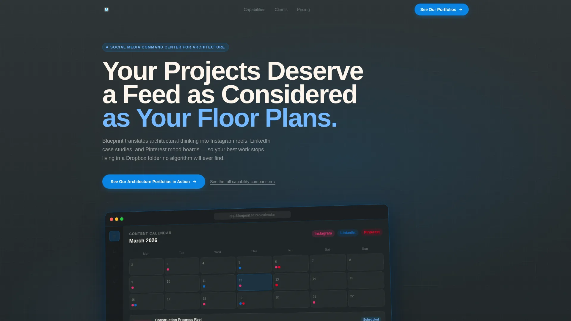
- A product screenshot hero section with a real content calendar visual and a headline that fades in on load
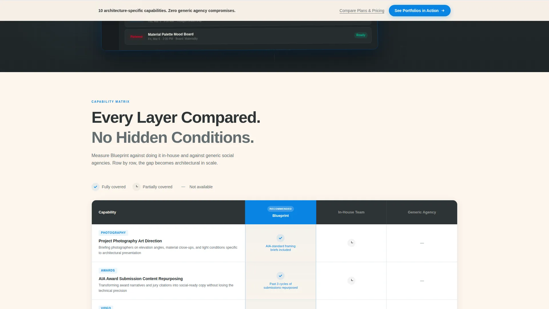
- A full feature matrix comparing the service against in-house management and generic social agencies
- A sticky bottom call-to-action bar that appears after 60 percent scroll depth, plus a pinned button at the table footer
Feature list
This template is built around a small number of high-impact components. Each one serves the comparison and click-through objectives described in the brief.
Architecture-Specific Feature Matrix
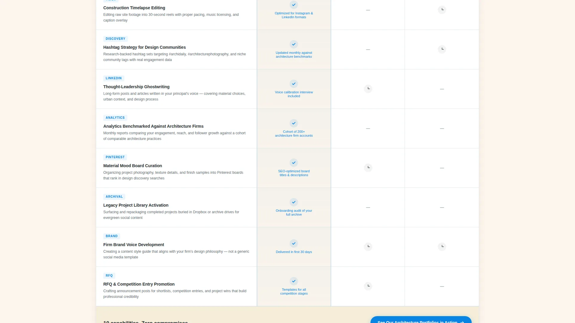
The core of the page is a structured comparison table with rows covering architecture-relevant capabilities. Rows include project photography art direction, construction timelapse editing, AIA award submission content repurposing, hashtag strategy for design communities, LinkedIn thought-leadership ghostwriting, and analytics benchmarked against other architecture firms. Each row carries a cerulean checkmark in the service column and honest gray dashes for alternatives.
Product Screenshot Hero
The header opens with a pixel-perfect platform dashboard screenshot showing a live content calendar. The screenshot sits on a deep charcoal surface with a soft cerulean browser-chrome glow and is angled five degrees to add visual depth. A single headline fades in above the image.
Two-Stage Call-to-Action Flow
The primary call-to-action button reads "See Our Architecture Portfolios in Action" and routes visitors to a gallery of before-and-after firm feed screenshots. A secondary text link reading "Compare Plans & Pricing" sits directly beneath it for visitors already ready to move forward. There is no form on this page.
Sticky Bottom Bar
After a visitor reaches 60 percent scroll depth, a sticky bottom bar appears carrying the primary call-to-action. This keeps the conversion path visible without interrupting the matrix reading experience.
Directory & Discovery Theme
The page layout follows a Directory & Discovery theme, organizing information the way a well-labeled plan drawer organizes drawings. Every section has a clear visual hierarchy, and the table structure ensures visitors can scan rows quickly without losing their place.
Page sections overview
| Section | Purpose |
|---|---|
| Hero Screenshot Header | Establishes product credibility with a real dashboard visual and a fade-in headline |
| Feature Comparison Matrix | Lets visitors measure the service against in-house effort and generic agencies row by row |
| Matrix Footer call to action | Pins the primary call-to-action button directly below the final comparison row |
| Secondary Text Link | Offers a direct path to pricing for visitors already convinced by the matrix |
| Sticky Bottom Bar | Keeps the primary call to action visible after 60 percent scroll depth without blocking content |
Design & branding system
The Slate & Sky color system gives the page the feel of a crisp morning on a rooftop terrace: cool concrete underfoot, sharp edges against a clear sky, and every detail reading with quiet confidence.
- Charcoal (#2D3436) anchors headers and table borders; architectural blue-gray (#636E72) carries body text and secondary labels
- Open-sky cerulean (#0984E3) activates on buttons, toggle states, and checkmarks to draw the eye to key decisions
- Vellum white (#FDF6EC) fills table cells and card backgrounds so the data layout stays open and readable
Mobile & speed optimization
The comparison table layout is designed to remain scannable on smaller screens without losing the row-by-row logic that makes the matrix persuasive.
- Table rows are structured so that column labels stay visible as a reference point while scrolling vertically
- The sticky bottom bar is positioned to avoid obscuring table content on mobile viewports
How this template helps you convert
The page is built around a single conversion goal: earn the click to the portfolio gallery or the pricing page. Every layout decision supports that goal.
- The feature matrix accumulates evidence row by row, so by the final row the gap between the service and its alternatives feels substantial and specific rather than claimed
- The sticky bottom bar and pinned footer button ensure the call-to-action is always within reach without requiring the visitor to scroll back up
- Removing the form from this page lowers friction; the click to the next page is the only commitment asked, which means visitors arrive at pricing already engaged
Other information about this template
Blueprint is part of a broader set of landing page templates designed for technology and software services targeting professional creative industries. It is particularly well-suited for architecture firm software and social media management tools where the buyer is visually literate and skeptical of generic marketing claims.
- The template style is a Comparison Table, making it reusable for any service that benefits from a structured side-by-side evaluation
- The lp_direction is Click-Through, meaning the page is optimized to earn a navigational action rather than a form submission
- The header concept is a Product Screenshot, which works well for any platform or dashboard-based service that can show a real, populated interface
- The creative direction is a Feature Matrix, a format proven to build trust with detail-oriented buyers who want to evaluate before they commit
Theme
Directory & Discovery
Creative direction
Feature Matrix
Color system
Slate & Sky
Style
Comparison Table
Direction
Click-Through
Page Sections
Architecture-specific Comparison Matrix
Product Screenshot Hero Section
Two-stage Call-to-action Flow
Sticky Scroll-triggered Bottom Bar
Slate & Sky Visual Identity
Related questions
Can I adapt this template for a service outside architecture?
Does this template include a contact form or lead capture?
How many rows can the feature matrix support?
When does the sticky bottom bar appear?
What makes this template suited to architecture firm buyers specifically?



