Blueprint - Precision Architecture Landing Page Template
Blueprint is a dashboard-style landing page template built for architecture scheduling software. It combines an interactive booking grid preview, a data-driven industry report scroll flow, and a sticky comparison table to turn studio managers, practice directors, and solo architects into confident sign-ups. Every section is designed to diagnose a real scheduling problem and make the solution feel obvious.
by Rocket studio
Quick summary
Blueprint is a single-page landing page template purpose-built for an architecture booking and scheduling system. It opens with a live, draggable project grid, walks visitors through a consulting-report-style scroll flow, and anchors conversion with a sticky comparison table. The design runs on a Monochrome Steel palette that feels precise, professional, and entirely at home in the architecture industry.
Who this template is for
This template is built for teams selling scheduling or resource management tools to architecture practices. It speaks directly to the people inside those studios who feel the cost of disorganization every week.
- Studio managers running multiple active projects across different time zones who need a single resource view
- Practice directors who must review utilization rates before weekly resourcing meetings
- Solo architects who lose significant time each week to scheduling admin and calendar management
What problem this template solves
Architecture studios lose billable hours every month to scheduling friction. Email threads, shared spreadsheets, wall calendars, and project management tool workarounds create a fragmented picture that no one fully trusts.
- Consultants get double-booked or left idle because availability data lives in different places
- Client review sessions fall through the gaps when no single calendar owns the full project timeline
- Practice leaders cannot make confident resourcing decisions without a clear, real-time utilization view
What you get with this template
You get a complete, conversion-focused landing page that mirrors the precision your audience already values. Every section is structured to move a skeptical studio manager from "this looks familiar" to "I need this."
- An interactive booking grid header that visitors can drag and rearrange in real time
- An industry report scroll flow with stat cards, side-by-side workflow comparisons, and utilization dashboards
- A sticky comparison table covering twelve architecture-specific criteria, plus a two-step sign-up form
Feature list
This template is built around four core capabilities drawn directly from the source brief. Each one earns its place on the page.
Interactive Booking Grid Header
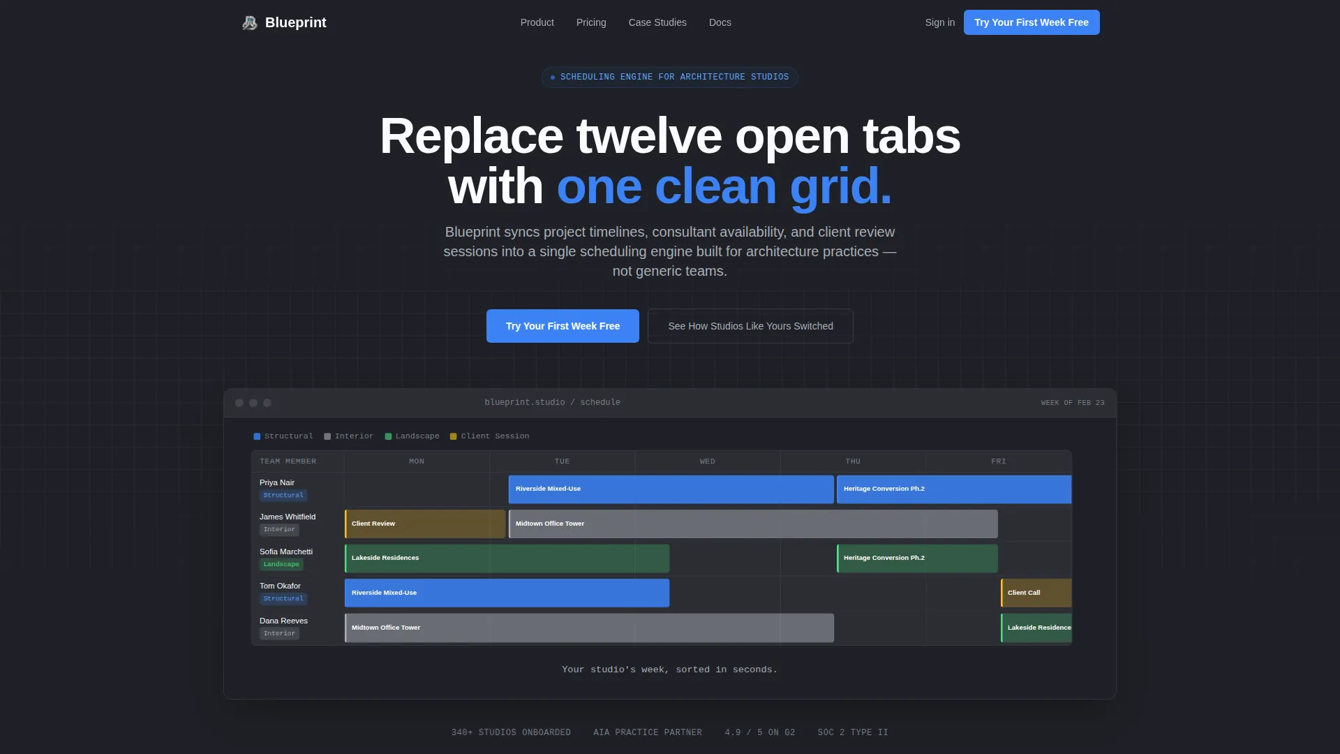
The header renders a fictional studio week at 70 percent scale. Project rows show names like "Riverside Mixed-Use" and "Heritage Conversion Ph.2." Team members appear color-coded by discipline: structural, interior, and landscape. A pulsing cursor demonstrates drag-and-drop interaction automatically for three seconds before the visitor touches anything. A single line then appears above the grid: "Your studio's week, sorted in seconds."
Industry Report Scroll Flow
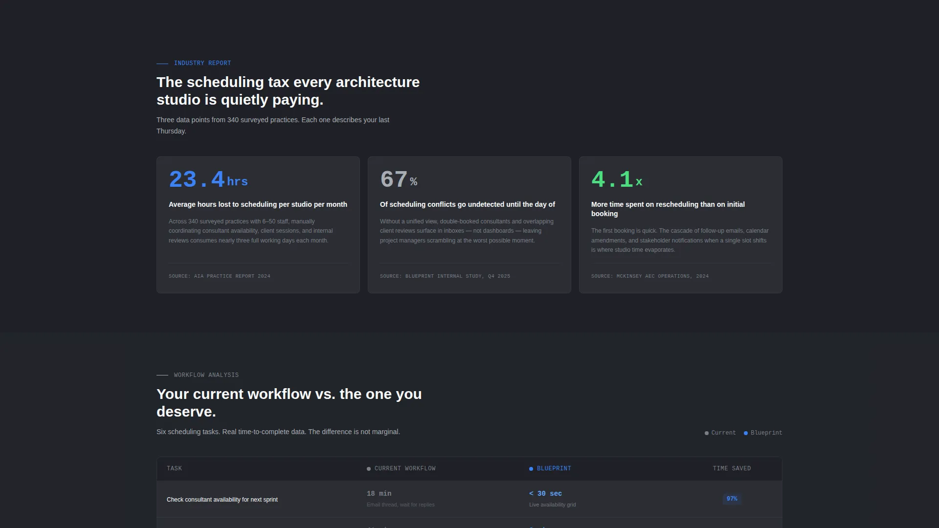
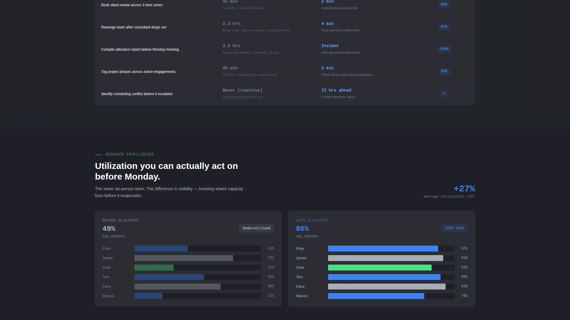
Three sequential scroll sections present data-backed insights that reframe how architecture practices lose time. The first shows a sourced stat card on average scheduling hours lost per studio per month. The second is a side-by-side grid comparing current workflows against the system's single-pane view, with time-to-complete metrics for each task. The third reveals before-and-after utilization dashboards. The pacing feels like a consulting report that keeps diagnosing exactly the reader's problem.
Sticky Comparison Table
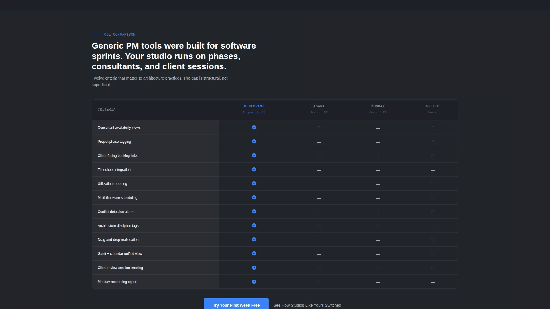
A comparison table anchors the middle of the page and stays visible as visitors scroll. It pits the scheduling system against generic project management tools and manual methods across twelve architecture-specific criteria. Criteria include consultant availability views, project phase tagging, client-facing booking links, timesheet integration, utilization reporting, and seven additional practice-relevant factors.
Two-Step Sign-Up Form
The primary call to action, "Try Your First Week Free," opens a two-step form. Step one captures studio name and size using three bands: 1 to 5 people, 6 to 20, and 21 or more. Step two captures work email and the primary project management tool currently in use. The form is lightweight and low-friction by design.
Floating Conversion Bar
A floating bar activates after the visitor reaches 60 percent scroll depth. It carries the same primary call to action and keeps the conversion path visible without interrupting the reading flow. This ensures the offer stays reachable at the exact moment a visitor is most persuaded.
Case Study Carousel Path
A secondary conversion path, labeled "See How Studios Like Yours Switched," links to a case study carousel. It catches visitors who are not yet ready to sign up but are willing to be convinced by real studio outcomes. This path reduces drop-off among high-intent but cautious buyers.
Page sections overview
| Section | Purpose |
|---|---|
| Interactive Grid Header | Demonstrates live booking interaction and sets the product's core value immediately |
| Stat Card Section | Anchors the business case with a sourced data point on scheduling hours lost |
| Workflow Comparison Grid | Shows task-by-task time costs of current methods versus the single-pane view |
| Utilization Dashboard Section | Visualizes before-and-after resource allocation to make the efficiency gain tangible |
| Sticky Comparison Table | Evaluates the system against generic tools across twelve architecture-specific criteria |
| Primary call to action Block | Delivers "Try Your First Week Free" with the two-step sign-up form |
| Floating Scroll Bar | Keeps the call to action visible after 60 percent scroll depth |
| Case Study Carousel | Offers a secondary path for visitors who need social proof before committing |
Design & branding system
The visual identity follows a Dashboard Pro theme using a Monochrome Steel color system. Every color choice reinforces the feeling of precision tooling rather than decorative software.
- Structural charcoal (#2B2D33) covers primary backgrounds; brushed aluminum (#A8ADB5) handles secondary panels and divider lines; bright white (#FAFBFC) fills data cells and card surfaces
- Signal blue (#3B82F6) appears exclusively on interactive elements, active states, and calls to action, keeping the eye drawn only to things that can be clicked or engaged
- The overall palette is described as a milled steel ruler on a black desk: no warmth, no decoration, just the confidence of a system that knows exactly what it is doing
Mobile & speed optimization
The template is built to hold its precision layout across device sizes. The dashboard-style grid and data-heavy sections are structured to remain readable and functional on smaller screens.
- The interactive booking grid scales and reflows so that project rows and team color-coding remain distinguishable on tablet and mobile viewports
- The sticky comparison table adapts its layout so that the twelve criteria remain easy to scan without horizontal overflow on narrower screens
- The floating conversion bar is designed to stay unobtrusive on mobile while remaining tappable and clearly visible
How this template helps you convert
Every structural decision in this template is aimed at moving a skeptical architecture professional toward the call to action. The page builds a layered case rather than asking for a commitment cold.
- The interactive header creates immediate product comprehension. Visitors understand what the scheduling system does within seconds, before reading a single line of body copy.
- The industry report scroll flow builds a data-grounded argument section by section. By the time a visitor reaches the comparison table, the cost of their current workflow has already been established in concrete terms.
- The dual conversion path covers two buyer states at once. The "Try Your First Week Free" call to action catches visitors ready to act, while the case study carousel holds those who need one more reason to trust the product.
Other information about this template
This template sits at the intersection of Architecture Vertical SaaS and a Dashboard or Data Grid template style. It is designed for technology products targeting architecture and built-environment professionals.
- The template follows a Comparison or Versus landing page direction, which is well suited to markets where buyers are actively evaluating multiple tools before making a switch
- The creative direction uses an Industry Report rhythm, which works particularly well for B2B audiences in professional services who expect data and evidence before committing
- The header concept is an Interactive Preview, a format that lets the product demonstrate its own value without relying on written claims alone
- This template can support a product positioned against both established generic project management platforms and informal manual workflows, making the comparison table especially effective for Architecture Vertical SaaS positioning
Theme
Dashboard Pro
Creative direction
Industry Report
Color system
Monochrome Steel
Style
Dashboard/Data Grid
Direction
Comparison/Versus
Page Sections
Live Draggable Booking Grid
Industry Report Scroll Sections
Sticky Twelve-criteria Comparison Table
Two-step Low-friction Sign-up Form
Floating Scroll-depth Conversion Bar
Case Study Carousel Secondary Path
Related questions
Who is this landing page template designed for?
Can I customize the project names and team members shown in the header grid?
What does the two-step sign-up form collect?
Does the comparison table cover architecture-specific criteria?
What is the secondary conversion path for visitors not ready to sign up?



