Architecture Firm Pricing & Packages Website Template
Blueprint is a bento grid landing page template built for architecture firms that lead with transparent, flat-fee pricing. It presents three service tiers side by side, uses a dark Midnight Blue palette with blueprint cyan accents, and guides visitors from social-proof logo bar to a qualifying intake form. The result feels less like a firm brochure and more like a confident product pitch.
by Rocket studio
Quick summary
Blueprint is a single-page, bento grid pricing layout designed for architecture firms that publish every fee upfront. The template combines staggered tier cards, a side-by-side billing comparison, a live cost calculator tile, and a pinned call-to-action button. It is built to turn skeptical, change-order-burned clients into qualified leads before they leave the page.
Who this template is for
This template speaks directly to architecture practices that have decided transparency is a competitive advantage, not a risk. If your firm charges flat fees and wants a page that proves it instantly, Blueprint was made for you.
- Startup founders converting warehouses or raw commercial space into functional headquarters
- Restaurateurs and boutique developers who need firm cost certainty before committing to a design contract
- Residential developers who have been surprised by change orders and now demand a number before the first sketch
What problem this template solves
Most architecture firm websites bury pricing behind contact forms and discovery calls. That friction costs firms qualified leads and costs clients trust. Blueprint removes that friction entirely.
- Visitors cannot find fee structures on traditional firm sites, so they leave before engaging
- Hourly billing with opaque scope makes budget planning nearly impossible for project owners
- Without a clear comparison, clients cannot see why flat-fee architecture is worth the commitment
What you get with this template
You get a complete, single-page pricing layout that does the sales work before a human ever picks up the phone. Every section serves a specific conversion role, and nothing is decorative without purpose.
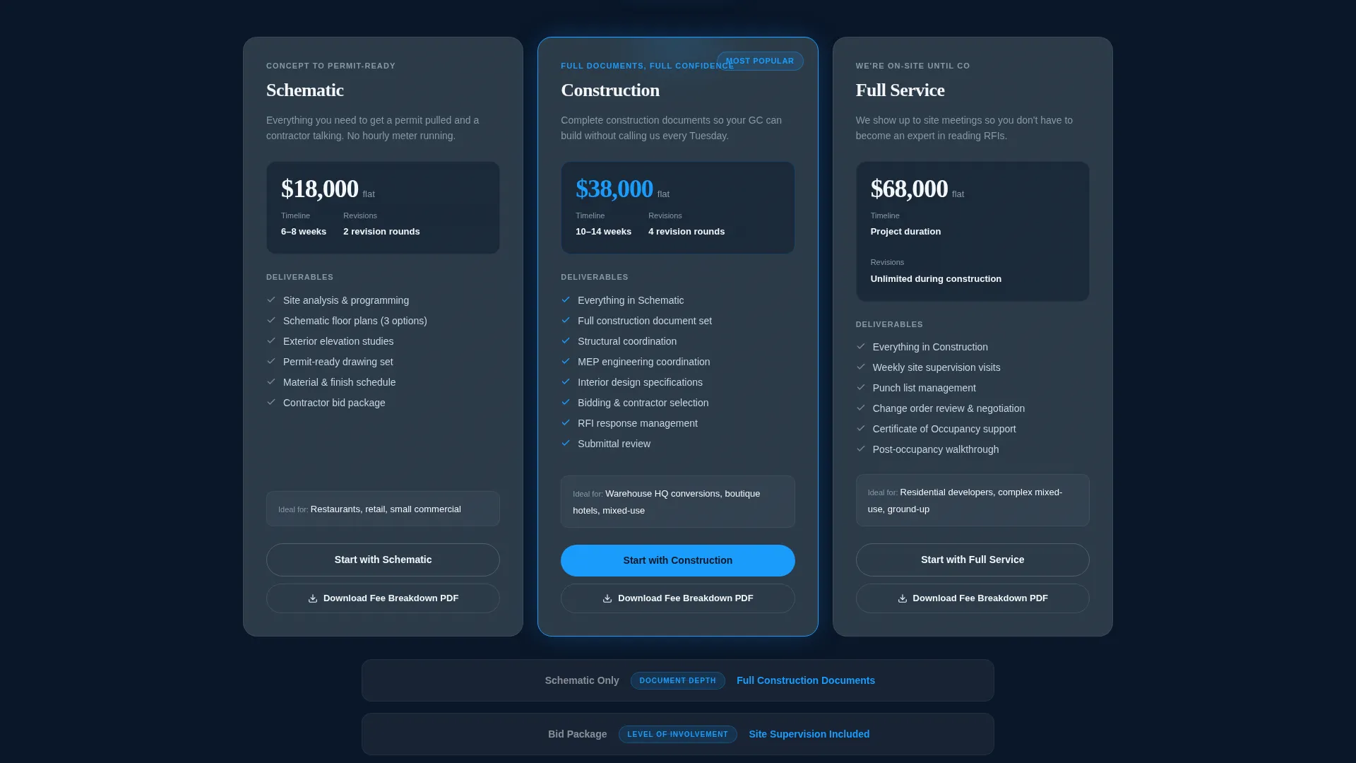
- A three-tier bento grid with scope, deliverables, and revision counts displayed per card
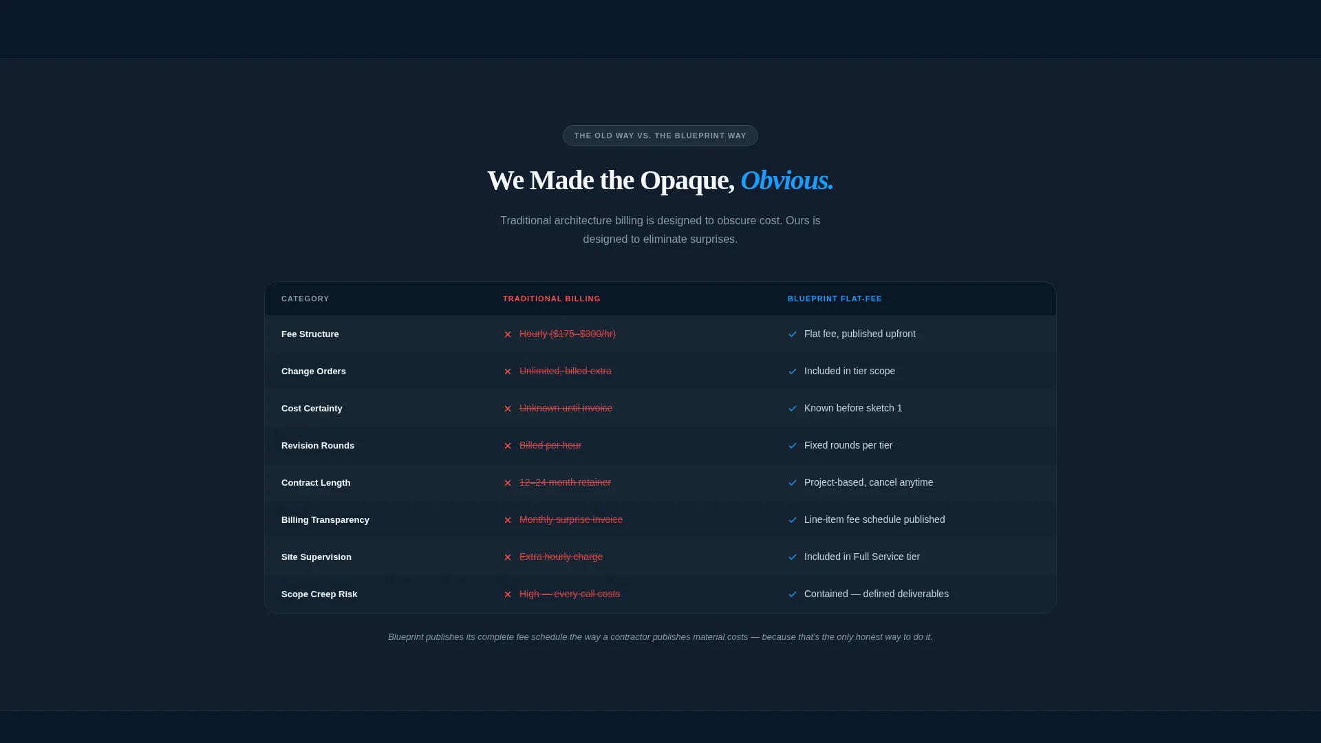
- A side-by-side comparison table with red strikethroughs on traditional hourly billing and cyan checkmarks on the flat-fee model
- A qualifying intake form with project type selector, square footage slider, and timeline options
Feature list
This section covers the core built-in components that make Blueprint functional as a pricing and lead-generation page.
Bento Grid Pricing Tiers
Three dark-surface tier cards snap into view with staggered micro-animations. Each card displays scope, deliverables, and revision counts in clean white type, with cyan connector lines mapping the escalation between tiers.
Versus Comparison Table
A full-width side-by-side table contrasts traditional architecture billing against the flat-fee model. Red strikethroughs mark the old way; cyan checkmarks confirm the new approach. The contrast is immediate and visual.
Live Cost Calculator Tile
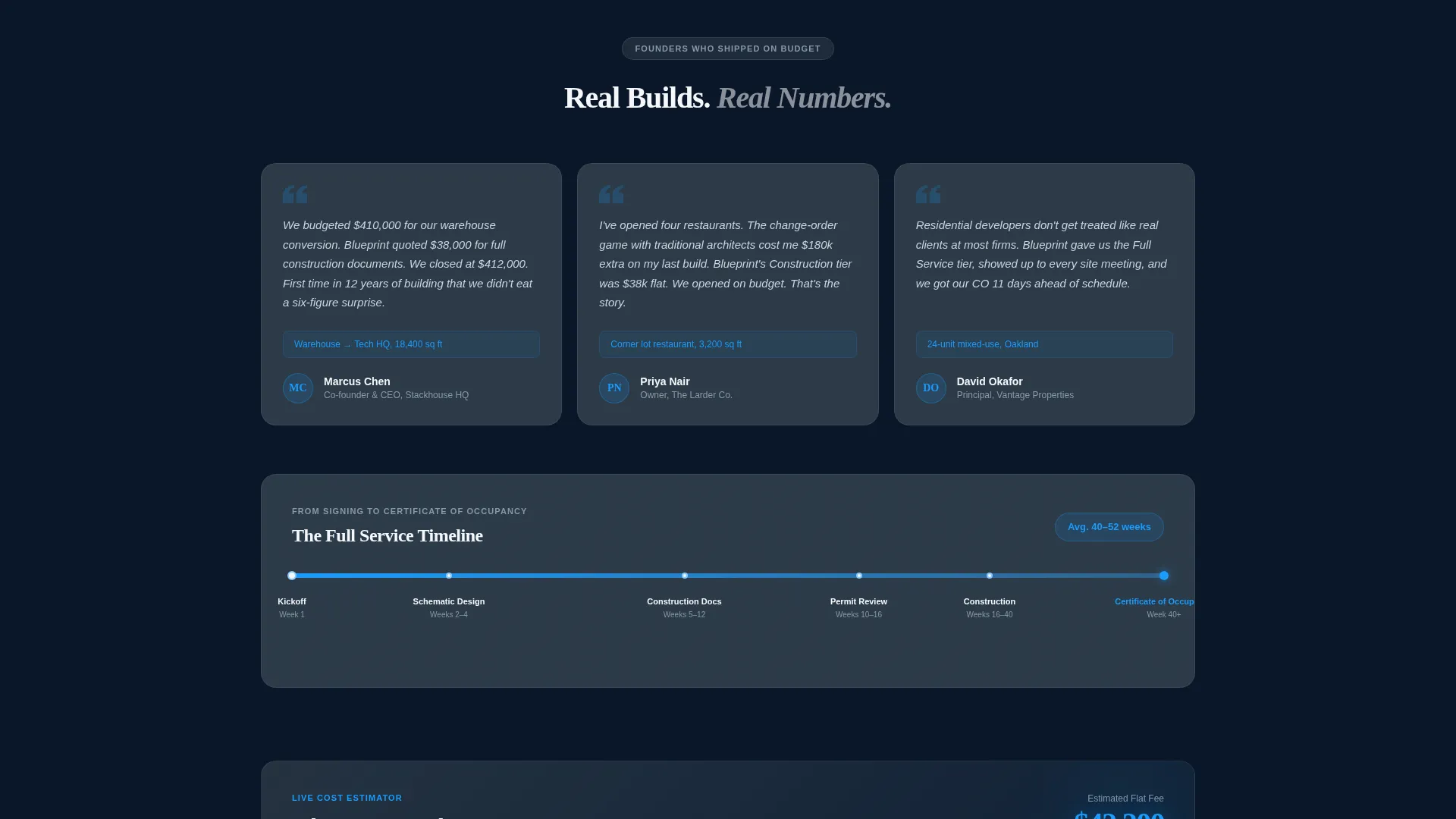
An interactive bento cell lets visitors input their project parameters and see an estimated cost update in real time. It gives potential clients a concrete number to carry into the conversation.
Pinned Tier Selection call to action
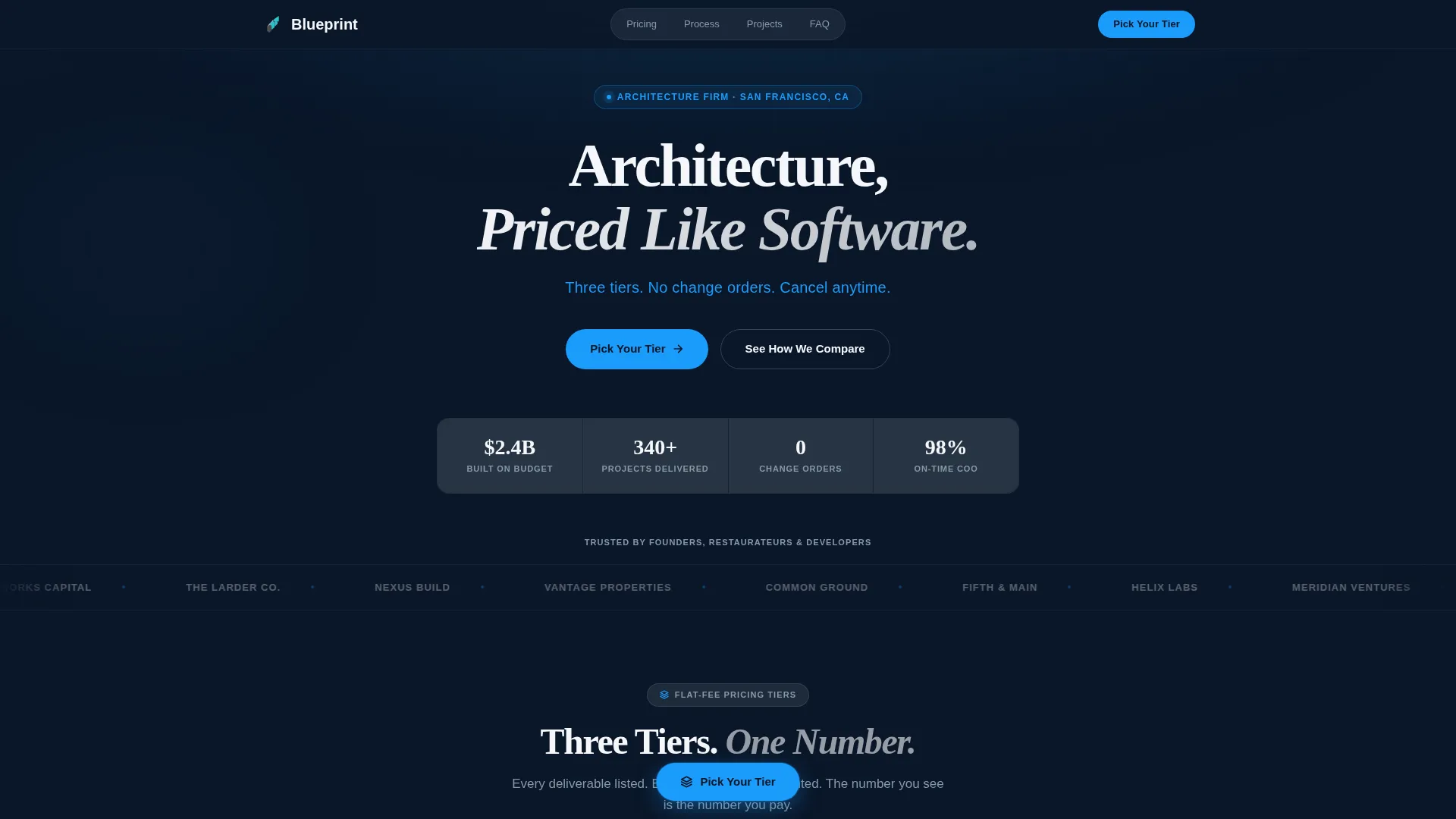
Once the pricing grid scrolls into view, a cyan pill button labeled "Pick Your Tier" pins to the bottom of the viewport. It stays visible throughout the scroll, reducing the distance between decision and action.
Qualifier Intake Form
A short form captures project type (commercial, residential, or mixed-use), square footage via a range slider, and a preferred timeline. It qualifies leads before they book a call, saving time on both sides.
Client Logo Bar with Social Proof Header
A slow-scrolling horizontal logo bar displays recognizable client names in monochrome white against the deep navy background. Above it, the oversized headline and cyan subline establish credibility and tone before the visitor reads a single word of copy.
Page sections overview
| Section | Purpose |
|---|---|
| Logo Bar Header | Establish credibility through client social proof |
| Headline and Subline | Communicate the flat-fee value proposition immediately |
| Three-Tier Pricing Grid | Compare scope and deliverables across service levels |
| Versus Callouts | Highlight what separates each pricing tier |
| Billing Comparison Table | Show the contrast between hourly and flat-fee models |
| Client Testimonials | Reinforce budget reliability with founder proof |
| Cost Calculator Tile | Let visitors estimate project cost interactively |
| Project Timeline Cell | Map the journey from signing to occupancy certificate |
| Qualifier Intake Form | Capture lead details and project parameters |
| Secondary PDF call to action | Collect emails from visitors not ready to commit |
Design & branding system
The visual identity follows a Startup Velocity theme rendered in a Midnight Blue color system. Every color choice is intentional, channeling the feeling of a pitch deck projected in a dark conference room.
- Deep terminal navy (#0A1628) as the primary background, architectural graphite (#2C3A47) for card surfaces, and exposed white (#F5F7FA) for all body text and divider lines
- Blueprint cyan (#1B9CFC) reserved for interactive elements: pricing toggles, hover states, connector lines, the pinned call to action button, and checkmarks in the comparison table
- Typography uses oversized white headlines paired with cyan sublines to create a clear visual hierarchy that guides the eye from credibility to conversion
Mobile & speed optimization
Blueprint is structured so that the bento grid collapses gracefully across screen sizes. The layout prioritizes content clarity at every breakpoint.
- Tier cards stack vertically on smaller screens, preserving the full scope and deliverable detail without horizontal scrolling
- The pinned call to action button remains anchored at the bottom of the viewport on mobile, keeping the primary action reachable at all times
- The qualifier form fields are sized and spaced for thumb-friendly interaction on touch devices
How this template helps you convert
Blueprint is built around a single conversion principle: make the new pricing model feel inevitable by making the old model look costly and unpredictable.
- The logo bar and headline establish authority in the first viewport, so visitors arrive at the pricing grid already trusting the firm rather than questioning it.
- The versus comparison table and cyan-versus-red visual treatment do the persuasion work silently, letting the data make the case without a single line of sales copy.
- The pinned call to action and secondary PDF download button give visitors two commitment levels to choose from, capturing both ready-to-book leads and early-stage researchers in one pass.
Other information about this template
Blueprint is a strong fit for any firm that wants its pricing page to function like a product landing page rather than a traditional portfolio site. The template style is bento grid, the creative direction is Launch Energy, and the header concept is Logo Bar.
- The template is categorized under Architecture Firm Website Templates within the Technology category on the marketplace
- The Comparison/Versus landing-page direction means every section builds toward a clear choice, not an open-ended inquiry
- The Startup Velocity theme makes this layout equally at home for tech-forward design studios, commercial interior practices, or any firm positioning itself as the modern alternative to legacy billing
Theme
Startup Velocity
Creative direction
Launch Energy
Color system
Midnight Blue
Style
Bento Grid
Direction
Comparison/Versus
Page Sections
Bento Grid Pricing Tier Cards
Versus Billing Comparison Table
Interactive Cost Calculator
Pinned Viewport Call to Action Button
Qualifier Intake Form
Scrolling Client Logo Bar
Related questions
Can I edit the pricing tiers to match my firm's actual fee structure?
Does the cost calculator tile require custom coding to configure?
Is this template suitable for a residential-only architecture practice?
How does the secondary PDF download call to action work?
Can this template support a firm that handles both commercial and residential projects?



