Sports Digital Presence Careers & Recruitment Website Template
Board is a dynamic sports job board landing page template built for the sports industry. It combines a Feature Tab Switcher header, a modular card grid layout, and a Comparison/Versus conversion architecture to serve job seekers, employers, and recruiters. The Slate and Sky color system gives every section a sharp, press-box energy that keeps serious sports professionals moving toward action.
by Rocket studio
Quick summary
Board is a single-page sports job board template designed around one goal: making the right hire happen faster. It opens with a tab-driven header that reshuffles content for three distinct audiences. Every section below scrolls like a scouting report, isolating one advantage per module and backing it with real numbers. The result is a landing page that earns trust before it asks for a click.
Who this template is for
This template is built for anyone operating at the intersection of sports and talent. Whether you are launching a niche job platform or validating a product concept, the layout gives your audience exactly what they need to act.
- Sports industry employers such as athletic departments, stadium operators, and sports tech startups looking to post roles and attract qualified candidates
- Job seekers in sports careers including kinesiology graduates, former collegiate athletes pivoting into front-office roles, and senior executives exploring franchise moves
- Sports agents and independent recruiters who manage candidate pipelines and need a dedicated portal view with placement metrics
What problem this template solves
Generic job boards force sports professionals to filter through irrelevant results. There is no sport-specific context, no salary transparency, and no way to signal niche expertise. This template is structured to fix that immediately.
- Sports employers struggle to reach candidates who understand the industry, and this layout leads with verified credentials, league-level sorting, and contract-type tagging
- Candidates waste time on platforms that treat a head strength coach and a software developer as identical profiles, so the tab-based architecture separates each audience from the first second
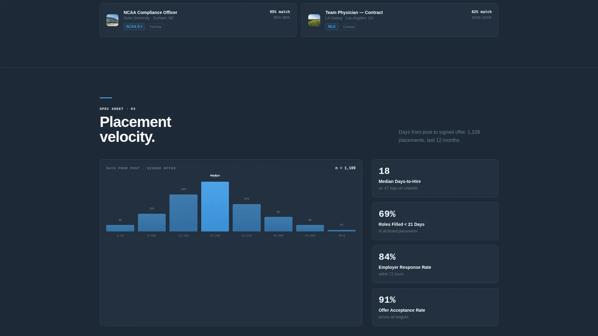
- Recruiters and agents lack a dedicated view on most job platforms, and this template solves that with a dedicated recruiter tab showing placement velocity metrics
What you get with this template
You get a fully structured, modular card grid landing page ready to represent a sports-specific job platform. Every section is pre-built as a discrete module with a clear informational purpose.
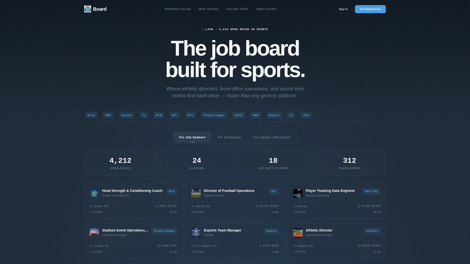
- A Feature Tab Switcher header with three tabs (For Job Seekers, For Employers, For Agents/Recruiters) each revealing a distinct card layout with physics-based tab transitions
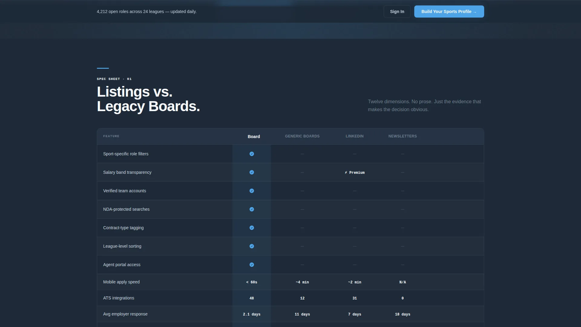
- A twelve-row platform comparison table that benchmarks the board against generic job sites, social networks, and industry newsletters across dimensions like salary transparency, NDA-protected searches, and free-tier listing limits
- A sticky bottom bar holding the active call to action so it stays within reach at all times, plus contextual primary calls to action that swap based on the last active tab
Feature list
This section covers the core functional components built into the Board template.
Feature Tab Switcher Header
The header opens with three tabs: For Job Seekers, For Employers, and For Agents/Recruiters. Each tab reveals a different card layout beneath it. Switching tabs triggers a fast, physics-based animation that reshuffles the cards without a page reload. The default Job Seeker tab displays a live-data spec sheet showing 4,212 open roles, leagues represented, 18-day average time to hire, and a mini-grid of six job cards with team logos, salary bands, and location pins.
Twelve-Row Comparison Table
The comparison module is the central conversion engine on the page. It places the platform side by side against three incumbent options across twelve rows: sport-specific filters, salary transparency, verified team accounts, NDA-protected searches, contract-type tagging, league-level sorting, agent portal access, mobile apply speed, applicant tracking system integration count, average employer response time, candidate anonymity options, and free-tier listing limits. Every cell contains a checkmark, a number, or a dash. No prose, no persuasion, just evidence.
Contextual call to action Architecture
The primary call to action switches based on the tab last active in the header. Employers see "Post Your First Role Free" and candidates see "Build Your Sports Profile." A sticky bottom bar holds whichever call to action is active so it is always accessible. The comparison table ends with a row-level "Switch to Board" prompt that triggers a one-field email capture and an import wizard.
Salary Data Conversion Gate
A secondary conversion path unlocks the compensation benchmarking tool after free registration. The "See Salary Data" gate turns passive browsers into activated accounts by offering something of immediate value. This converts curiosity-driven traffic without requiring a hard sell.
Modular Spec Sheet Scroll
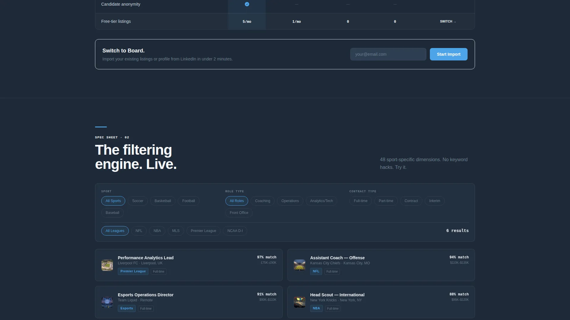
Below the header, every scroll section is a discrete module card. Each card isolates one competitive advantage and anchors it with hard numbers. One card zooms into the filtering engine with an interactive demo. Another shows a placement velocity histogram of days from post to signed offer. The layout feels like flipping through a scouting report where each page sharpens the decision.
Page sections overview
| Section | Purpose |
|---|---|
| Tab Switcher Header | Segments three audience types and surfaces relevant card grids per tab |
| Live Data Spec Sheet | Shows open role count, leagues, time-to-hire stats, and six sample job cards |
| Listings versus. Legacy Boards | Twelve-row comparison table benchmarking platform against three competitors |
| Filtering Engine Demo | Interactive module showcasing sport-specific filter capabilities |
| Placement Velocity Card | Histogram of days from job post to signed offer |
| Sticky call to action Bar | Keeps active call to action accessible throughout the full page scroll |
Design & branding system
The visual identity follows a Startup Velocity theme built on the Slate and Sky color system. The palette references a pre-dawn stadium viewed from the press level: dark steel structure everywhere, then that first crack of blue sky over the upper deck.
- Deep charcoal slate (#1E2A38) fills roughly seventy percent of the screen as the dominant background, press-box gray (#6B7D8D) handles secondary text and card borders, and chalk-line white (#F7F9FC) is used for card surfaces and headline text
- Stadium-sky blue (#4DA3E8) appears only on active and interactive elements including primary buttons, hover states, toggles, notification badges, and progress bars, making every clickable element feel like a scoreboard lighting up
- No stock photography is used anywhere; every visual element is functional information presented through cards, tables, stats, and data grids
Mobile & speed optimization
The card grid layout is built modular so each section stacks cleanly on smaller screens. The sticky bottom bar is designed with thumb reach in mind, keeping the primary call to action accessible without scrolling back to the top.
- The tab switcher and card grid reflow gracefully for mobile viewports, ensuring the comparison table and job card mini-grid remain readable at smaller sizes
- Physics-based tab animations are kept intentionally fast so switching between audience views feels immediate rather than sluggish on any device
How this template helps you convert
The Comparison/Versus conversion architecture turns the page itself into the sales argument. Every section builds a case before the call to action appears.
- The twelve-row comparison table removes objections methodically by showing hard evidence across every relevant dimension, so by the time a visitor reaches the row-end call to action, the decision feels obvious rather than pressured
- The contextual call to action system ensures employers and candidates never see the wrong prompt, and the sticky bottom bar means the right action is always one tap away no matter how deep into the page a visitor scrolls
- The salary data gate creates a low-friction secondary conversion path that turns passive visitors into registered users without requiring them to commit to posting a role or building a full profile
Other information about this template
This template is categorized under Technology with a Sports Digital Presence subcategory, specifically targeting the sports job board niche. It is built as a single-page card grid landing page using the Startup Velocity theme.
- The template style is Card Grid (Modular), meaning each section functions as a self-contained information block that can be updated independently
- The header concept is a Feature Tab Switcher, a format well suited to platforms serving multiple distinct user types from one entry point
- The creative direction follows a Spec Sheet approach, which means content is structured as evidence-first modules rather than narrative storytelling
- The landing page direction is Comparison/Versus, placing competitive differentiation at the center of the conversion flow
Theme
Startup Velocity
Creative direction
Spec Sheet
Color system
Slate & Sky
Style
Card Grid (Modular)
Direction
Comparison/Versus
Page Sections
Feature Tab Switcher with Physics Animation
Twelve-row Platform Comparison Table
Contextual Sticky Call to Action Bar
Salary Data Conversion Gate
Modular Spec Sheet Card Sections
Related questions
Who are the three audience types this template addresses?
What does the comparison table include?
Can the primary call to action change based on what a visitor does?
Is any stock photography used in this template?
What is the secondary conversion path in this template?



