Board - Powerful Jobboard Landing Page Template
Board is a split-screen landing page template built for white-label job board platforms. It combines an animated dashboard preview header, an interactive vertical-template explorer, and a freemium conversion flow into one cohesive page. Designed with a Tech Glass aesthetic and an AI Iridescent color system, it gives staffing firms, universities, and niche communities a launch-ready sales page that feels as sharp as the product it promotes.
by Rocket studio
Quick summary
Board is a single-page, split-screen landing page template for a white-label job board platform. It pairs a live dashboard preview header with an interactive feature explorer, social-proof counters, and a no-credit-card freemium sign-up flow. The design uses a Tech Glass visual identity built on deep obsidian, prismatic lilac, holographic teal, and soft pearl.
Who this template is for
This template is designed for founders and operators who want to sell or launch a branded job board product. It speaks clearly to buyers who are building a platform, not just using one.
- Staffing firm founders who want to replace expensive, seat-based applicant tracking software with their own branded board
- University career services directors who need a modern job portal that reflects their institution's identity
- Slack community leaders and niche community managers who want to turn an active jobs channel into a revenue-generating platform
What problem this template solves
Most platform landing pages either look like generic software screenshots or try to explain too much at once. This template solves the credibility and clarity gap in one scroll.
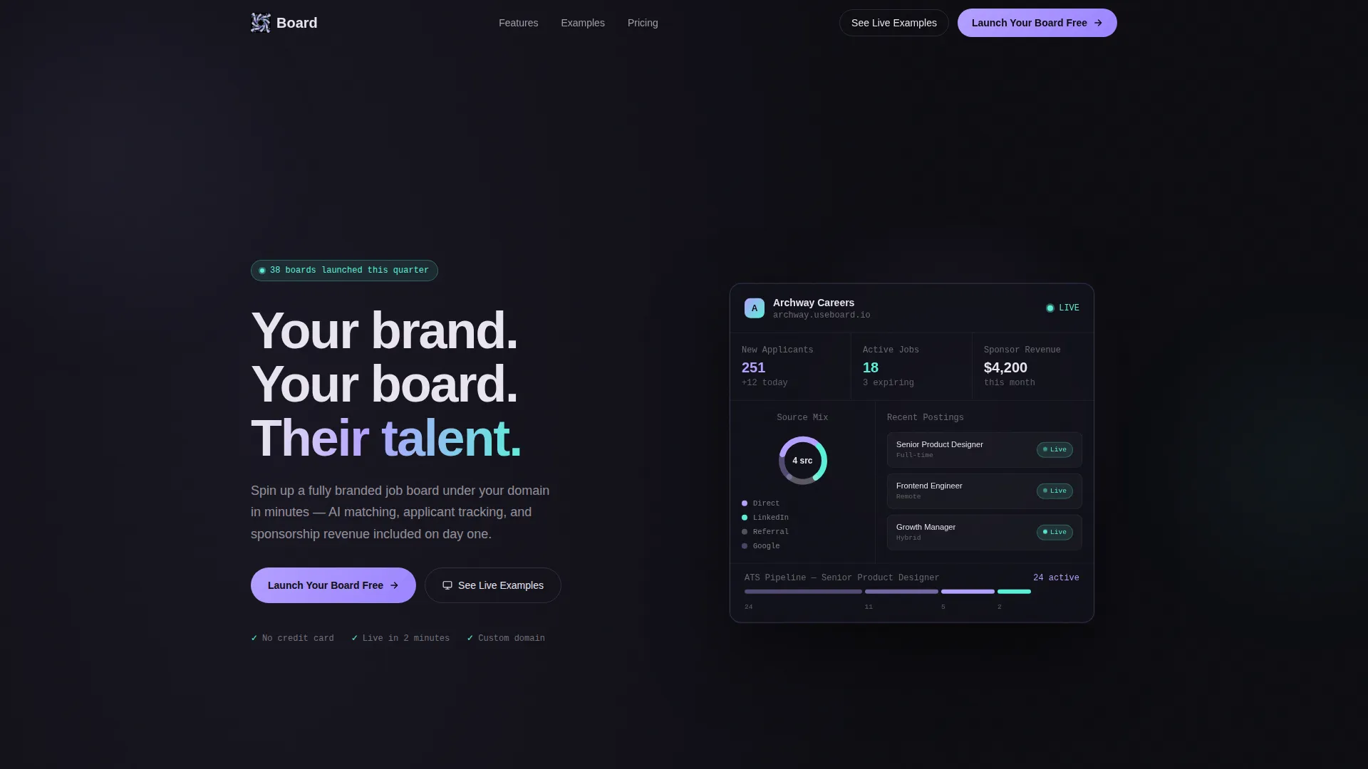
- Visitors cannot tell immediately that a white-label product will disappear behind their own brand; the animated "Archway Careers" dashboard demo proves it instantly
- Potential customers leave before signing up because there is no low-risk entry point; the freemium two-step form removes the credit card barrier entirely
- Feature-heavy platforms overwhelm prospects with bullet lists; the interactive vertical-template explorer lets visitors self-select their use case and see relevant copy adapt in real time
What you get with this template
You get a fully structured, section-led landing page where every component serves a specific conversion role. Nothing is decorative without purpose.
- An animated header section with a 50/50 split screen showing a live-breathing admin dashboard on the right and a primary headline with a single-line subhead on the left
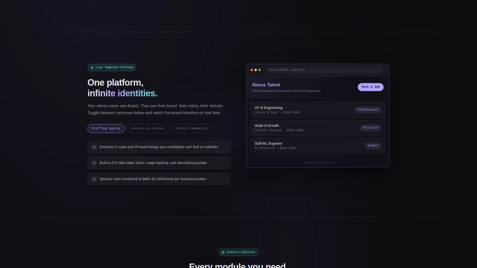
- An interactive three-panel explorer where visitors toggle between staffing agency, university, and creator community templates and watch logos, color schemes, and sample job listings swap live
- A sticky mobile bottom bar, a post-explorer call-to-action block, and a translucent pricing comparison card placed just above the final conversion point
Feature list
This template delivers six tightly integrated components, each designed to carry a specific share of the conversion workload.
Animated Dashboard Header
The header splits the screen evenly. The left side carries the headline and subhead. The right side shows a fictional branded admin dashboard with gently animating data: applicant counts ticking up, a rotating doughnut chart of source channels, and a job post toggling from Draft to Live with a teal pulse. The fictional brand "Archway Careers" demonstrates instantly that the platform recedes behind the customer's identity.
Interactive Vertical Template Explorer
Section two gives visitors an active role in their own evaluation. Three toggle buttons switch between staffing agency, university, and creator community modes. On selection, the right panel live-swaps logos, color schemes, and sample job listings while the left panel updates its benefit copy to match. Visitors choose their path; the page responds.
Exploded Feature Tour
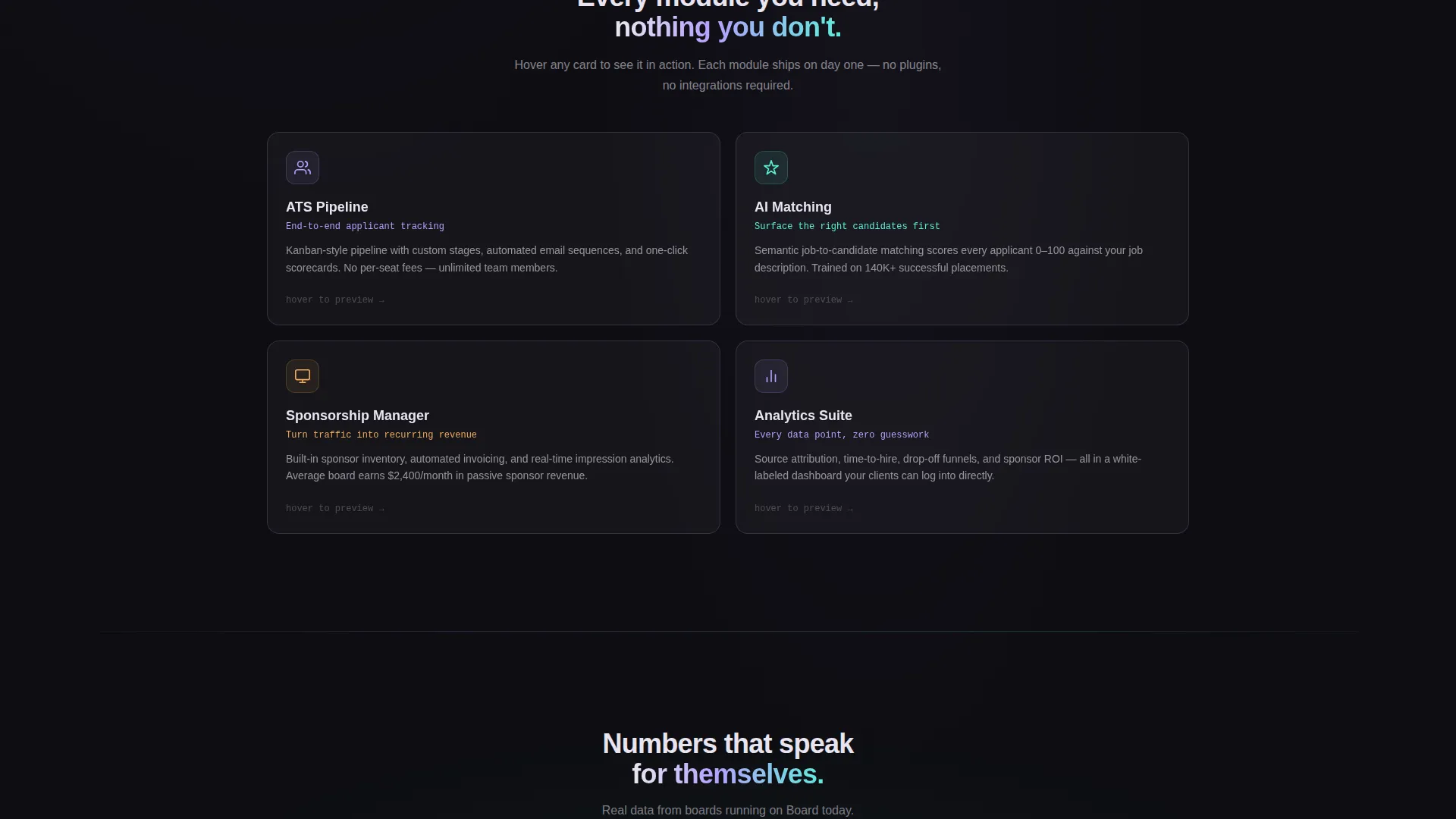
Section three uses glassmorphic card panels to represent four core platform modules: the applicant tracking pipeline, the AI-powered matching engine, the sponsorship manager, and the analytics view. Hovering over any card lifts it off the surface and expands a micro-interaction demo. The interaction makes abstract features feel tangible before a visitor signs up.
Animated Social Proof Counters
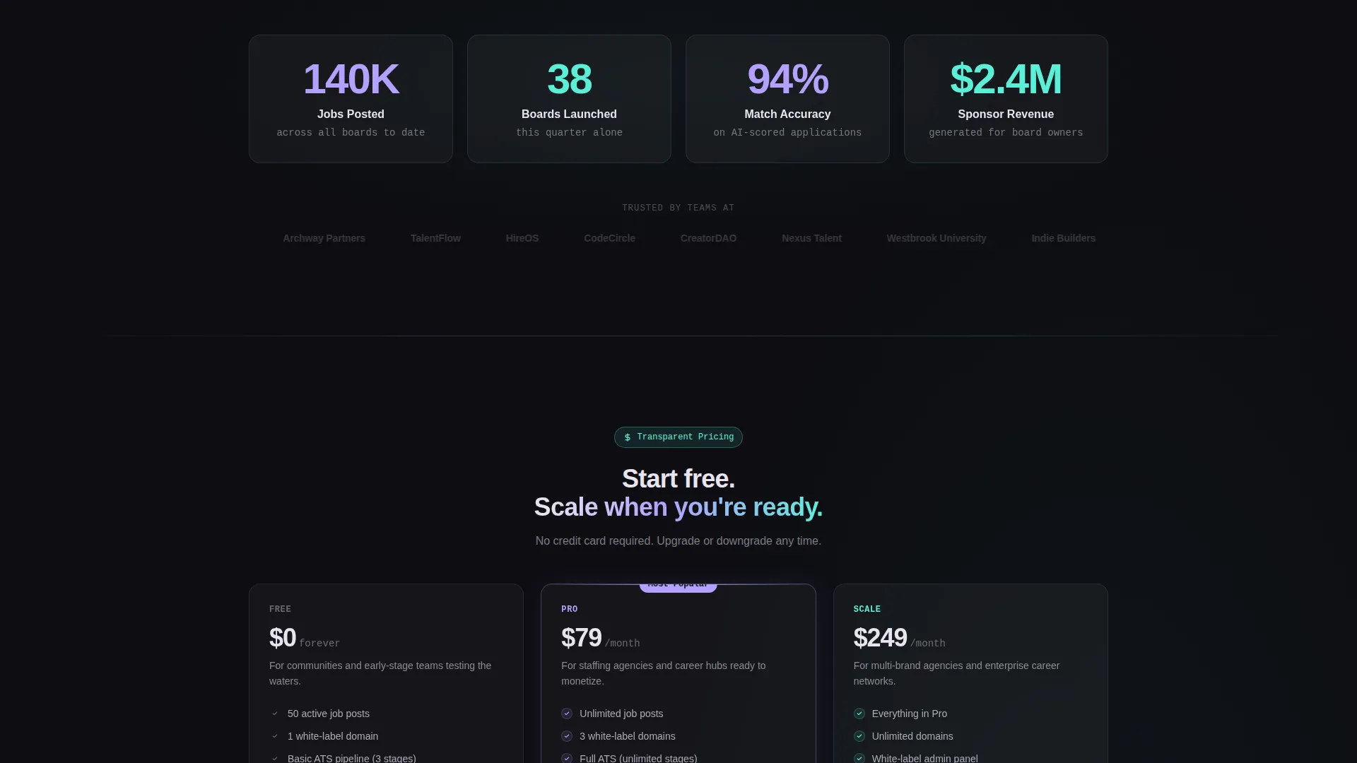
Section four displays real platform metrics, including 140,000 jobs posted and 38 white-label boards launched in the current quarter. Each counter spins up as it enters the viewport. The motion rewards continued scrolling and adds credibility at the moment a visitor is deciding whether this platform is proven.
Freemium Two-Step Sign-Up Form
The primary call-to-action, "Launch Your Board Free," opens a two-step form. Step one captures the board name and preferred subdomain, with a live preview showing the chosen name at boardname.useBoard.io. Step two collects work email and company size. There is no credit card field. The low-friction flow reduces the commitment barrier for new sign-ups.
Translucent Pricing Comparison Card
Just above the final call-to-action block sits a glassmorphic comparison card that lays out the free tier's generous limits alongside the upgrade path. The side-by-side layout makes the value of the free tier obvious and frames the paid plan as a natural next step rather than a forced upsell.
Page sections overview
| Section | Purpose |
|---|---|
| Split Screen Header | Introduces platform value with animated admin dashboard and primary headline |
| Vertical Template Explorer | Lets visitors toggle use-case views for staffing, university, and community contexts |
| Exploded Feature Tour | Demonstrates ATS pipeline, AI matching, sponsorship manager, and analytics via hover cards |
| Social Proof Counters | Builds credibility with animated job and board launch metrics |
| Freemium Sign-Up Form | Converts visitors with a two-step, no-credit-card onboarding flow |
| Pricing Comparison Card | Clarifies free tier value and surfaces the upgrade path transparently |
| Secondary call to action Block | Directs undecided visitors to a live customer board gallery for social proof |
Design & branding system
The template uses a Tech Glass visual identity built on an AI Iridescent color system. Every palette decision reinforces the sense of a futuristic, luminous product that still feels controlled and professional.
- Deep obsidian (#0D0D12) forms the primary background; prismatic lilac (#B4A0FF) drives primary actions and hover states; holographic teal (#59F0D8) marks data highlights and success indicators; soft pearl (#E8E4F0) handles body text and card surfaces
- Glassmorphic card panels float over subtle gradient mesh backgrounds, and each card border catches a one-pixel iridescent shimmer that shifts between cool violet and warm aqua as the viewer scrolls
- Dark sections bleed into each other with an oil-on-water depth effect, keeping the page visually unified without repeating the same background treatment
Mobile & speed optimization
The template is structured for a clean mobile experience without sacrificing the richness of the desktop layout. Key interactive elements adapt gracefully to smaller screens.
- The sticky bottom bar on mobile keeps the "Launch Your Board Free" call-to-action visible throughout the entire scroll without interrupting the reading flow
- The split-screen header collapses to a stacked single-column layout on narrow viewports, keeping the animated dashboard visible below the headline rather than hidden behind it
- Glassmorphic card panels in the feature tour maintain their frosted appearance on mobile while the hover-expand interaction converts to a tap-expand pattern
How this template helps you convert
Every section of this page is sequenced to move a skeptical visitor from curiosity to confidence to action. The conversion architecture follows a clear logic.
- The animated dashboard header answers the most important white-label question in the first five seconds: "Will this actually look like my brand?" The Archway Careers demo says yes before the visitor reads a single word of body copy.
- The interactive explorer and exploded feature tour give visitors two hands-on moments that replace passive reading with active discovery, keeping engagement high through the middle of the page.
- The no-credit-card freemium form, combined with the translucent pricing card placed directly above it, removes the two most common objections at the moment of decision: "Is this risky?" and "What do I actually get for free?"
Other information about this template
This template is built specifically for the white-label job board platform niche, where trust and brand clarity are the primary conversion obstacles. A few additional details are worth noting for anyone evaluating this template for their project.
- The "See Live Examples" secondary call-to-action links to a gallery of existing customer boards, giving undecided visitors a social proof path without pulling them away from the main conversion flow permanently
- The fictional platform subdomain preview (boardname.useBoard.io) in the sign-up form step one is a live interactive element, not a static mockup, making the onboarding feel real from the first interaction
- The template is positioned for a freemium or free-trial go-to-market model and is most effective for platforms that lead with a no-cost entry point before introducing paid tiers
- The Interactive Explorer creative direction means the template rewards curiosity at every scroll increment; each section reveals new content only through interaction, which increases time on page organically
Theme
Tech Glass
Creative direction
Interactive Explorer
Color system
AI Iridescent
Style
Split Screen (50/50)
Direction
Freemium/Trial
Page Sections
Animated Split-screen Dashboard Header
Interactive Vertical Template Explorer
Exploded Glassmorphic Feature Tour
Animated Viewport Social Proof Counters
Two-step Freemium Sign-up Form
Translucent Pricing Comparison Card
Related questions
What type of businesses is this landing page template designed for?
Can I customize the color scheme to match my own brand?
Does the two-step sign-up form include a credit card field?
What does the secondary call-to-action do?
How many vertical use-case modes does the interactive explorer include?



