Powerful Corrections Landing Page Template
This landing page template is built for corrections booking software vendors targeting county jails and detention facilities. It uses a dark command-center visual style, a scroll-driven comparison table layout, and two conversion paths: a sticky-bar qualification form and a gated PDF spec sheet. Every section is designed to make legacy workflows feel obsolete before the visitor reaches the call to action.
by Rocket studio
Quick summary
A single-page comparison template built for a corrections booking platform that processes intake in under four minutes. The layout uses a dark Dashboard Pro theme, scroll-driven spec sheet rows, and two conversion paths. It is designed to help county sheriffs, corrections administrators, and detention center IT directors see exactly why their current system falls short.
Who this template is for
This template is built for software vendors and product teams selling vertical SaaS platforms into the corrections and detention market. It speaks directly to the buyers who evaluate, approve, and implement booking technology at the facility level.
- County sheriffs modernizing aging county jail infrastructure
- Corrections administrators preparing for Department of Justice compliance audits
- IT directors at regional detention centers integrating booking, warrants, and inmate management
What problem this template solves
Most corrections software vendors struggle to communicate capability against deeply entrenched legacy systems. Decision-makers have seen dozens of feature lists. What they need is a side-by-side breakdown that makes their current clipboard-and-carbon workflow feel as outdated as it actually is.
- Legacy vendor comparisons are rarely structured in a way that maps to real shift-change scenarios
- Feature lists alone do not answer the question a sheriff asks at 3 AM on a Saturday
- Generic SaaS landing pages lack the operational tone that earns trust in a corrections environment
What you get with this template
You get a fully structured single-page layout built around the Comparison/Versus conversion model. Every section is purpose-built for the corrections booking niche, from the header concept down to the secondary conversion gate.
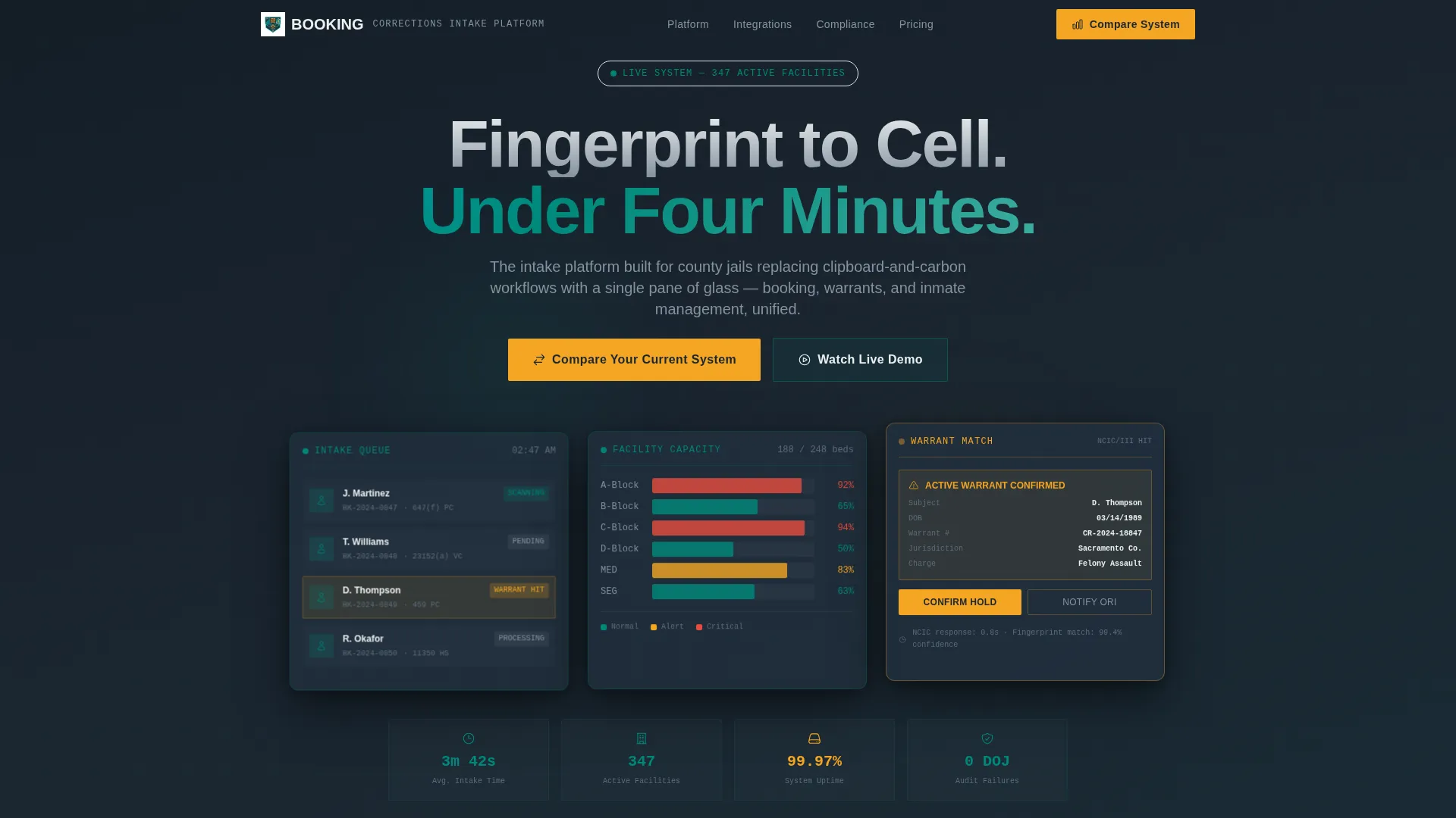
- A Dark Glass Panels hero header with three floating user interface panel mockups showing live intake, capacity, and warrant data
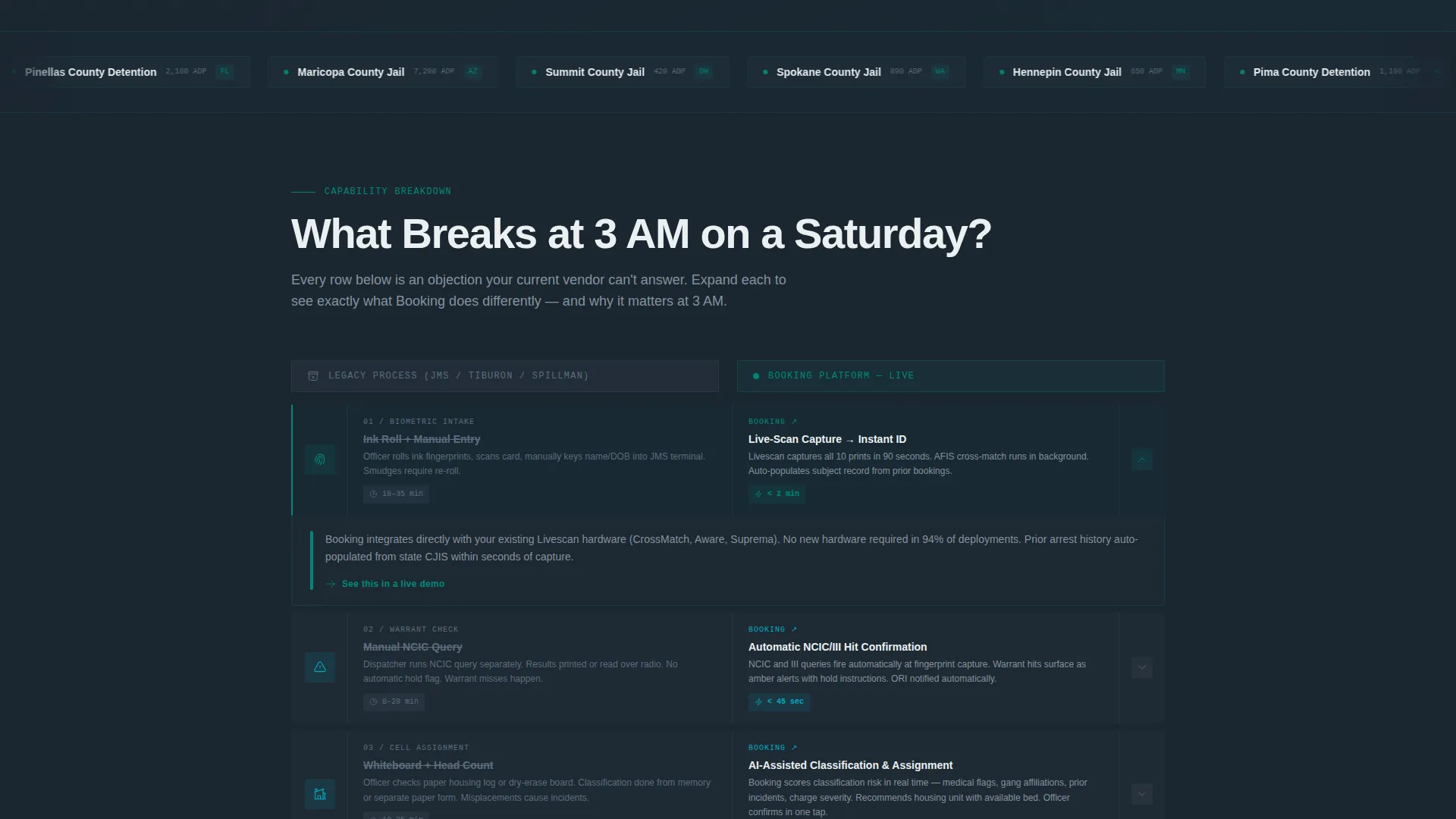
- A scroll-driven comparison table where each row expands on hover or tap to contrast legacy processes against the platform's workflow
- A persistent sticky bar carrying the primary call to action and a secondary gated PDF download positioned after the third comparison row
Feature list
This template is built around a set of clearly defined components drawn directly from the brief. Each one serves the Comparison/Versus conversion goal.
Dark Glass Panels Hero Header
Three frosted-glass user interface panels float against a near-black background. Each panel shows a different live-data view: an intake queue with mugshot thumbnails and charge codes, a facility capacity heatmap in green-yellow-red, and a warrant-match alert mid-confirmation. The panels carry subtle parallax depth, layered like monitors on a watch commander's desk.
Scroll-Driven Comparison Table
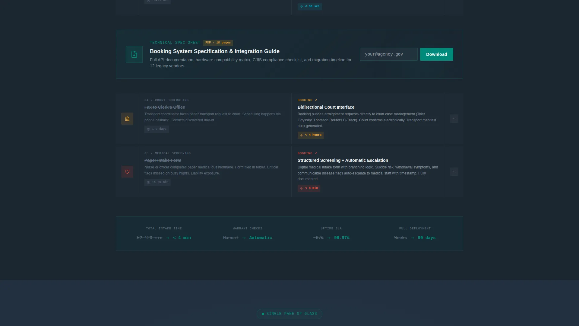
The core of the page is a systematic capability teardown. Each row places the legacy process on the left in muted gray and the platform's workflow on the right in teal, with animated micro-interactions that reveal real user interface. The narrative escalates from fingerprint capture through warrant checks, court-interface scheduling, and medical screening.
Persistent Sticky Bar with Primary call to action
A sticky bar follows the visitor down the page, always carrying the "Compare Your Current System" call to action. This keeps the primary conversion path visible regardless of how far the visitor has scrolled into the comparison rows.
Qualification Form with Facility Segmentation
The primary call to action opens a short qualification form. It captures facility type, average daily population via a dropdown, and current booking software via a free-text field with autocomplete for legacy vendor names.
Gated PDF Spec Sheet Download
A secondary conversion path appears after the third comparison row. Visitors provide an email address to download a detailed PDF spec sheet. Placement is intentional: credibility is established before the gate is introduced.
Teal Catalyst Color System
The palette uses deep command-center charcoal, operational teal, alert-status white, and catalyst amber. Amber is reserved exclusively for calls to action and critical-state indicators. The overall effect mirrors a dispatch console at a late-night shift, reducing eye fatigue while signaling priority items clearly.
Page sections overview
| Section | Purpose |
|---|---|
| Hero Header Panels | Establish product credibility with live-data user interface mockups |
| Intake Speed Row | Compare fingerprint-to-cell speed against legacy intake |
| Warrant Check Row | Show NCIC and III warrant matching versus manual lookup |
| Court Scheduling Row | Contrast automated court-interface scheduling with paper logs |
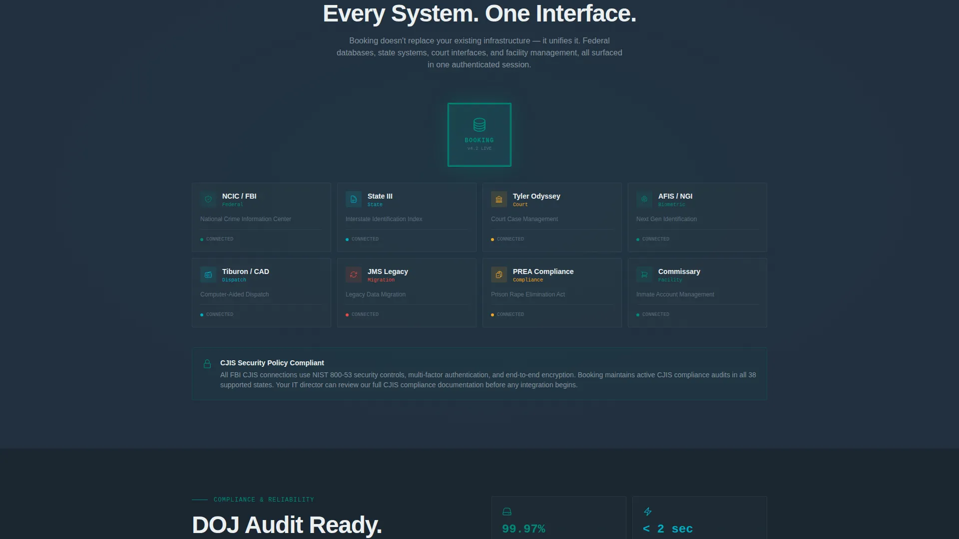
| Commissary and Medical Row | Demonstrate screening integration that legacy systems miss |
| Gated Spec Sheet | Capture email leads after credibility is established |
| Sticky call to action Bar | Maintain primary conversion path across all scroll positions |
| Qualification Form | Segment leads by facility type, population, and current software |
Design & branding system
The visual identity follows the Dashboard Pro theme paired with the Teal Catalyst color system. The palette is built for operational environments where screens run across long shifts and attention needs to land in the right place instantly.
- Deep command-center charcoal (#1B2631) as the dominant background, operational teal (#00897B) for platform-side table cells and active user interface states, and alert-status white (#ECF0F1) for body text
- Catalyst amber (#F5A623) reserved strictly for calls to action and critical-state indicators, never used for decorative purposes
- No stock photography of facilities or badges; all visual storytelling uses product user interface panels and data-driven mockups
Mobile & speed optimization
The template is structured so that the comparison table rows, sticky bar, and modal form all translate cleanly to narrower viewports. The dark-panel header adapts its layered depth to single-column stacking without losing the command-center atmosphere.
- Comparison table rows collapse to a vertical card format on mobile, keeping the legacy-versus-platform contrast readable on small screens
- The sticky call to action bar remains anchored at the bottom of the viewport on mobile, preserving conversion access throughout the scroll
- The gated PDF form is designed as a lightweight modal overlay that does not disrupt the scroll position when dismissed
How this template helps you convert
The page is structured to eliminate objections progressively, so visitors arrive at the form already convinced. Every layout decision serves the Comparison/Versus conversion model.
- The escalating comparison rows build a case row by row, moving from basic intake speed to complex integrations, so each scroll step removes another reason to stay with the legacy system.
- The sticky bar ensures the primary call to action is never out of reach, while the email-gated spec sheet creates a lower-commitment second path for visitors who are not ready to fill out the qualification form yet.
Other information about this template
This template sits at the intersection of the Dashboard Pro theme and the Spec Sheet creative direction. It is purpose-built for the Prison and Corrections Vertical SaaS category and is designed to serve the corrections booking system niche specifically.
- The template style is Comparison Table, making it well suited for vendors whose primary sales challenge is differentiating from entrenched legacy systems
- The header concept (Dark Glass Panels) and the Teal Catalyst color system work together to signal operational seriousness without relying on generic public-safety imagery
- The landing page direction is Comparison/Versus, meaning every section is sequenced to build a logical case before either conversion gate appears
Theme
Dashboard Pro
Creative direction
Spec Sheet
Color system
Teal Catalyst
Style
Comparison Table
Direction
Comparison/Versus
Page Sections
Dark Glass Panels Hero Header
Scroll-driven Comparison Table
Persistent Sticky Call to Action Bar
Segmented Qualification Form
Gated PDF Spec Sheet
Teal Catalyst Color System
Related questions
Can I customize the comparison table rows for my platform's specific features?
What does the qualification form collect from visitors?
Where does the gated PDF download appear on the page?
Is this template suitable for vendors selling to both county jails and state prisons?
Does the sticky bar call to action stay visible throughout the entire scroll?



