Booking - Powerful Environmental Landing Page Template
A modular card-grid landing page built for environmental booking and scheduling workflows. This template targets Phase I and Phase II assessors, wetland delineators, and compliance managers who need to coordinate crews, equipment, and regulatory deadlines across multiple active projects. The Dashboard Pro theme uses a Slate and Sky color system to deliver a clean, field-ready visual experience.
by Rocket studio
Quick summary
A scheduling engine landing page designed specifically for environmental consultants. The template uses a modular card-grid layout with a Problem to Solution Arc, a live API code snippet header, and a persistent comparison module. It speaks directly to Phase I assessors, remediation project managers, and compliance teams managing tight regulatory windows.
Who this template is for
Environmental professionals need scheduling tools that match the complexity of their fieldwork. This template is built for the teams managing that complexity every day.
- Phase I and Phase II site assessors coordinating drill rigs and field technicians across overlapping project timelines
- Wetland delineators and environmental scientists who plan around seasonal survey windows and permit deadlines
- Compliance managers tracking regulatory hold times and permit renewal dates that carry serious financial penalties if missed
What problem this template solves
Environmental project management is fragmented. Crews get double-booked, equipment conflicts go unnoticed, and permit windows expire buried in email threads. This template frames those pain points clearly, then resolves them visually.
- Double-booked drill rigs, missed hold times, and field technicians arriving at the wrong site
- Subcontractor coordination gaps and equipment availability conflicts across simultaneous projects
- Regulatory deadlines that fall through the cracks when managed through spreadsheets and email chains
What you get with this template
The template delivers a fully structured single-page layout with every section purpose-built for an environmental booking audience. Each component is designed to build trust and move technical evaluators toward action.
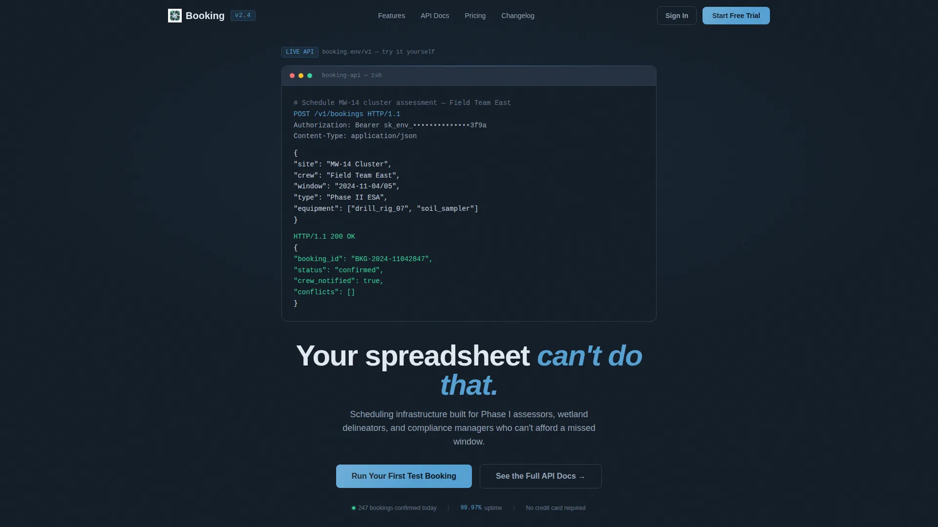
- An animated code snippet header block showing a real API call with a confirmed booking response
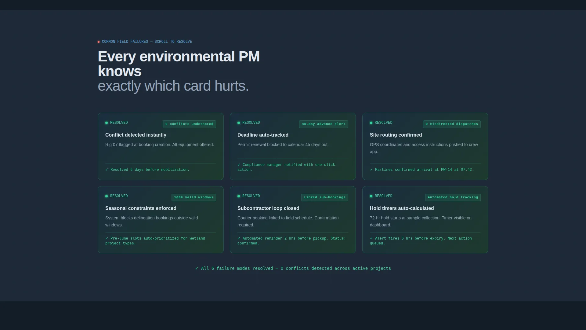
- A modular card grid that transitions from problem states to solution states as the visitor scrolls
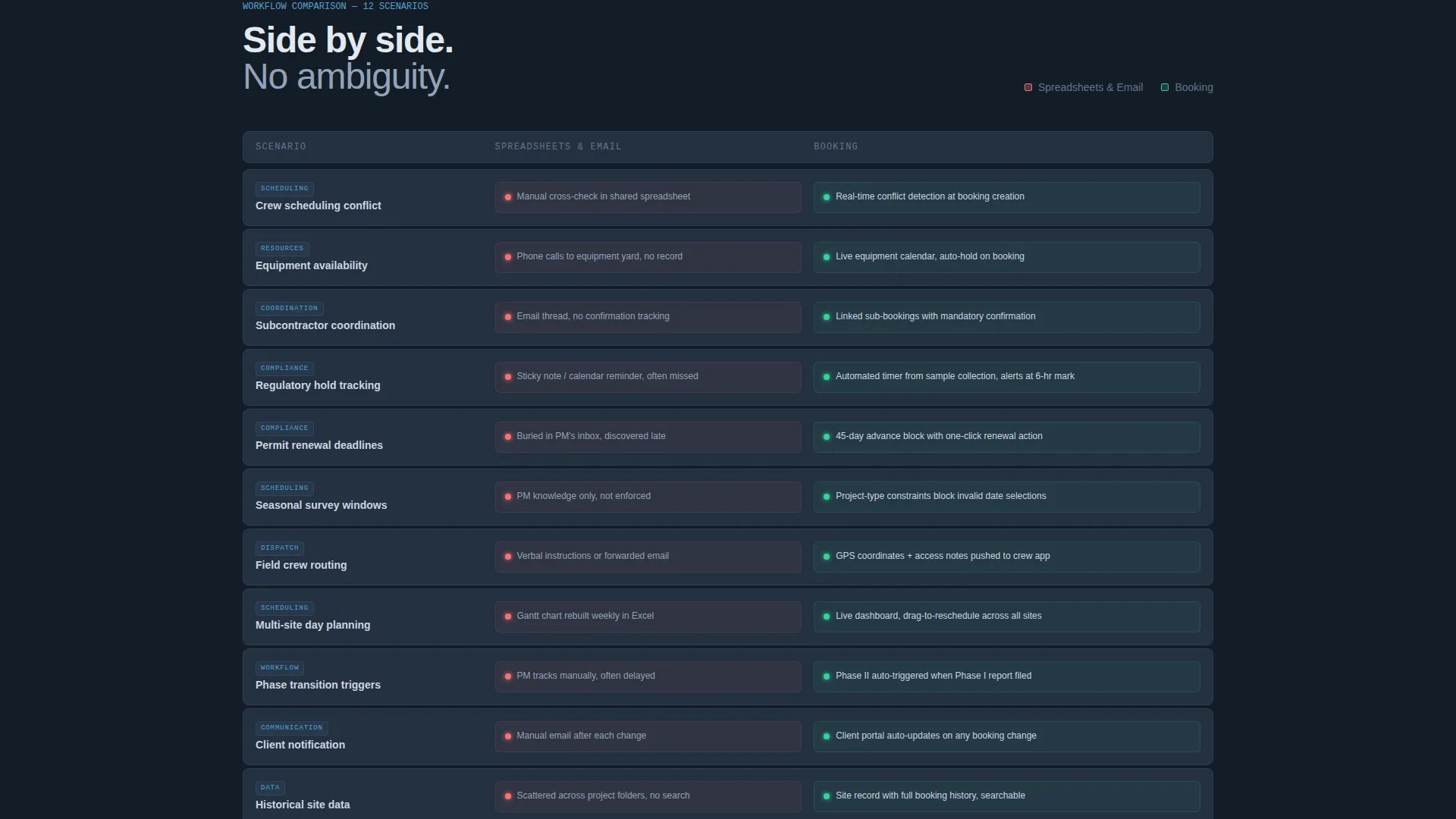
- A twelve-row comparison module pitting legacy workflows against the booking system, row by row
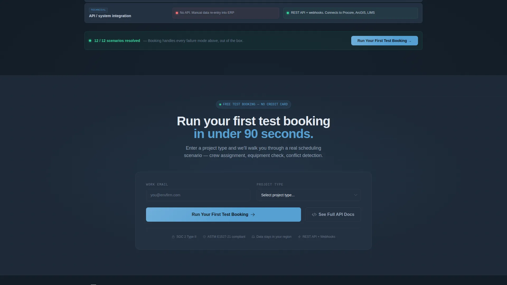
- A primary call-to-action form with an email field and a project-type selector covering Phase I, Phase II, Remediation, and Monitoring
- A secondary path directing technical evaluators to full API documentation
Feature list
This template includes purpose-built components that reflect real environmental workflow complexity. Each one earns its place on the page.
Animated API Code Snippet Header
The header opens with a styled terminal block displaying a real POST request to the bookings endpoint. Each line types in sequentially, showing a live JSON payload with site, crew, and scheduling window fields, plus a 200 OK confirmation response. The headline fades in below: "Your spreadsheet can't do that."
Problem-to-Solution Card Grid
A modular card grid opens the scroll with recognizable pain-point scenarios rendered in slate gray with red status indicators. As the visitor continues scrolling, each card flips to its resolved state in sky blue, showing the same scenario handled by the booking system. The grid ends fully blue and green, communicating resolution without a single word of explanation.
Twelve-Row Comparison Module
A persistent two-column layout anchors the lower section of the page. It compares legacy spreadsheet and email workflows against the booking platform across twelve real scenarios including crew scheduling conflicts, equipment availability, subcontractor coordination, and regulatory hold tracking. Each row animates on scroll, with red friction indicators on the left and green resolved states on the right.
Project-Type Selector call to action
The primary call-to-action combines a single email field with a project-type dropdown. Options cover Phase I, Phase II, Remediation, and Monitoring. This pairing qualifies leads by project context from the very first interaction, making follow-up more targeted.
Secondary API Documentation Path
A secondary conversion path sits alongside the primary call to action. It routes technical evaluators directly to full API documentation. This gives developers and integration leads the proof they need before committing to a platform decision.
Dashboard Pro Visual Theme
The Slate and Sky color system applies deep charcoal slate as the dominant background, sky blue for interactive and selected states, and alert green for confirmed booking indicators. The palette is consistent across every card, row, and component on the page.
Page sections overview
| Section | Purpose |
|---|---|
| API Code Header | Opens with animated POST request and confirmed booking response to prove system capability immediately |
| Problem Card Grid | Displays recognizable environmental workflow pain points in slate gray with red status indicators |
| Solution Card Flip | Reveals resolved states in sky blue and alert green as the visitor scrolls through the grid |
| Comparison Module | Anchors lower page with twelve-row side-by-side of legacy workflows versus the booking platform |
| Primary call to action Block | Captures email and project type to qualify leads and prompt a first test booking |
| API Docs Path | Provides a secondary conversion route for technical evaluators needing integration evidence |
Design & branding system
The Slate and Sky color system is built to feel like a field instrument panel on a clear morning. Every color choice serves a functional role, not just an aesthetic one.
- Deep charcoal slate (#1E2A38) and field-grade gray (#4A5568) dominate card surfaces and backgrounds, grounding the layout in a professional, technical register
- Open sky blue (#56A0D3) marks all interactive elements, selected states, and solution card flip states, guiding the eye toward resolved outcomes
- Alert green (#34D399) appears exclusively at confirmation and active booking states, reinforcing successful actions the way a probe reading within spec confirms a clean result
Mobile & speed optimization
The modular card-grid structure scales cleanly across screen sizes. Each component is designed to reflow without losing the visual logic of the problem-to-solution narrative.
- The card grid collapses into a single column on smaller screens while preserving the flip animation sequence and status indicator color coding
- The comparison module stacks rows vertically on mobile, keeping each scenario readable without horizontal scrolling
- The code snippet header and call to action form are sized for comfortable interaction on touch screens, keeping the primary conversion path accessible on any device
How this template helps you convert
Every section of this page moves a visitor from skepticism toward action. The conversion logic is built into the scroll sequence itself.
- The animated API snippet opens with proof of capability before any marketing claim appears, earning credibility with technically minded evaluators in the first five seconds of the visit.
- The problem-to-solution card grid creates recognition and tension, then resolves it visually, so visitors feel understood before they reach the offer.
- The dual call to action structure captures both immediate signups through the primary form and longer-consideration leads through the API documentation path, covering the full range of decision timelines.
Other information about this template
This template is built on the Dashboard Pro theme and uses the matched intersection context of Environmental Vertical SaaS. It is designed for teams evaluating purpose-built environmental booking platforms as an upgrade from generic project management tools.
- The template style is Card Grid (Modular), making it straightforward to reorder, add, or remove individual cards without disrupting the overall page flow
- The creative direction follows a Problem to Solution Arc, a proven structure for vertical SaaS landing pages where the audience already knows their pain points well
- The Comparison/Versus landing-page direction is particularly effective for environmental professionals who have lived with spreadsheet-based workflows and need a clear side-by-side case for switching
- The header concept uses a Code Snippet to establish technical credibility immediately, which is essential when the target audience includes developers and integration evaluators assessing API capability
Theme
Dashboard Pro
Creative direction
Problem→Solution Arc
Color system
Slate & Sky
Style
Card Grid (Modular)
Direction
Comparison/Versus
Page Sections
Animated API Code Snippet Header
Problem-to-solution Card Grid
Twelve-row Comparison Module
Project-type Selector Call to Action
Secondary API Documentation Path
Dashboard Pro Visual Theme
Related questions
Who is this landing page template designed for?
What does the animated code snippet in the header actually show?
Can I customize the card grid pain-point scenarios?
What project types does the call to action selector include?
Is there a path for visitors who need technical integration details?



