Forensic Vertical SaaS Booking Website Template
A high-impact landing page template built for forensic booking system providers. It combines a dark Dashboard Pro aesthetic with a scrolling Industry Report structure, an interactive header preview, and a data-driven comparison table that makes the case for digital intake. Two lead capture paths serve both decision-makers and technical evaluators at county jails and sheriff's offices.
by Rocket studio
Quick summary
This single-page template is designed for forensic booking system vendors targeting county jails and sheriff's offices. It opens with a live-feeling intake screen preview, moves through a hard-data comparison table, and closes with dual lead capture. Every section is structured to turn intake inefficiency into a compelling case for change.
Who this template is for
This template fits teams selling or promoting digital jail intake software to law enforcement agencies. It speaks directly to the people who feel the daily weight of paper-based booking workflows.
- County jail administrators managing overnight intake surges and staff shortages
- Booking sergeants dealing with illegible handwriting, duplicate entries, and compliance pressure
- Information technology directors at sheriff's offices tasked with modernizing aging records management systems
What problem this template solves
Manual jail intake creates a cascade of problems: slow processing times, transcription errors, duplicate records, and compliance gaps. No single printed form or legacy screen can show those costs clearly side by side. This template builds that case visually and factually.
- Buyers cannot easily see the true cost of paper intake until time, error, and liability numbers are lined up together
- Legacy comparison tools rarely escalate evidence the way a structured Industry Report scroll does
- Generic software landing pages fail to earn the trust of skeptical IT directors and operations-focused sergeants
What you get with this template
You get a fully structured, single-page layout with every section pre-designed around a forensic booking use case. The template is purpose-built, not adapted from a generic SaaS starter.
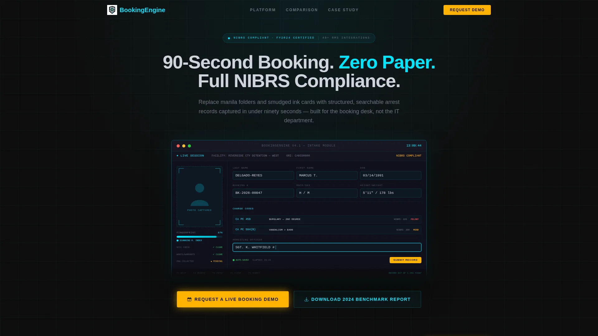
- An interactive-style header section with a mock booking screen, pre-populated demo data, a fingerprint-scan progress bar frozen at 87 percent, and a blinking cursor in the arresting officer field
- A scrolling comparison table that places legacy workflow costs against the digital system column by column, escalating from time waste to liability exposure
- Two distinct lead capture paths: a primary demo request form and a secondary benchmark report download gated behind email-only entry
Feature list
This template ships with purpose-designed components. Each one directly supports the goal of converting skeptical public-sector buyers into qualified demo requests.
Interactive Booking Preview Header
The header renders a functioning mock intake screen with pre-populated charge codes, a sample mugshot placeholder, a fingerprint-scan progress bar at 87 percent, and a real-time clock stamp. A blinking cursor in the arresting officer field invites interaction and signals that the system is live, not static.
Escalating Comparison Table
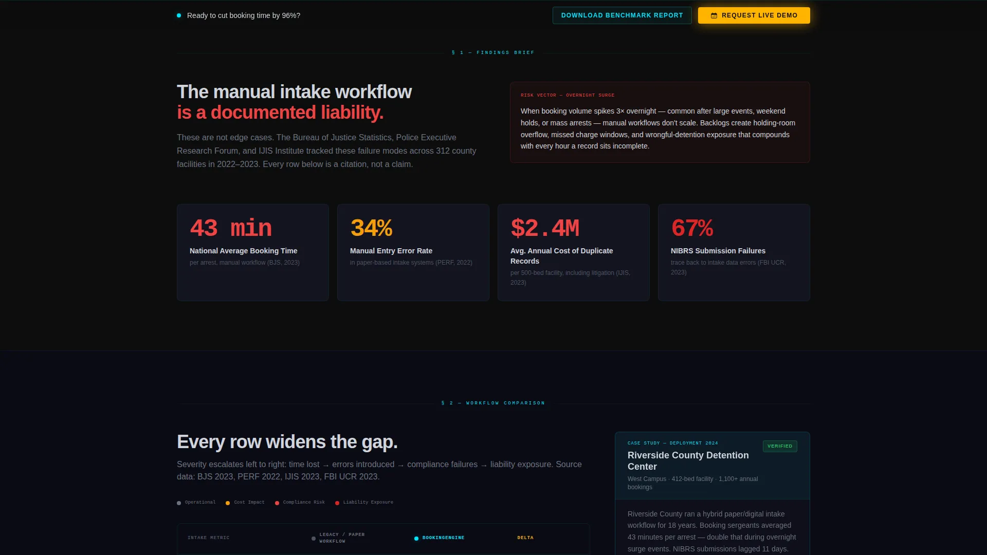
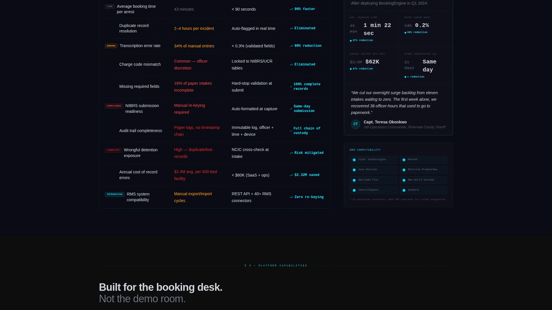
The core of the page is a multi-row comparison table. Each row pairs a hard national statistic (average booking time, manual entry error rate, cost of duplicate records) with a legacy workflow column and a modern digital system column. Severity escalates row by row from time wasted to compliance failures to liability exposure.
Sticky Bottom-Rail Call to Action
The primary call to action, "Request a Live Booking Demo," locks to the bottom of the viewport after the first scroll. It stays visible throughout the entire reading experience without interrupting the content flow.
Dual Lead Capture Forms
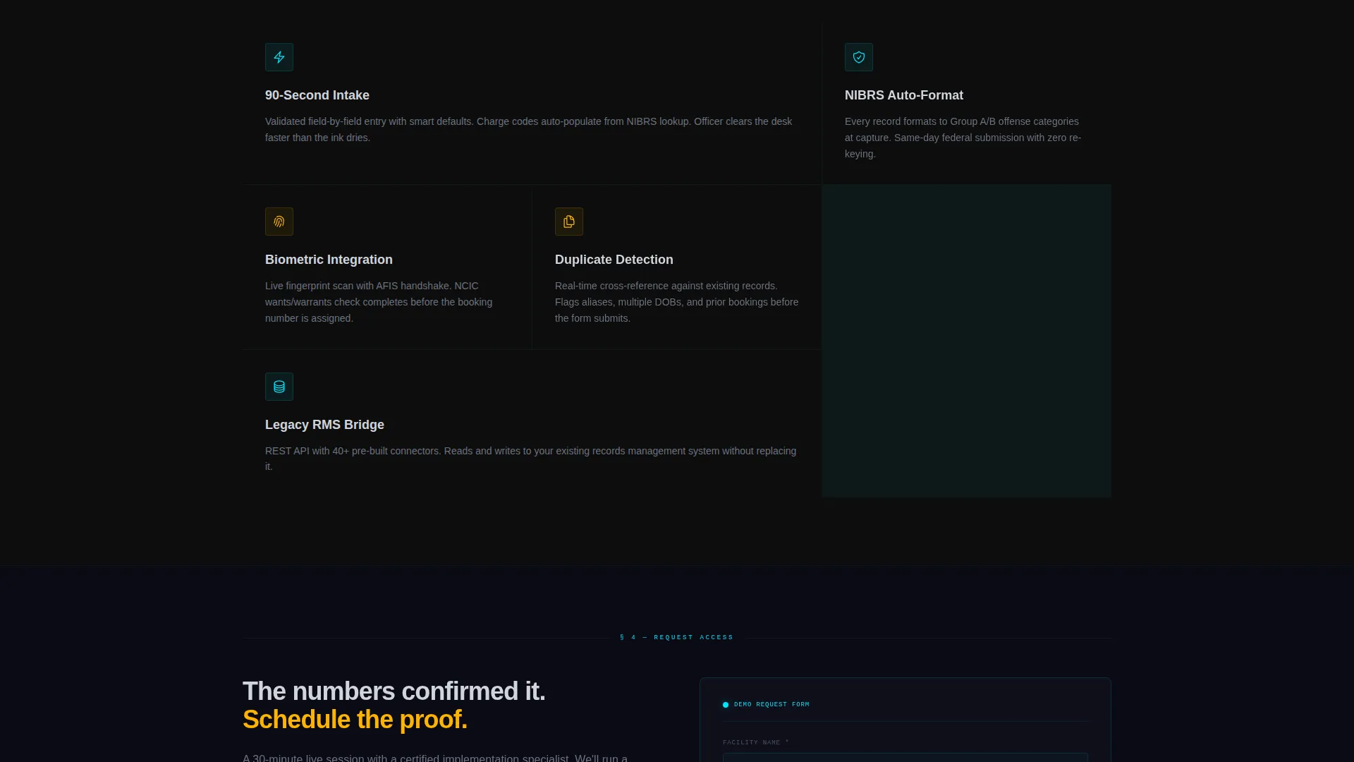
The primary form collects facility name, average daily bookings via dropdown, current records management system vendor, and work email. A secondary lighter-commitment form gates the 2024 Jail Intake Benchmark Report behind email-only entry, giving data-focused evaluators an easier first step.
Case Study Sidebar
A midpage sidebar features anonymized reduction numbers from a 400-bed county facility. It breaks the scroll rhythm and delivers social proof at the moment when comparison table evidence reaches its peak.
Carbon Fiber Dark user interface System
The full page is built in the Carbon Fiber color system: deep cockpit black backgrounds, instrument-panel charcoal card surfaces, status-active cyan for active user interface states, and alert-warm amber reserved for calls to action and data callouts. The palette is matte, focused, and built for high-stakes environments.
Page sections overview
| Section | Purpose |
|---|---|
| Interactive Header Preview | Opens with a mock booking screen and headline to establish immediate relevance |
| Headline and Subhead | Delivers the core value statement: 90-second booking, zero paper, full compliance |
| Time and Error Stats | Presents national average booking time and manual entry error rate statistics |
| Legacy versus. Digital Table | Side-by-side comparison escalating from time waste to liability exposure |
| Case Study Sidebar | Shows real reduction numbers from a 400-bed county facility |
| Compliance and Liability Rows | Escalates stakes to compliance failures and cost of inaction |
| Primary Demo Form | Captures facility name, daily bookings, current vendor, and work email |
| Benchmark Report Gate | Offers the 2024 Jail Intake Benchmark Report in exchange for email entry |
| Sticky call to action Rail | Keeps the demo request visible and accessible throughout the scroll |
Design & branding system
The visual identity follows the Dashboard Pro theme using the Carbon Fiber color system. Every choice reinforces the feeling of a high-trust, purpose-built operations environment.
- Backgrounds use deep cockpit black (#0D0D0D) and instrument-panel charcoal (#1E1E2E); text renders in cool silver-white (#D0D4DC) for high contrast without harshness
- Status-active cyan (#00E5FF) traces active user interface state edges and telemetry-style interface lines, while alert-warm amber (#FFB300) is reserved exclusively for calls to action and data callouts
- The overall palette is matte and non-reflective, designed to feel like the center console of a professional-grade operations vehicle rather than a consumer product
Mobile & speed optimization
The template layout is designed to remain readable and functional at smaller viewport sizes. The field-heavy comparison table and form components are structured to reflow without breaking the content hierarchy.
- The sticky bottom-rail call to action adapts to mobile viewports so the demo request button stays accessible during scroll
- The mock booking header preview is cropped to feel like a live system at any screen size, not a shrunk-down screenshot
- Form fields and dropdown selectors are sized and spaced for touch interaction on mobile devices
How this template helps you convert
The page earns the conversion by building an evidence chain, not just presenting a product. Each scroll position moves the reader from awareness to inevitability.
- The interactive header preview creates immediate credibility by looking and feeling like a real intake workstation, not a marketing mockup, so visitors engage before reading a single word of copy
- The escalating comparison table makes the cost of inaction specific and cumulative, so by the time the primary demo form appears, requesting a demo feels like confirming what the data already proved
- The dual lead capture structure gives both action-ready administrators and research-phase IT directors a clear next step that matches their readiness level
Other information about this template
This template is part of a broader set of vertical SaaS landing page designs built under the Dashboard Pro theme. It is specifically matched to the Forensic Vertical SaaS subcategory and is suited for technology vendors operating in regulated public-sector environments.
- The template style is Comparison Table, making it compatible with any product pitch that benefits from a structured legacy-versus-modern workflow narrative
- The Industry Report creative direction means the scroll rhythm reads like a findings brief, which builds authority with technically minded buyers who distrust pure marketing language
- The Lead Generation page direction is reflected in every structural decision, from the sticky call to action rail to the dual form architecture
Theme
Dashboard Pro
Creative direction
Industry Report
Color system
Carbon Fiber
Style
Comparison Table
Direction
Lead Generation
Page Sections
Interactive Booking Preview Header
Escalating Comparison Table
Sticky Bottom-rail Call to Action
Dual Lead Capture Architecture
Case Study Sidebar Block
Carbon Fiber Visual System
Related questions
Can I adapt this template for a different public-safety software product?
What are the two lead capture options included in this template?
Does the header preview require a live backend connection?
Can the comparison table rows be customized?
Who is the primary audience this template is designed to reach?



