Nonprofit Software & SaaS Booking Website Template
Bookinghub is a split-screen nonprofit booking landing page template built for organizations managing events, volunteer shifts, and shared spaces. It pairs a bold statistical narrative with an interactive tab-switching header and a low-friction freemium sign-up flow. The result is a focused, conversion-ready page that turns scheduling chaos into a clear value proposition.
by Rocket studio
Quick summary
Bookinghub is a single-page template for nonprofit booking software. It uses a 50/50 split-screen layout, a three-tab interactive header, and an industry-report scroll structure to move visitors from daily scheduling pain toward a free trial sign-up. Every section is designed to feel like evidence, not marketing.
Who this template is for
This template was built for nonprofit software teams and SaaS founders targeting the nonprofit operations market. It speaks directly to the people who live inside scheduling problems every day.
- Development directors managing 40 or more cultivation events per quarter
- Volunteer coordinators handling shift coverage across multiple locations
- Executive directors who need clear resource utilization data for board reporting
What problem this template solves
Nonprofit operations teams rely on spreadsheets, email chains, and sticky notes to manage bookings. That workflow creates double-booked rooms, unfilled volunteer shifts, and missed donor meetings. This template gives a booking platform a page that makes the cost of that status quo impossible to ignore.
- No clear visual proof that the software replaces real pain points
- Friction-heavy sign-up flows that lose qualified users before they start
- Generic SaaS pages that do not speak to nonprofit-specific scheduling needs
What you get with this template
You get a fully structured, design-ready landing page built around three distinct use cases. Every section is mapped to a specific part of the nonprofit booking journey, from daily room conflicts to board-level reporting.
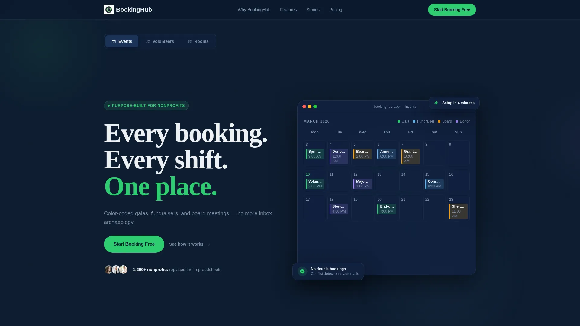
- A Feature Tab Switcher header with three live-styled dashboard previews for Events, Volunteers, and Rooms
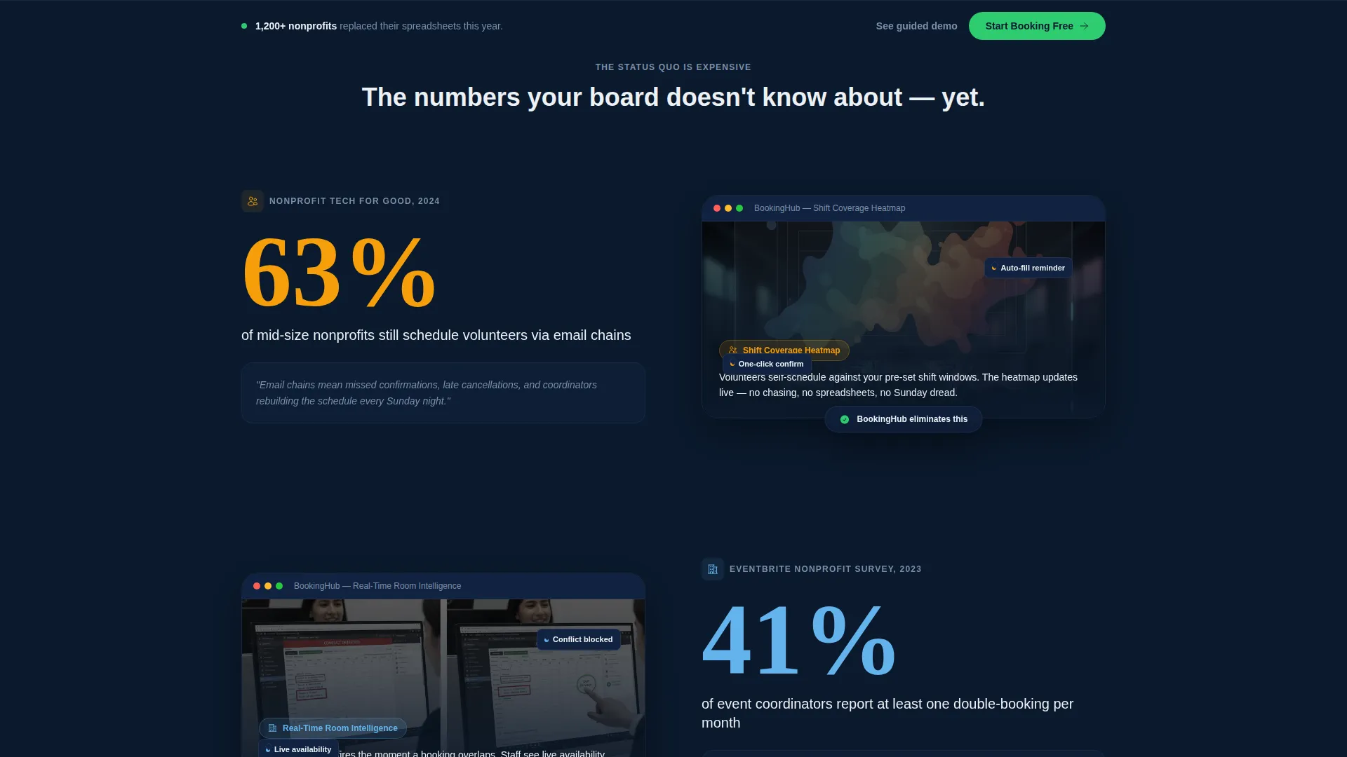
- An industry-report scroll narrative pairing bold nonprofit statistics with annotated product user interface screenshots
- A low-friction inline sign-up form and a sticky bottom call-to-action bar for consistent conversion pressure
Feature list
This template is built with purposeful components that serve a single goal: proving the product works, then making it effortless to start.
Three-Tab Interactive Header
The header holds three clickable tabs labeled Events, Volunteers, and Rooms. Each tab swaps the right panel of the split screen to reveal a different live-styled dashboard view. No autoplay runs; the visitor controls the reveal entirely. The left panel headline and subline update contextually with each tab switch.
Split-Screen Layout
The 50/50 layout keeps the value proposition anchored on the left while product evidence fills the right. This structure prevents either side from competing for attention. It also makes scrolling feel like a controlled briefing rather than a wall of text.
Industry Report Scroll Narrative
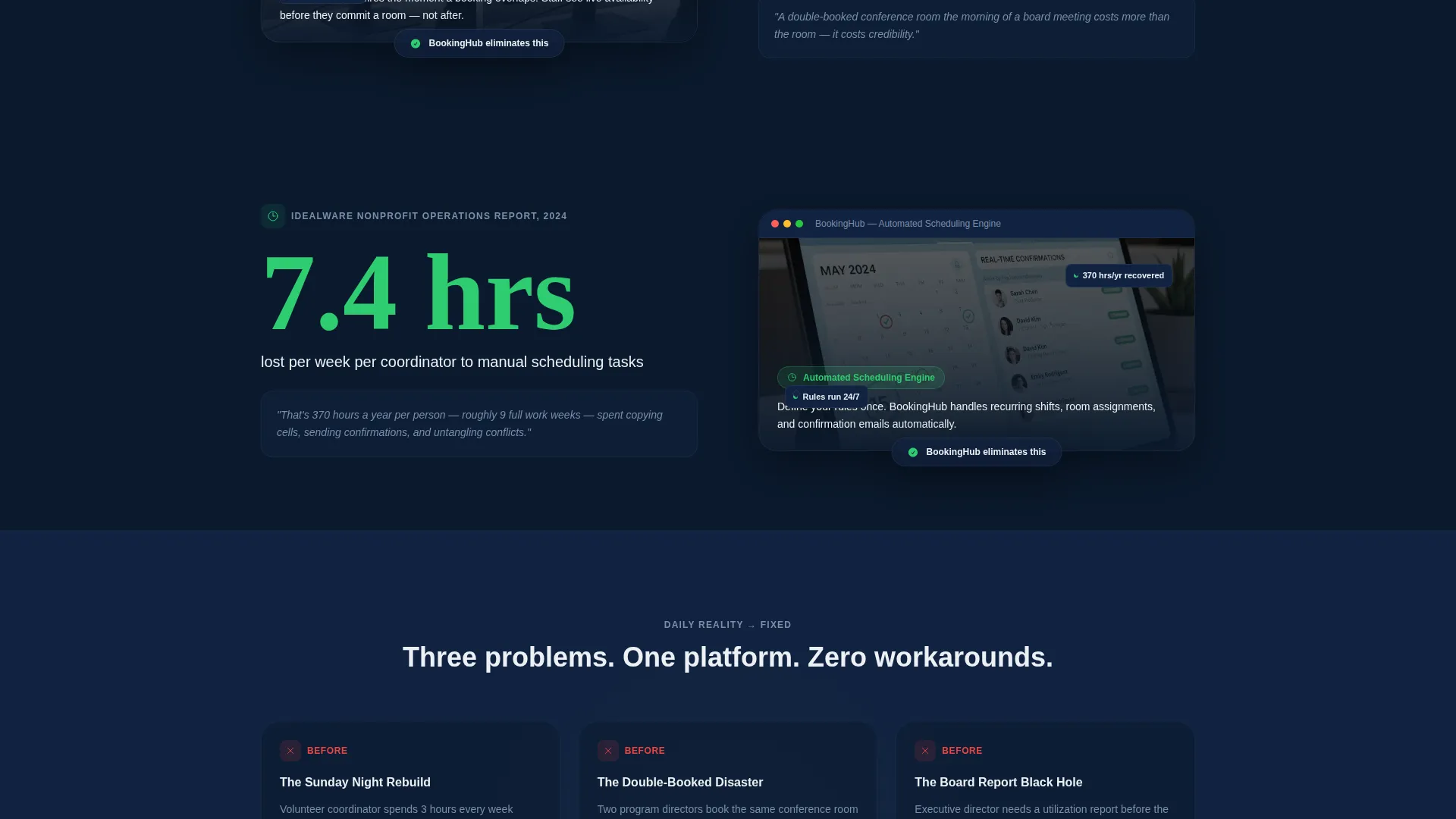
Each content section opens with a large, sourced nonprofit statistic on the left. The right half shows the specific product feature that solves that problem, presented as an annotated user interface screenshot with callout tooltips. The scroll escalates from daily pain to strategic visibility, building the case section by section.
Freemium Sign-Up Flow
The primary call-to-action, labeled "Start Booking Free," appears inside the header and repeats as a sticky bottom bar after the second scroll section. Clicking opens an inline sign-up form requesting only organization name, work email, and a single dropdown. Friction is kept as low as possible to protect conversion at every entry point.
Sticky Conversion Bar
After the visitor scrolls past the second content section, a sticky bottom bar locks into view with the primary call-to-action. This ensures the sign-up prompt is always visible without interrupting the reading flow. The bar uses impact green to stay visually distinct against the dark background.
Demo Request Path
A secondary conversion path sits below the final section. It is labeled "See It With Your Data" and links to a guided demo request form. This path targets larger organizations that need a more consultative entry point before committing to a free account.
Page sections overview
| Section | Purpose |
|---|---|
| Tab Switcher Header | Introduces the three core use cases with interactive dashboard previews |
| Events Dashboard View | Shows a color-coded calendar grid for galas, fundraisers, and board meetings |
| Volunteers Heatmap View | Displays shift-coverage status with filled and open slot indicators |
| Rooms Floor-Plan View | Renders a floor-plan diagram with real-time availability badges |
| Stat and Feature Block 1 | Pairs a daily pain statistic with the matching product user interface screenshot |
| Stat and Feature Block 2 | Escalates the narrative toward room utilization and scheduling visibility |
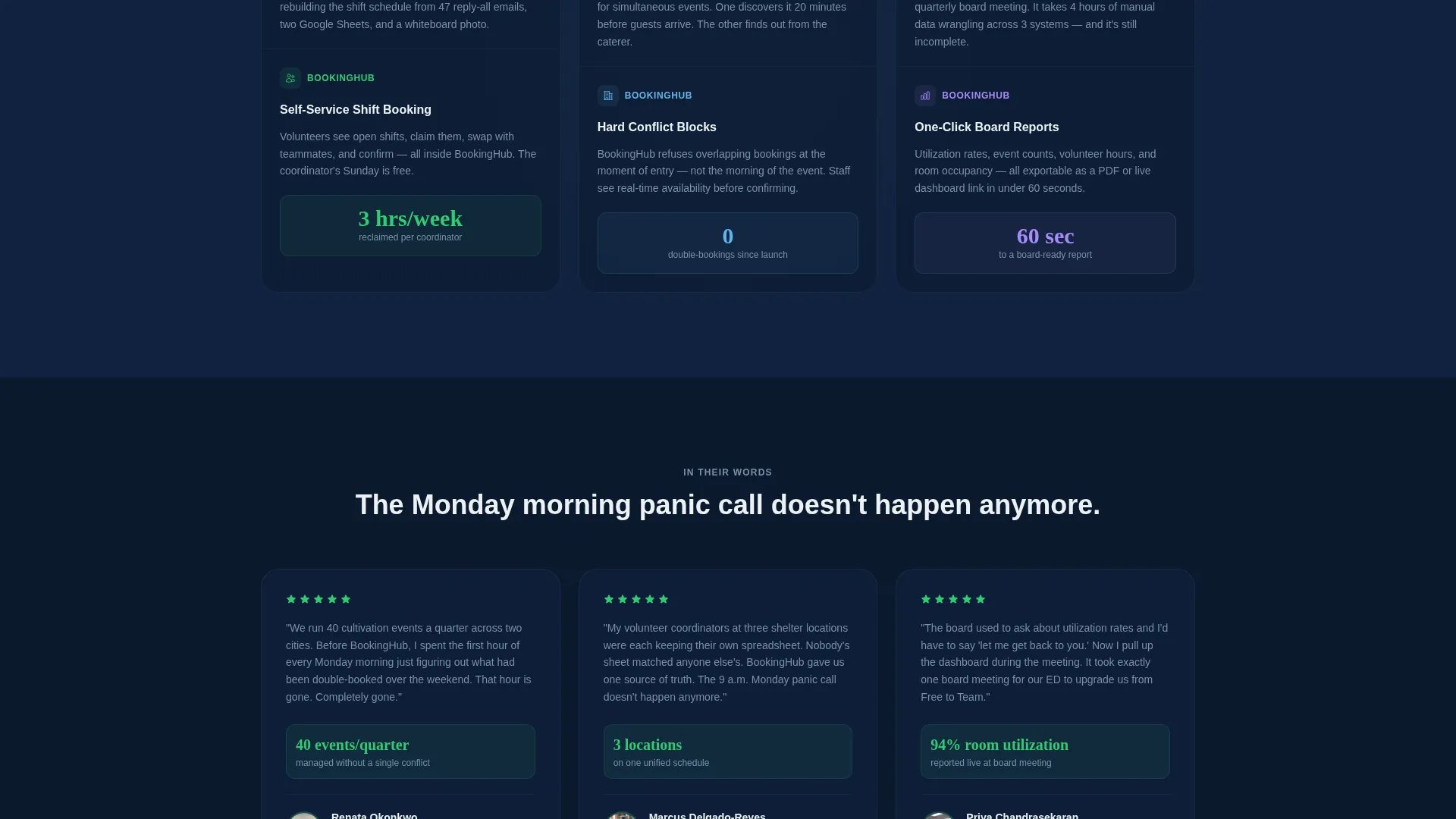
| Stat and Feature Block 3 | Closes the report cadence with board-ready utilization reporting evidence |
| Inline Sign-Up Form | Captures organization name, work email, and booking category in one step |
| Sticky call to action Bar | Keeps the free trial prompt visible throughout the scroll experience |
| Demo Request Section | Offers a guided demo path for larger or enterprise-level organizations |
Design & branding system
The visual identity follows a Dashboard Pro theme using a Midnight Blue color system. The palette reads like a control room running a late-night operational review: calm authority, no unnecessary decoration.
- Deep operational navy (#0B1A2E) as the primary background, soft mission-white (#EDF1F5) for card surfaces and data panels, and steel periwinkle (#7B8FA8) for secondary text and axis labels
- Impact green (#2ECC71) reserved exclusively for success states, active toggles, and the primary call-to-action to keep visual hierarchy sharp
- The overall aesthetic mirrors a live command terminal, where every element earns its place and the data is always the most important thing on screen
Mobile & speed optimization
The split-screen layout is designed to adapt cleanly to smaller viewports without losing the core visual logic. Each panel stacks predictably so the dashboard previews and statistics remain readable at any screen size.
- The tab switcher and sticky conversion bar are built to function on touch interfaces without requiring hover interactions
- Annotated user interface screenshots and callout tooltips are sized and positioned to stay legible when the layout collapses to a single column
How this template helps you convert
The page is structured as a sequential argument, not a feature list. Every design decision moves a visitor one step closer to starting a free account.
- The interactive header immediately places the visitor inside the product experience, reducing abstraction and building trust before a single statistic appears.
- The industry-report scroll format uses real nonprofit data to make the visitor's current workflow feel increasingly costly, so the call-to-action feels like relief rather than a sales pitch.
- The three-field inline form and the secondary demo path serve two distinct buyer types simultaneously, capturing both self-serve users and organizations that need a guided introduction.
Other information about this template
This template is built specifically for the nonprofit software and SaaS space. It works equally well for platforms launching a new scheduling product and for established tools refreshing their acquisition page.
- The template style is a 50/50 split screen, the theme is Dashboard Pro, and the creative direction follows an industry report cadence
- The color system is Midnight Blue, combining deep navy, mission-white, steel periwinkle, and impact green for a high-contrast operational aesthetic
- The freemium conversion direction means the page is optimized for low-barrier trial entry, not demo-only or sales-led funnels
- The header concept is a Feature Tab Switcher, making it straightforward to showcase multiple product areas without building separate pages
Theme
Dashboard Pro
Creative direction
Industry Report
Color system
Midnight Blue
Style
Split Screen (50/50)
Direction
Freemium/Trial
Page Sections
Three-tab Interactive Header
Split-screen 50/50 Layout
Industry Report Scroll Narrative
Low-friction Inline Sign-up
Sticky Conversion Bar
Secondary Demo Request Path
Related questions
Who is this template built for?
Can I adapt the three tabs for different product categories?
Does the page support both self-serve and demo-led sign-ups?
What does the inline sign-up form ask for?
Is the color system easy to update for a different brand?



