Box — Curated Delivery Landing Page Template
Curate is a bento grid landing page template built for subscription box discovery platforms. It pairs a scrolling logo bar, a cycling search field, and a layered feature matrix to guide curious shoppers toward their perfect box. The page is designed to convert through demonstrated depth, not sign-up friction, pushing visitors straight into the discovery engine with a single compelling click.
by Rocket studio
Quick summary
Curate is a single-page, click-through landing page template for subscription box discovery platforms. It opens with a hypnotic logo ribbon and a smart search bar, then unfolds a bento grid that proves platform depth tile by tile. No forms. No gates. Just a fast, confidence-building path toward the "Find Your Box" call to action.
Who this template is for
This template is built for founders and teams running a subscription box directory, curation platform, or discovery engine. It suits anyone who needs to convert cold traffic into engaged explorers without asking for a sign-up upfront.
- Subscription box platform operators who index multiple brands and want to showcase range at a glance
- Gift-givers and hobbyist-focused marketplaces that need to communicate depth and variety instantly
- Early-stage SaaS teams in the subscription box vertical who want a polished, high-converting first impression
What problem this template solves
Discovery platforms live or die by one question: does the visitor believe you have what they want? Most landing pages answer that question too slowly, burying variety behind long copy or a forced sign-up wall.
- Visitors leave before seeing enough inventory, assuming the platform is shallow
- Generic layouts fail to communicate the intelligence behind a filterable, searchable directory
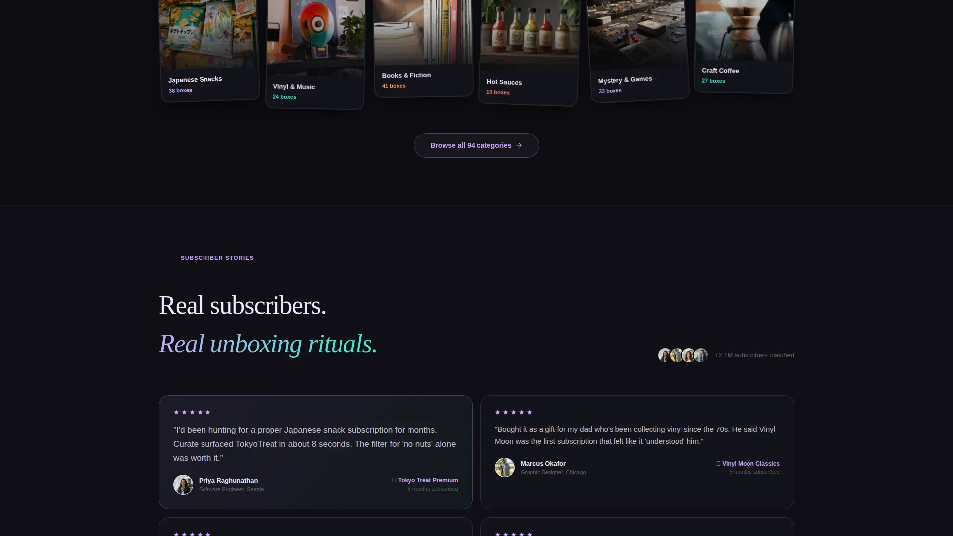
- Standard hero-and-call to action structures cannot show dozens of categories and features in a single scroll
What you get with this template
You get a fully structured bento grid landing page with every section and interactive element defined in the design brief. The layout is ready to customize with your own brand assets, copy, and box listings.
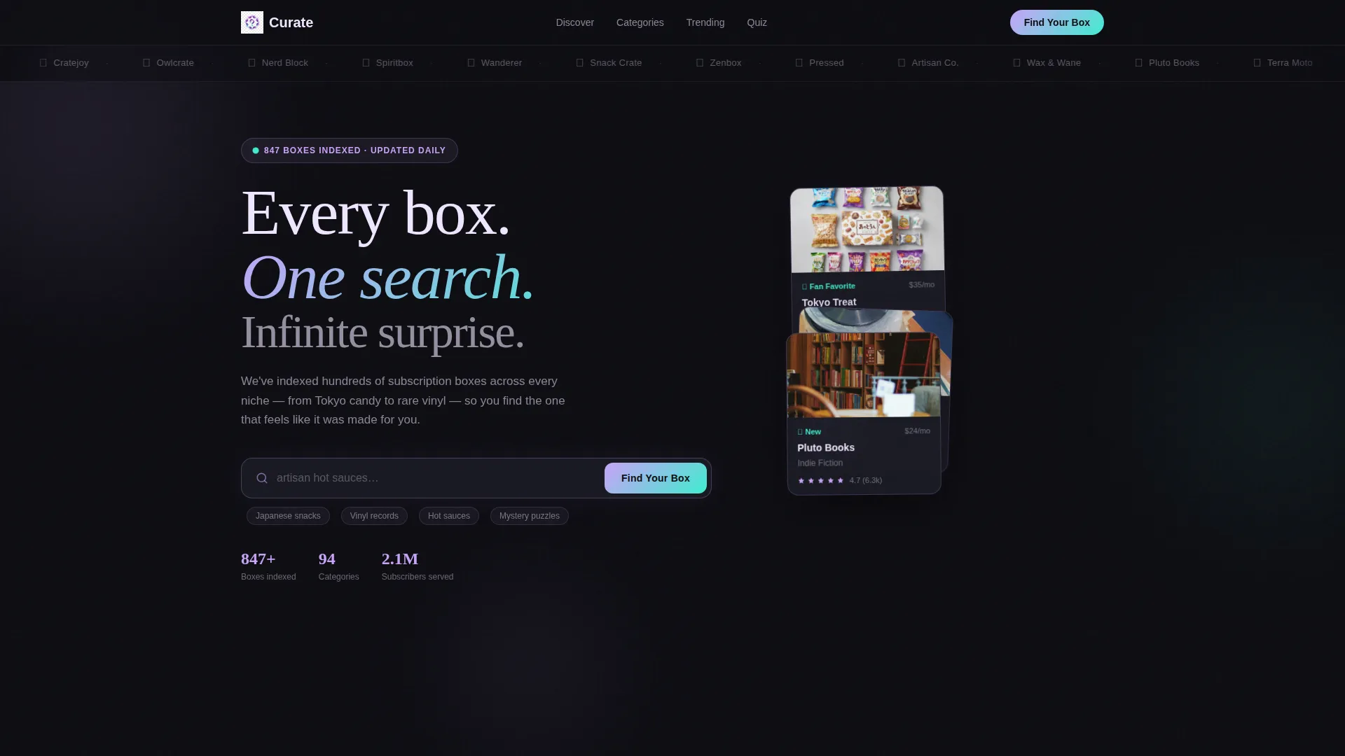
- A horizontally scrolling logo bar carrying sixty to seventy subscription box brand logos as visual proof of inventory depth
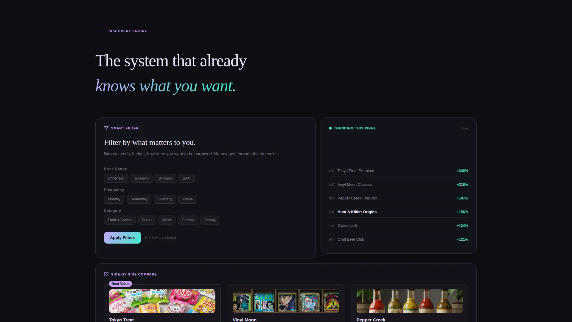
- A bento grid feature matrix with varied tile sizes covering smart filtering, a trending ticker, a side-by-side comparison panel, and a new-arrivals counter
- A click-through conversion flow featuring a pinned floating "Find Your Box" button and a mid-page "Take the Match Quiz" tile
Feature list
This template is built around a set of purpose-designed sections and components. Each one earns the visitor's trust before asking for any action.
Scrolling Logo Bar Header
A slow-drifting ribbon of subscription box brand logos runs across the top of the viewport. It functions as both social proof and an instant inventory statement. The sheer volume of logos communicates platform breadth before a single word of body copy is read.
Cycling Ghost-Text Search Field
A single oversized search bar sits beneath the logo bar with ghost text that cycles through category suggestions such as "Japanese candy... vinyl records... mystery puzzles... craft coffee..." It orients new visitors quickly and makes the discovery engine feel alive and responsive.
Asymmetric Bento Grid Matrix
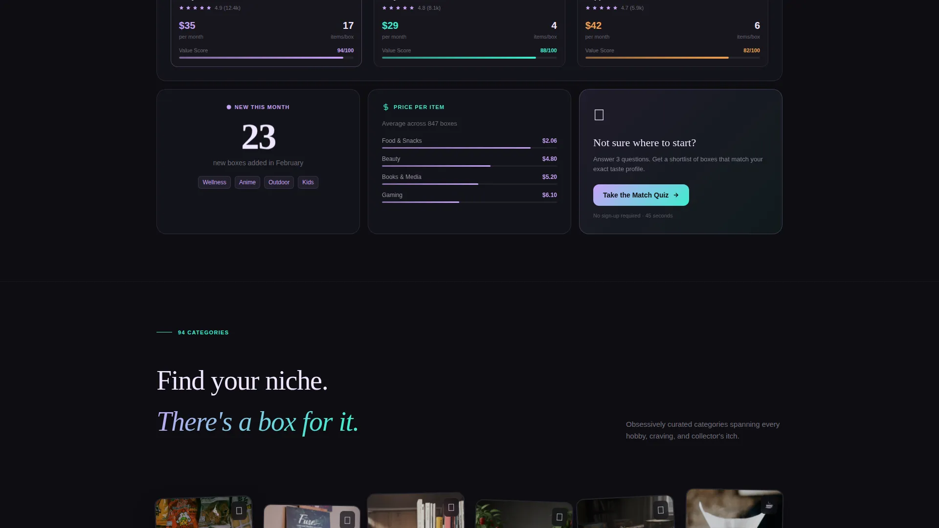
The core of the page is a non-uniform bento grid where every tile is a different shape and proof point. One large tile demonstrates smart filtering by dietary preference, price range, and shipping frequency. A tall narrow tile shows a live trending-this-week ticker. A wide tile compares three boxes side by side with star ratings and price-per-box breakdowns. A small tile pulses with a new-this-month counter.
Pinned Floating call to action Button
After the visitor scrolls past the header, a floating "Find Your Box" button stays pinned on screen. It removes any friction between a moment of interest and the click into the discovery engine, making the primary conversion path always visible.
Mid-Page Match Quiz Tile
Embedded inside the bento grid is a dedicated tile inviting visitors to "Take the Match Quiz." The promise is personalized results in just three questions. It gives hesitant visitors a gentler on-ramp than the direct search path, without adding a separate page or form flow.
Side-by-Side Box Comparison Panel
A wide bento tile presents three subscription boxes simultaneously with star ratings and a price-per-box calculation. It demonstrates the platform's intelligence layer and helps visitors make quick, informed decisions before they even reach the discovery engine.
Page sections overview
| Section | Purpose |
|---|---|
| Logo Bar Ribbon | Establishes inventory breadth through scrolling brand logos |
| Cycling Search Bar | Orients visitors and surfaces the discovery engine immediately |
| Smart Filter Tile | Shows filtering by diet, price, and shipping frequency |
| Trending Ticker Tile | Displays real-time popular box categories this week |
| Box Comparison Panel | Compares three boxes side by side with ratings and pricing |
| New Arrivals Counter | Pulses with a count of boxes added this month |
| Match Quiz Tile | Offers a three-question personalization path for hesitant visitors |
| Floating call to action Button | Keeps the primary action visible throughout the full scroll |
Design & branding system
The visual identity follows a Directory and Discovery theme powered by an AI Iridescent color system. The palette feels like light refracting through a soap bubble, shifting between futuristic softness and cool shimmer depending on where your eye lands.
- Core colors: shifting pearl white (#F0E6FF) and deep digital black (#0D0D12) anchor backgrounds, holographic lilac (#C8A2F8) fills category cards, and prismatic teal (#3EEDCF) activates only on hover states
- Typography and layout: oversized search input, asymmetric tile sizing, and varied grid weights create a sense of organized abundance rather than a flat directory grid
- Mood: the overall feel is "sliding open a drawer full of perfectly wrapped surprises" with each tile labeled and lit for immediate delight
Mobile & speed optimization
The bento grid layout is structured to reflow cleanly across screen sizes, keeping the most important tiles prominent on smaller viewports. The floating call to action and the search bar remain accessible regardless of how the grid rearranges.
- Bento grid tiles are sized and weighted so key proof points such as the comparison panel and match quiz tile remain visible without excessive scrolling on mobile
- The scrolling logo bar is designed as a continuous ribbon, which adapts naturally to narrower widths without breaking the social proof effect
- The pinned floating button stays in a fixed position across all viewport sizes, ensuring the primary conversion path is never lost during mobile scroll
How this template helps you convert
The page earns the click through demonstrated platform depth rather than persuasive copy alone. Every scroll reveals another layer of system intelligence, building visitor confidence in a logical sequence.
- The logo bar and cycling search field immediately signal inventory scale and category range, reducing the first objection before any copy is read.
- The bento grid feature matrix teaches the platform's filtering and comparison logic tile by tile, so visitors arrive at the bottom of the page already confident the engine will surface something worth subscribing to.
- The dual call to action structure, with a direct "Find Your Box" path and a softer "Take the Match Quiz" option, captures both decisive shoppers and those who need a guided nudge before committing to a click.
Other information about this template
This template is built specifically for the subscription box vertical within a SaaS discovery platform context. It is designed as a bento grid landing page with a click-through conversion goal, meaning the page pushes traffic into a deeper product experience rather than collecting leads directly.
- The template style is Bento Grid with a Directory and Discovery theme, making it well suited for any platform that indexes and curates multiple subscription box options in one place
- The header concept is a Logo Bar, which works particularly well when a platform has enough brand partners or indexed boxes to fill a scrolling ribbon with recognizable names
- The creative direction is Feature Matrix, meaning each bento tile is a self-contained proof point rather than a step in a linear narrative
- The color system is AI Iridescent, a palette designed to feel premium and futuristic without being cold or clinical
- This is a single landing page template, not a multi-page website build, so all conversion paths remain within one scrollable canvas
Theme
Directory & Discovery
Creative direction
Feature Matrix
Color system
AI Iridescent
Style
Bento Grid
Direction
Click-Through
Page Sections
Scrolling Logo Bar Header
Cycling Ghost-text Search Field
Asymmetric Bento Grid Matrix
Pinned Floating Call to Action Button
Mid-page Match Quiz Tile
Side-by-side Box Comparison Panel
Related questions
Does this template require visitors to sign up before exploring?
Can I use this template if I have fewer than sixty partner brands?
What is the Match Quiz tile and how does it work in this layout?
Is this template suitable for a niche subscription box directory, or only broad platforms?
How customizable is the bento grid layout?



