Live Fire Cybersecurity Training Landing Page Template
The Breach live fire cybersecurity training landing page template is a dark-ops modular card grid built for cyber security training platforms. It opens with a rendered dashboard console, drives awareness through stats-first flip cards, and converts visitors via head-to-head comparison rows. Every section is designed to support security awareness goals and move qualified leads toward a free range trial.
by Rocket studio
Quick summary
The Breach template is a single-page, card-grid layout built for cyber security training platforms that need to convert serious buyers fast. It combines a live dashboard header, modular stat cards, certification path modules, role-specific social proof, and a gated call-to-action into one cohesive flow. The dark Carbon Fiber palette and monospace typography reinforce the ops-center identity from the first scroll.
Who this template is for
This template serves training platforms whose customers are hands-on cyber security professionals and teams. It is equally strong for business-to-consumer and business-to-business services where the offer is practical, range-based training rather than passive video content.
- Security operations center analysts at Level 1 or Level 2 who need proof of skill to earn a promotion
- Career-switchers targeting their first blue-team role and looking for a clear certification roadmap
- Enterprise security leads who must get their entire team certified before an upcoming compliance audit
What problem this template solves
Most cyber security training pages fail to differentiate. They list course names, display a generic screenshot, and ask for an email. That approach loses visitors who are already evaluating three competing platforms in other tabs. Employees and security professionals need to see hard evidence before they commit.
- Visitors leave before understanding why this platform beats alternatives on lab count, realism, and price
- Security awareness messaging stays vague, giving potential clients no reason to trust the numbers
- Comparison-ready buyers have no single place to evaluate the platform against competitors side by side
What you get with this template
This template gives you a fully structured, modular landing page ready to customize for your cyber security training offer. Every section is purposeful, and every design choice supports the goal of turning a skeptical security professional into an active user.
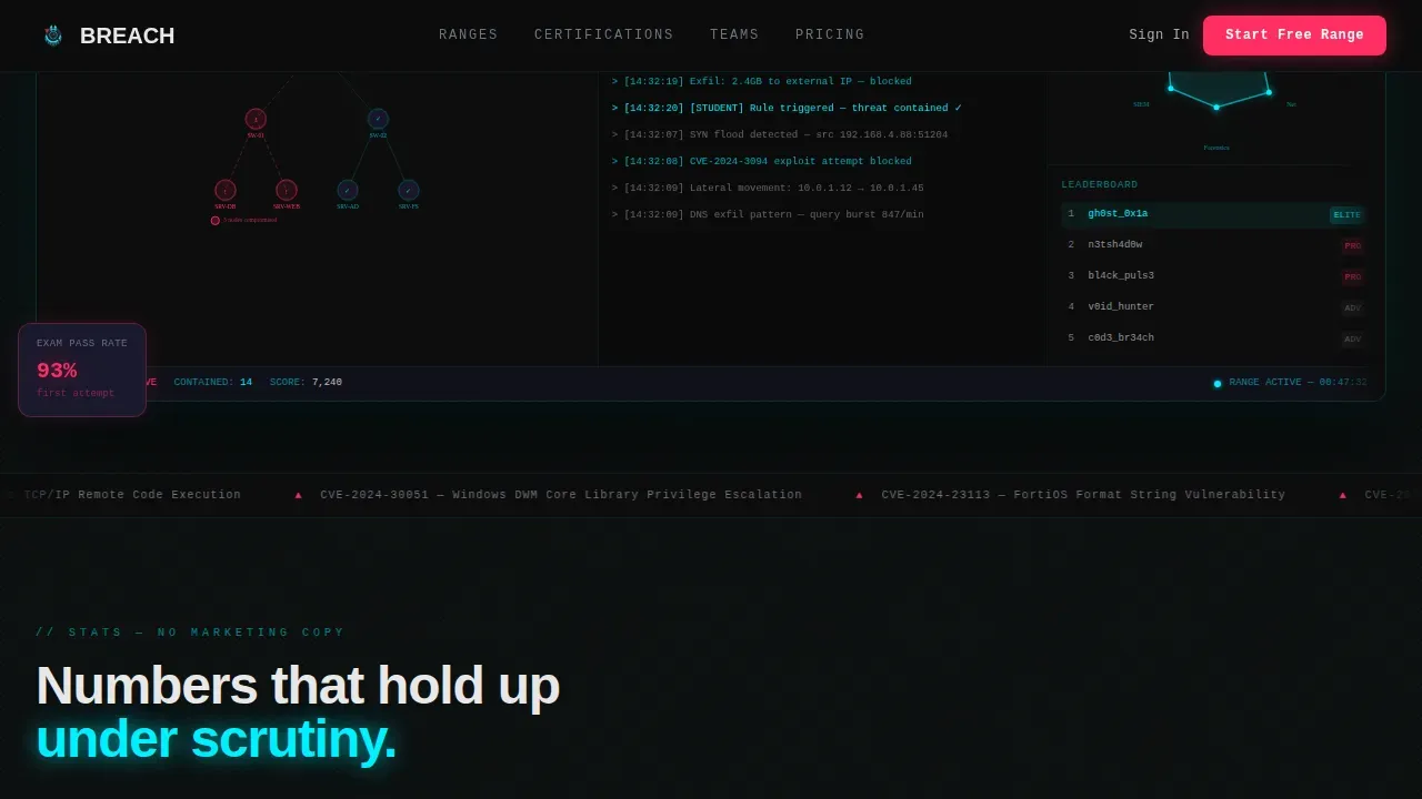
- A hero dashboard console showing a student mid-exercise, with pulsing threat nodes, a live packet capture terminal, a skill-radar chart, and an anonymized leaderboard
- A stats grid of flip cards showing hard numbers like labs completed and exam pass rates, plus a second row of versus comparison cards that highlight your platform's advantages in cyan
- A certification path bento grid, role-specific social proof cards, and a dual call-to-action row with a primary "Start Your Free Range" button and a gated PDF download
Feature list
This template's features are grounded in the specific components described in the source brief. Each one is built to support the security awareness and conversion goals of a live-fire training platform.
Dashboard Preview Hero Console
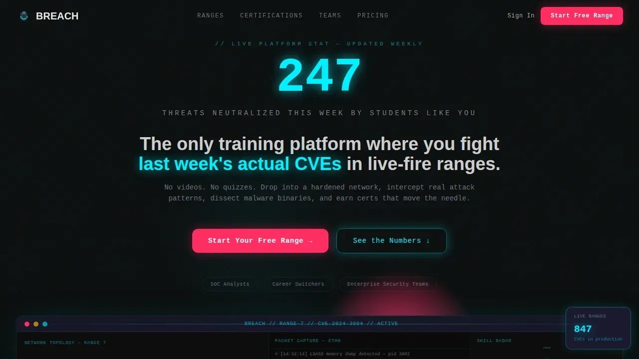
The header renders a fully detailed training console. It shows a network topology map with three compromised nodes pulsing red, a sidebar terminal scrolling live packet data, a skill-radar chart filling in real time, and an anonymized leaderboard. A single oversized monospace stat floats above the interface: "247 threats neutralized this week by students like you." This combination of data and motion signals to visitors that the platform is active and real, not a recorded demo.
Stats-First Flip Card Grid
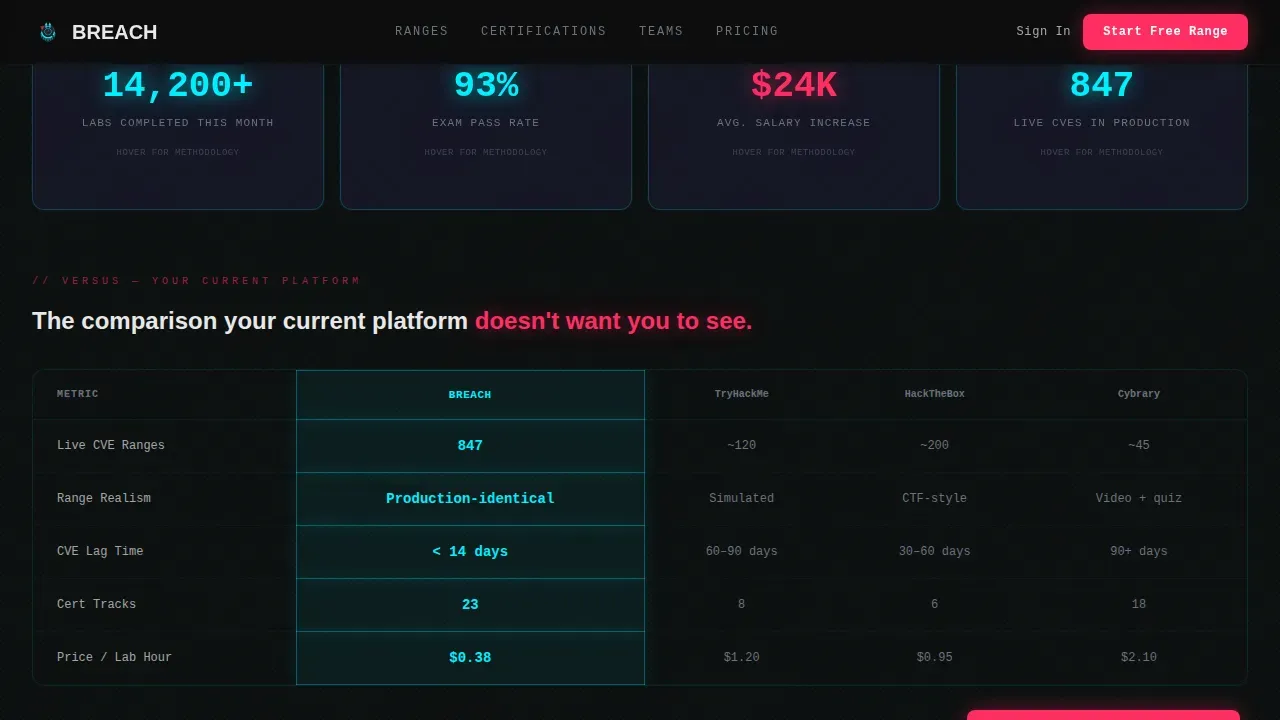
The first card row hits visitors with hard numbers before any explanation. Cards display metrics such as "14,200+ labs completed," "93% exam pass rate," and "Avg. salary increase: $24K." Each card flips on hover to reveal the methodology behind the number. This transparency helps organizations and individual users trust the data and reinforces the platform's commitment to measurable outcomes.
Comparison Versus Row
The second card row uses a side-by-side framework to compare the platform against competitors on lab count, range realism, certification coverage, and cost per hour. The platform's column is highlighted in threat-alert cyan. This format is designed so the visitor's current platform loses on at least one dimension they care about, making the decision to switch feel rational rather than impulsive.
Certification Path Modules
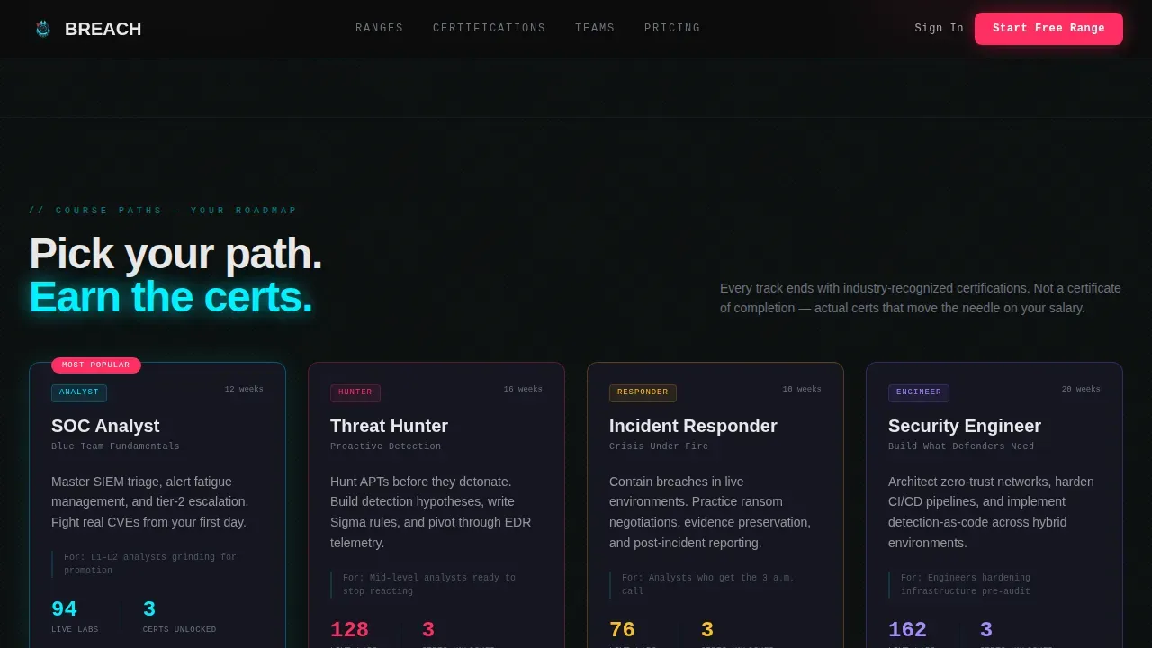
A bento-grid section organizes courses into clear tracks. Each module shows exactly which certifications a given path unlocks, turning a dense course catalog into a personal roadmap. This helps employees at all levels understand where to start and what they gain by completing each track.
Role-Specific Social Proof Cards
Outcome cards are written for each target audience type: the SOC analyst, the career-switcher, and the enterprise security lead. Each card includes specific numbers such as salary increases and time-to-certification. This specificity helps different users see themselves in the results and encourages them to actively participate.
Gated PDF Lead Capture
A secondary conversion path offers a full platform comparison document gated behind a single email field. Limiting the form to one field keeps friction low and supports better conversion rates for visitors who are still evaluating their options before committing to a free range trial.
Page sections overview
| Section | Purpose |
|---|---|
| Hero Dashboard Console | Show a live training exercise and anchor the platform's realism with a bold headline stat |
| Stats Flip Cards | Deliver hard proof numbers with hover-reveal methodology on each card |
| Versus Comparison Row | Compare the platform against competitors across four key dimensions |
| Certification Path Grid | Map course tracks to specific certifications for each learner type |
| Social Proof Cards | Present role-specific outcomes with salary and timing data |
| Primary Call to Action | Drive free range sign-ups with a pinned call to action on every comparison card |
| Gated PDF Download | Capture evaluating leads via a single-field email gate |
| Footer Row | Provide a clean linear single-row close with essential links |
Design & branding system
The visual system is built on a Carbon Fiber color palette that makes every element feel functional. The goal is a dark ops-center aesthetic where color is earned by purpose, not decoration. Typography pairs JetBrains Mono for statistics and data labels with DM Sans for body copy and interface text.
- Deep terminal black (#0D0D0D) for the primary background, woven carbon gray (#1A1A2E) for card surfaces, threat-alert cyan (#00F0FF) for active highlights and data lines
- Incident red (#FF2E63) used exclusively for calls to action and competitive differentiator labels, so it always signals a decision moment
- High-motion GSAP-style animations including scroll-blur backgrounds, IntersectionObserver card reveals, terminal scroll simulation, pulsing threat nodes, and real-time radar chart fills
Mobile & speed optimization
Although the template is desktop-first by design, reflecting how SOC analysts work across multiple monitors, the layout is structured to remain accessible on smaller screens. The dashboard header is the most viewport-dependent component and is prioritized for wide displays.
- GPU-accelerated transforms are used for all animations to keep motion smooth without blocking the main thread
- The requestAnimationFrame loop handles terminal simulation, ensuring the scrolling packet capture stays fluid on any device
- Card grids reflow into narrower columns on smaller viewports so the core stats and comparison data stay readable without horizontal scrolling
How this template helps you convert
The template is engineered for a Comparison and Versus conversion strategy. Every persuasion moment is timed to catch the visitor at peak contrast, right when they realize their current platform falls short.
- The hero stat and dashboard console create immediate credibility, giving the security team or individual user a reason to keep reading before a single feature is explained.
- Flip cards and the versus row build the case progressively, so by the time the visitor reaches the call to action pinned to the bottom of each comparison card, the decision feels obvious rather than pressured.
- The gated PDF offer captures leads who are not yet ready to start a free trial, keeping them in the funnel and giving the platform a way to follow up with evaluating stakeholders or management contacts.
Other information about this template
This template is a strong fit for any cyber security business that wants to promote training programs with a high-impact, data-forward presentation. It can be adapted to support security awareness campaigns, compliance-driven team training, and onboarding programs where new employees need to quickly understand company security policy.
- The template supports awareness goals year-round, not just during National Cybersecurity Awareness Month, which aligns with the view that cybersecurity awareness should be a continuous priority for every organization
- Topics covered in the platform's training programs, such as phishing simulation, password hygiene, and protection against advanced ransomware campaigns, can all be represented through the certification path and social proof sections
- Small businesses and enterprise departments alike can use this template to promote their cyber security services, since the card grid scales to as few or as many course tracks as needed
- The comparison row format is particularly useful when clients want to demonstrate compliance coverage, as it lets them show which certifications and regulatory frameworks their training unlocks at a glance
- Professional templates like this one help organizations create engaging materials that encourage employees to actively participate in security training, reinforce good practices, and stay secure in the workplace
- Editable template sections allow teams to tailor the platform's messaging to specific audiences, whether that is a small business owner learning password basics or an enterprise security lead managing department-wide compliance efforts
Theme
Dashboard Pro
Creative direction
Stats-First Impact
Color system
Carbon Fiber
Style
Card Grid (Modular)
Direction
Comparison/Versus
Page Sections
Live Dashboard Console Hero
Stats-first Flip Card Grid
Versus Comparison Row
Certification Path Bento Grid
Role-specific Social Proof Cards
Single-field Gated PDF Download
Related questions
Who is this template best suited for?
Can I customize the stats and comparison data on the cards?
Does this template support compliance and certification messaging?
Is the template suitable for small businesses running security awareness programs?
How does the gated PDF section work for lead capture?



