QA Engineering Bootcamp Landing Page Template
Breakpoint is a single-column landing page template built for a twelve-week QA engineering bootcamp. It opens with animated metrics, walks visitors through a scrollable curriculum timeline, and closes with a sticky registration call to action. The Slate & Sky color system keeps the page focused and credible, helping bootcamp operators convert career-switchers into enrolled students.
by Rocket studio
Quick summary
Breakpoint is a single-column landing page template designed for an intensive QA engineering bootcamp. It leads with hard proof, animated graduate stats, then guides visitors through a vertical curriculum timeline before presenting a clear registration path. The dark slate and sky-blue palette feels deliberate and focused, earning trust before asking for a commitment.
Who this template is for
This template is built for bootcamp operators and independent educators running intensive QA and software testing programs. It speaks directly to audiences who need evidence before they enroll, not just a pitch.
- Bootcamp founders running cohort-based QA or automation engineering programs
- Independent instructors launching a first or updated technical training cohort
- Program directors who want a registration-focused page without a custom build
What problem this template solves
Most course landing pages lead with a sales pitch. That approach loses the mid-career professional who has been burned by vague promises before. Breakpoint reverses the order: numbers first, curriculum second, outcomes third.
- Skeptical adult learners need proof of results before they trust a program
- Career-switchers and manual testers need to see a clear path, not just a course outline
- Educators lose registrations when visitors scroll away before the call to action appears
What you get with this template
Breakpoint delivers a complete, production-ready single-column landing page. Every section is purpose-built for a QA bootcamp registration flow.
- An animated stats header with three rolling counters showing graduate placement data
- A vertical timeline layout covering the full twelve-week curriculum with testimonial cards pinned to each phase
- A sticky bottom registration bar, an inline seat-reservation form, and a secondary syllabus download gate
Feature list
Breakpoint includes six purpose-built layout features. Each one serves the registration goal directly.
Animated Stats Header
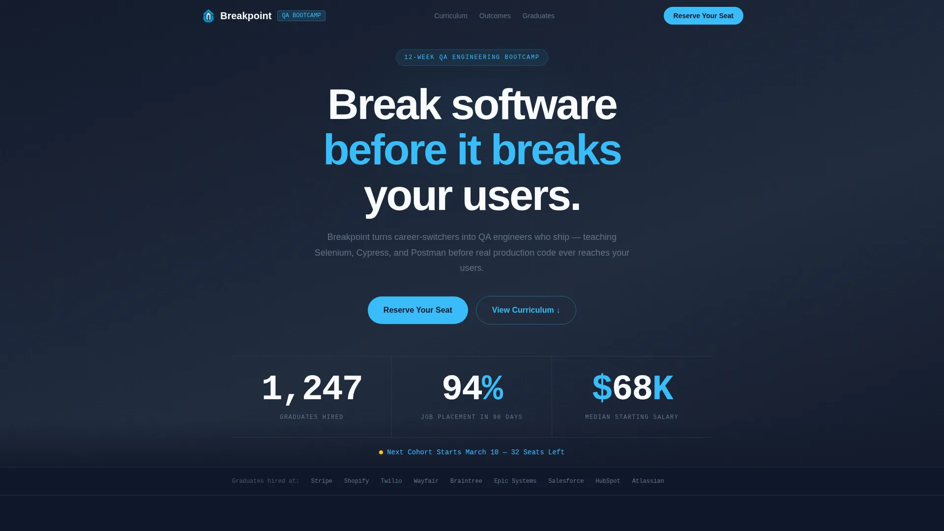
Three large counters tick upward in a monospaced font against the deep slate background. The numbers display graduate hiring totals, placement rate, and median starting salary. A sky-blue cohort reminder line sits directly below, showing the next start date and remaining seats.
Scrollable Curriculum Timeline
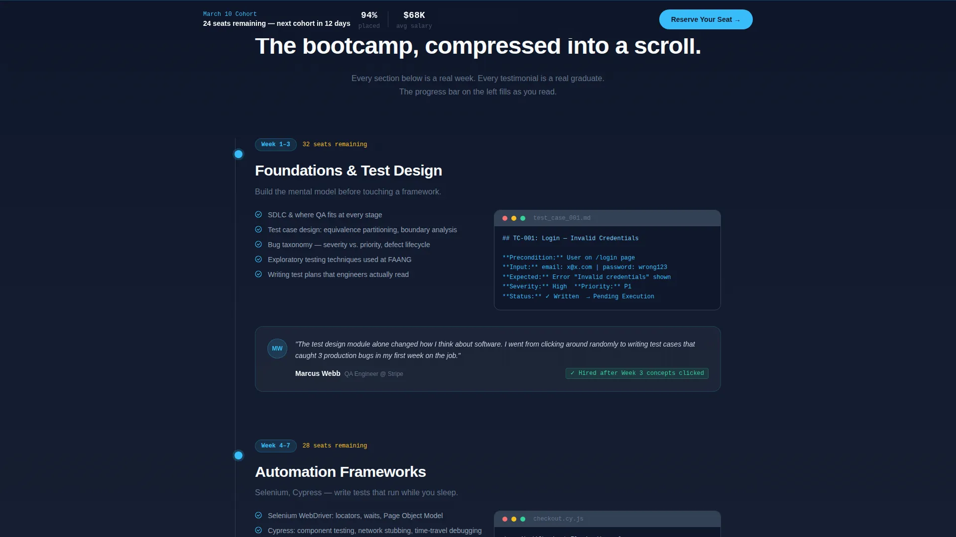
A vertical timeline rail runs down the left edge of the page. It fills with sky blue as the visitor scrolls, turning the page into a live progress bar. Each phase of the twelve-week program appears as a node on the rail, with curriculum content, code snippets, and tool logos anchored to the right.
Pinned Testimonial Cards
Graduate testimonial cards are attached to the timeline phase where that outcome was earned. This grounds social proof in specific curriculum moments rather than floating it in a generic section. Each card connects a real result to a real part of the program.
Sticky Registration Bar
After the visitor scrolls past the Week 4 section, a sticky bottom bar activates. It displays the "Reserve Your Seat" call to action and a seat counter. The bar stays visible for the rest of the scroll, ensuring the primary conversion point is always one tap or click away.
Seat Scarcity Indicators
Each timeline section ends with a subtle remaining-seats reminder. The seat count decrements as the visitor scrolls deeper. This reinforces urgency without interrupting the curriculum narrative.
Syllabus PDF Download Gate
A secondary conversion path offers a full syllabus download in exchange for an email address alone. This captures visitors who are not ready to register but are willing to be followed up with. It reduces the cost of leaving the page without committing.
Page sections overview
| Section | Purpose |
|---|---|
| Stats Metrics Header | Opens with animated graduate counters to establish proof immediately |
| Cohort Seats Alert | Sky-blue line showing next start date and available seats |
| Week 1 to 3 Timeline | Foundations, test case design, and bug taxonomy curriculum phase |
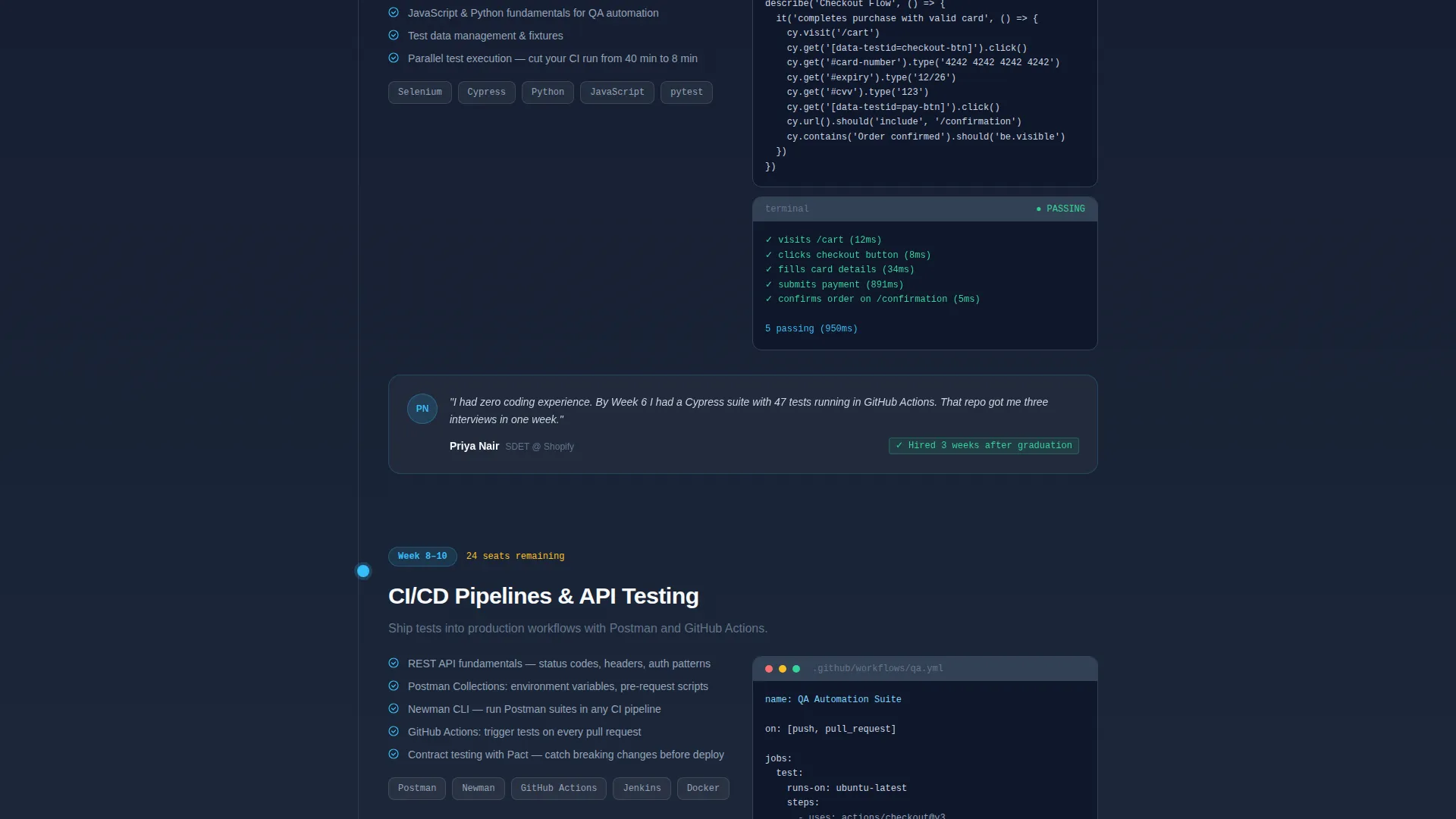
| Week 4 to 7 Timeline | Automation frameworks phase with code snippets and micro-animations |
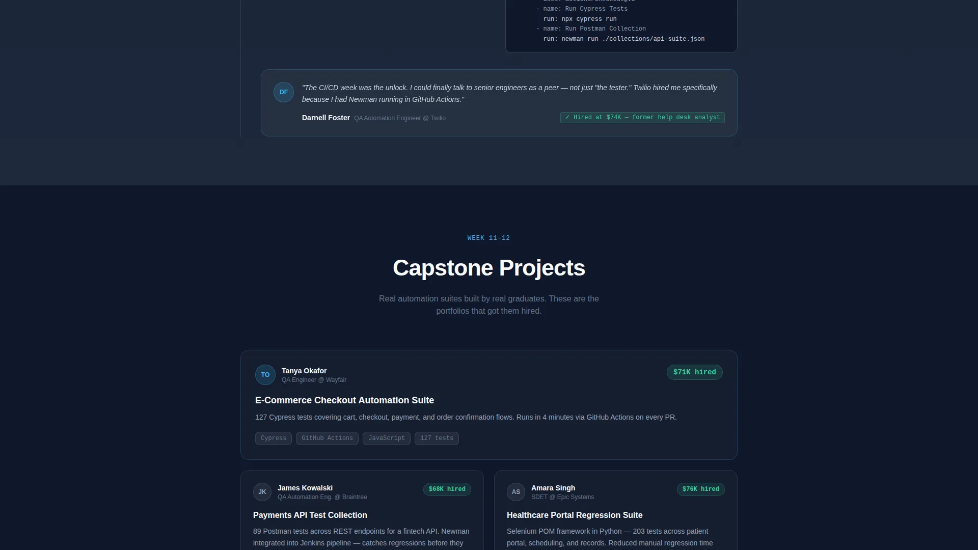
| Week 8 to 10 Timeline | API testing and pipeline integration phase with tool logos |
| Week 11 to 12 Capstone | Capstone showcase with actual graduate project work |
| Registration Form | Inline seat-reservation form with name, email, and background dropdown |
| Syllabus Download Gate | Secondary email capture for PDF syllabus download |
| Sticky Bottom Bar | Persistent registration call to action active after Week 4 scroll |
Design & branding system
The Breakpoint template uses an Educational Guide theme with a Slate & Sky color system. The palette is described in the brief as a code editor at dawn: dark, calm, and sharp, with a single electric-blue accent that signals action.
- Deep slate charcoal (#1E293B) for primary backgrounds, mid-tone graphite (#475569) for secondary text and dividers, and clean cloud white (#F8FAFC) for content cards
- Open sky blue (#38BDF8) on all primary buttons, progress indicators, and interactive highlights
- Monospaced typography on counter numbers to evoke terminal output; standard readable type for body and curriculum content
Mobile & speed optimization
The single-column flow is designed to work cleanly on smaller screens without horizontal scrolling or layout collapse. The vertical timeline structure translates naturally to a mobile viewport.
- Single-column layout means no complex grid reflows on narrow screens
- The sticky registration bar is built for thumb-tap use on mobile devices
- Animated counters and timeline fill behavior are scoped to the landing page scroll context
How this template helps you convert
Breakpoint sequences its content to resolve objections before they form. By the time a visitor reaches the registration form, they have already seen the data, followed the curriculum, and read outcomes from real graduates.
- The stats header front-loads credibility: placement rate, salary, and graduate count appear before any program description, so skeptical visitors see proof first.
- The scrollable timeline makes the curriculum feel tangible and earned, not abstract, which builds confidence in the program's structure before the ask.
- The dual conversion paths, seat reservation and syllabus download, capture both ready-to-commit visitors and those who need more time, reducing page abandonment.
Other information about this template
Breakpoint is categorized under Education & Training, specifically within the Coding Bootcamp and Tech School subcategory. It is purpose-built for the QA and testing bootcamp niche.
- The template style is Single Column Flow, making it straightforward to customize within any standard page builder environment
- The creative direction is Timeline Progression, which means the scroll behavior itself tells the story of the program's twelve-week arc
- The header concept is Stats and Metrics, a format proven to build trust with adult learners who are evaluating a significant career investment
- The registration direction is Event Registration, optimized for cohort-based programs with limited seats and a fixed start date
Theme
Educational Guide
Creative direction
Timeline Progression
Color system
Slate & Sky
Style
Single Column Flow
Direction
Event Registration
Page Sections
Animated Stats Header with Rolling Counters
Scrollable Twelve-week Curriculum Timeline
Phase-pinned Testimonial Cards
Sticky Seat-reservation Bar
Inline Registration Form with Background Dropdown
Syllabus PDF Download Gate
Related questions
What type of program is this landing page designed for?
Can I adapt this template if my bootcamp has a different program length?
What are the two conversion paths built into this template?
When does the sticky registration bar appear on the page?
Who is the ideal student audience this template is written for?



