Charming Café Landing Page Template for Membership
Brew is a charming café landing page template built for woman-owned coffee businesses that want to lead with personality and pricing. A modular card grid, Neo-Retro visual identity, and a price-anchored header work together to turn first-time visitors into loyal members before they even reach the form.
by Rocket studio
Quick summary
Brew is a single-page café landing page template designed around membership tiers, interactive card reveals, and a warm Neo-Retro aesthetic. It opens with bold pricing, guides visitors through a delight-driven grid, and closes with a low-friction upgrade form, making the experience feel personal from the first scroll to the final click.
Who this template is for
This template was built for café owners who want their website to feel as inviting as their physical space. It suits independent, community-rooted coffee businesses that want to sell memberships or recurring visits rather than just announce hours and a menu.
- Woman-owned cafés launching or refreshing a membership program
- Independent coffee shops with a loyal neighborhood following
- Café owners who want a page that reflects genuine personality and warmth
What problem this template solves
Most café websites look like digital menus, flat, static, and forgettable. Brew solves the problem of a café that has real personality but no way to show it online. It removes the gap between the warmth of the physical space and the coldness of a typical business page.
- Visitors leave without understanding the membership value or difference between tiers
- The page feels generic and gives no reason to stay, explore, or sign up
- There is no clear conversion path from casual browser to paying member
What you get with this template
You get a fully structured single-page layout with every section already designed and purposeful. The template handles the visual hierarchy, interactive behavior, and conversion flow so you can focus on your content and your community.
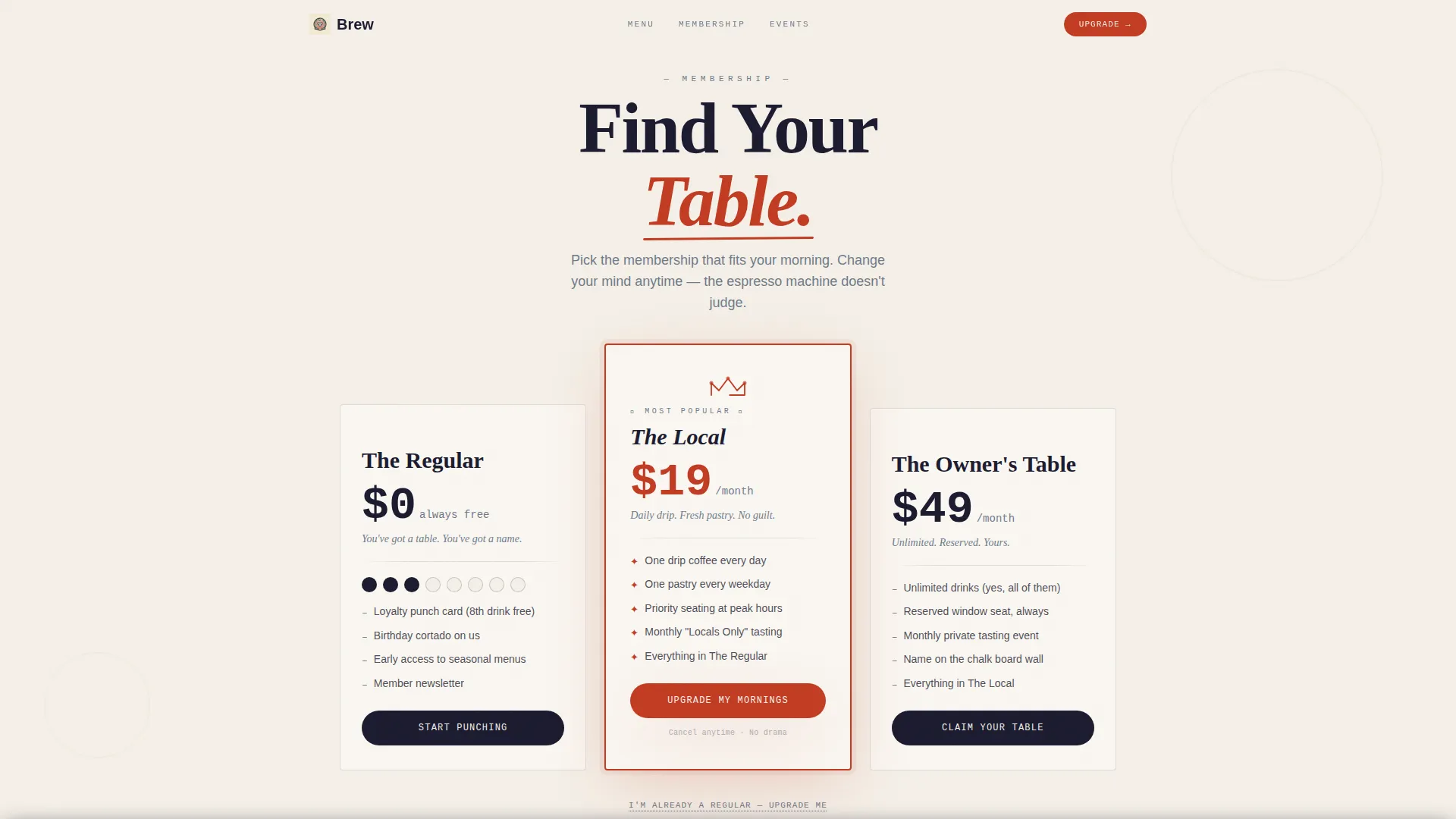
- A price-anchored header with three membership tier cards styled like a café chalkboard
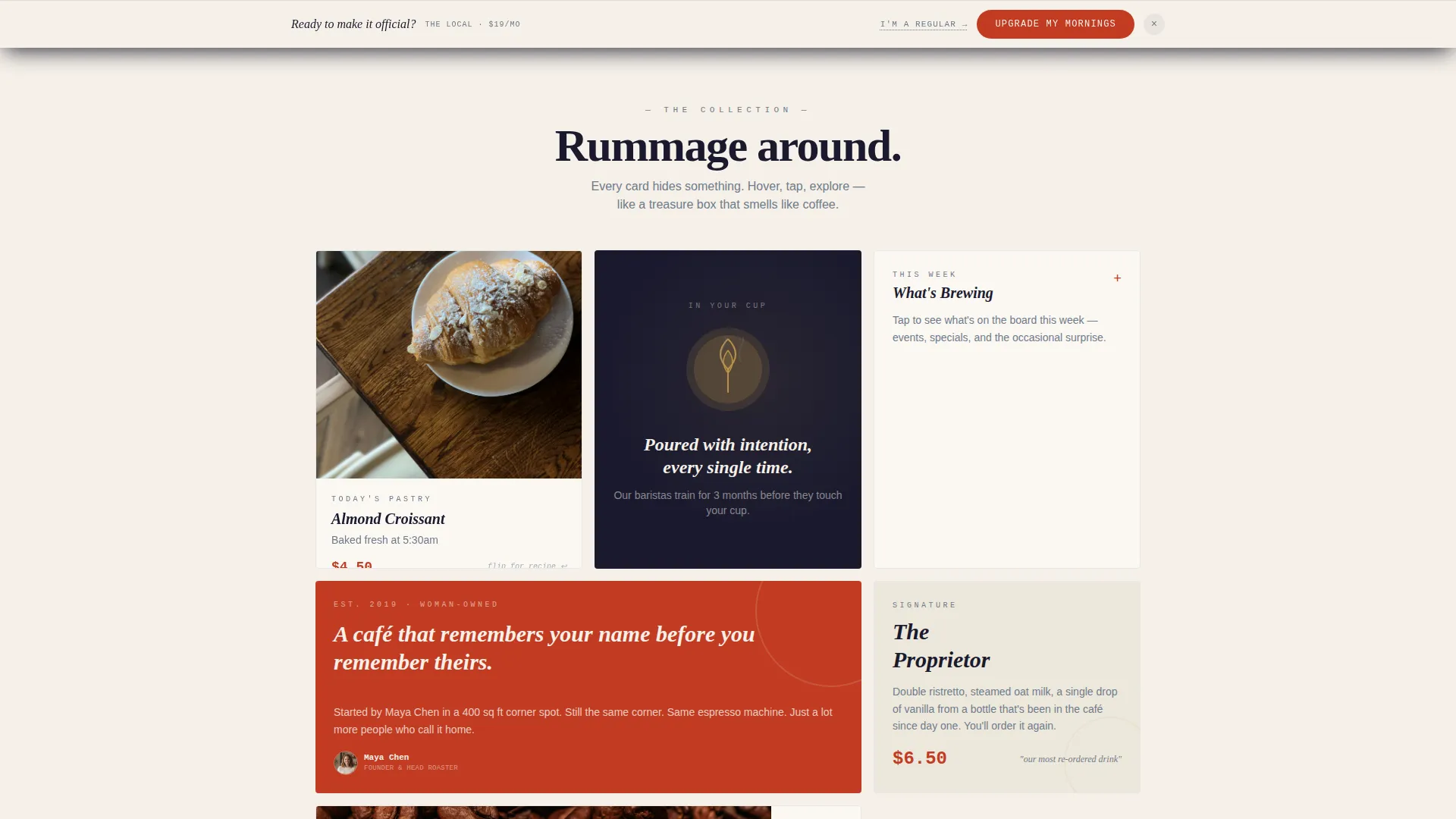
- A modular card grid with hover and tap reveal interactions across multiple card types
- A pinned upgrade call-to-action and a single-step membership sign-up form
Feature list
This template packs purposeful design decisions into every module. Each feature below reflects something built directly into the layout and interaction model.
Price-Anchored Membership Header
Three oversized membership tier cards open the page in place of a traditional hero image. "The Regular" at no cost, "The Local" at nineteen dollars per month, and "The Owner's Table" at forty-nine dollars per month are typeset large enough to read across a room. The premium tier card is centered, slightly elevated, and edged in typewriter red with a hand-illustrated crown detail above it.
Surprise and Delight Card Grid
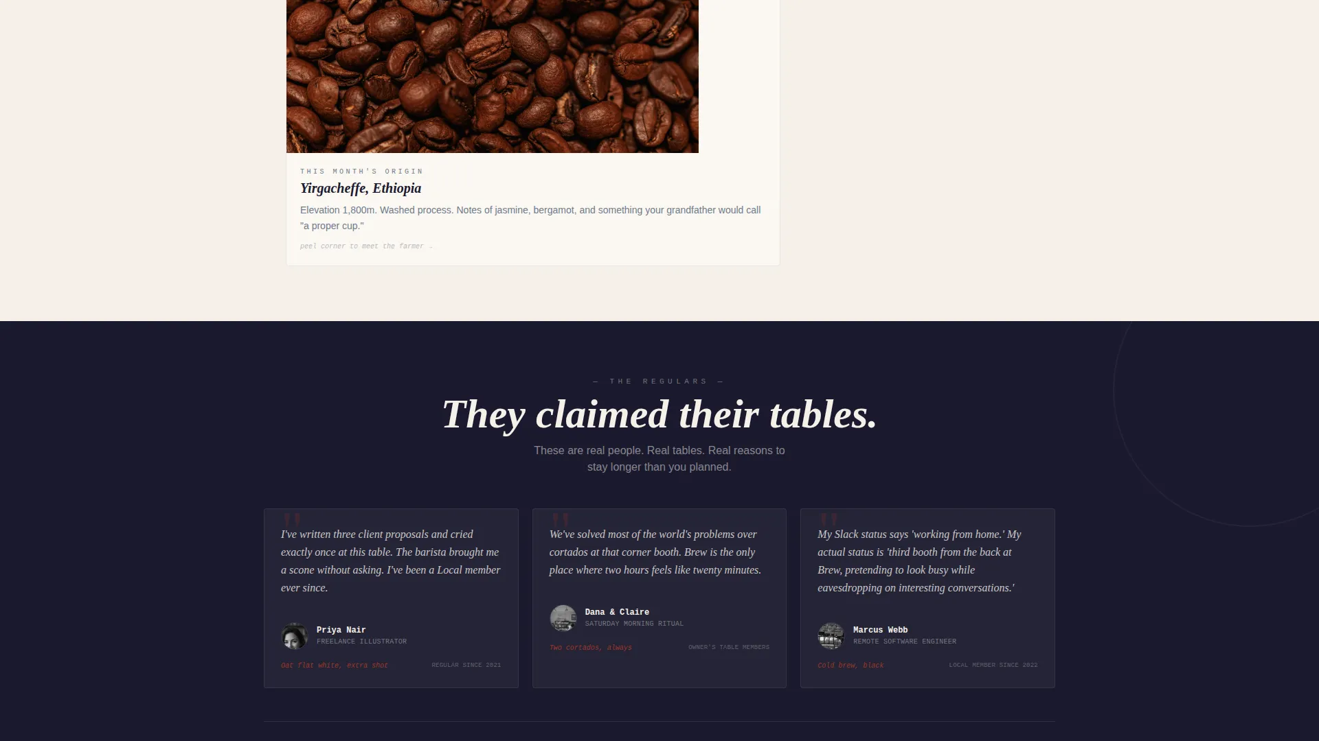
The modular grid uses hover and tap reveals to reward curiosity. A pastry card flips to show the baker's handwritten recipe note. A coffee origin card peels back like a postage stamp to reveal the farmer's portrait. A "What's Brewing This Week" card unfolds into a mini-calendar with event illustrations.
Mixed-Format Bento Grid Layout
Cards vary in height and width across the grid, breaking the predictable row-by-row rhythm most pages use. Some cards contain looping cinemagraph-style visuals of latte art being poured or steam rising from a fresh scone. The layout feels like rummaging through a treasure box rather than scanning a brochure.
Pinned Upgrade Call-to-Action
After the first scroll, a persistent "Upgrade My Mornings" button appears anchored to the bottom of the viewport in typewriter red. It stays accessible without blocking content, keeping the conversion path visible throughout the entire browsing experience.
Single-Step Membership Form
Clicking the call-to-action opens a focused sign-up form with three fields: first name, a playful favorite-drink dropdown, and a tier selector with the middle tier pre-selected. The form is intentionally minimal so the decision feels easy and the commitment feels light.
Existing Member Upgrade Path
A secondary interaction labeled "I'm Already a Regular" lets current members bypass the main form and access a one-tap upgrade flow. This keeps the page useful for returning visitors without cluttering the primary sign-up experience.
Page sections overview
| Section | Purpose |
|---|---|
| Membership Tier Header | Opens with three pricing cards as the primary visual |
| Pastry Card Reveal | Flips to show baker's handwritten recipe note on interaction |
| Coffee Origin Card | Peels back to reveal the farmer's portrait on hover or tap |
| Weekly Brewing Calendar | Unfolds into an illustrated event mini-calendar |
| Cinemagraph Content Cards | Displays looping latte art and steam visuals in the grid |
| Pinned Upgrade Button | Keeps "Upgrade My Mornings" visible after first scroll |
| Membership Sign-Up Form | Collects name, drink preference, and tier selection |
| Member Return Path | Offers one-tap upgrade flow for existing members |
Design & branding system
The visual identity follows a Neo-Retro direction that feels less like a website and more like a well-loved neighborhood institution. Every color and type choice was made to evoke warmth, handcraft, and quiet confidence.
- Deep fountain-pen black (#1A1A2E) for headlines in a serif that looks hand-set; warm parchment cream (#F5F0E8) as the dominant background tone; typewriter-ribbon red (#C23B22) for prices, call-to-action elements, and interactive accents
- Faded carbon-copy blue (#6E7B8B) for secondary text, dividers, and supporting details that organize without competing
- Hand-illustrated details including a doodled crown above the premium tier card give the layout a personal, human quality that printed templates rarely achieve
Mobile & speed optimization
The modular card grid is built to restack gracefully on smaller screens. Hover interactions translate to tap reveals on touch devices so mobile visitors get the same surprise-and-delight experience as desktop users.
- Tall and wide card variants reflow into a readable single-column order on mobile viewports
- The pinned call-to-action button remains visible and accessible without obscuring card content on smaller screens
- The single-step sign-up form is compact enough to complete comfortably on a phone without excessive scrolling
How this template helps you convert
Brew earns the conversion before it asks for one. The page is structured so every scroll builds emotional connection and clarity, making the sign-up feel like a natural next step rather than an interruption.
- The price-anchored header removes ambiguity immediately, visitors understand the three membership tiers and their value within seconds of landing on the page.
- The interactive card grid builds genuine affection for the café before any ask appears, so by the time the form is visible the visitor already feels like they belong.
- The pre-selected middle tier, playful form fields, and one-tap member upgrade path all reduce decision friction and make completing the sign-up feel effortless.
Other information about this template
Brew was designed to fit the Retail and E-Commerce category with a specific focus on woman-owned business contexts. The template style follows a Bento Grid structure, and the creative direction is rooted in Surprise and Delight interactions throughout.
- Template style: Bento Grid with mixed card sizes and interactive reveals
- Theme: Neo-Retro with an Ink and Paper color system
- Intersection niche alignment: woman-owned bakery and café businesses
- Creative direction: Surprise and Delight, where every card module rewards exploration
- Header concept: price-anchored layout presenting membership tiers as the primary visual statement
Theme
Neo-Retro
Creative direction
Surprise & Delight
Color system
Sunset Gradient
Style
Bento Grid
Direction
Quiz/Assessment
Page Sections
Price-anchored Membership Header
Surprise and Delight Card Reveals
Mixed-format Bento Grid
Pinned Upgrade Call-to-action
Single-step Sign-up Form
Existing Member Upgrade Flow
Related questions
Can I change the membership tier names and prices?
How do the card reveal interactions work on mobile?
Can I replace the cinemagraph cards with static images?
Is this template suitable for a café launching a membership program for the first time?
Does the template work if I do not offer three membership tiers?



