Vibrant Café Landing Page Template | Masonry Grid
Brew is a vibrant café landing page template built on a playful geometric visual system and a citrus-burst color palette. It combines a masonry card grid with scarcity-driven urgency through countdown badges, sold-out states, and a sticky cart. The result is a single-page ordering experience that feels as warm and immediate as the café it represents.
by Rocket studio
Quick summary
Brew is a single-page café landing page template designed for premium food and beverage businesses. It uses a masonry grid layout, bold geometric illustrations, and a warm citrus color palette to turn seasonal menu items into must-have moments. Every card ticks quietly toward a deadline, and every scroll deepens the sense that the best things here will not wait.
Who this template is for
This template is built for café owners and specialty food brands that want their online presence to match the energy of their physical space. It suits businesses that rotate menus, run seasonal specials, or sell limited-quantity items that reward loyal, fast-moving customers.
- Specialty cafés offering pour-overs, seasonal lattes, and artisan pastries
- Premium bakeries and food vendors running limited-time product drops
- Neighborhood coffee shops building a regular pre-order customer base
What problem this template solves
Most café websites feel static. They list a menu, show a photo of latte art, and do nothing to communicate urgency or exclusivity. Brew solves the problem of a passive online presence that lets hesitant visitors drift away without ordering.
- Countdown badges and sold-out states make scarcity visible without aggressive copy
- The masonry grid gives visual weight to seasonal specials over everyday items
- A sticky cart and pre-order flow turn casual browsers into committed customers
What you get with this template
Brew delivers a complete single-page café ordering experience built around a modular card grid. Every component is designed to show the right product at the right moment and nudge the visitor toward action before the item disappears.
- A geometric hero header with a centered search box and animated pill-filter navigation
- A masonry product grid with countdown badges, sold-out overlays, and category row labels
- A sticky cart panel and a pre-order capture module for upcoming menu drops
Feature list
Brew includes a focused set of purpose-built components drawn directly from the template brief. Each one earns its place by supporting the overall goal of turning a café menu into a live, ticking sales experience.
Geometric Hero Header
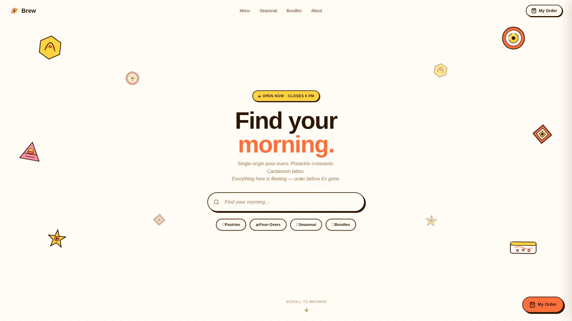
The header replaces a traditional hero photo with bold flat-vector illustrations. Hexagonal croissant cross-sections, circular latte art rings, and triangular sandwich shapes orbit a centered search box. The placeholder text reads "Find your morning…" and pill-shaped quick filters sit beneath it, labeled "Pastries," "Pour-Overs," "Seasonal," and "Bundles."
Masonry Product Card Grid
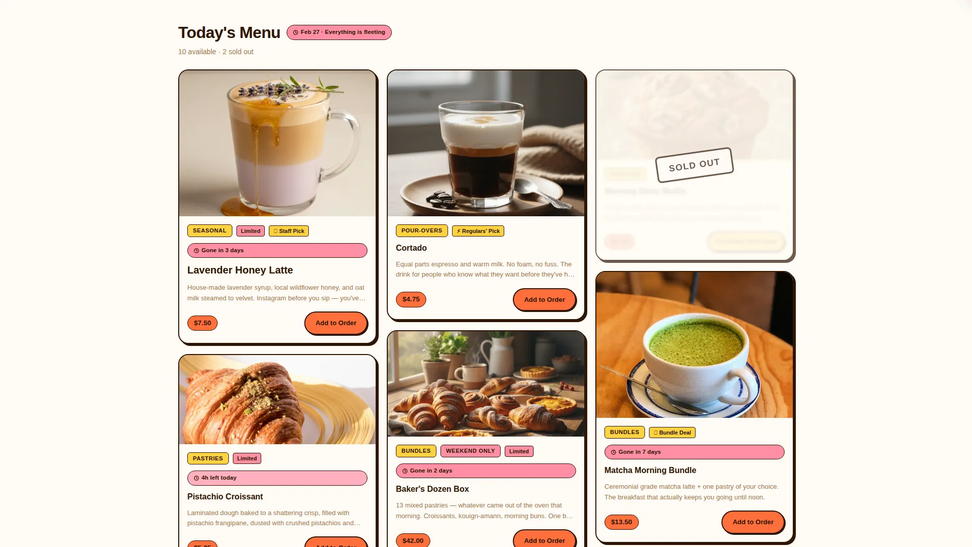
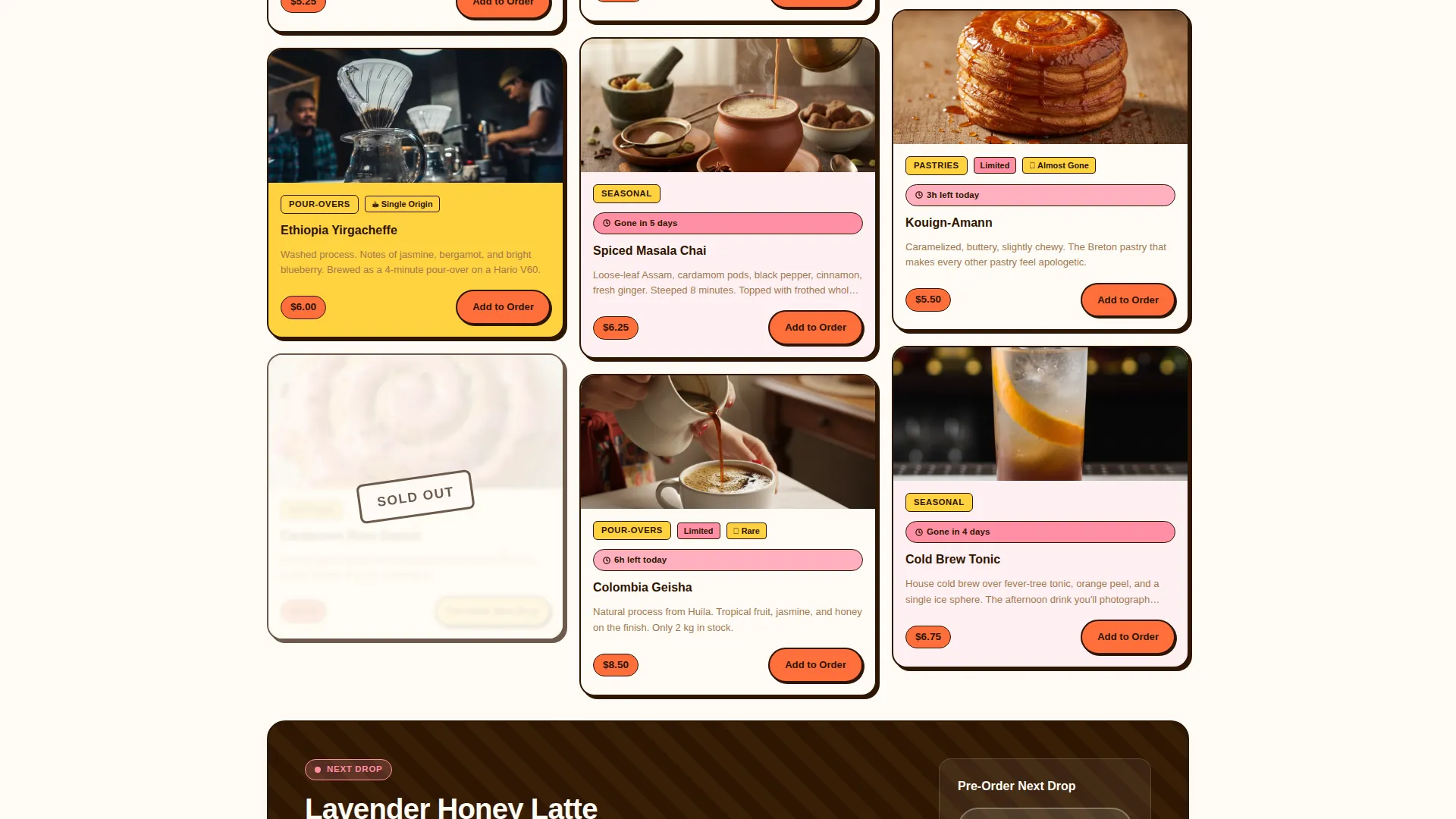
Cards vary in size across every row, mixing tall tiles with square ones to keep the eye moving. Each card carries a quiet countdown badge, a category label, and an "Add to Order" button in espresso crema text on a tangerine background. A full-width banner periodically breaks the grid pattern to announce upcoming menu drops.
Scarcity and Sold-Out States
Sold-out items remain visible in the grid but are grayed out with geometric confetti overlays. This design choice communicates real demand without hiding the products. Oversized seasonal tiles carry grapefruit-pink countdown badges reading "Gone in 3 days" or specific day-of-week deadlines.
Sticky Right-Side Cart
Every "Add to Order" action feeds a cart panel that slides in from the right side of the screen. The cart remains accessible as the visitor continues scrolling, reducing the friction between browsing and checkout intent.
Pre-Order Capture Module
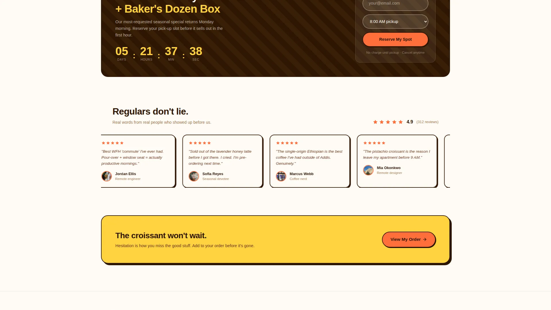
Below the main grid, a secondary conversion block invites visitors to pre-order the next drop. It captures an email address and a preferred pickup time, building a reservation list for unreleased menu items before they go live.
Citrus Burst Color System
Tangerine zest (#FF6F3C) drives buttons and price tags. Meyer lemon (#FFD23F) washes across card backgrounds and hover states. Grapefruit pink (#FF8FA4) marks limited badges and countdown timers. Deep espresso crema (#2E1503) anchors headlines and grounding elements so the brightness never feels uncontrolled.
Page sections overview
| Section | Purpose |
|---|---|
| Geometric Hero Header | Centers search and quick-filter navigation inside bold vector illustrations |
| Pill Filter Bar | Lets visitors jump directly to Pastries, Pour-Overs, Seasonal, or Bundles |
| Masonry Product Grid | Displays rotating menu cards with countdown badges and category row labels |
| Full-Width Drop Banner | Breaks the grid to announce the next scheduled menu drop |
| Sold-Out Overlay Layer | Keeps unavailable items visible with confetti overlays to signal real demand |
| Sticky Cart Panel | Slides in from the right and holds selected items during continued browsing |
| Pre-Order Capture Block | Collects email and pickup-time preference for upcoming unreleased items |
Design & branding system
Brew's visual identity is built on a Playful Geometric theme that treats every shape as a design asset. The palette feels pressed from actual citrus, warm, saturated, and grounded by a single deep anchor tone that stops the brightness from becoming chaotic.
- Tangerine zest (#FF6F3C) for primary buttons and price tags; Meyer lemon (#FFD23F) for card backgrounds and hover states
- Grapefruit pink (#FF8FA4) reserved for limited badges and countdown timers; deep espresso crema (#2E1503) for all headlines and anchoring text
- Flat bold vector illustrations replace photography in the header, keeping the visual language consistent and scalable across screen sizes
Mobile & speed optimization
The masonry grid and geometric header are designed to reflow clearly on smaller screens. Card proportions and pill-filter spacing adjust so touch targets remain comfortable and the countdown information stays readable at every size.
- Pill-shaped quick filters are sized for thumb taps and spaced to avoid accidental selections
- The sticky cart panel is designed to remain accessible without blocking product cards on mobile viewports
- Sold-out overlays and countdown badges scale with their parent cards so urgency cues stay visible on small screens
How this template helps you convert
Brew layers three conversion mechanisms on top of each other. The result is a page that builds desire, communicates scarcity, and captures intent from visitors who are not ready to order today.
- The masonry grid uses visual hierarchy and countdown badges to surface the most time-sensitive items first, pushing the visitor toward a fast decision before the deadline passes.
- The sticky cart keeps the commitment low, visitors can add items and keep browsing without losing their selection, reducing the chance they leave before completing an order.
- The pre-order module captures undecided visitors with a low-friction email and pickup-time form, converting a browse session into a future confirmed order.
Other information about this template
Brew is categorized under Retail and E-Commerce as a Premium Business template. It is built on a Card Grid (Modular) layout structure and carries a Playful Geometric theme with a Limited Time creative direction. The template is designed for single-page deployment as a café landing page.
- The template is suitable for premium bakery and specialty coffee niches where rotating inventory and limited drops are core to the brand experience
- The header concept uses geometric illustration rather than photography, making the template easier to launch without professional food photography
- The intersection match score for this template is 9 out of 10, reflecting strong alignment between the Retail and E-Commerce category, the Premium Business subcategory, and the premium bakery niche
Theme
Playful Geometric
Creative direction
Limited Time
Color system
Obsidian & Gold
Style
Card Grid (Modular)
Direction
Direct Sales
Page Sections
Geometric Hero Header with Search
Masonry Card Grid with Countdown Badges
Sold-out Scarcity Overlays
Sticky Right-side Cart Panel
Pre-order Email Capture Block
Citrus Burst Color System
Related questions
Do I need professional food photography to use this template?
Can I update the countdown timers and menu cards myself?
What makes the scarcity design different from a typical sale page?
Who is the sticky cart panel designed for?
Is this template suitable for a rotating or seasonal menu?



