Robust API Orchestration Landing Page Template
Gateway is a Bold Brutalist landing page template built for an API management newsletter and community. It opens with a live interactive API response preview, anchors attention with a hard-numbers comparison table, and drives visitors toward app downloads. The Void and Violet color system gives it the feel of a production dashboard at midnight, focused, urgent, and impossible to ignore.
by Rocket studio
Quick summary
Gateway is a single-page, stats-first landing page template designed for an API management newsletter and community. It pairs a live interactive header feed with a brutalist comparison table to prove value before asking for commitment. Two clear conversion paths, app download and free issue preview, guide different visitor types to the same decision.
Who this template is for
This template speaks directly to technically fluent audiences who already live inside the problem it solves. It is built for operators who want proof, not promises.
- Platform engineers who debug rate limit errors and gateway outages in production environments
- Developer relations leads tracking how fast their community hears about breaking changes
- Chief technology officers evaluating whether to build or buy their next integration layer
What problem this template solves
Most newsletter landing pages describe what the product is. They do not show what it costs to go without it. Gateway flips that logic by leading with a comparison table that quantifies the gap between reading release notes alone and reading the newsletter.
- Visitors arrive skeptical and leave having seen real numbers on time-to-awareness and deprecation lead time
- Two conversion paths reduce drop-off for visitors who want the app versus those who want a free sample first
- The interactive header preview lets the content itself act as the proof of quality
What you get with this template
You get a fully structured single-page layout built around a Stats-First Impact creative direction. Every section is designed to escalate conviction, from the animated header feed to the oversized violet stats that follow.
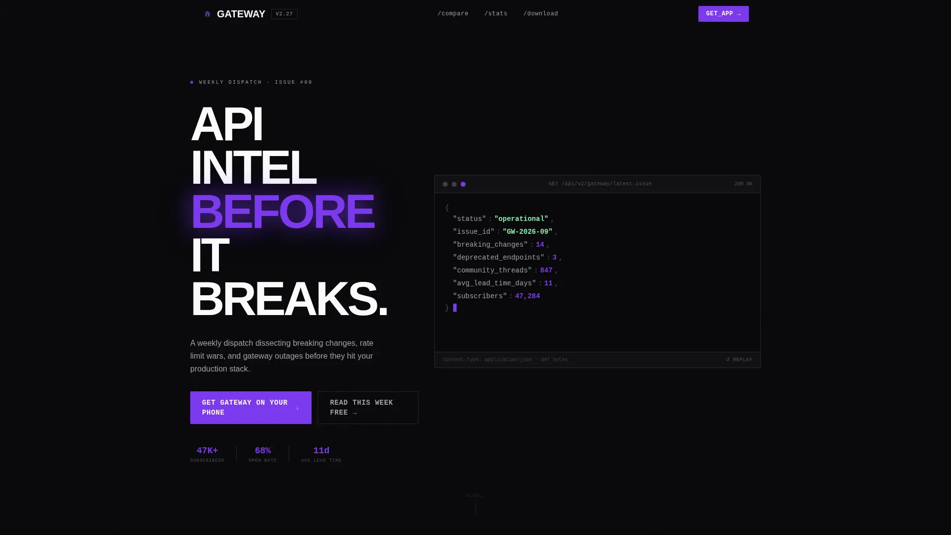
- An interactive header that renders the latest newsletter as a live API response object with animated key-value pairs
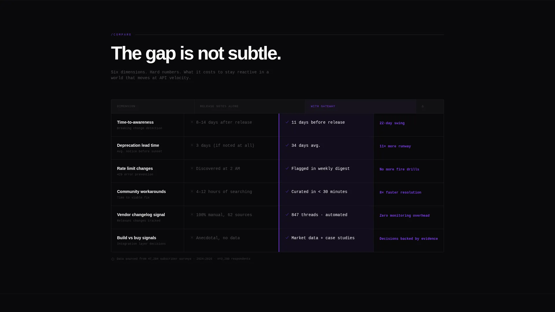
- A brutalist comparison table with row-by-row hard numbers pitting solo research against the newsletter
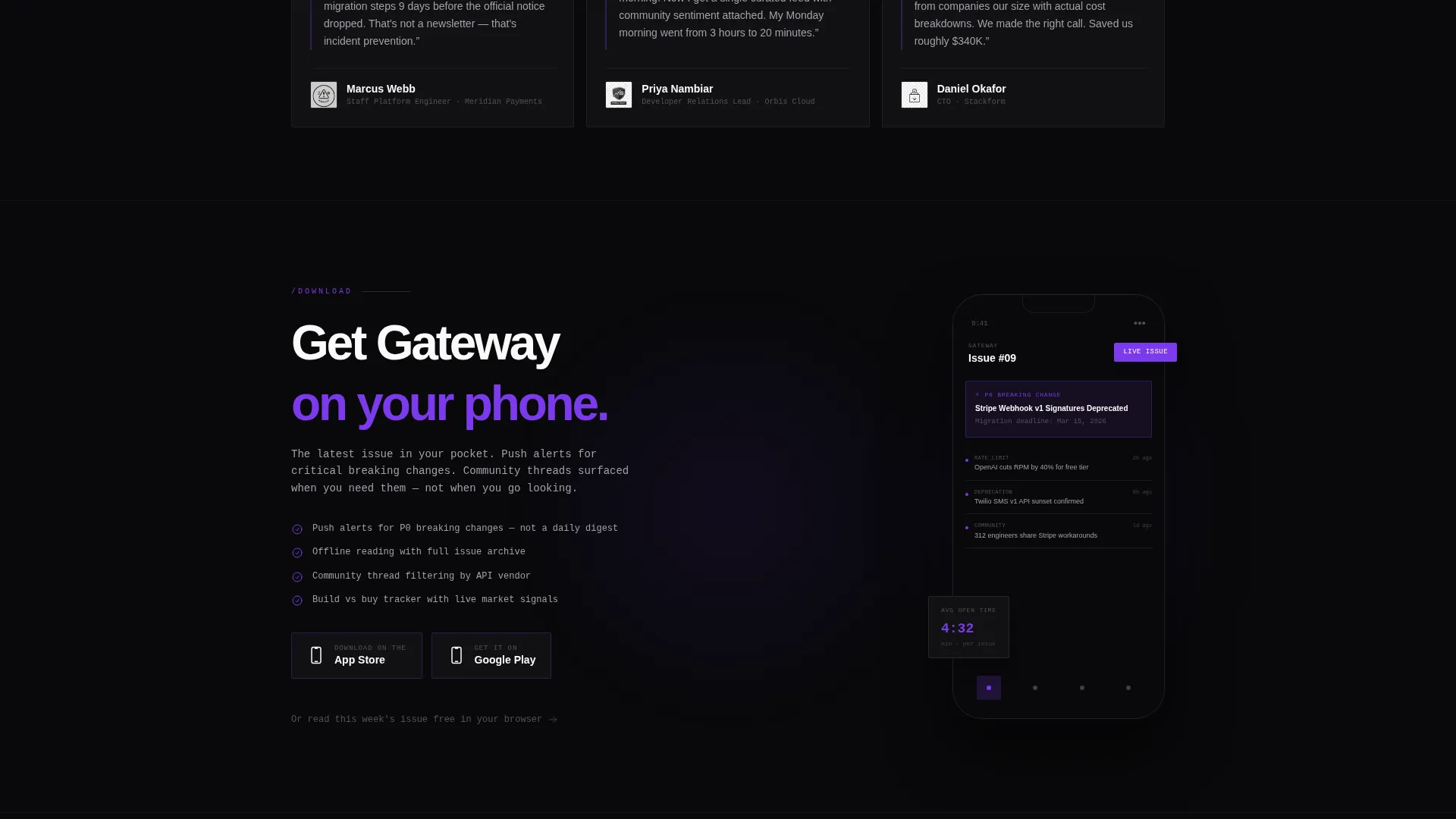
- A download-focused conversion zone with App Store and Play Store badges, a device mockup, and a secondary free-issue call to action
Feature list
This template includes purpose-built components drawn directly from the source brief. Each one serves the core goal: make the value of the newsletter undeniable before the visitor reaches the download prompt.
Interactive API Response Header
The header simulates a live API response feed. Fields like breaking changes count, deprecated endpoints, and community thread volume animate in like a streaming payload. Visitors can click any value to expand a snippet from the latest issue, turning the header into a live content sample.
Brutalist Comparison Table
The comparison table is the structural centerpiece of the page. It pits "reading release notes alone" against "reading Gateway" across dimensions including time-to-awareness on breaking changes, deprecation lead time, and community-sourced workarounds. Each row reveals hard numbers that widen the gap between the two options.
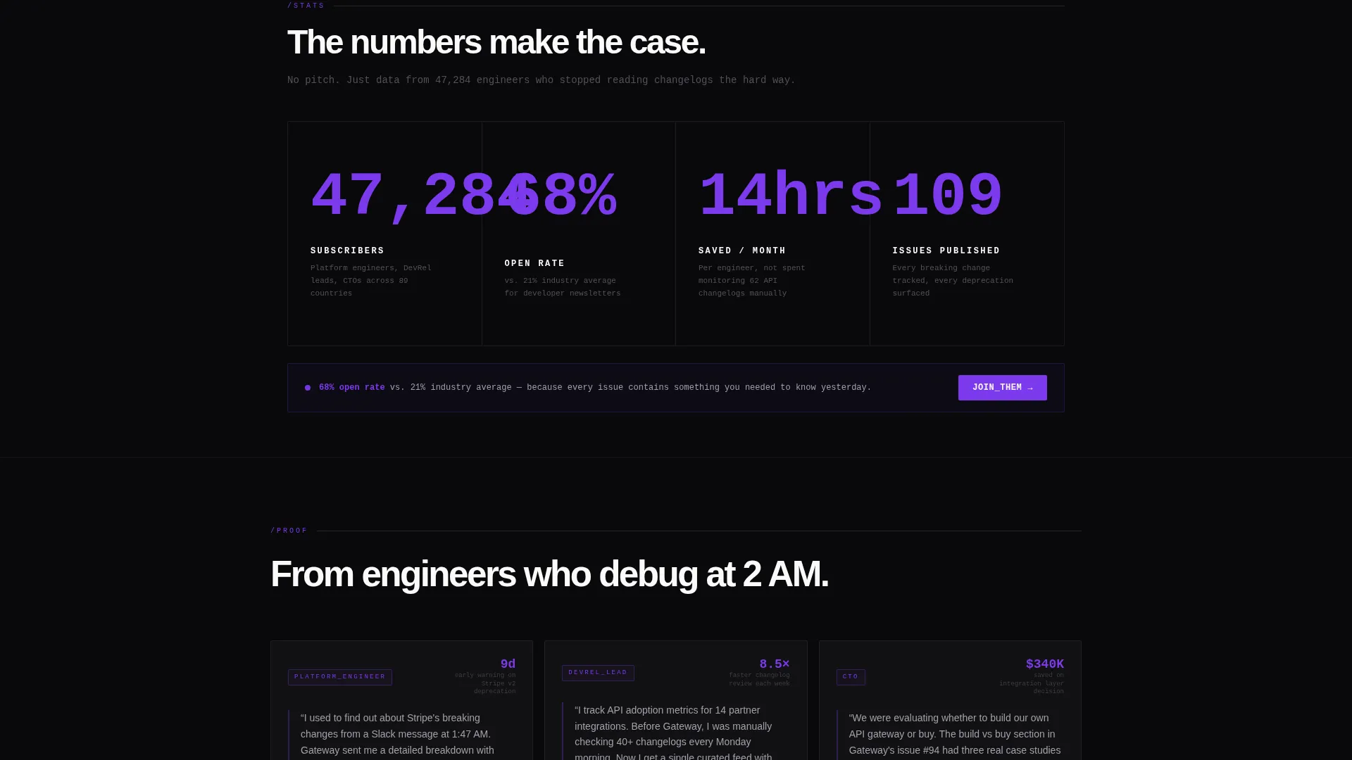
Escalating Stats Sections
Below the comparison table, sections build a rhythm of evidence. Subscriber count, average open rate, and hours saved per month each appear as oversized violet numbers against void black. The visual weight of each stat makes the next one feel earned rather than inflated.
Dual Conversion Zone
The primary call to action reads "Get Gateway on Your Phone" and pairs App Store and Play Store download badges with a device mockup showing the latest issue mid-scroll. A secondary path offers "Read This Week's Issue Free" for visitors who want proof before committing to the download.
Bold Brutalist Visual System
The layout strips away decorative chrome and lets content float against absolute void black. Electric violet appears only on interactive states, hover glows, and data highlights. Phosphor gray handles supporting type while terminal white punches through dark sections with high contrast.
Page sections overview
| Section | Purpose |
|---|---|
| Interactive Header Feed | Renders a live API response preview with animated values and expandable content snippets |
| Comparison Table | Quantifies the gap between solo research and the newsletter across key dimensions |
| Escalating Stats Block | Displays oversized subscriber, open rate, and time-saved figures to build conviction |
| App Download Zone | Drives the primary conversion with store badges, a device mockup, and a free-issue fallback |
Design & branding system
The visual identity is grounded in a Void and Violet color system designed to feel like a production dashboard viewed at midnight. Nothing decorative survives the palette.
- Core colors are absolute void black (#09090B) for backgrounds, electric violet (#7C3AED) for interactive and highlight states, phosphor gray (#A1A1AA) for secondary type, and terminal white (#FAFAFA) for primary readable text
- Typography follows a monospaced, terminal-inspired aesthetic where every character feels like output from a live system
- Violet is used sparingly and purposefully, appearing only on hover glows, interactive states, and the oversized stat figures that anchor each evidence section
Mobile & speed optimization
The template is designed so that the Stats-First layout translates clearly to smaller screens. The comparison table, animated header, and download zone each adapt to mobile viewport widths without losing their structural clarity.
- The device mockup in the download zone is already rendered at mobile proportions, reinforcing the app-native experience on phone screens
- Oversized stat figures scale fluidly so they retain visual impact on both compact and wide displays
How this template helps you convert
The page is structured so that conviction builds before the call to action appears. By the time a visitor reaches the download prompt, the comparison table and escalating stats have already done the persuasive work.
- The interactive header immediately signals depth and credibility by showing real newsletter data as a live, explorable feed rather than a static tagline
- The comparison table makes the cost of not subscribing visible in hard numbers, removing the need for a visitor to imagine the value themselves
- The dual conversion zone captures both the ready-to-download visitor and the still-skeptical one, reducing total page drop-off by offering a low-commitment entry point alongside the primary action
Other information about this template
This template is categorized under Technology, with a specific focus on the API management newsletter and community niche. It is suited for any operator, creator, or developer relations team that publishes recurring technical content for infrastructure-focused audiences.
- The template style is a Comparison Table layout, making it straightforward to adapt the central table rows to reflect any newsletter's specific value dimensions
- The header concept is classified as an Interactive Preview, meaning the animated API response feed is a core structural component rather than an optional enhancement
- The landing page direction is App Download, so the primary and secondary calls to action are both oriented toward mobile app acquisition and content sampling
- The Bold Brutalist theme and Void and Violet color system are paired intentionally; the palette and layout philosophy reinforce each other without requiring additional visual assets
Theme
Bold Brutalist
Creative direction
Stats-First Impact
Color system
Void & Violet
Style
Comparison Table
Direction
App Download
Page Sections
Interactive API Response Header
Brutalist Comparison Table
Escalating Stats Sections
Dual Conversion Zone
Bold Brutalist Visual Identity
Related questions
Who is the target reader for a newsletter using this template?
Can the comparison table rows be customized?
What are the two conversion paths on this landing page?
Does the interactive header require real live data to function?
Is this template suited for a community platform as well as a newsletter?



