Online Skill Courses Careers Website Template
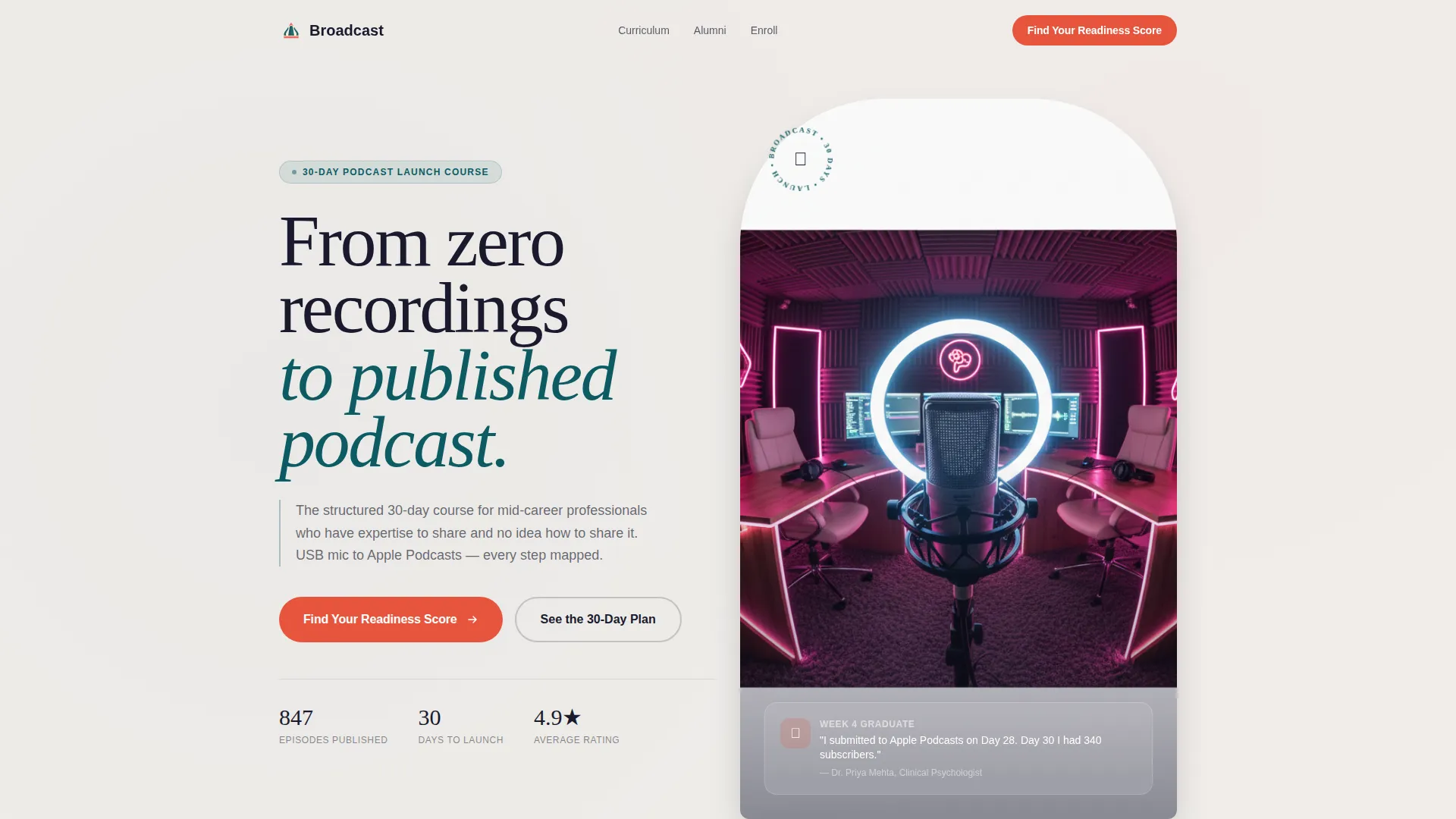
Broadcast is a modular card-grid landing page built for a thirty-day podcast launch course. It greets visitors with a persona selector, then unfolds a week-by-week timeline as they scroll. A five-question readiness quiz drives sign-ups by delivering a personalized curriculum track. The design draws on an Institutional Authority theme with a deep-teal and charcoal palette that feels serious, credible, and ready to act on.
by Rocket studio
Quick summary
Broadcast is a single-page course landing page designed for a thirty-day podcast launch program. It opens with an illustrated persona selector, transitions into a vertical timeline of weekly curriculum cards, and closes the loop with a readiness quiz that segments visitors into Starter, Intermediate, or Ready to Record tracks. Every visual decision reinforces the authority of the instructor and the clarity of the path ahead.
Who this template is for
This template is built for course creators who teach practical, outcome-driven skills to experienced adults. It works especially well when the audience already holds deep expertise but needs a structured push to share it publicly.
- Podcast educators selling a step-by-step launch program to mid-career professionals
- Online course creators in the knowledge-sharing or personal-branding space
- Consultants, coaches, or educators who want a credibility-first sales page with interactive quiz segmentation
What problem this template solves
Most course landing pages treat every visitor the same. That approach loses the therapist who is worried about tech, the consultant who already records demos, and the hobbyist who just needs a deadline. This template solves the personalization gap without requiring a complex funnel.
- Visitors self-identify through a persona selector, so the page speaks directly to their situation
- A five-question quiz segments prospects by readiness level, reducing enrollment friction
- The scrolling timeline turns curriculum into a visual progress story rather than a flat bullet list
What you get with this template
You get a fully structured, modular card-grid landing page built around three interactive systems: persona selection, timeline progression, and quiz-driven conversion. Each system is designed to move a skeptical expert toward confident enrollment.
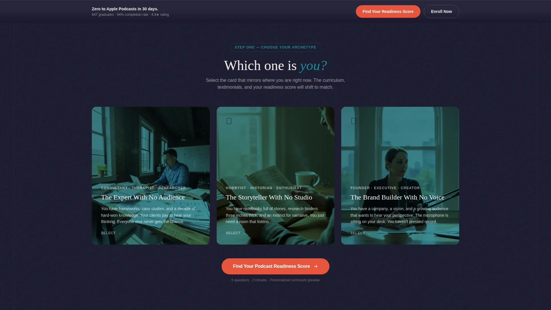
- Persona selector header with three illustrated archetype cards and coral hover states
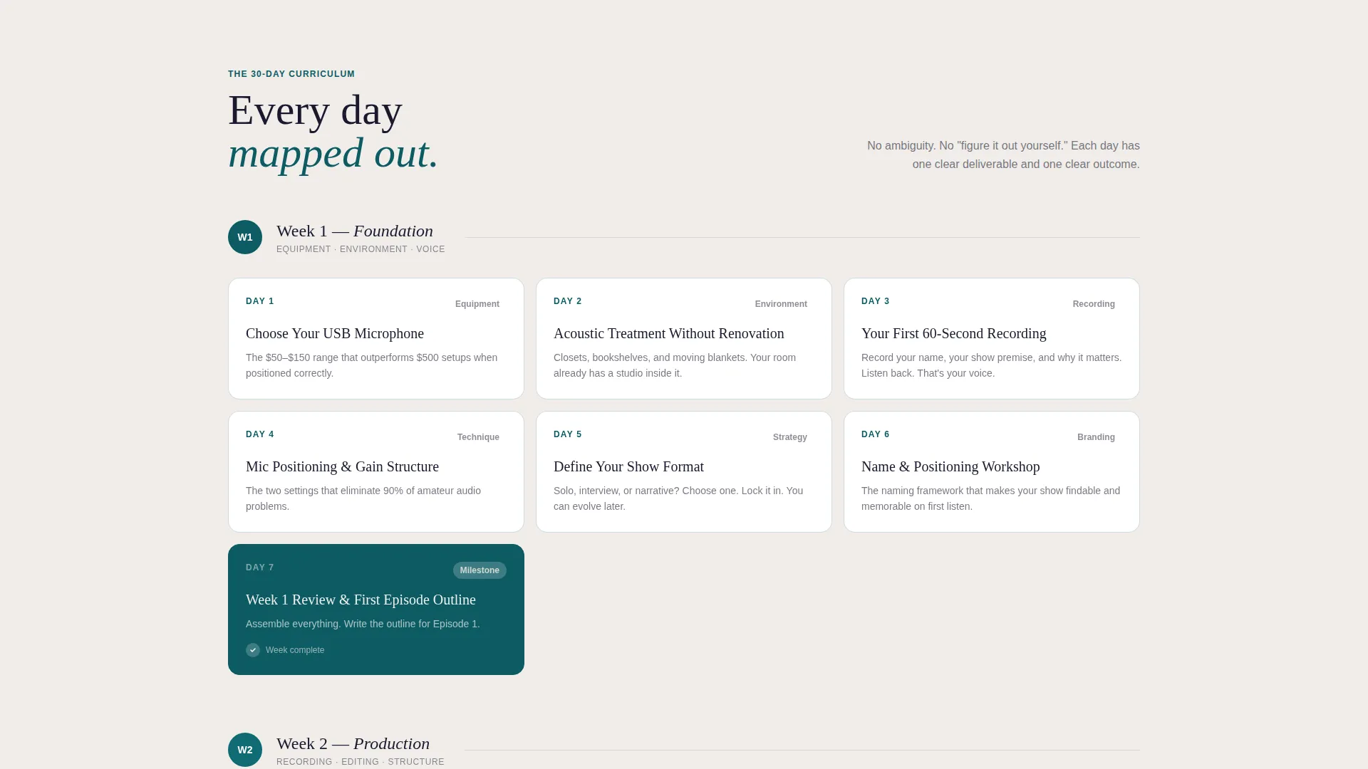
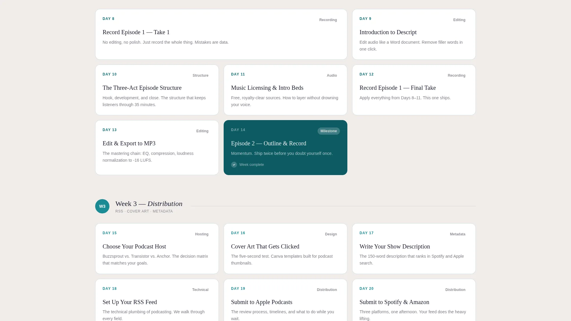
- A thirty-day scrolling timeline split into four weekly card groups, with visual state changes on completed weeks
- A five-question readiness quiz with tiered results and a track-specific enrollment call to action
Feature list
This template is built around a small set of high-impact interactive features. Each one earns its place by reducing friction, building trust, or making the curriculum tangible.
Illustrated Persona Selector Header
Three side-by-side illustrated cards represent distinct aspiring podcaster archetypes. Each card is rendered in teal duotone with a coral hover state. Selecting a card pre-fills the first quiz answer and reflows the headline, testimonials, and curriculum emphasis to match the visitor's profile.
Thirty-Day Timeline Scroll
After persona selection, the scroll becomes a vertical thirty-day calendar. Week one covers equipment and environment. Week two introduces recording and editing. Week three covers distribution, cover art, and metadata. Week four reveals launch strategy, review solicitation, and analytics dashboards. Completed-week cards shift from charcoal outlines to filled teal backgrounds, making progress feel visible.
Five-Question Readiness Quiz
The primary conversion path is a structured quiz that asks about recording experience, available weekly hours, subject clarity, tech comfort, and launch goal. Results place the visitor in one of three tiers: Starter, Intermediate, or Ready to Record. Each tier delivers a tailored curriculum preview and a secondary call to action to enroll in that specific track.
Sticky Bottom-Bar Call to Action
A persistent bottom bar reading "Find Your Podcast Readiness Score" appears after the second scroll fold. It keeps the primary conversion action visible throughout the page without interrupting the reading experience.
Modular Card-Grid Layout
The curriculum sections are built as a card grid, making each week's content easy to scan and visually distinct. Cards use consistent sizing and spacing, so the layout adapts cleanly as content changes between persona-driven page reflows.
Tiered Enrollment Call to Action
Quiz results each surface a secondary call to action: "Enroll in Your Track." This moves visitors from awareness to a personalized decision point, matching their self-reported readiness to the right course entry level.
Page sections overview
| Section | Purpose |
|---|---|
| Persona selector header | Lets visitors identify their archetype and pre-fill quiz data |
| Hero headline block | Displays a persona-matched headline after card selection |
| Week one cards | Covers equipment setup and recording environment basics |
| Week two cards | Introduces recording technique and editing workflow |
| Week three cards | Covers distribution, cover art, and metadata preparation |
| Week four cards | Reveals launch strategy, review solicitation, and analytics |
| Readiness quiz module | Segments visitors into Starter, Intermediate, or Ready tiers |
| Tiered results block | Shows personalized curriculum preview and enrollment call to action |
| Testimonials section | Displays social proof aligned to the selected persona |
| Sticky bottom bar | Keeps the quiz call to action visible throughout the scroll |
Design & branding system
The visual identity follows an Institutional Authority theme. It channels the quiet confidence of a broadcast studio or a well-funded academic department, without feeling cold or inaccessible.
- Color palette uses deep lecture-hall teal (#0D5C63), chalkboard charcoal (#1A1A2E), studio-booth cream (#F0EDEA), and catalyst coral (#E8553D) reserved strictly for interactive buttons and progress indicators
- Persona cards and curriculum week cards use teal duotone rendering with coral hover states to signal interactivity clearly
- Completed-week timeline cards shift from charcoal outlines to filled teal backgrounds, giving the scroll a built-in sense of momentum and forward progress
Mobile & speed optimization
The card-grid layout is modular by design, which keeps the page structure manageable across screen sizes. Each interactive system is built to function clearly on a smaller viewport without losing its visual logic.
- Persona selector cards stack vertically on narrow screens while retaining their illustrated teal duotone treatment
- The sticky bottom bar is designed to remain legible and tappable on mobile without obscuring content
- Weekly curriculum cards reflow cleanly within the grid, maintaining readable spacing and visual hierarchy at all sizes
How this template helps you convert
The page is built around reducing the gap between curiosity and commitment. Every section is designed to answer a hesitation before it forms.
- The persona selector creates an immediate sense of recognition. Visitors see themselves in one of three illustrated archetypes and feel the page was built for them specifically, which increases the likelihood they continue reading.
- The readiness quiz turns passive browsing into active self-assessment. By answering five short questions, visitors invest attention and receive a personalized result, making the enrollment decision feel informed rather than impulsive.
- The tiered curriculum preview tied to quiz results removes the "is this for me?" doubt. Each readiness tier surfaces content matched to that visitor's starting point, so the call to action to enroll feels like a natural next step rather than a sales push.
Other information about this template
This template was designed for the podcast launch course online course category and fits within the broader Education and Training, Online Skill Courses market. It is particularly well-suited for instructors who teach a structured, deadline-driven curriculum to adult learners.
- The template style is Card Grid (Modular), which makes it straightforward to update curriculum cards as course content evolves
- The Teal Catalyst color system and Institutional Authority theme are intentionally paired to appeal to mid-career professionals who respond to credibility signals over hype-driven copy
- The Quiz and Assessment landing page direction means the page is built to segment and personalize, not just to broadcast a single message to everyone
- The thirty-day course structure maps directly to the timeline scroll, so the page architecture reflects the course architecture without extra explanation
Theme
Institutional Authority
Creative direction
Timeline Progression
Color system
Teal Catalyst
Style
Card Grid (Modular)
Direction
Quiz/Assessment
Page Sections
Illustrated Persona Selector
Thirty-day Timeline Scroll
Five-question Readiness Quiz
Tiered Enrollment Call to Action
Sticky Quiz Bottom Bar
Modular Card-grid Curriculum Layout
Related questions
Can I change the persona archetypes to match my specific audience?
Does the readiness quiz connect to an enrollment or checkout flow?
What if my course is shorter or longer than thirty days?
Who is this landing page template best suited for?
Can the sticky bottom bar be turned off or repositioned?



