Warm Artisan Opinion Magazine Landing Page Template
Broadsheet is a single-column landing page template for a long-form opinion magazine launching Autumn 2025. It combines a newspaper masthead header, three creator spotlight sections, a sample essay fragment, and a focused waitlist form. The warm artisan design uses parchment, terracotta, and charcoal to evoke letterpress craft. Readers experience the editorial voice before they are ever asked to subscribe.
by Rocket studio
Quick Summary
Broadsheet is a coming-soon landing page template built for a long-form opinion and commentary magazine. It earns waitlist signups by leading with editorial voice, a typographic masthead, three contributor spotlights, and a taste of real prose, before presenting a single, focused call to action. The design feels like a letterpress publication: warm, deliberate, and made to read.
Who This Template Is For
This template is built for editorial founders, independent publishers, and writers who want to launch a serious magazine with a landing page that matches the quality of their ideas. It suits anyone creating a publication where voice, argument, and craft come before volume.
- Opinion and commentary magazine founders preparing a waitlist launch
- Independent editors and essayists who want their landing page to read like the first page of the magazine itself
- Literary publishers and newsletter writers ready to graduate from inbox to a proper publication site
What Problem This Template Solves
Most coming-soon pages give nothing away. They ask for an email before the visitor has any reason to care. For a magazine built on editorial conviction, that exchange feels wrong. Readers who care about ideas need to be met with ideas first.
- Generic waitlist pages reject the logic of editorial publishing by hiding voice behind a form
- A blank countdown page cannot communicate the weight, tone, or ambition of a long-form opinion magazine
- Without a sense of the people behind the project, readers have no reason to trust the publication or choose to follow it
What You Get With This Template
You get a complete, single-column landing page that works as both a magazine preview and a waitlist conversion tool. Every section is designed to carry the reader forward, from masthead to contributor spotlights to subscription form, without friction or distraction.
- A typographic newspaper masthead with dateline, three headline teasers, and a terracotta rule
- Three creator spotlight sections, each with a hand-drawn portrait illustration, a large defining quote, and a dust-jacket style two-sentence biography
- An editorial manifesto section, a sample essay fragment with pull-quote treatment, a waitlist form with a personality chip selector, and a persistent bottom bar that stays visible after the second creator card
Feature List
This template includes six carefully designed components that work together to build trust, demonstrate editorial voice, and convert curious visitors into waitlist subscribers.
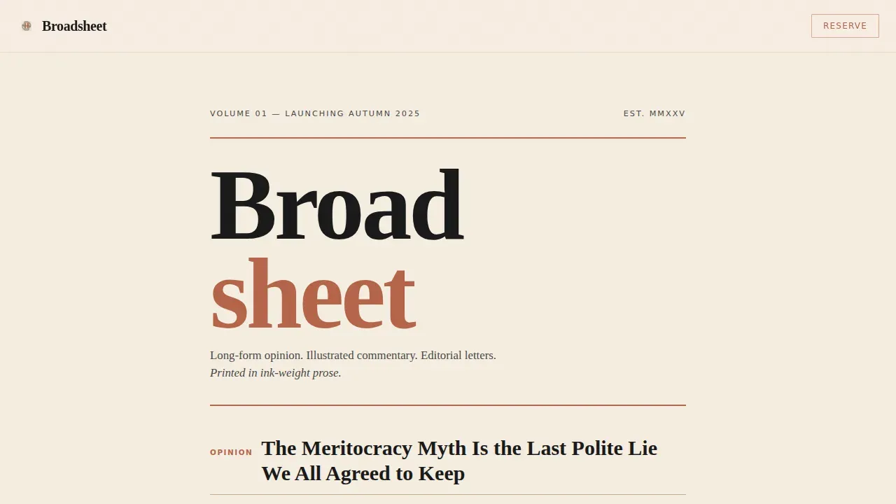
Newspaper Masthead Header
The header fills the viewport with the magazine nameplate set in a heavy transitional serif. A dateline reading "Volume 01, Launching Autumn 2025" anchors the publication's sense of occasion. Three stacked headline teasers in varying weights hint at the editorial voice: provocative, literate, and unafraid. There is no imagery here, only black type on parchment with enough white space to let the words breathe like a front page pinned to a café wall. This approach draws directly from the design language of classic broadsheet newspapers, where typography alone carries authority.
Editorial Manifesto Section
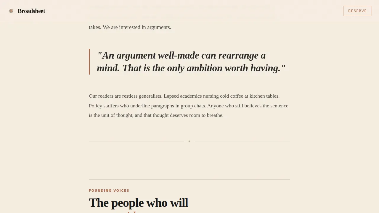
A single-column statement of purpose sits beneath the masthead. It sets the magazine's tone with a large pull-quote and a brief declaration of editorial intent. This section tells readers exactly what kind of publication Broadsheet is and what it stands for, giving them a reason to keep scrolling. The design uses a structured visual hierarchy to make long-form editorial writing feel organized and inviting rather than dense.
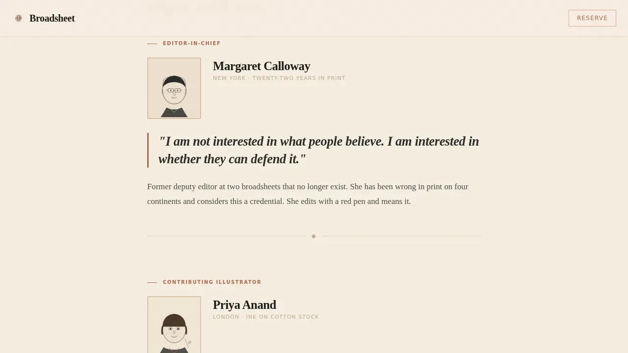
Creator Spotlight Sections
Three sequential spotlight sections introduce the founding editor, the illustrator, and the first featured essayist. Each section reveals one contributor through a hand-drawn portrait illustration SVG, a single defining quote set large in display type, and a two-sentence biography written in dust-jacket style. The rhythm of these sections builds like turning the pages of a magazine, drawing readers deeper into the publication's world before they reach the subscription form. Authentic contributor voices serve as social proof and establish credibility.
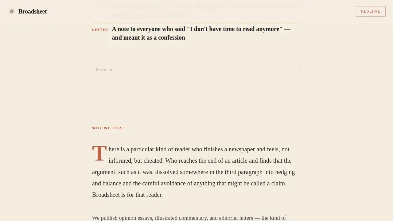
Sample Essay Fragment
A curated excerpt of actual magazine prose is displayed with pull-quote treatment. This section earns the call to action by giving readers a genuine taste of the writing. By the time visitors finish reading this section, they have already been inside the magazine. The design uses generous white space and a warm serif body typeface to make even a fragment feel like an invitation to read more.
Waitlist Form with Personality Chip Selector
The primary call to action reads "Reserve Your Subscription." The form asks only for an email address, keeping friction minimal. A single editorial question, "Which matters more, being right, or being honest?", is presented as two selectable chips. These chips serve as both a personality signal and a piece of editorial data. The approach aligns with best practice: a focused, single call-to-action landing page consistently outperforms pages that scatter attention across multiple goals.
Persistent Bottom Bar
After the second creator card, a persistent bottom bar appears and stays anchored at the base of the viewport as the reader scrolls. It repeats the "Reserve Your Subscription" call to action without interrupting the reading experience. This ensures the conversion path is always visible without overwhelming the editorial content above it.
Page Sections Overview
| Section | Purpose |
|---|---|
| Masthead Header | Introduces magazine nameplate, dateline, and headline teasers |
| Manifesto Section | States editorial purpose and sets the publication tone |
| Creator Spotlight One | Introduces the founding editor with portrait, quote, and bio |
| Creator Spotlight Two | Introduces the illustrator with portrait, quote, and bio |
| Creator Spotlight Three | Introduces the first featured essayist with portrait, quote, and bio |
| Essay Fragment | Delivers a prose sample to earn the subscription ask |
| Waitlist Form | Captures email and editorial personality chip response |
| Persistent Bar | Keeps the subscription call to action visible during scroll |
| Footer Section | Provides minimal horizontal flow footer information |
Design & Branding System
The visual identity is grounded in a Warm Stone color system that evokes a letterpress workshop where the ink is still drying on cotton stock. Every design choice is deliberate: warm, tactile, and carrying the faint quality of something made by hand rather than assembled by a machine. The palette and typography work together to communicate that this is a publication built on craft, not convenience.
- Color palette: parchment cream (#F5EDE0) as the background, kiln-fired terracotta (#B5654A) for accent rules and highlights, charcoal editorial black (#2B2B2B) for body text, and weathered sandstone (#C4AA8B) for pull-quotes and divider rules
- Typography: Fraunces in heavy weight for display headings and the nameplate, Crimson Text for body serif reading, and DM Sans for interface labels and form elements
- Visual style: warm artisan letterpress aesthetic with ample white space, hand-drawn portrait illustrations, large pull-quote treatments, and thin terracotta rules that divide sections with the precision of a printed broadside
Mobile & Speed Optimization
The single-column flow of this landing page is well-suited to both desktop and mobile reading. The design is desktop-first in its proportions, but the column structure translates naturally to narrower screens without layout adjustments that would compromise the editorial feel.
- Single-column design means the reading flow works cleanly on mobile without reordering content blocks
- Static-first construction with server components used for all non-interactive sections keeps the page lightweight and fast to load
- Low-to-medium animation approach, scroll reveals with stagger, avoids heavy scripts that would slow the site on mobile devices
How This Template Helps You Convert
This template is built around one conversion goal: getting the right readers to reserve their subscription. Every design and content decision serves that single objective, from the masthead that establishes authority to the personality chip that makes signing up feel like participating in the magazine.
- The editorial voice does the selling first. Readers encounter the masthead, the manifesto, three contributor voices, and a prose fragment before they see the form. By the time the call to action appears, they are already invested in the publication and ready to choose to join.
- The persistent bottom bar keeps the conversion path visible without disrupting the reading experience. It appears after the second creator spotlight and stays anchored at the bottom of the viewport, meaning the subscription option is always one click away regardless of how deep into the page the reader has scrolled.
- The minimal form design respects the reader's time. Asking only for an email address and a single chip-selection question reduces friction to its lowest possible level while still gathering meaningful editorial preference data that can inform future marketing and content decisions.
Other Information About This Template
This template belongs to a broader family of editorial and magazine design ideas built on the Warm Artisan theme. It draws inspiration from the long tradition of broadsheet newspaper design, where typographic hierarchy and editorial conviction do the work that imagery does elsewhere. The design trends embedded in this template reflect real cultural movements in independent publishing: a rejection of algorithmic aesthetics in favor of craft, warmth, and slower, more considered ideas.
- The Broadsheet warm artisan opinion magazine landing page template is suitable for opinion publications, literary journals, essay-driven newsletters graduating to a full magazine site, and any editorial project that wants its website to feel as considered as its prose
- Design awards such as the National Design Awards celebrate excellence in design across disciplines, and the aesthetic principles that inform this template, typographic rigor, warm color systems, deliberate white space, are the same ones recognized for their creativity, innovation, and impact in editorial design
- The PRNEWS Platinum Awards recognize outstanding achievements in modern communications, and a landing page that leads with editorial voice rather than a generic countdown is the kind of communication design that earns that kind of recognition
- This template can support a wide range of editorial use cases: fashion commentary, food writing, cultural criticism, policy analysis, events coverage, and long-form letters to readers, any content that benefits from the weight and presence of a printed broadsheet brought to a digital site
- No-code platforms allow users to build production-ready websites from natural language prompts without extensive coding knowledge, and this template is designed to work within those environments, a developer can customize it further, but an editor can use it as-is
- Cookies and basic information collection for the waitlist form follow standard web practice; the form captures email and chip-selection data to help protect the editorial team's ability to segment and co-ordinate their early subscriber outreach
- The personality chip question, asking whether being right or being honest matters more, is both an editorial statement and a practical marketing data point that helps the magazine co-ordinate its first-year content calendar around reader values
- Broadsheet templates are customizable for various content types, and this one can be adapted for events-focused publications, annual year-in-review magazines, food and culture titles, or any project that shares the same commitment to considered, long-form writing
- Continuing the tradition of broadsheet newspaper design into the digital era, this template rejects the aesthetic of fast-loading commerce pages in favor of something that celebrates the craft of editorial publishing, an inspired choice for anyone who still believes a well-made argument can rearrange a mind
Theme
Warm Artisan
Creative direction
Creator Spotlight
Color system
Warm Stone
Direction
Waitlist/Coming Soon
Page Sections
Newspaper Masthead Header
Creator Spotlight Sections
Editorial Manifesto Block
Sample Essay Fragment
Waitlist Form with Chip Selector
Persistent Subscription Bottom Bar
Related questions
What is the format of a broadsheet newspaper?
What are the features of a broadsheet newspaper?
What is a broadsheet example?
Can this template be customized for different editorial niches?
Does the waitlist form require technical setup?


