Gaming & Esports Blog Pre-Launch Website Template
Parry is a single-column coming-soon landing page template built for fighting game editorial publications. It opens with a full-viewport typographic hero, walks visitors through staggered editorial preview cards, and captures waitlist sign-ups through a segmented email form. The design draws from brutalist zine culture, high-contrast ink tones, heavy serif headlines, and monospaced body type, built for an audience that lives and breathes fighting games.
by Rocket studio
Quick Summary
Parry is a coming-soon landing page template designed for fighting game editorial blogs and niche gaming publications. The template uses a single-column flow to guide visitors through a curated gallery of article previews before presenting a segmented waitlist form. Every design choice, from the ink-black color palette to the heavy serif headlines, reflects the intensity and culture of competitive fighting games.
Who This Template Is For
This landing page template speaks directly to creators who want to launch a publication rooted in the fighting game community. It is built for people who understand that great editorial work earns sign-ups before the first issue ever drops.
- FGC writers, scene historians, and commentators who are building a longform fighting game publication and need a pre-launch landing page to capture their earliest readers
- Tournament organizers, frame-data analysts, and community contributors who want a landing page that communicates editorial credibility and taste before the content goes live
- Independent creators launching niche gaming media who need a bold, opinionated landing page template that reflects the culture they write for
What Problem This Template Solves
The main problem for any new editorial publication is trust. Readers do not sign up for a newsletter they cannot evaluate yet. Generic coming-soon pages fail because they offer nothing to judge. This template solves that real problem by front-loading editorial taste, giving visitors something to read, react to, and respect before they ever see a single finished article.
- Visitors get five editorial preview cards with article titles, one-sentence hooks, and contributor tags, giving them enough signal to trust the voice of the publication before the first issue drops
- The waitlist form appears in two strategic positions: once when curiosity peaks after the third card, and once at the bottom anchored by a closing line that frames the sign-up as insider access rather than a generic opt-in
- The Player or Spectator toggle on the form segments readers from creators at the point of sign-up, giving the publication useful audience data from day one without adding friction to the process
What You Get With This Template
This landing page template is a complete, ready-to-customize single-column page. Every section is pre-built and structured to deliver a specific job in the conversion journey, from first impression to final sign-up.
- A full-viewport hero section with a massive centered headline and monospaced subline, followed by five staggered editorial preview cards in a gallery walk layout that builds editorial range without showing finished content
- Two waitlist call-to-action placements, each with an email input field and a Player or Spectator toggle, designed to convert visitors at the moment of highest engagement
- A minimal horizontal footer and a complete Ink and Paper design system, type scales, color tokens, and layout rhythm, built around Fraunces heavy serif headlines and IBM Plex Mono monospaced body type
Feature List
This landing page template ships with a focused set of features. Each one is designed to serve the specific conversion goals and editorial identity of a fighting game publication.
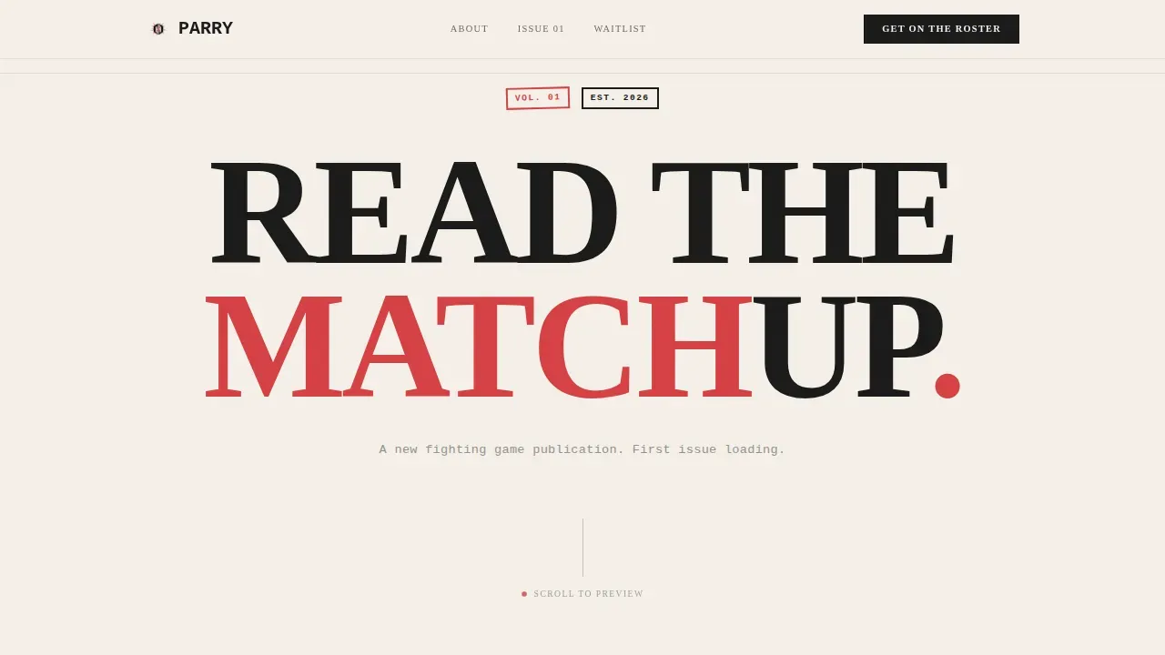
Full-Viewport Typographic Hero Section
The hero section opens with a single giant headline centered in the viewport. The type is set in a tight, heavy serif that fills edge to edge. Beneath it, a monospaced subline delivers the publication's premise in one line. There are no images and no illustrations, the letterforms carry the full visual weight, landing with the confidence of a clean punish in a top-eight set.
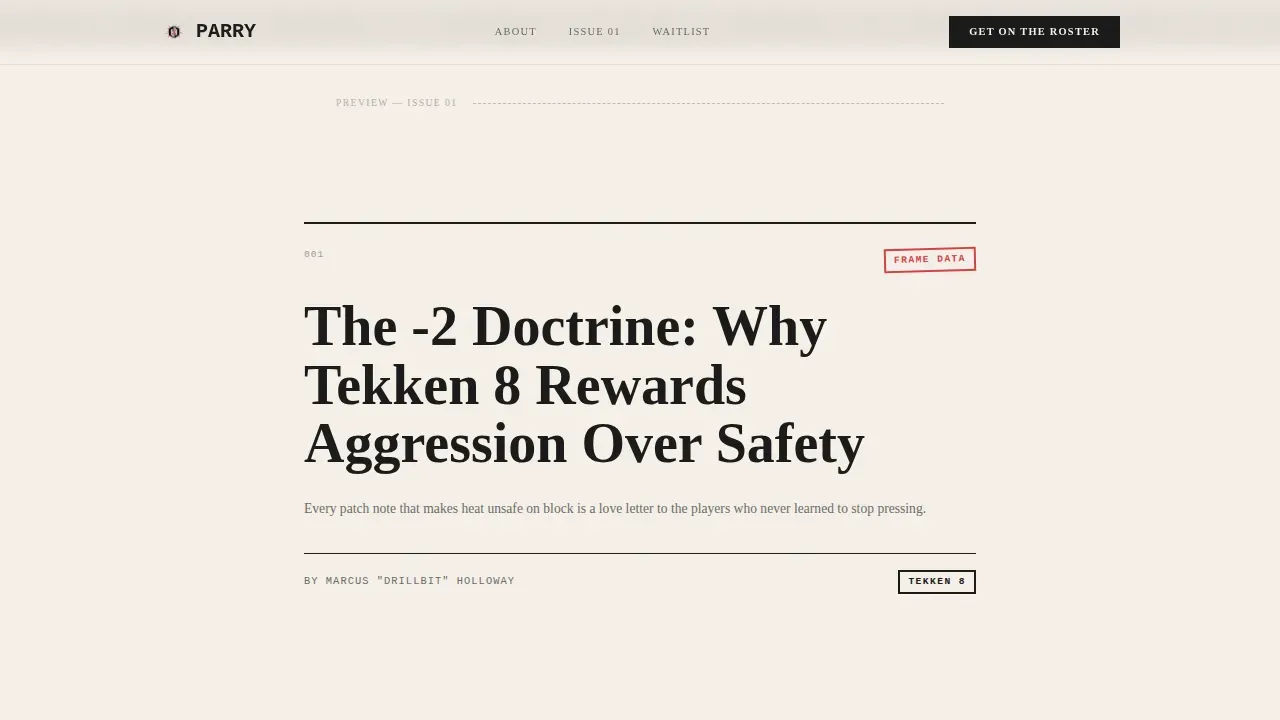
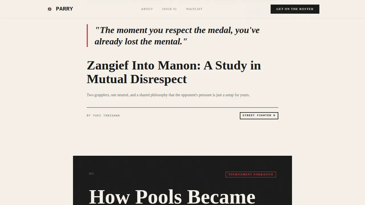
Staggered Editorial Gallery Walk
Five editorial preview cards are revealed through a deliberate scroll-triggered flow. Each card presents an article title, a one-sentence hook, and a contributor tag. The layouts shift between cards, pull-quote format here, full-bleed type there, building the sense of editorial range. This gallery walk gives visitors compelling visuals through pure typography, making the publication's voice the only proof it needs.
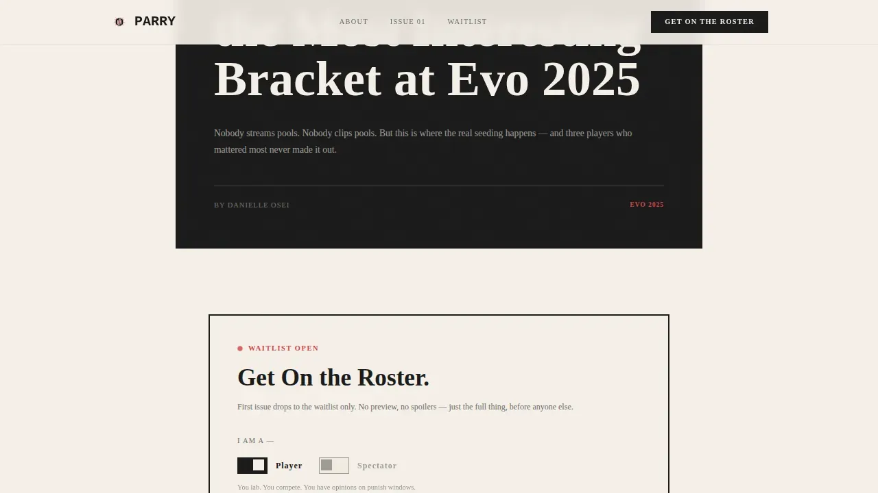
Dual Segmented Waitlist Form
The landing page features two waitlist sign-up placements. Each instance includes a single email field, a clear call-to-action labeled "Get On the Roster," and a Player or Spectator toggle. Placing the form at two points in the page flow, mid-scroll and bottom anchor, means the template captures sign-ups from both quick decision-makers and readers who need more time with the editorial previews before they commit.
Player or Spectator Audience Toggle
The toggle is a lightweight interactive element that segments the audience at the moment of sign-up. Visitors identify as either a player (a practitioner labbing the game) or a spectator (a reader focused on commentary, narrative, and scene coverage). This distinction helps a new publication understand who is joining the roster and tailor its early issues to match the split between its reader types.
Scroll-Triggered Card Reveal Animation
Cards appear on scroll in a staggered sequence with medium animation intensity. The pacing is deliberate and unhurried, matching the gallery walk creative direction. Each card earns its moment on screen rather than loading all at once. The result is a page that feels curated and intentional, the same way a well-edited print issue feels different from a content dump.
Minimal Horizontal Footer
The footer uses a clean horizontal flow layout. It keeps the page grounded without competing for attention. Social media links can be integrated here to extend the publication's community presence beyond the landing page itself, connecting visitors to wherever the conversation about fighting games is already happening.
Page Sections Overview
| Section | Purpose |
|---|---|
| Hero Headline Block | Opens page with full-viewport centered headline and monospaced subline |
| Editorial Card 1 | First gallery walk preview card with article title, hook, and contributor tag |
| Editorial Card 2 | Second staggered preview card in pull-quote layout format |
| Editorial Card 3 | Third preview card that immediately precedes the first waitlist form |
| Waitlist Form 1 | First "Get On the Roster" email form with Player or Spectator toggle |
| Editorial Card 4 | Fourth preview card continuing the gallery walk after the first form |
| Editorial Card 5 | Fifth and final preview card completing the editorial range demonstration |
| Closing Line Block | Anchor text reading "First issue drops to the waitlist. Everyone else is on stream delay." |
| Waitlist Form 2 | Second email form repeating the primary call-to-action at the bottom of the page |
| Minimal Footer | Horizontal flow footer with social links and publication credit |
Design & Branding System
The design system for this landing page template draws from brutalist editorial zine culture. Every visual decision earns its place through contrast, weight, and intention. There are no decorative graphics, no gradients, and no stock imagery, the entire page communicates through typography and negative space alone. The result feels like a photocopied tournament bracket pinned to a venue wall: high-contrast, zero gloss, and completely direct.
- The Ink and Paper color system uses four tokens: sumi ink black (#1A1A1A) for backgrounds and primary type, uncoated stock cream (#F5F0E8) for surface and contrast text, red-ink stamp vermillion (#D64045) for accent elements and calls-to-action, and margin-note graphite (#6B6B6B) for secondary labels and contributor tags
- Typography uses Fraunces in heavy weights for all headlines, delivering the bold typography that makes the hero section hit immediately, and IBM Plex Mono for body text, tags, and form labels, a combination that reflects the game's analytical, data-forward editorial voice
- Layout spacing is generous and deliberate, with wide negative space between editorial cards to support the gallery walk pace, giving each card room to land before the next one enters the scroll
Mobile & Speed Optimization
This landing page template is built on a single-column flow, which gives it a natural advantage on smaller screens. The layout does not require restructuring between desktop and mobile because the column structure is already linear. The design prioritizes readability at every viewport width, keeping the editorial experience intact whether visitors are on a desktop at home or a phone at a regional tournament venue.
- The static-first build approach, pure typography and CSS with no image assets, keeps the page lightweight and fast-loading, which is essential since a significant portion of the gaming audience browses on mobile devices and page load time directly affects whether visitors stay or leave
- Scroll-triggered animations are set to medium intensity and use CSS-based transitions rather than heavy JavaScript libraries, keeping the interactive elements performant across devices without sacrificing the deliberate gallery walk pacing
How This Template Helps You Convert
A game landing page is a specialized web page designed to showcase content and convert visitors into leads. This template focuses that definition on one action: getting the right reader onto the waitlist before the first issue drops. It earns sign-ups by demonstrating editorial taste rather than just asking for an email address.
- The hero section establishes a strong first impression immediately, with a clear, punchy headline that communicates the publication's premise in seconds, giving visitors a clear reason to keep scrolling and engaging with the editorial preview cards that follow
- Social proof on this template comes from the editorial cards themselves: named contributor tags, specific article titles, and pointed one-sentence hooks all function as signals of credibility, helping visitors trust the publication's voice before any issue has been published, strategically placing this social proof before the primary call-to-action placement improves conversion by reducing hesitation at the sign-up point
- The dual-placement waitlist form with a clear calls-to-action and a segmentation toggle means the template captures sign-ups from multiple visitor types without adding complexity, the first form catches readers who are ready to commit after three cards, and the second catches those who needed the full gallery walk to feel confident
Other Information About This Template
This section covers additional context about the Parry editorial landing page template, including practical usage notes, design references, and guidance for creators building a landing page in the fighting game and broader video game editorial space.
- The Parry editorial fighting game community blog landing page template is a niche-specific page template designed for the FGC editorial vertical, where a blog aimed at the fighting game community needs to combine high-energy, competitive aesthetics with readable, analytical content that players and spectators both trust
- A game landing page like this one is a specialized web page built to convert visitors into leads through clear value propositions, social proof, and strategic calls-to-action, and this template applies all of those key elements in a sequence tuned for the fighting game audience specifically
- The fighting game community, commonly known in the scene as the FGC, is characterized by deep loyalty among its members and a culture shaped by arcade roots and urban competitive play; a publication landing page that reflects that culture authentically will always perform better as a traffic source than a generic gaming blog template
- Effective game landing pages improve conversion when they use targeted messaging that speaks directly to the audience's pain points, and this template addresses that by showing readers article hooks that mirror the exact questions players ask at locals and majors, making the editorial voice feel like a shared experience rather than outside commentary
- The design inspiration for this template draws from print zine culture and photocopied tournament flyers, a whole lot of personality packed into high-contrast ink-and-paper aesthetics that distinguish the brand immediately from the rest of the video game editorial landscape
- Building social proof into a pre-launch landing page when no published content exists yet is a real challenge, this template solves it by using contributor tags and specific article descriptions as credibility signals, functioning the same way case studies and testimonials function on other types of game landing pages
- The landing page uses contact forms in the form of a minimal single-field email capture, keeping the barrier to entry low while the Player or Spectator toggle adds meaningful audience segmentation data without turning the form into a survey
- For creators thinking about long-term platform growth, the footer's social media integration point allows the landing page to serve as a hub that connects each traffic source, whether readers arrive from a Reddit thread, a Discord share, or a tournament venue QR code, back to the same central sign-up flow
- The template supports ideas around editorial range by varying the card layout between pull-quote and full-bleed type formats, giving the publication brand a sense of depth and craft before a single article is published
- Pretty good design alone does not convert, this template pairs the visual identity with editorial copy that proves taste, so that by the time a visitor reaches the primary call-to-action, they have already made the decision to sign up and the form is just the final step
- Most important elements on any coming-soon game landing page are a clear value proposition, a compelling hero section, social proof, and clear calls-to-action that guide visitors to act, and this template delivers all of them in a focused single-column flow that keeps visitors moving toward the sign-up without distraction
- The template can serve as strong design inspiration for any creator building a niche editorial landing page in the broader video game space, not just fighting game publications, the Ink and Paper color system, the gallery walk scroll structure, and the segmented waitlist form are all adaptable to other competitive gaming verticals with minimal adjustments
- From a conversion standpoint, interactive elements like the Player or Spectator toggle and the scroll-triggered card reveals create a sense of participation in the page journey, which keeps user attention longer and helps improve conversion rates compared to static, single-block coming-soon pages
- The page is built to help the publication defend its editorial positioning from day one, giving it a strong brand presence and a growing waitlist well before the first issue drops, the success of the launch depends on how many of the right readers are already on the roster when the content is ready to publish
Theme
Editorial Magazine
Creative direction
Gallery Walk
Color system
Ink & Paper
Direction
Waitlist/Coming Soon
Page Sections
Full-viewport Typographic Hero
Staggered Editorial Gallery Walk
Dual Segmented Waitlist Form
Player or Spectator Audience Toggle
Scroll-triggered Card Reveal Animation
Minimal Horizontal Footer
Related questions
What page sections does this landing page template include?
How does the waitlist form segment readers from creators?
What is the fighting game community called?
What is the 80/20 rule in game design?
Can this template be adapted for other gaming editorial niches?


