Bugfield - Dynamic Betatesting Landing Page Template
Bugfield is a modular card-grid landing page built for beta tester communities. It combines a Dynamic Motion visual identity with a Spec Sheet creative direction to present hard metrics, platform coverage, and cost comparisons in scannable card modules. Two conversion paths handle client lead generation and tester recruitment from a single, evidence-stacked page.
by Rocket studio
Quick summary
Bugfield is a single-page lead generation template designed for beta testing communities. Its card-grid layout presents proof before persuasion: a live-state dashboard screenshot opens the page, followed by rows of metric cards, cost comparisons, and case study flips. Two calls to action handle both sides of the marketplace, software teams launching a test cycle and individuals joining as testers.
Who this template is for
This template serves the people who feel the pressure of a shipping deadline most directly. It speaks to both sides of the beta testing relationship without confusion.
- Startup CTOs and product leads shipping on venture-backed timelines who need external QA coverage fast
- QA directors at mid-market software-as-a-service companies requiring multi-device test coverage before a release window
- Indie game developers dealing with unresolved crash logs and needing a structured tester community to reproduce and document defects
What problem this template solves
Most beta testing platforms look like generic service pages. They list features but offer no evidence that the infrastructure is real or that the tester pool is active. Potential clients leave before they trust the product enough to submit a lead.
- Visitors need proof of scale before they will share their build or their email
- Internal QA teams need a clear cost justification to bring an external testing platform to their manager
- Tester recruits need a lightweight, frictionless entry point that does not compete visually with the client-facing pitch
What you get with this template
This template delivers a complete, conversion-ready landing page structure with no placeholder sections. Every module has a defined purpose drawn directly from the brief.
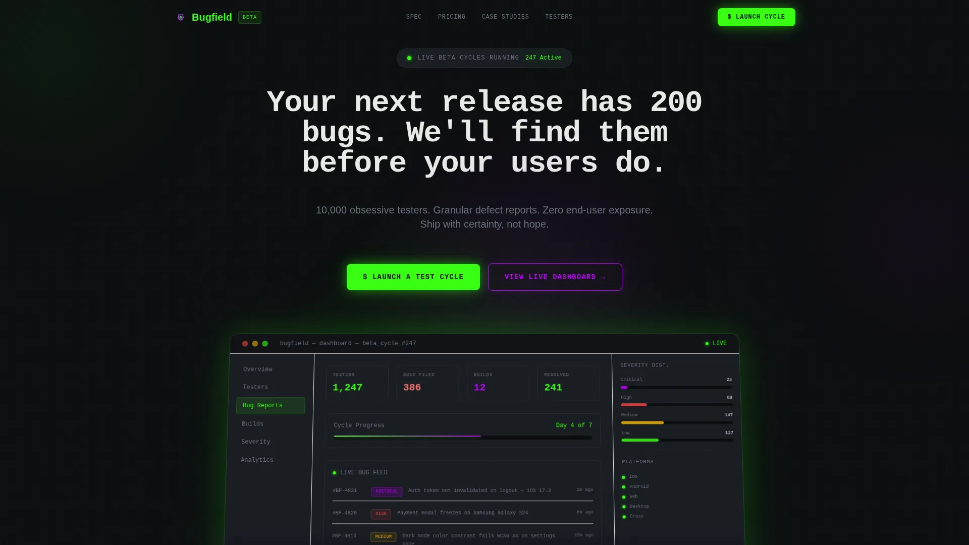
- A rotating product screenshot header showing a live beta cycle dashboard with active tester count, bugs filed, builds deployed, and severity distribution
- A full card grid with three distinct rows covering tester pool metrics, animated cost comparison counters, and hover-flip case study cards
- A dual-call to action system: a floating phosphor green primary button that opens a sequential modal form, and a bottom-of-page ultraviolet tester signup path
Feature list
A paragraph introducing this section: each feature below maps directly to a described component in the template brief. Nothing here is speculative, these are the building blocks you are editing and deploying.
Z-Axis Dashboard Header
The header presents a product screenshot of an active beta cycle: 1,247 testers assigned, 386 bugs filed, 12 builds deployed, and a severity distribution chart. The screenshot sits slightly rotated on a Z-axis with a soft phosphor glow bleeding off its edges over a void black background. A self-typing headline animates beneath it character by character.
Spec Sheet Card Grid
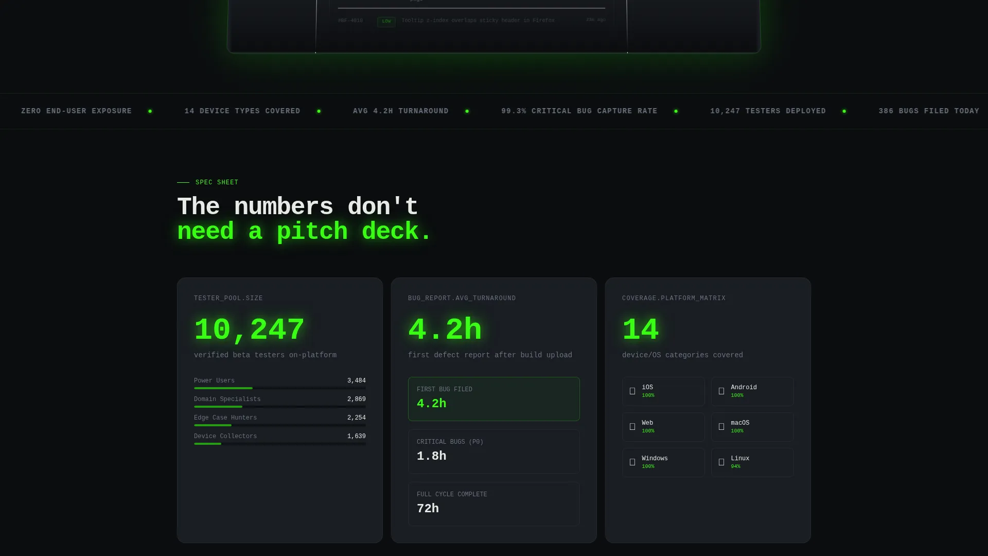
The core layout is a modular card grid organized in three rows. The first row shows three discrete metric cards: tester pool size, average bug turnaround time, and platform coverage matrix. Each card presents one hard number or capability, formatted the way a developer reads documentation.
Animated Cost Comparison Row
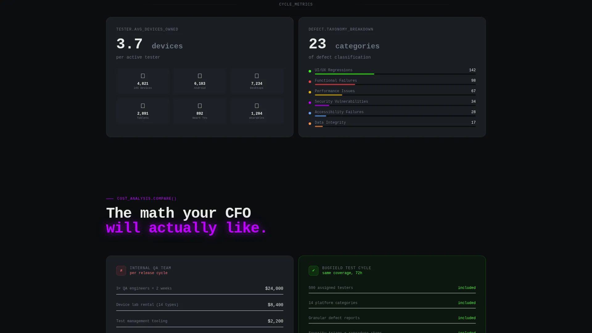
The second card row contains two wider cards that compare internal QA cost against a Bugfield test cycle cost. Counters animate on scroll, ticking to their final values as the visitor reaches that section. The math is visible and unambiguous.
Hover-Flip Case Study Cards
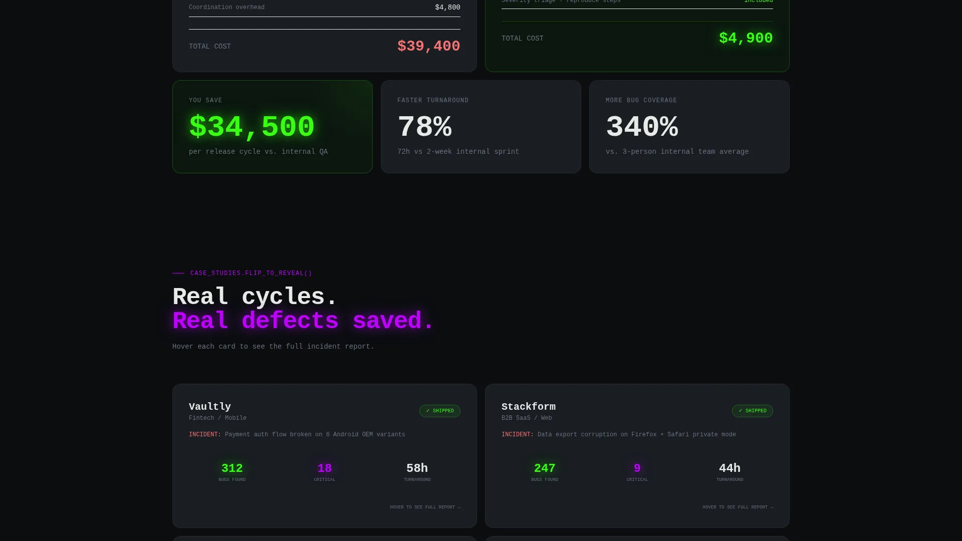
The third row contains case study cards. Each card flips on hover to reveal defect count, time-to-resolution, and whether the target ship date was hit or missed. These are evidence units, not testimonials, they show outcomes, not opinions.
Sequential Lead Capture Modal
Clicking the primary call to action opens a modal with three fields presented in sequence: platform type selection (iOS, Android, Web, Desktop, or Cross-platform), an estimated tester count drag slider, and a work email field. The step-by-step flow reduces friction and qualifies the lead before submission.
Dual Conversion Path System
The floating primary button stays pinned after the first scroll fold, keeping the main conversion action visible at all times. A secondary path at the bottom of the page routes potential testers to a separate lightweight signup using an ultraviolet outline button style.
Page sections overview
| Section | Purpose |
|---|---|
| Dashboard Screenshot Header | Open with live-cycle proof and animated headline |
| Tester Pool Metrics | Show scale with three discrete stat cards |
| Cost Comparison Row | Justify budget with animated scroll counters |
| Case Study Cards | Deliver flip-reveal outcome evidence |
| Floating Primary call to action | Keep lead capture visible after first fold |
| Tester Signup Footer | Route tester recruits to a separate lightweight form |
Design & branding system
The visual identity runs on the Acid Digital color system, a palette built to feel like a cathode-ray tube monitor bleeding light into a dark room. Every color carries a specific role, and nothing is decorative without function.
- Void black (#0B0D0F) dominates all backgrounds; terminal phosphor green (#39FF14) pulses on live counters, status badges, and primary buttons; ultraviolet (#BF00FF) marks severity-critical elements including high-priority bug tags and urgent call-to-action states
- Scanner-line gray (#1A1D23) surfaces the card grid modules, providing just enough contrast to read as layered terminal panes without breaking the dark-room atmosphere
- The Dynamic Motion theme animates key moments: the self-typing headline, scroll-triggered counter ticks, and card hover-flip transitions all move with purpose rather than decoration
Mobile & speed optimization
The card grid layout is modular by design, which makes responsive reflow straightforward. Each card is a self-contained unit that stacks cleanly on smaller viewports without losing its metric-first readability.
- The floating call-to-action button and the modal form are designed for single-thumb interaction, keeping the lead capture path usable on mobile without extra scrolling
- Animation triggers (scroll counters, hover flips) are scoped to user interaction rather than auto-playing, which keeps the experience intentional on both desktop and touch devices
How this template helps you convert
The page earns the click by stacking evidence before asking for anything. Conversion is a conclusion the visitor reaches, not a request the page makes.
- The dashboard screenshot opens with visible proof of infrastructure, real numbers from a live beta cycle appear before any marketing claim, establishing credibility in the first viewport
- The spec card rows answer every practical objection in order: scale, speed, device coverage, cost, and real-world outcomes, so the visitor who reaches the floating call-to-action button has already resolved their doubts
- The sequential modal form breaks the lead capture into three small steps, reducing the cognitive load of submitting and increasing the likelihood that a qualified visitor completes the form
Other information about this template
This template sits inside the Documentation and Support category, specifically within the Community and Forum subcategory, targeting the beta tester community niche. It is structured as a single-page lead generation flow with a card-grid modular layout.
- The template is built for teams and communities where both sides of the marketplace need separate, clear entry points, client teams and tester recruits are never sent to the same form
- The Spec Sheet creative direction is intentional: the page reads like a technical brief, not a sales pitch, which matches how software decision-makers evaluate tools
- The intersection of the Dynamic Motion theme, Acid Digital color system, and Product Screenshot header concept produces a visual language that signals active infrastructure rather than a static marketing page
Theme
Dynamic Motion
Creative direction
Spec Sheet
Color system
Acid Digital
Style
Card Grid (Modular)
Direction
Lead Generation
Page Sections
Z-axis Dashboard Screenshot Header
Modular Spec Sheet Card Grid
Scroll-triggered Cost Comparison Counters
Hover-flip Case Study Cards
Sequential Three-step Lead Modal
Floating Call to Action and Tester Signup Path
Related questions
Who should use this template?
Can I edit the card grid to show different metrics?
How does the dual call-to-action system work?
Does the hover-flip animation work on mobile devices?
Is this template suitable for a platform that is still early in development?



