Fast Construction Landing Page Template
Scaffold is a high-contrast construction landing page template built for crews that move fast and win clients on proof. An interactive cost estimator anchors the header, a three-column comparison table handles the heavy persuasion, and a pinned call-to-action button drives visitors to request a full build estimate. The Void and Violet color system keeps every pixel intentional.
by Rocket studio
Quick summary
Scaffold is a single-page construction landing page template designed around speed, credibility, and conversion. It opens with an interactive cost estimator, moves through a competitive comparison table, and closes with a pinned call-to-action button. The Void and Violet palette projects authority without clutter. Every section earns its place before asking visitors to act.
Who this template is for
This template is built for construction companies that need to convert skeptical clients quickly. It suits crews handling a wide range of project types, from accessory dwelling units to commercial tenant improvements to ground-up builds.
- First-time developers comparing contractors before committing SBA loan funds
- Property flippers and restaurant owners with tight timelines and fixed lease windows
- Construction teams that want to lead with proof of competence before asking for trust
What problem this template solves
Most construction websites bury credibility behind stock photos and vague promises. Potential clients arrive uncertain, compare multiple contractors, and often walk away without converting. Scaffold flips that dynamic by giving visitors something useful the moment they land.
- Visitors get an instant cost range before they even scroll, reducing early drop-off
- The comparison table collapses the "should I get more quotes" hesitation directly on the page
- A persistent call-to-action button keeps the next step visible without interrupting the reading flow
What you get with this template
Scaffold delivers a focused, single-page layout structured to move visitors from curiosity to a qualified estimate request. Every component is tied to a specific persuasion goal.
- An interactive estimator in the header with three input sliders and a real-time cost range display
- A three-column comparison table with micro-animations, checkmarks, and delta percentages
- A project gallery with build timers, a developer testimonial block, and a pinned violet call-to-action button
Feature list
This template is built around a small set of high-impact components. Each one is designed to do measurable persuasion work.
Interactive Cost Estimator Header
The header skips the traditional hero image entirely. In its place sits a dark-field estimator with three sliders: square footage, project type, and timeline urgency. As visitors adjust the sliders, a real-time cost range animates in oversized violet numerals. A supporting line reads "Based on 340+ completed projects in the metro," grounding the estimate in demonstrated volume.
Three-Column Comparison Table
The comparison table pits this construction company against a general contractor average and a do-it-yourself or owner-builder approach. Rows cover timeline reliability, permit handling, cost transparency, warranty coverage, and communication cadence. Checkmarks ignite in violet on scroll-in, gray marks stay muted, and delta percentages pulse once to draw the eye to performance gaps.
Rapid-Fire Project Gallery with Build Timers
Below the comparison table, a gallery of completed projects loads in sequence. Each card displays a build timer showing days to completion. The format is fast and scannable, reinforcing execution speed without requiring long copy.
Developer Testimonial Block
A single testimonial from a developer anchors the social proof section. The quote centers on a concrete outcome: framing finished a week early, allowing the client to close escrow on schedule. One well-chosen story outperforms a generic star-rating grid.
Pinned Call-to-Action Button
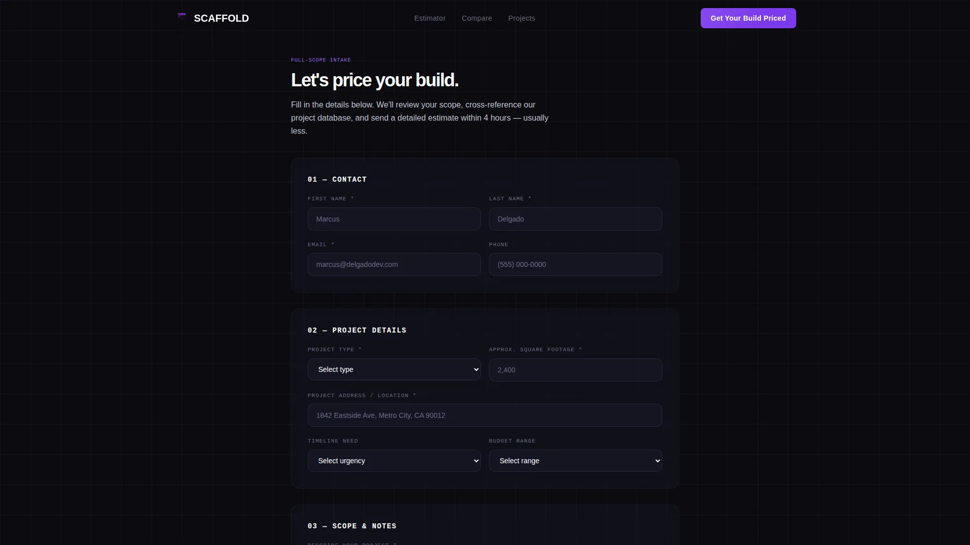
After the estimator interaction triggers, a violet "Get Your Build Priced" button pins to the bottom of the viewport. It reappears below the comparison table and again after the testimonial. Clicking through leads to a full-scope intake form on a separate estimate request page.
Launch Energy Scroll Progression
The page is structured as a deliberate escalation. The estimator proves competence first. The comparison table makes the rational case. The gallery and testimonial deliver emotional confirmation. Each section is designed to hand off momentum to the next, keeping visitors moving toward the call-to-action rather than bouncing sideways.
Page sections overview
| Section | Purpose |
|---|---|
| Estimator Header | Deliver instant cost range via interactive sliders |
| Comparison Table | Show performance advantage across five measurable rows |
| Project Gallery | Prove execution speed with real build timers |
| Testimonial Block | Close the emotional case with one outcome-driven quote |
| Pinned call to action Button | Keep the estimate request step visible throughout scroll |
Design & branding system
The Void and Violet color system is built for high contrast in low-light viewing conditions. It reads like a pitch deck projected in a dark room: nothing decorative, nothing wasted.
- Background layers use absolute void black (#0B0B0F) and deep structural charcoal (#1A1A2E), while electric violet (#7C3AED) drives hover states, active table cells, and call-to-action buttons
- Exposed-conduit silver (#C0C0D0) handles secondary text and the grid lines that trace the comparison columns, giving the table a structural, architectural feel
- The overall theme follows a Startup Velocity direction: dense information delivered with kinetic energy, not decorative flourish
Mobile & speed optimization
The layout is designed to remain functional and legible on smaller screens. Slider inputs, table cells, and the pinned button all adapt to touch interaction patterns.
- The comparison table reflows on narrow viewports so column data stays readable without horizontal scrolling
- The pinned call-to-action button remains anchored at the bottom of the screen on mobile, keeping the conversion step one tap away at all times
- Micro-animations are scoped to scroll-triggered events, so they fire once per section rather than looping and competing for attention
How this template helps you convert
Scaffold is a click-through landing page, meaning every design decision points toward one outcome: getting visitors to request a detailed estimate. The persuasion arc is deliberate and sequential.
- The estimator delivers immediate value before asking for anything, establishing competence in the first five seconds of the visit
- The comparison table removes the need to seek outside validation by presenting the competitive case directly on the page, collapsing hesitation in real time
- The pinned button ensures the call-to-action is never more than one tap away, regardless of how far down the page a visitor has scrolled
Other information about this template
This template is categorized under construction digital presence within the broader technology template category. It is built as a single-page click-through experience, not a multi-page website.
- The template style is a comparison table layout, which suits construction niches where clients naturally want to evaluate options before committing
- The Startup Velocity theme and Launch Energy creative direction make this template adaptable beyond construction to any service business where speed and credibility are the core sales proposition
- The header concept of a calculator or estimator is a proven entry point for high-consideration purchases, where visitors need a number before they can decide whether to engage further
- This template is suited to use cases including commercial buildouts, ground-up residential construction, accessory dwelling unit projects, and tenant improvement work



Theme
Startup Velocity
Creative direction
Launch Energy
Color system
Void & Violet
Style
Comparison Table
Direction
Click-Through
Page Sections
Interactive Cost Estimator with Real-time Output
Three-column Competitive Comparison Table
Project Gallery with Build Timers
Outcome-driven Testimonial Block
Pinned Viewport Call-to-action Button
Launch Energy Scroll Progression
Related questions
Can I change the project types in the estimator sliders?
Does the comparison table work for niches other than construction?
How does the pinned call-to-action button behave?
What happens when a visitor clicks the primary call-to-action?
Is this template suitable for a solo contractor or a larger construction firm?



