Build — Modern Construction Landing Page Template
Slab is a bold brutalist landing page template built for construction online stores. It uses a split-screen layout, a tab-switching category header, and an interactive side-by-side comparison system to help site supervisors, general contractors, and estimators find materials, safety gear, and tools faster, and see exactly why your prices win.
by Rocket studio
Quick summary
Slab is a single-page construction supply store template built around a head-to-head comparison experience. It greets trade buyers with a Feature Tab Switcher header, guides them through product categories using a split-screen versus layout, and earns the contractor pricing ask only after showing real savings. The design is bold, industrial, and built for people who work fast.
Who this template is for
This template is designed for construction supply businesses that sell directly to trade buyers. It speaks the language of people ordering materials before sunrise, not casual shoppers browsing in the afternoon.
- Site supervisors and foremen restocking personal protective equipment between project phases
- Small-crew general contractors price-checking fiber cement board, fasteners, and shoring hardware against wholesalers
- Estimators building material takeoffs who need unit counts ready to drop into a bid sheet
What problem this template solves
Trade buyers do not trust generic store layouts. They arrive with a specific need, a reference price already in their head, and zero patience for a soft sell. Most construction supply pages fail to show why their price is better. They also bury bulk pricing and contractor perks behind contact forms the buyer never fills out.
- No clear proof of price advantage over big-box or wholesale alternatives
- Contractor program details, bulk-break discounts, and delivery windows hidden too deep
- Lead capture that asks for commitment before showing any value
What you get with this template
You get a fully structured single-page layout that puts your competitive advantage front and center. Every section is a deliberate step toward a contractor pricing conversation.
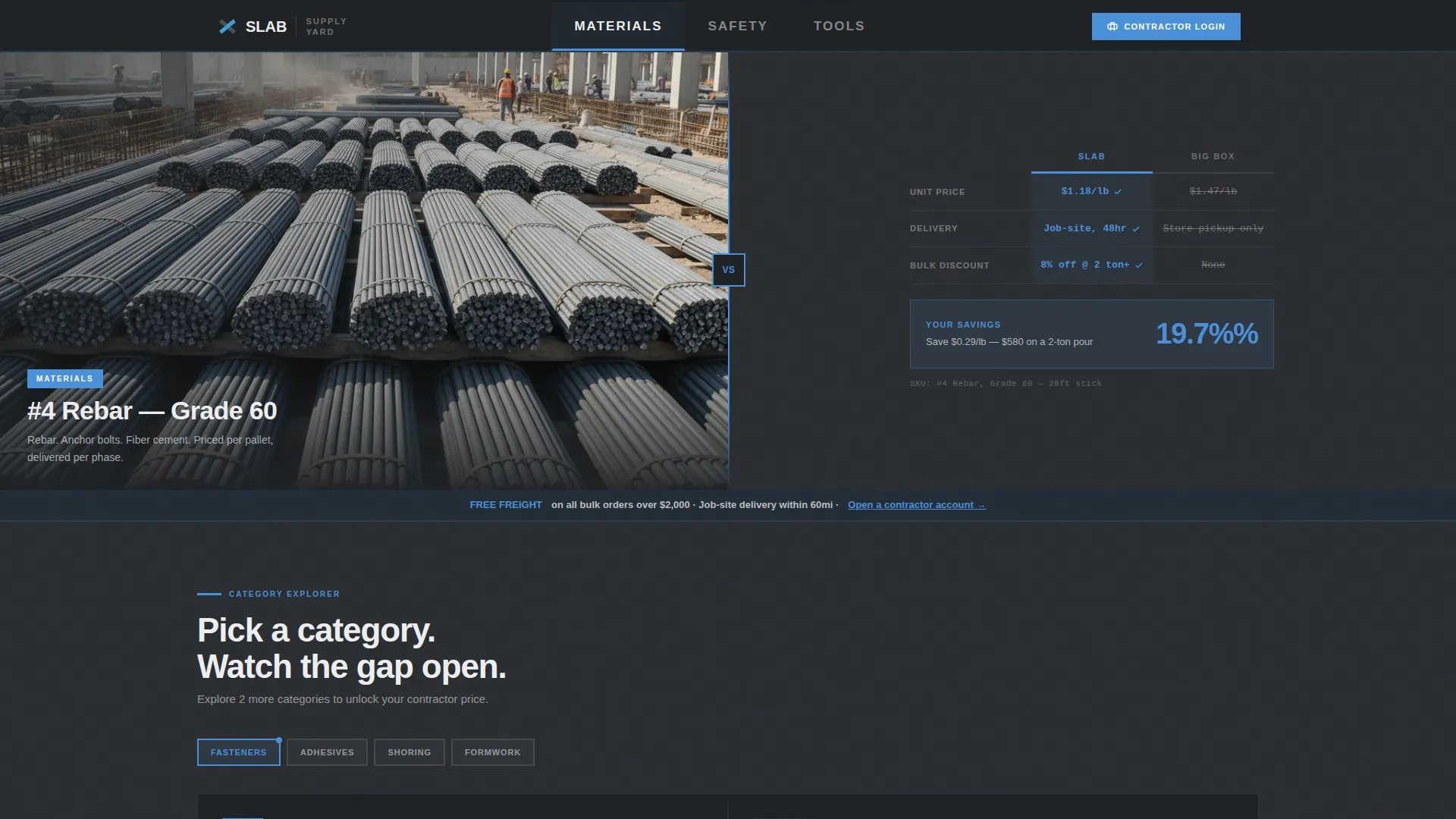
- A three-tab category header that snaps between Materials, Safety, and Tools with a paired hero image and live comparison card
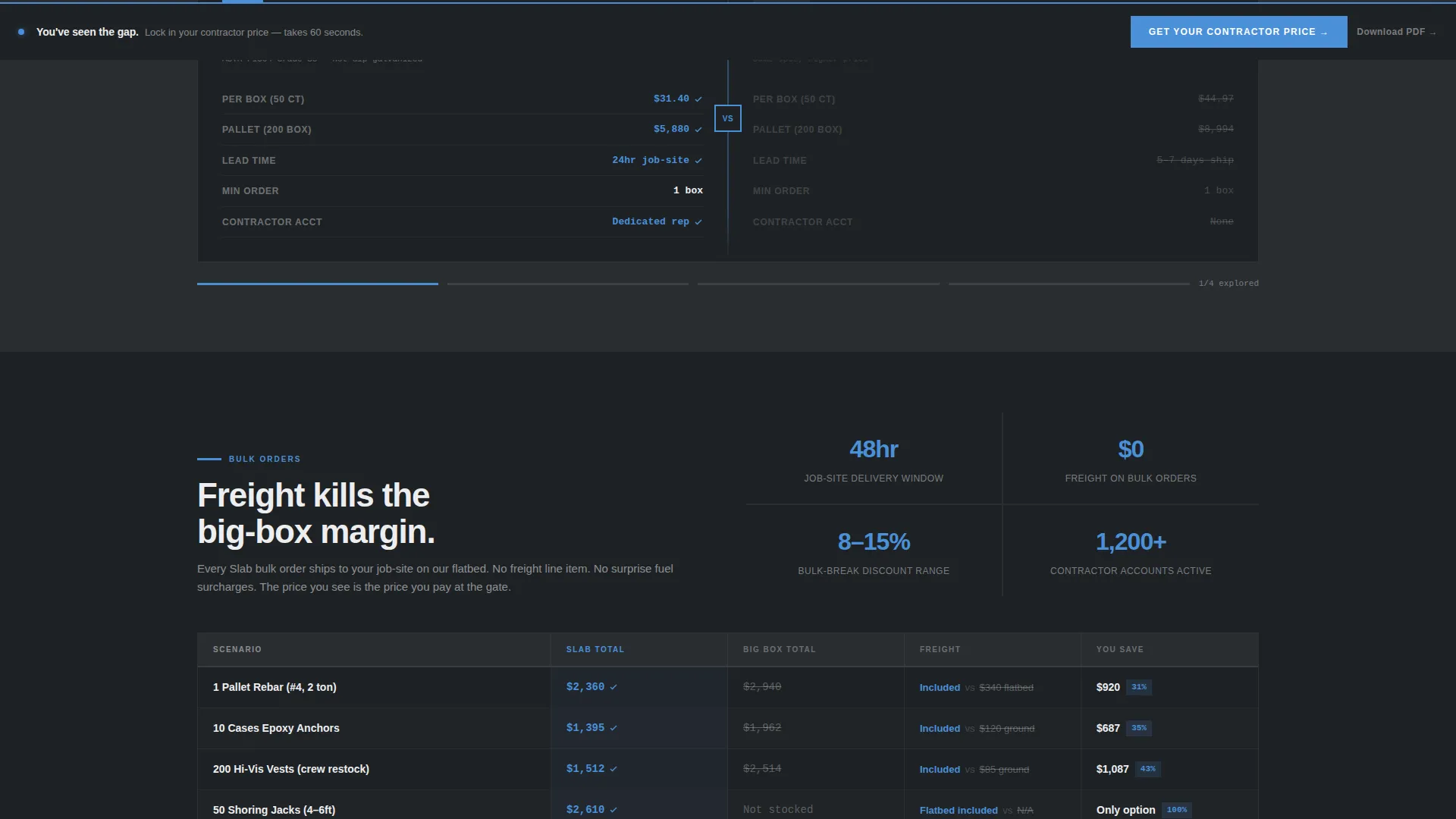
- A scrollable versus arena where visitors explore product pairs and see side-by-side spec tables with your wins highlighted
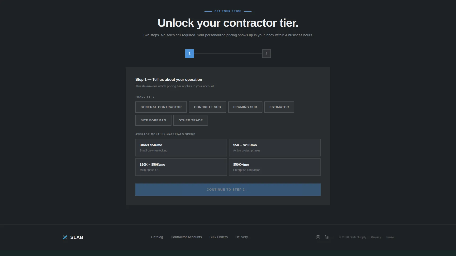
- A sticky bottom bar call to action and a two-step contractor pricing form, plus a secondary PDF lead capture path
Feature list
This template is built around five core functional components that work together to move a trade buyer from browsing to committing.
Three-Tab Category Header
The header renders three oversized brutalist tabs labeled MATERIALS, SAFETY, and TOOLS in condensed all-caps type. Clicking any tab snaps the left panel to a matching category hero image while the right panel loads a live comparison card. The card shows your store price, delivery window, and bulk-break discount side by side against a generic big-box column. Panels swap instantly with no soft transitions.
Split-Screen Versus Layout
The core page layout divides every section into a 50/50 split. The left half always represents your store and the right half always represents the competition. This structure is consistent throughout the scroll so the buyer always knows which side to trust.
Interactive Product Category Explorer
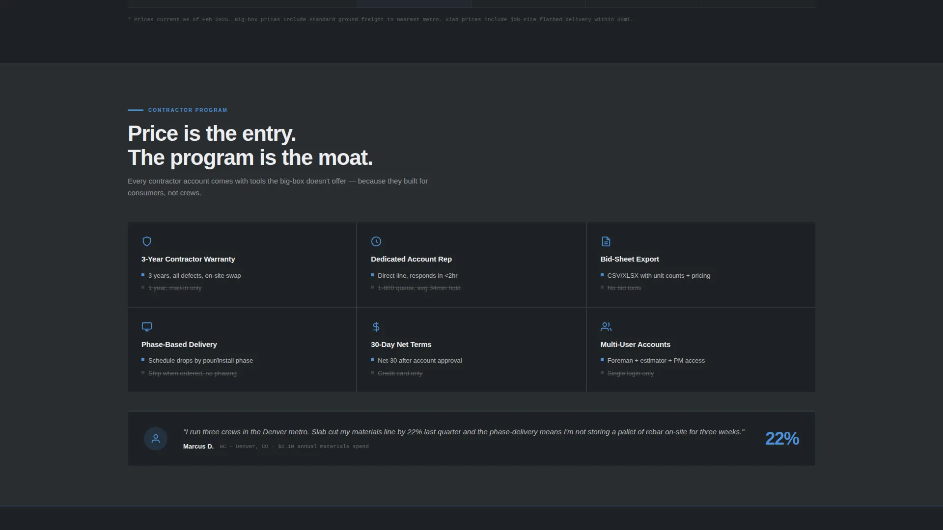
Below the header, visitors select product category pairs covering fasteners, adhesives, and shoring jacks among others. Each selection populates a side-by-side spec table with winning values highlighted in sky blue. The scroll sequence escalates from commodity price comparisons through tool warranties and contractor perks up to bulk freight savings.
Sticky Contractor Pricing call to action Bar
A bottom bar carrying the primary call to action, "Get Your Contractor Price," stays anchored as the visitor scrolls. The bar only becomes visible after the visitor has explored at least two categories. This earns the ask by showing demonstrated savings first.
Two-Step Lead Capture Form
Clicking the primary call to action opens a two-step form. Step one uses chunky toggle buttons to capture trade type and average monthly spend. Step two asks for email and job-site zip code to unlock a personalized pricing tier. A secondary path lets lead-cautious buyers download a full comparison PDF gated behind email only.
Page sections overview
| Section | Purpose |
|---|---|
| Tab Switcher Header | Lets visitors snap between Materials, Safety, and Tools category views |
| Hero Comparison Card | Shows store price, delivery window, and bulk-break discount versus big-box |
| Category Versus Arena | Interactive explorer for fasteners, adhesives, and shoring hardware pairs |
| Spec Table Rows | Side-by-side product specs with sky blue highlights marking your wins |
| Bulk Order Section | Demonstrates freight savings and job-site delivery advantages at scale |
| Sticky call to action Bar | Anchors the contractor pricing ask after two categories are explored |
| Two-Step Form | Captures trade type, spend level, email, and zip for pricing tier unlock |
| PDF Lead Gate | Secondary capture path for buyers who want comparison proof on paper |
Design & branding system
The visual identity follows a Bold Brutalist theme using the Slate and Sky color system. Every color choice has a functional purpose: heavy backgrounds carry authority, and bright interactive surfaces demand attention.
- Base palette: poured-concrete charcoal (#3B3F45) for backgrounds, rebar shadow gray (#5C6370) for secondary surfaces, and formwork white (#EDEEF0) for panel text and card backgrounds
- Interactive highlights: open-sky blue (#4A90D9) applied to hover states, winning spec highlights, and every clickable surface
- Typography uses condensed all-caps display type for headers and tabs, giving the layout the load-bearing visual weight of structural text
Mobile & speed optimization
The template is structured for fast scanning on any screen. Trade buyers often check pricing from a job site on a phone with one hand, and the layout accounts for that reality.
- The split-screen panels reflow into a stacked single-column layout on smaller screens so comparison content stays readable without pinching
- Toggle buttons in the lead capture form are sized for gloved-hand use, making step one fast to complete even in the field
How this template helps you convert
The conversion strategy in Slab is deliberate. It withholds the pricing ask until the visitor has already seen enough evidence to trust it.
- The tab header and comparison cards show price, delivery, and bulk savings immediately, giving trade buyers a concrete reason to keep scrolling before any form appears.
- The sticky call to action bar surfaces only after two category interactions, so the "Get Your Contractor Price" prompt arrives at the exact moment the buyer has already built a mental case for switching.
- The two-path lead system captures both action-ready buyers through the pricing form and evidence-first buyers through the PDF download, covering two different decision speeds without losing either.
Other information about this template
Slab is a purpose-built template for the construction online store niche. It is designed to feel credible to trade professionals who spot generic layouts immediately.
- The template style is Split Screen (50/50), giving every comparison visual equal weight on both sides
- The creative direction is Interactive Explorer, meaning the visitor drives the content reveal rather than scrolling through static sections
- The header concept is Feature Tab Switcher, which organizes three major supply categories into one scannable entry point
- The landing page direction is Comparison/Versus, and every design decision reinforces that single strategic frame
- The Bold Brutalist theme is not decorative. It signals durability and industrial seriousness to a buyer who works in that world every day
- The template fits within the Construction Digital Presence subcategory under the broader Technology category on the marketplace
Theme
Bold Brutalist
Creative direction
Interactive Explorer
Color system
Slate & Sky
Style
Split Screen (50/50)
Direction
Comparison/Versus
Page Sections
Feature Tab Switcher Header
Split-screen Versus Layout
Interactive Category Explorer
Sticky Contractor Pricing Call to Action
Two-step Lead Capture Form
PDF Comparison Lead Gate
Related questions
Who is this landing page template designed for?
Can I change the product categories shown in the tab header?
How does the sticky call to action bar know when to appear?
What does the two-step lead form capture?
Is there a lower-commitment path for buyers not ready to request pricing?



