Build — Rapid App Development Landing Page Template
A dark, immersive landing page template built for Flutter video tutorial series. It features a live widget tree animation hero, an interactive Widget Demo Playground, a scrollable course map with flip-card lesson previews, and a platform-aware app download call to action. The design follows a midnight code-editor aesthetic with neon accents on void-black surfaces.
by Rocket studio
Quick summary
This is a single-page hub-and-spoke landing page template designed specifically for Flutter video tutorial series. It opens with an animated widget tree that assembles itself in real time, leads visitors through three interactive widget demos, maps out four learning tracks on a scrollable course map, and closes with a platform-aware download call to action. Every section is built to prove tutorial quality before asking for commitment.
Who this template is for
This template was designed for educators, indie developers, and content creators who teach Flutter through video. It fits courses that focus on building real, shippable flutter app projects rather than toy code exercises. The tone and visual identity speak directly to developers who live in a code editor.
- Flutter course creators and tutorial series authors who want a high-converting landing page
- Developer educators selling or distributing a flutter app for learning on iOS and Android devices
- Bootcamp instructors and freelance teachers who need a page that earns trust through interactive proof before any download prompt
What problem this template solves
Most tutorial landing pages fail developers because they lead with a talking-head image, a bullet list of topics, and a single call to action. Visitors have no proof the content is any good before they commit. This template solves that credibility gap by letting visitors interact with real widget output before they ever see a download button.
- Junior developers stuck in tutorial hell need quick wins they can see and touch, not a promise buried in a feature list
- Backend engineers evaluating a new flutter project need depth signals, not marketing copy
- Course creators need a landing page that mirrors the quality and craft of the code being taught
What you get with this template
You get a fully designed, single-page hub-and-spoke layout that covers every stage of the visitor journey from curiosity to download. The template ships with six distinct page sections, a live-animation hero, an interactive playground, a course map with anchor navigation, learner profile cards, social proof blocks, and a platform-aware download section. Every section has been purpose-built for the Flutter education niche.
- A complete landing page layout with six named sections plus a developer-minimal footer, all wired to an anchor navigation sidebar
- Three embedded interactive widget demos that let visitors experience the tutorial output directly on the page before reaching the call to action
- A flip-card course map covering four learning tracks, a platform-toggle download section with iOS and Android paths, and a free browser preview fallback
Feature list
This template ships a specific set of designed and coded features grounded in the source brief. Each one exists to serve a particular job on the page.
Animated Widget Tree Hero
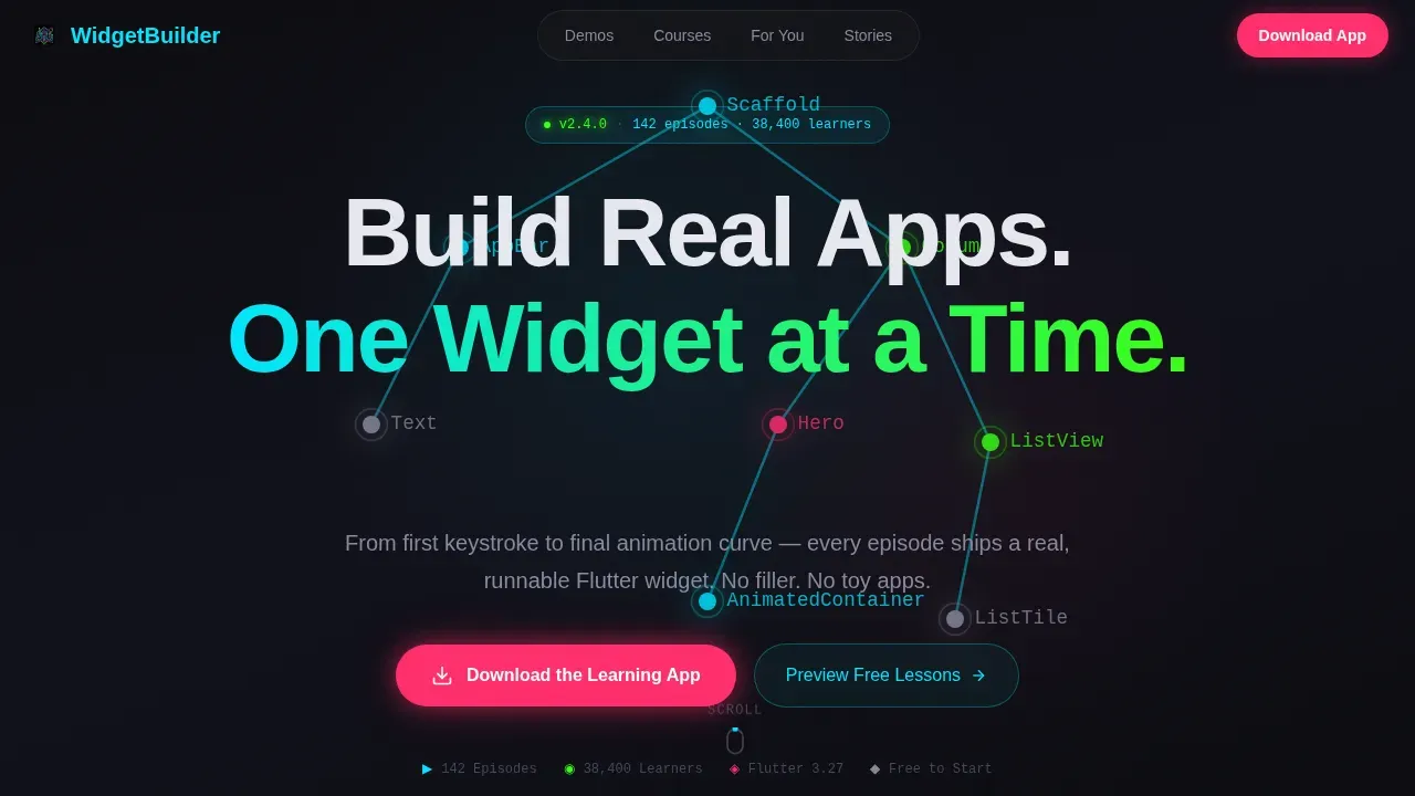
The hero section fills the full screen with a void-black canvas. A Flutter widget tree assembles itself live, with glowing cyan lines connecting each node and widget labels typed out in monospace font as if written by an invisible developer. The headline types itself letter by letter, and the cursor blinks twice before a magenta call to action pulses beneath it. This entrance sets the tone before a visitor reads a single word.
Interactive Widget Demo Playground
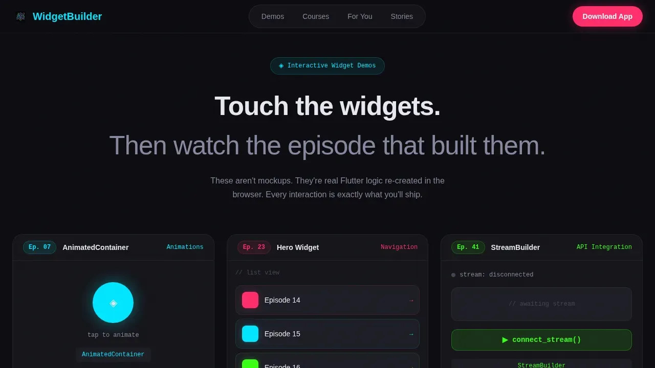
Three embedded widget demos let visitors interact with real flutter app output directly on the landing page. Each demo is a working simulation, not a screenshot. Visitors can tap, trigger, and observe the widget behavior before ever scrolling to a download prompt. This section is the proof layer that earns the final call to action.
Anchor Nav Course Map
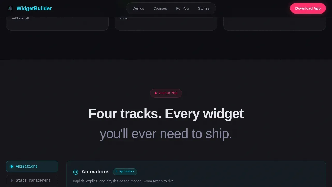
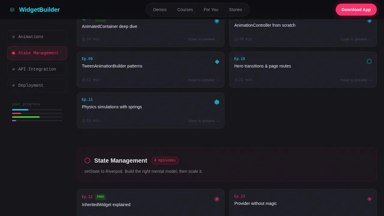
A vertical sidebar of module icons glows active as the visitor scrolls through each learning track. The course map covers four spokes: Animations, State Management, API Integration, and Deployment. Inside each track, lesson cards flip on hover to reveal a three-second looping preview of the tutorial output. The anchor nav keeps visitors oriented across a long page without losing their place.
Learner Profile Cards
Three learner profile cards address distinct audiences with specific pain-point and outcome language. Each card speaks to a real developer persona: the junior dev who cannot ship an APK, the bootcamp grad who can style a div but not build a screen, and the backend engineer quietly learning Flutter on evening commutes. Visitors recognize themselves and feel the course was made for them.
Platform-Aware Download Section
The primary call to action is "Download the Learning App" with platform toggle buttons for iOS and Android that auto-detect the visitor's device. A secondary path offers a browser preview for visitors not yet ready to install. Both paths are present on the same screen, removing friction for any visitor type.
Social Proof Block
Stacked testimonial cards display specific shipped-app outcomes alongside learner count metrics and episode completion statistics. Outcomes are concrete: a learner shipped an app, completed a track, deployed to a device. This section converts skeptics by showing results, not ratings.
Page sections overview
| Section | Purpose |
|---|---|
| Hero Animation | Animated widget tree, typewriter headline, magenta call to action pulse |
| Widget Demo Playground | Three interactive live widget simulations as proof of output |
| Course Map | Anchor nav sidebar with four learning tracks and flip-card previews |
| Learner Profile Cards | Three persona cards with specific pain-point and outcome language |
| Social Proof Block | Testimonial cards with shipped-app outcomes and learner metrics |
| Download Call to Action | Platform-aware iOS and Android toggle with browser preview fallback |
| Developer Footer | Single-row GitHub-style minimal footer |
Design & branding system
The visual identity follows a Dynamic Motion theme built on an Acid Digital color system. The design language reads like a midnight code editor: neon syntax-highlight accents floating over void-black surfaces. Every color has a specific job on the page so the system stays coherent at a glance.
- Void black (#0B0B0F) and near-black matte surface (#141419) form the base; electric cyan (#00E5FF) marks navigation and active states; hot magenta (#FF2D6B) fires on hover and call to action pulses; phosphor green (#39FF14) signals progress and completion badges
- Typography uses JetBrains Mono for all code labels, widget names, and monospace display text, with DM Sans for body and headings; custom fonts are loaded to maintain the dark mode IDE personality across every device
- Animation runs at high intensity throughout: the widget tree SVG assembly in the hero, node glow pulses, card flips on the course map, scroll-reveal transitions, and the platform toggle interaction in the download section
Mobile & speed optimization
The template is designed desktop-first with full mobile support, reflecting the real usage pattern: developers research on a large screen and download on their phone. The layout adapts using Flutter's responsive layout principles, wrapping key sections in LayoutBuilder to handle screen size variation cleanly.
- Animations are driven by GPU-accelerated transforms and an Intersection Observer pattern for scroll-reveal, keeping the page feeling fast even with high visual intensity
- The hamburger menu collapses the anchor nav sidebar on smaller screens, preserving orientation without consuming screen real estate; the platform toggle auto-detects the visitor's device so the correct download path is foregrounded
- Images are served in WebP format where applicable to reduce load times, and the course map flip-card previews use short looping clips rather than full video files to keep data transfer light
How this template helps you convert
The conversion path in this template is built around a principle: let visitors build something in their head before you ask them to install an app. Each section earns the next click by delivering proof rather than promises.
- The hero animation and typewriter headline create immediate atmosphere and signal that this course treats craft seriously; visitors who recognize the midnight code-editor feeling already feel at home before reading a word of copy
- The Widget Demo Playground places three working widget interactions directly on the page, so visitors experience tutorial output firsthand; by the time a user clicks through to the download section they have already interacted with the course material
- The platform-aware download call to action removes the final decision friction by detecting the visitor's device and showing the right path automatically, while the browser preview fallback keeps visitors who are not ready to install moving forward rather than bouncing
Other information about this template
This template is built specifically for the Flutter education niche and reflects real Flutter development patterns throughout its design and content structure. The following notes cover technical context and ecosystem tools that are relevant to course creators and developers working inside this space.
- In Flutter, almost everything is a widget, including layout models. The primary layout is managed using core widgets like the scaffold widget, column widget, row widget, and Stack. You compose a layout by nesting child widgets to build more complex widgets, and the expanded widget allows a widget to occupy available space within a row or column.
- The container widget lets you add padding, margins, borders, and background color to other widgets. Use the alignment property to position child widgets precisely. A single child widget like the center widget places its child at the middle of the available space. Avoid hardcoding widths; use Flexible and expanded widget patterns for fluid layouts.
- Each widget class should represent one responsibility. The build method returns a widget tree, and buildcontext context carries the location of a widget in the tree. Use const text and const edgeinsets wherever content is static so Flutter can skip unnecessary rebuilds. A const textstyle applied globally through ThemeData keeps custom fonts consistent. A const divider can add visual separation between sections cleanly.
- When writing dart code for a flutter project, keep the following code patterns in mind: add padding using const edgeinsets, use return container for section wrappers, and apply the children property on column widget and row widget to list child widgets. The following values should be defined in a central theme rather than scattered across files. Mark widgets as const wherever possible, and use a scrollable list via ListView or SingleChildScrollView as the body of the scaffold widget.
- The text widget is one of the most frequently used core widgets. A text widget displays a string and accepts a const textstyle for styling. When new data arrives from an API, update the widget tree through a StatefulWidget rather than rebuilding the entire screen. Use the build method carefully: buildcontext context is passed to every build method and is used to look up inherited widgets or navigate to a new target.
- Home screen widgets are mini versions of a flutter app that surface app data without requiring the user to open the full application. Both Android and iOS limit the ui components and features available in home screen widget contexts. The home_widget package allows developers to create a home screen widget for both Android and iOS from a single flutter project. It wraps local key/value store APIs to simplify saving data to local storage so the home screen widget can pull new data on refresh.
- To create a home screen widget for iOS, you add an app extension to your flutter iOS app in Xcode. The widget extension and the parent app must both belong to the same app group so they can share data. To set up sharing, you configure an app group identifier in Xcode under the runner target capabilities. The ios folder in your flutter project holds the Xcode workspace where you add the new app group and configure the widget target. You can test the result in the ios simulator after configuring the runner target.
- To send data from your flutter app to the iOS widget, use the WidgetKit.setItem() method from the flutter_widgetkit package. For Android, the home_widget package handles the native code bridge so you do not need to write platform-specific code manually. Once data is saved, call the update method to push new data to the home screen widget on both platforms. A screenshot displays the widget target in the Xcode interface when you preview the widget in the ios simulator.
- When building a landing page in Flutter, decompose the layout into small, single-purpose widgets. Avoid writing the entire page in a single file or class; create one class per major section and place reusable ui components in a dedicated directory. Most parts of a landing page can be StatelessWidgets. Interactive elements like the platform toggle or the hamburger menu may need to be StatefulWidgets.
- Building a landing page in Flutter involves composing various flutter widgets into a hierarchical structure. Use a container widget with a BoxDecoration to set a background image or color. Wrap key sections in a LayoutBuilder to adapt the ui across device sizes. The flutter framework handles responsive layout through LayoutBuilder and MediaQuery, so you can plan breakpoints based on content needs rather than fixed device widths. A new app group structure in your project keeps section widgets organized and easy to find examples of when revisiting the code.
- Flutter applications built for education benefit from a global ThemeData that defines dark mode colors, custom fonts, and text styles in one place. Using Flex and Wrap widgets alongside the expanded widget and column widget gives you layouts that adapt across screen orientations without hardcoded dimensions. The elevation property on cards and buttons adds visual depth in the dark mode surface system. Two children inside a row widget can represent a label and a value side by side, and the left corner of a screen is often where the hamburger menu icon lives in a scaffold widget drawer setup.
- Vibe Studio is a no-code platform that allows users to create full-stack flutter applications integrated with Firebase backend services. Rocket.new is an AI-powered vibe-coding platform that enables users to build production-ready flutter app projects from natural-language prompts. Both tools accelerate the development process for teams who want to visually manage and deploy flutter applications without writing every line of dart code manually. No-code tools like these simplify the app development process for non-technical users who want to create and distribute a flutter app quickly.
- The flutter build real apps widget by widget landing page template is designed for the Flutter Documentation and Developer Education category. It fits any flutter project that teaches through doing, ships real widget output, and wants a landing page that matches the craft of the code it promotes.
- Android Studio is the recommended integrated development environment for Flutter on Android. It provides a device emulator, a layout inspector, and a flutter plugin that streamlines running and debugging flutter applications. When setting up a new flutter project in Android Studio, you configure the android folder, set the runner target, and connect a physical device or emulator to run the app. The android studio layout inspector lets you verify how each column widget, row widget, and container widget renders at runtime, which is especially useful when debugging how much space each child occupies in a complex layout.
- The splash screen is the first image a user sees when the flutter app launches. Configure it in both the android and iOS folders to display the course branding before the home screen loads. The home page of the learning app should mirror the landing page experience: the same dark mode palette, the same custom fonts, and a scrollable list of available episodes organized by learning track.
Theme
Dynamic Motion
Creative direction
Interactive Explorer
Color system
Acid Digital
Style
Hub & Spoke (Anchor Nav)
Direction
App Download
Page Sections
Live Widget Tree Hero Animation
Interactive Widget Demo Playground
Anchor Nav Hub and Spoke Course Map
Platform-aware App Download Section
Learner Profile and Social Proof Blocks
Dynamic Motion Design System
Related questions
What sections does this landing page template include?
Does this template support both iOS and Android download paths?
Can I adapt this template for a different Flutter course or topic?
What animation and interaction features are included?
Is this template suitable for a free tutorial series as well as a paid course?



