Construction Software & SaaS Booking Website Template
Jobsite is a construction CRM landing page template built around a side-by-side competitor comparison. It targets project managers, estimators, and general contractors who lose deals and revenue to disorganized workflows. The template combines a Feature Tab Switcher header, a Problem-to-Solution scroll arc, and a dense comparison table to make the case for switching before a single demo is booked.
by Rocket studio
Quick summary
Jobsite is a single-page construction CRM landing page template designed for the Comparison/Versus conversion goal. It opens with a tabbed product preview, walks through three field-specific pain points with paired animations, then drops into a row-by-row feature comparison table. The page is built to make a visitor feel the gap viscerally and act on it.
Who this template is for
This template is built for construction technology companies and SaaS founders selling CRM tools to the trades. It speaks directly to the people who live between the trailer and the jobsite every day.
- Project managers handling multiple active builds and subcontractor coordination at once
- Estimators who toggle between takeoff software and manual spreadsheets daily
- General contractors whose follow-up process relies on sticky notes and memory
What problem this template solves
Construction CRM buyers are skeptical. They have been burned by software that looked good in a demo and fell apart in the field. This template addresses that skepticism head-on by showing the product working with real construction data before asking for anything.
- Visitors cannot picture how a CRM handles their specific workflows, so abstract marketing copy fails them
- Competitor comparisons live in PDF guides no one reads, not on the page where decisions are made
- Generic demo request forms feel risky; buyers want proof before they hand over a work email
What you get with this template
You get a fully structured, single-page landing page layout with every section pre-built to move a construction CRM buyer from skeptical to convinced. The template delivers layout, interaction design concepts, copy structure, and visual hierarchy all in one place.
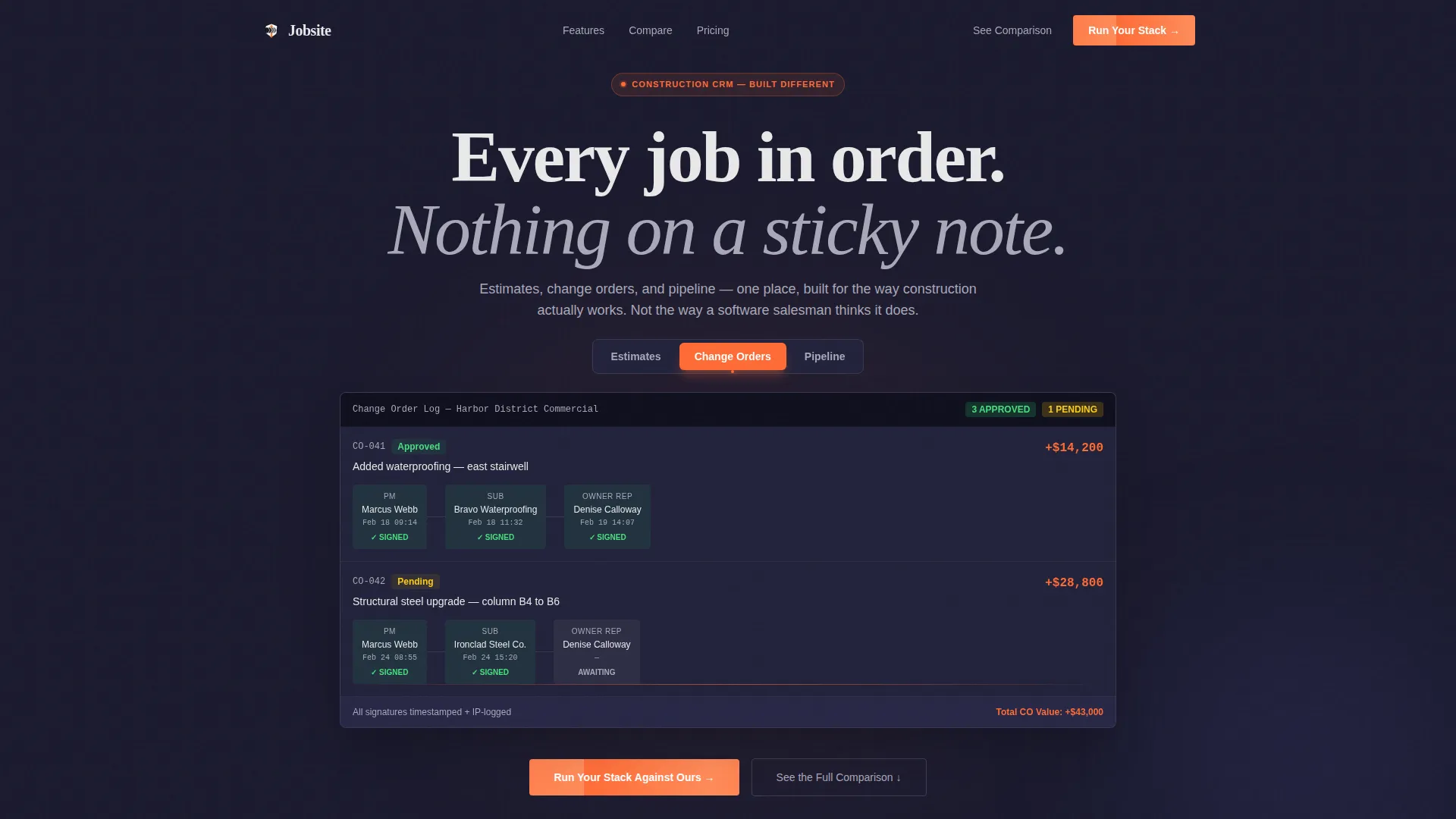
- A three-tab Feature Tab Switcher header showing live-user interface product screenshots with real construction data
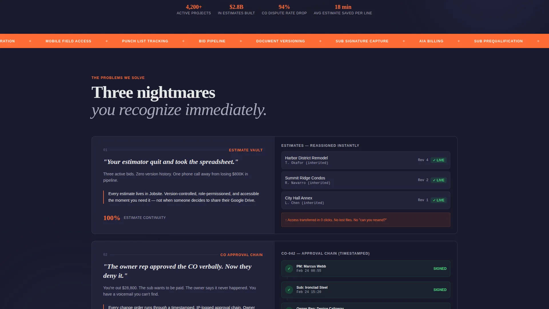
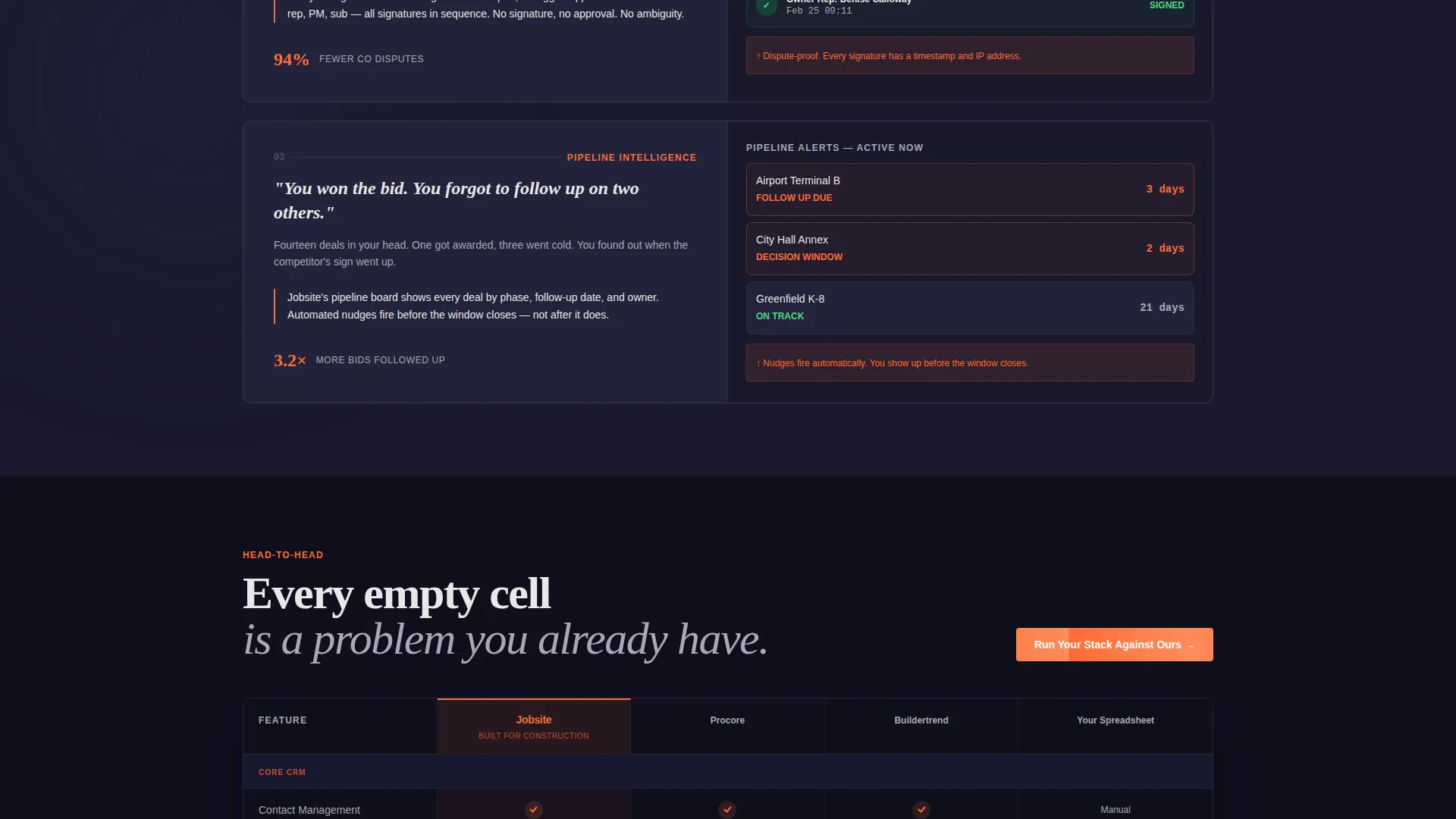
- A Problem-to-Solution arc section with three named pain points and short animation slots
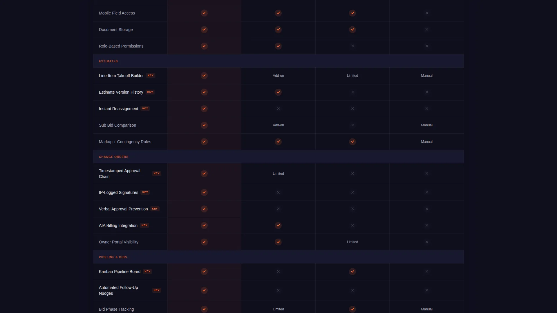
- A full comparison table structure with escalating feature categories and competitor columns
Feature list
This template ships with six purpose-built sections, each designed to advance the buyer's confidence one step at a time.
Feature Tab Switcher Header
Three labeled tabs display the CRM in action: a dollar-amount commercial remodel estimate with line-item takeoffs, a change order approval chain with timestamped signatures, and a twelve-deal pipeline board sorted by project phase. The active tab highlights in safety orange; inactive tabs sit in graphite. No stock imagery, no illustrations.
Problem-to-Solution Arc Section
Three specific construction nightmares are named and addressed in sequence. Each pain point is paired with an animation slot showing the CRM preventing the problem. The framing is grounded in real field language, not generic software marketing copy.
Competitor Comparison Table
The table runs row-by-row across feature categories that escalate from basic to construction-specific. Each row where a competitor falls short shows an empty cell beside Jobsite's orange checkmark. The scroll builds a verdict without the page ever stating one directly.
Pinned and Repeated Primary call to action
The "Run Your Stack Against Ours" call to action is pinned to the comparison table header and repeated at the bottom of the page. Each instance opens a two-field form: current tools used via multi-select, and monthly active project volume.
Gated Secondary call to action
A secondary path offers a full feature matrix as a downloadable PDF. It requires only a work email to unlock. This gives fence-sitters a lower-commitment entry point while still capturing a lead.
Carbon Fiber Visual System
The color system uses deep carbon black for backgrounds and table headers, brushed graphite for row separation and secondary panels, safety orange for calls to action and winning checkmarks, and poured concrete white for body text and spacing. The result is technically dense but never visually claustrophobic.
Page sections overview
| Section | Purpose |
|---|---|
| Feature Tab Switcher | Opens with tabbed product screenshots showing estimates, change orders, and pipeline data |
| Pain Point Arc | Names three specific construction nightmares and pairs each with a CRM solution animation |
| Comparison Table Core | Rows escalating from basic to construction-specific features across four comparison columns |
| Pinned call to action Header | Anchors the primary call to action at the top of the comparison table for persistent visibility |
| Lead Capture Form | Two-field form collecting current tools and active project volume for a personalized teardown |
| Gated PDF Download | Secondary email-gated path offering the full feature matrix as a downloadable document |
Design & branding system
The visual identity follows a Startup Velocity theme executed through the Carbon Fiber color system. The palette is technical and no-nonsense, built to match the aesthetic expectations of construction professionals rather than enterprise software buyers.
- Deep carbon black (#1A1A2E) anchors all backgrounds and table headers; brushed graphite (#30305A) separates rows and secondary panels
- High-vis safety orange (#FF6B35) fires on all calls to action, active tab indicators, and winning comparison checkmarks
- Poured concrete white (#E8E8E8) holds body text and open space so dense comparison data stays readable
Mobile & speed optimization
The layout is structured to remain legible and functional on smaller screens, which matters for a construction audience that reviews tools on phones between site visits. Dense comparison tables are the hardest layout pattern to make mobile-friendly, and this template addresses that directly in its design structure.
- The comparison table is designed to scroll horizontally on smaller viewports without losing column context
- The pinned call to action remains accessible during table scroll so the conversion path is never buried
How this template helps you convert
The page is engineered for Comparison/Versus conversion, meaning it moves buyers who are already evaluating options rather than buyers who are unaware they have a problem.
- The Feature Tab Switcher puts real product data in front of the visitor immediately, replacing skepticism with evidence before any copy is read
- The Problem-to-Solution arc makes the visitor recognize their own situation in specific, named pain points, building emotional momentum toward the comparison table
- The dual-call to action structure gives buyers two ways to commit: a personalized stack analysis for high-intent visitors and a gated PDF for those who need more time
Other information about this template
This template is categorized under Construction Software and SaaS technology templates. It is purpose-built for the construction CRM niche and is designed to support comparison-driven buying decisions common in that market.
- The template style is a Comparison Table layout matched to the Startup Velocity theme
- The creative direction follows a Problem-to-Solution Arc, a proven structure for high-consideration SaaS purchases
- The header concept is a Feature Tab Switcher, an interaction pattern well-suited to multi-feature CRM products
Theme
Startup Velocity
Creative direction
Problem→Solution Arc
Color system
Carbon Fiber
Style
Comparison Table
Direction
Comparison/Versus
Page Sections
Feature Tab Switcher Header
Problem-to-solution Arc
Escalating Comparison Table
Pinned Primary Call to Action with Lead Form
Gated PDF Secondary Path
Carbon Fiber Visual System
Related questions
Can I adapt this template for a construction CRM with different feature categories?
Does the template include the form backend for lead capture?
Is the Feature Tab Switcher built for real product screenshots?
Who does the comparison table compare against by default?
Is this template suitable for a SaaS product outside of construction?



