Complete Construction Software & SaaS Comparison Website Template
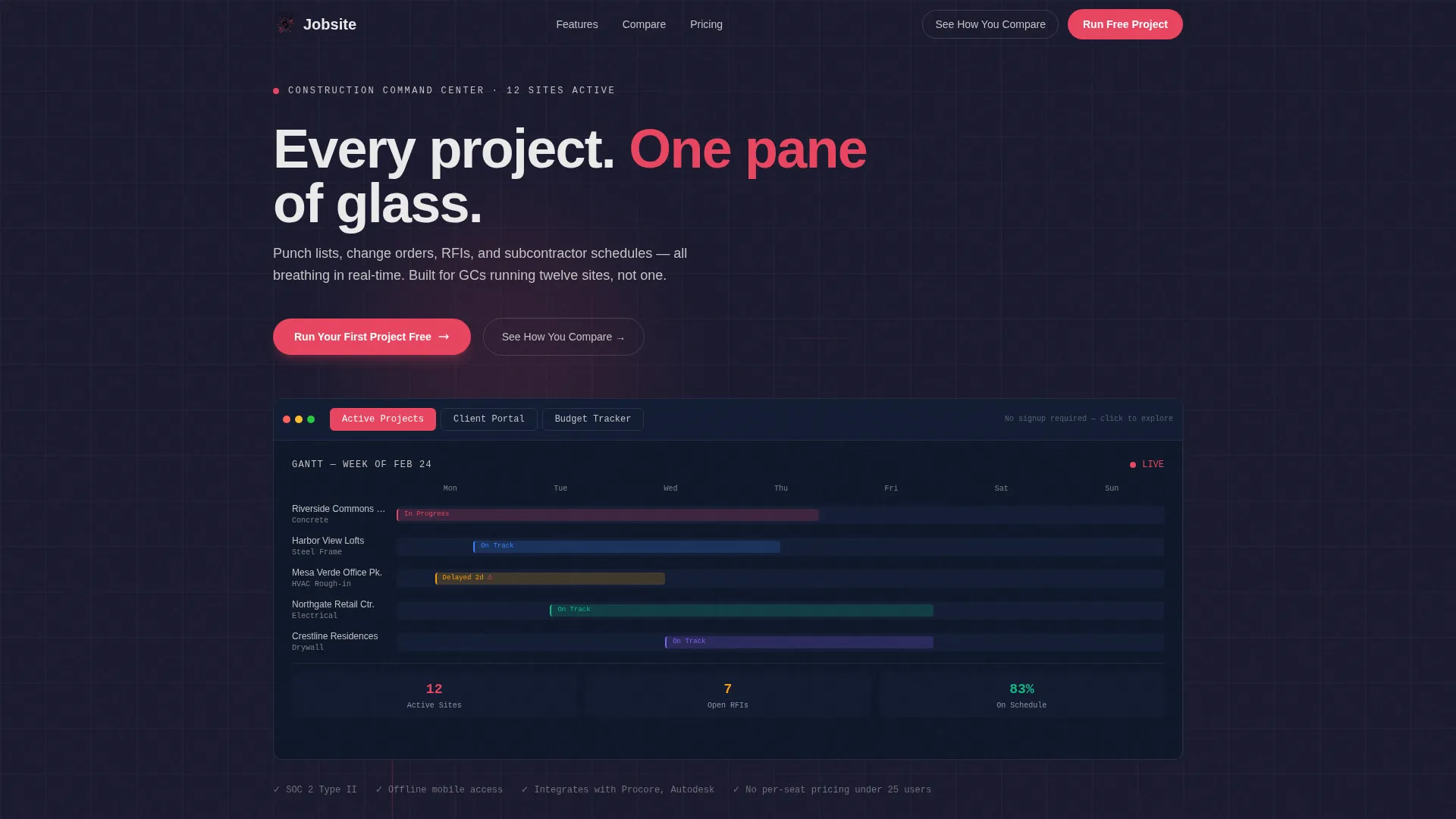
Jobsite is a bento grid landing page template built for construction client management platforms. It combines an interactive dashboard preview, spec-sheet-style feature cards, and a head-to-head comparison grid. The dark Carbon Fiber color system and safety-orange accents give it an industrial, authoritative feel that speaks directly to general contractors, project managers, and construction firm owners.
by Rocket studio
Quick summary
Jobsite is a single-page bento grid landing page template designed for construction management software. It opens with a clickable dashboard mockup, moves through evidence-stacked feature cards, and closes with a structured comparison grid. Every section is self-contained, so a busy contractor can scan directly to their pain point without reading from top to bottom.
Who this template is for
This template is built for founders, product marketers, and developers launching or promoting a construction client management platform. It is ideal when your audience skips long sales copy and responds to proof.
- General contractors managing multiple active job sites simultaneously
- Project managers coordinating RFIs (Requests for Information) across several trades at once
- Construction firm owners who need budget visibility before overruns become emergencies
What problem this template solves
Construction teams lose time and money when project data lives in disconnected places. Punch lists sit in inboxes, change orders stall in text threads, and subcontractor schedules exist only in someone's cab. This template gives your platform a landing page that mirrors the solution it sells.
- Visitors arrive skeptical and leave having already touched a working dashboard preview
- Teams evaluating software need side-by-side proof that the platform beats their current process
- Decision-makers want to see real construction data, not generic placeholder content
What you get with this template
You get a fully structured, single-page bento grid layout that presents a construction management platform with clarity and confidence. The template is organized into distinct content zones, each serving a specific conversion purpose.
- An interactive header preview with three clickable tabs showing live-looking project, communication, and budget data
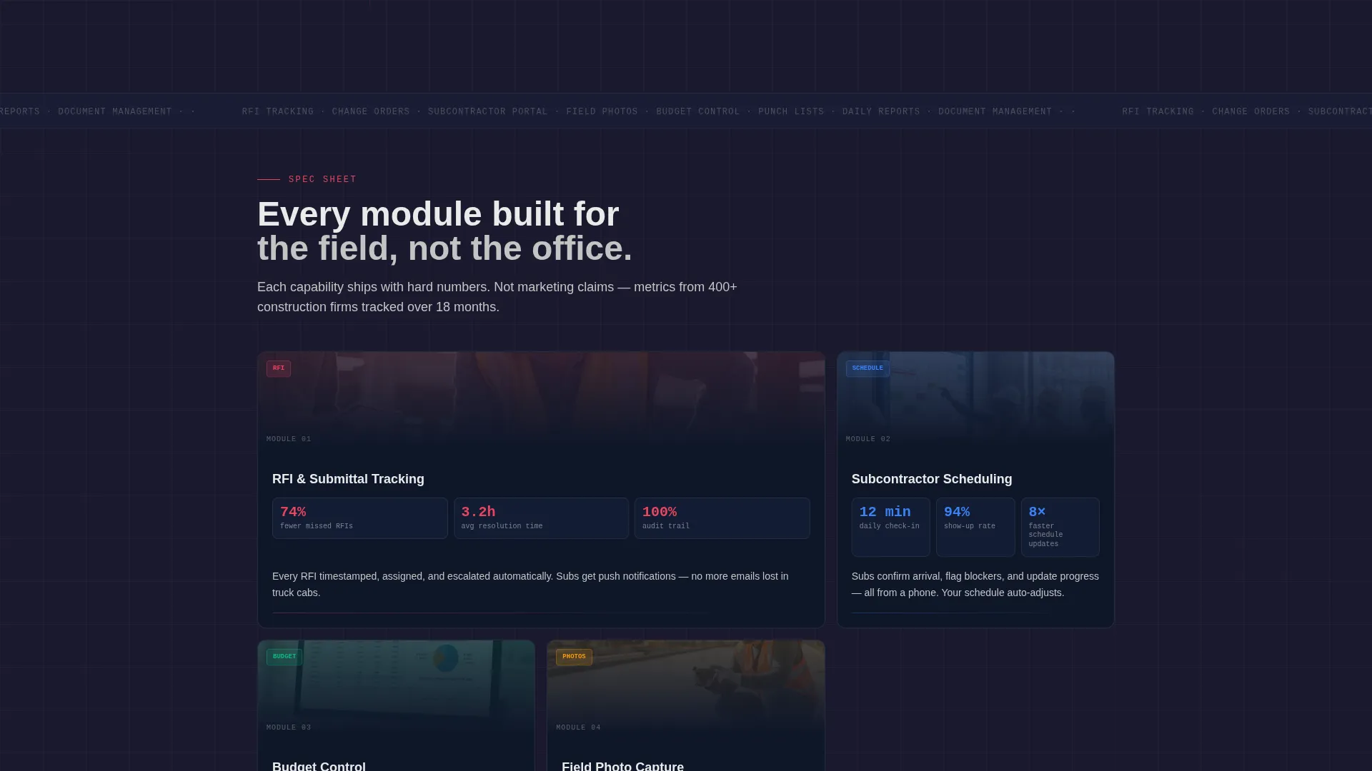
- A spec-sheet card grid that isolates each platform capability with hard metrics and micro-screenshots
- A three-column comparison grid and two call-to-action placements anchored by a five-question diagnostic quiz path
Feature list
This template ships with a deliberate set of components drawn directly from the brief. Each one earns its place by addressing a real construction buyer objection.
Interactive Dashboard Header
The header is a functioning bento mockup, not a static screenshot. Visitors click between "Active Projects," "Client Portal," and "Budget Tracker" tabs. Each tab populates the grid with realistic construction data: a Gantt chart, a timestamped photo thread, and a budget bar chart showing committed costs versus actuals. No account required to interact with it.
Spec Sheet Feature Cards
Below the header, each bento card presents one platform capability in isolation. The format follows a product data sheet pattern: bold feature name, three hard metrics, a micro-screenshot of that specific module, and one plain-language explanation. Cards are self-contained so scanners can land anywhere without losing context.
Three-Column Comparison Grid
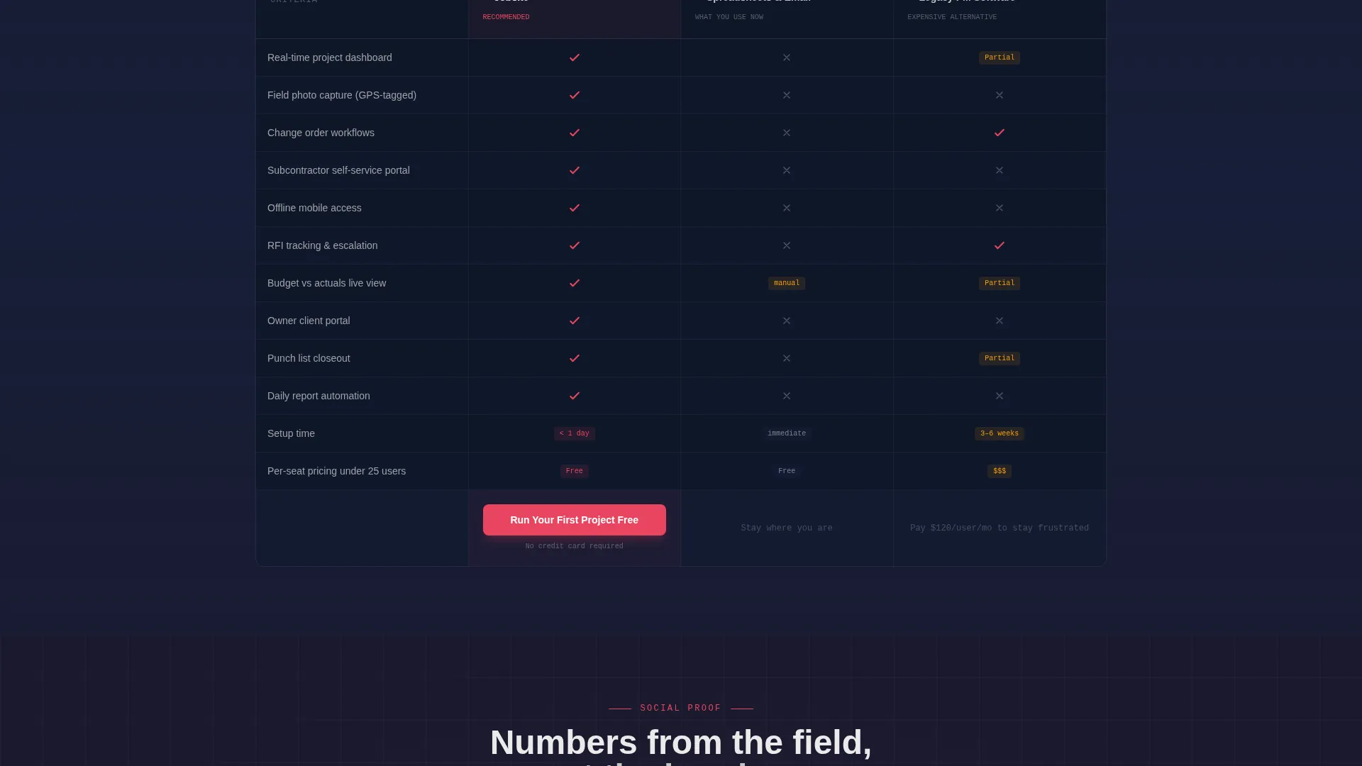
A dedicated bento row compares the platform against spreadsheets and email, and against legacy project management software. Twelve construction-specific criteria are evaluated, including field photo capture, change order workflows, subcontractor self-service portals, and offline mobile access. Checkmarks appear in safety orange; gaps appear in concrete gray.
Dual Call-to-Action Placement
The primary call to action, "Run Your First Project Free," appears twice: once below the interactive header and once anchoring the comparison grid. This positions the offer at both the curiosity stage and the decision stage without feeling repetitive.
Diagnostic Quiz Secondary Path
A secondary conversion path links to a five-question diagnostic quiz. It asks about current project count, team size, and biggest coordination bottleneck, then returns a personalized gap analysis. This path serves visitors who are not yet ready to commit but want a concrete reason to return.
Carbon Fiber Visual System
The entire template uses a dark, industrial color palette applied consistently across backgrounds, bento cards, borders, and interactive elements. Every toggle, button, and active tab uses safety orange so critical actions are never missed.
Page sections overview
| Section | Purpose |
|---|---|
| Interactive Header Preview | Lets visitors explore a live-looking dashboard before signing up |
| Active Projects Tab | Shows a Gantt chart with real construction milestone data |
| Client Portal Tab | Displays a timestamped photo communication thread from the field |
| Budget Tracker Tab | Renders a bar chart comparing committed costs to actuals |
| Spec Sheet Cards | Presents each platform feature with metrics and micro-screenshots |
| Comparison Grid Row | Pits the platform against spreadsheets and legacy software |
| Primary call to action Block | Places "Run Your First Project Free" below the header |
| Comparison call to action Anchor | Repeats the primary call to action after the comparison evidence |
| Diagnostic Quiz Path | Offers a personalized gap analysis for hesitant visitors |
Design & branding system
The template uses a Dashboard Pro theme built on the Carbon Fiber color system. The palette reads industrial and direct, matching the expectations of construction professionals who distrust flashy interfaces.
- Deep matte black (#1A1A2E) and reinforced graphite (#16213E) serve as the primary background layers, with bento cards floating on matte black behind 1px concrete-gray (#C4C4C4) borders
- High-vis safety orange (#E94560) activates all interactive elements including toggles, buttons, and selected tabs so they demand attention without competing with content
- Poured-concrete gray (#C4C4C4) handles secondary text and dividers, keeping the hierarchy clean and easy to scan under pressure
Mobile & speed optimization
The bento grid layout is structured to reflow cleanly on smaller screens. Construction professionals often check platforms from a job site on a phone or tablet, so the template accounts for that context.
- Bento cards are individually self-contained, making them easy to stack vertically on mobile without losing meaning
- Interactive tab elements and call-to-action buttons are sized and spaced for reliable tap targets on touch screens
- The dark background palette reduces eye strain in high-glare outdoor environments where phones are often used
How this template helps you convert
The page is engineered around a single principle: let the visitor experience the product before asking for commitment. Every structural decision serves that goal.
- The interactive header lets visitors click through a realistic dashboard with named projects and real-sounding data, building trust before a single word of sales copy is read
- The spec-sheet card grid stacks independent proof points so scanners who skip the header still encounter three hard metrics and a module screenshot before they leave
- The comparison grid closes the argument by showing, line by line, exactly what spreadsheets and legacy tools cannot do, then places the primary call to action directly underneath that evidence
Other information about this template
This template was designed specifically for the Construction Software and SaaS category. It fits within the broader construction client management niche and is optimized for technology-forward platforms targeting field-to-office communication gaps.
- The template style is Bento Grid, paired with the Dashboard Pro theme and a Spec Sheet creative direction
- The header concept is an Interactive Preview, and the landing-page direction is Comparison/Versus
- The color system is Carbon Fiber, which suits brands that want to project durability and professionalism to a construction-industry audience
- Template customization involves swapping the placeholder project names, metrics, and module screenshots with your platform's real data to maximize authenticity

Theme
Dashboard Pro
Creative direction
Spec Sheet
Color system
Carbon Fiber
Style
Bento Grid
Direction
Comparison/Versus
Page Sections
Interactive Dashboard Header Preview
Spec Sheet Feature Card Grid
Three-column Comparison Grid
Dual Call-to-action Placement
Diagnostic Quiz Secondary Path
Related questions
Who is this landing page template designed for?
Can visitors interact with the template before signing up?
What does the comparison grid include?
What is the diagnostic quiz path?
How do I customize this template with my own data?



