Buildforum - Highvelocity Squarespace Landing Page Template
Buildforum is a hub-and-spoke landing page template built for Squarespace community forums. It opens with a live stats dashboard, guides visitors through a five-spoke anchor navigation, and uses a comparison matrix to prove the forum's value before asking for a signup. The Carbon Fiber color system and animated counters create an atmosphere of real, active momentum.
by Rocket studio
Quick summary
Buildforum is a single-page, anchor-nav landing page template designed for Squarespace community forums. It leads with animated metrics, walks visitors through five comparison spokes, and closes with a focused signup flow. The dark Carbon Fiber palette and electric cyan accents give it a fast, technical energy that matches the audience it is built for.
Who this template is for
This template is for anyone building or growing a community around the Squarespace platform. It speaks directly to people who know the difference between a CSS override and a custom integration.
- Freelance web designers managing multiple client projects who need a community of peers to turn to quickly
- Self-taught small business owners who built their own site and want real answers from people with hands-on experience
- Developers and plugin builders who live inside the Squarespace ecosystem and want to connect with others doing the same work
What problem this template solves
Most forum landing pages fail to answer the visitor's first question: "Is this community actually active and worth my time?" Generic layouts offer no evidence. Buildforum solves this by leading with proof.
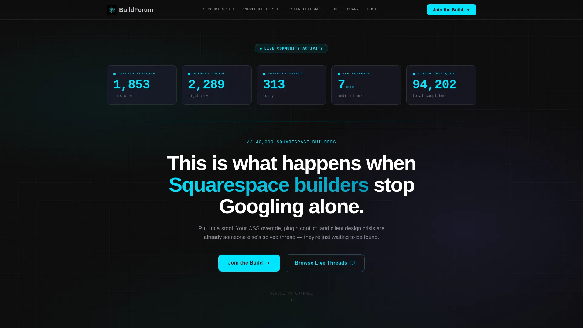
- Visitors land on a live metrics dashboard that shows threads resolved, members online, and response times in real time
- The comparison matrix removes doubt by placing the forum's performance directly next to alternatives, letting data do the persuading
- The two-path conversion design lets skeptics browse live threads before committing, reducing the friction of a cold signup
What you get with this template
You get a complete, structured landing page ready to be customized for your Squarespace forum community. Every section is purposeful and built around a specific conversion moment.
- A header stats band with five animated counters and a single punchy headline beneath them
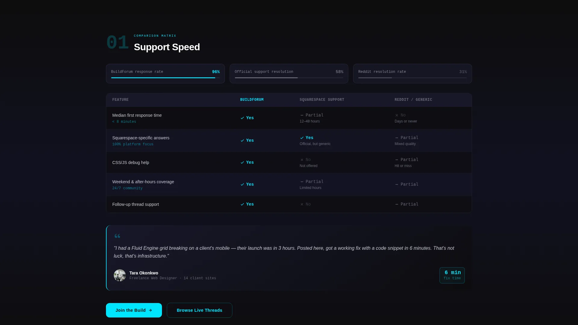
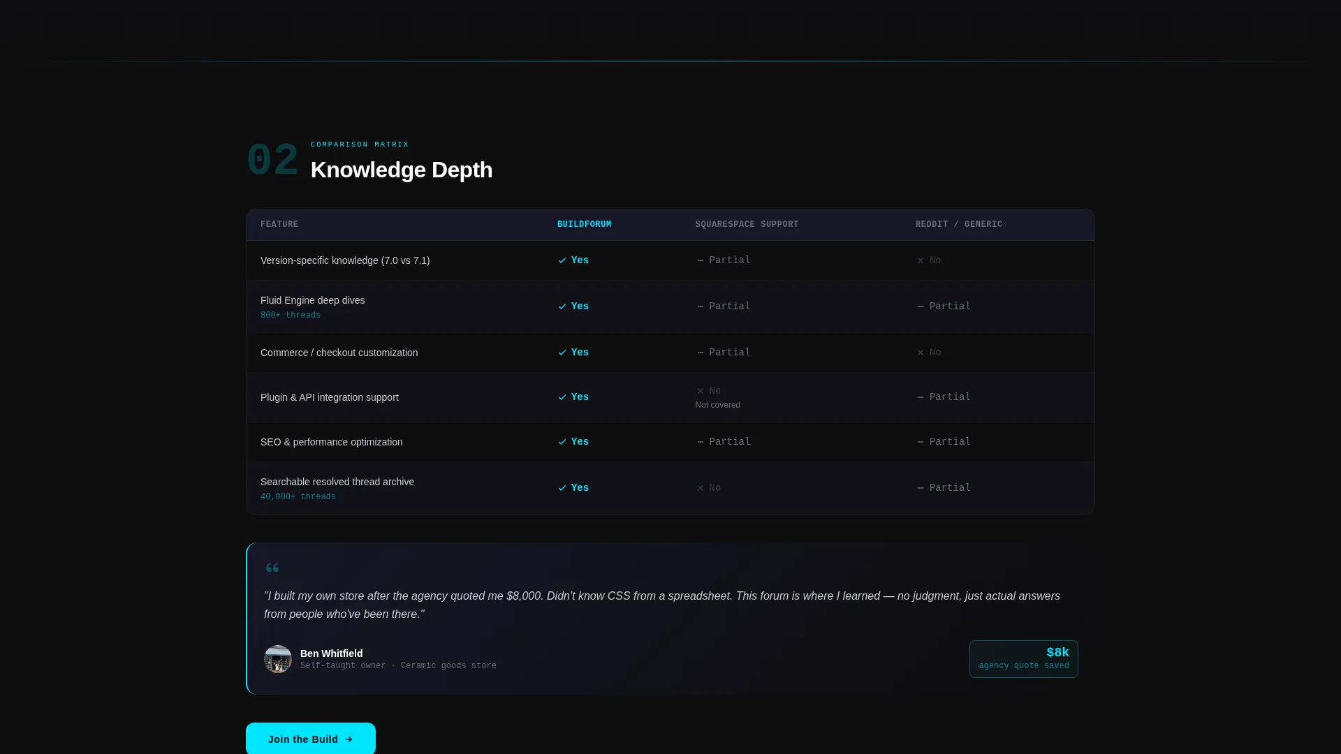
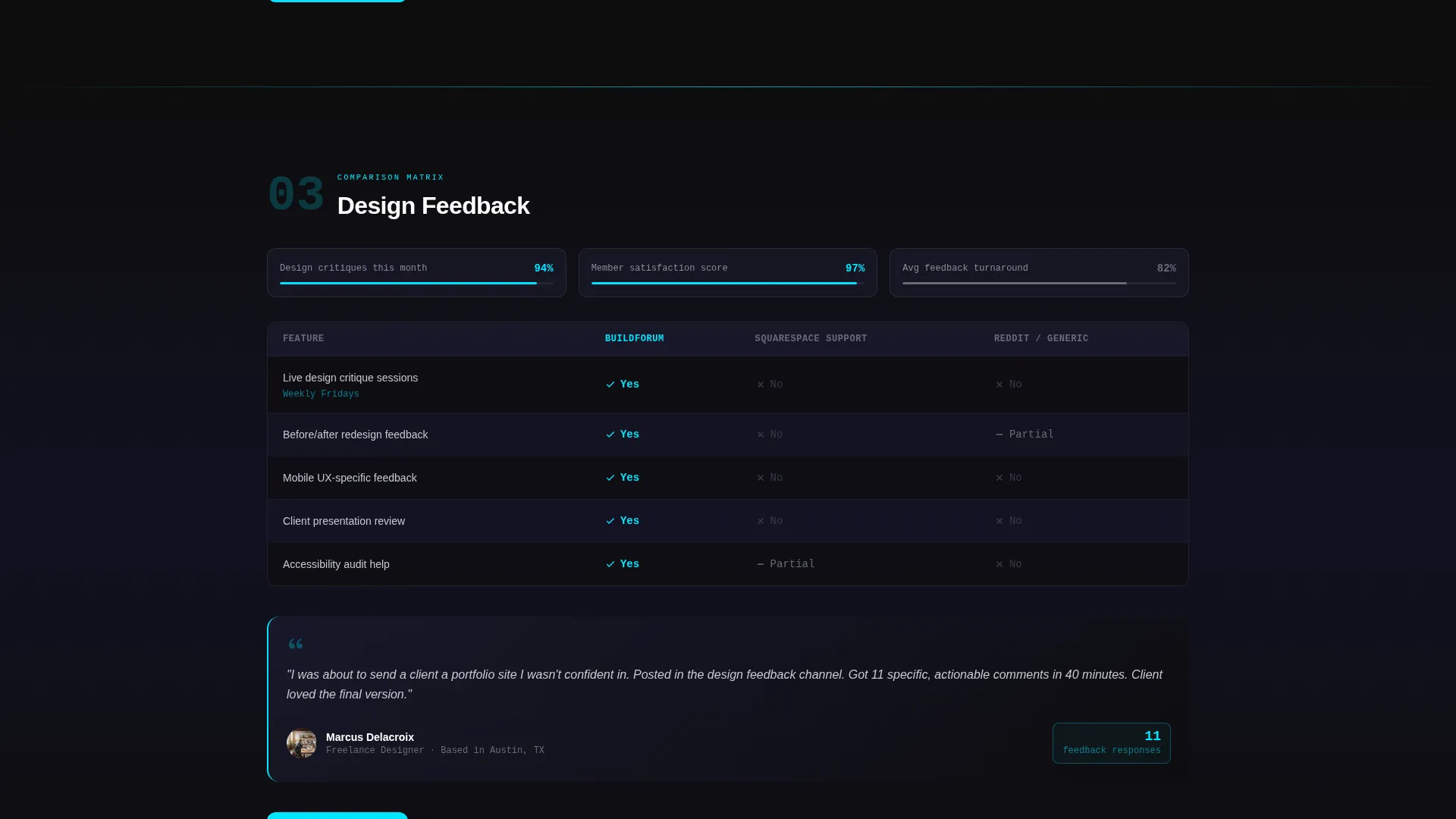
- Five anchor-navigated spoke sections, each containing a three-column comparison matrix, scroll-triggered animations, and a testimonial card
- A primary "Join the Build" call to action that appears after the header and resurfaces as a sticky bar on mobile, plus a secondary "Browse Live Threads" modal preview
Feature list
This section covers the core components built into the template.
Live Stats Header Dashboard
Five oversized, animated counters display community activity in real time. Metrics include threads resolved, active members online, code snippets shared, average response time, and total design critiques completed. The headline beneath them anchors the entire value proposition in one line.
Five-Spoke Anchor Navigation
A sticky navigation bar pins to the top of the page and links to five content spokes: Support Speed, Knowledge Depth, Design Feedback, Code Library, and Cost. Visitors can jump directly to the comparison that matters most to them.
Three-Column Comparison Matrix
Each spoke section contains a structured matrix comparing the forum against two alternatives. Cells use cyan checkmarks, graphite dashes, and scroll-triggered progress bar animations. The layout presents evidence calmly rather than aggressively.
Testimonial Cards by Member Type
Immediately below each matrix row sits a testimonial card representing a real member profile. The freelancer, the self-taught owner, and the plugin developer each appear at the moment their story is most relevant to what the visitor just read.
Two-Path Conversion Flow
The primary call to action opens a single-step signup form with three fields: email address, skill level, and an optional problem statement. The secondary path opens a modal preview of live threads, giving cautious visitors a low-commitment way to evaluate quality before signing up.
Sticky Mobile Call-to-Action Bar
On mobile, the primary call to action resurfaces as a fixed bottom bar after each matrix section. This keeps the conversion option visible without interrupting the scroll experience on smaller screens.
Page sections overview
| Section | Purpose |
|---|---|
| Header Metrics Dashboard | Displays five live animated counters and the community headline |
| Primary call to action Band | Introduces the "Join the Build" signup prompt immediately below the header |
| Support Speed Spoke | Compares response time against alternatives with matrix and testimonial |
| Knowledge Depth Spoke | Compares depth of documented answers with matrix and testimonial |
| Design Feedback Spoke | Compares quality of design critique with matrix and testimonial |
| Code Library Spoke | Compares available code snippet resources with matrix and testimonial |
| Cost Spoke | Compares membership value and pricing context with matrix and testimonial |
| Live Threads Modal | Previews today's active discussions for visitors who want to browse first |
| Signup Form | Collects email, skill level, and optional problem statement in one step |
Design & branding system
The template uses a Carbon Fiber color system that feels technical, focused, and premium without being cold. Every design decision serves legibility and trust.
- The core palette runs from deep cockpit black (#0D0D0D) and woven graphite (#1A1A2E) as backgrounds, through titanium mid-tone (#4A4A5A) for supporting surfaces, with bright silver (#C8C8D0) for body text
- Electric cyan (#00E5FF) is reserved exclusively for interactive states, active navigation indicators, metric highlights, and checkmarks, so it always signals something meaningful
- Section dividers use a single-pixel cyan rule, and all counter and metric figures render in oversized monospaced type to reinforce the data-first visual language
Mobile & speed optimization
The template is structured to stay clear and functional on small screens without sacrificing the visual weight that makes it compelling on desktop.
- The anchor navigation adapts so spoke sections remain accessible on mobile without requiring horizontal scrolling
- The sticky bottom call-to-action bar activates on mobile after each matrix section, keeping the signup prompt reachable without cluttering the main content area
- Scroll-triggered animations on the comparison matrix are designed to activate as sections enter the viewport, working with natural mobile scroll behavior
How this template helps you convert
Every section of this template is designed to move a skeptical visitor one step closer to signing up. The page earns the click rather than demanding it.
- The live metrics dashboard establishes credibility in the first three seconds. Visitors see real numbers before they read a single word of marketing copy.
- The five comparison spokes build a layered case across multiple dimensions. By the third spoke, visitors have seen enough evidence across response time, knowledge depth, and resolved threads to feel that joining is a practical decision.
- The two-path conversion design removes the binary pressure of "sign up or leave." The "Browse Live Threads" option keeps skeptics engaged and lets the community's quality close the deal on its own terms.
Other information about this template
This template was designed at the intersection of the Documentation and Support category and the Squarespace community forum niche. It is well suited to any hub-based community page where demonstrating activity and depth is more persuasive than static feature lists.
- The template style is Hub and Spoke with anchor navigation, making it straightforward to extend or reorganize spokes if your community priorities differ from the default five
- The Startup Velocity theme and Carbon Fiber color system are paired intentionally. The visual language signals that this is a working community, not a marketing brochure
- The Comparison and Versus landing page direction means the template works best when you have honest, specific data to populate the matrix cells. Placeholder values will undermine the credibility the layout is designed to build
Theme
Startup Velocity
Creative direction
Feature Matrix
Color system
Carbon Fiber
Style
Hub & Spoke (Anchor Nav)
Direction
Comparison/Versus
Page Sections
Live Stats Header Dashboard
Five-spoke Anchor Navigation
Three-column Comparison Matrix
Member Testimonial Cards
Two-path Conversion Flow
Sticky Mobile Call to Action Bar
Related questions
Can I change the five spoke topics to match my own community focus areas?
Do I need real data to make the header metrics dashboard work?
Is this template suitable for a community that is not focused on web design?
How does the Browse Live Threads modal work?
What skill level do I need to customize this template?



