Local Government Software Professional Website Template
Govstack is a government project management landing page built for federal program managers, contracting officers, and agency CIOs. Its Tech Glass visual identity pairs a dark heads-up display aesthetic with electric chartreuse data highlights. Interactive capability cards, a tab-switching header, and two clear calls to action make complex federal program oversight feel immediate and navigable.
by Rocket studio
Quick summary
Govstack is a modular, card-grid landing page template designed for government project management platforms. It translates sprawling federal program data into a crystal-clear command center experience. The Tech Glass design system, interactive capability cards, and a Feature Tab Switcher header give visitors the feel of working inside the product before they ever click a button.
Who this template is for
This template is built for teams that operate inside the machinery of federal program delivery. It speaks directly to the people responsible for making complex government work visible and accountable.
- Program managers at Department of Defense and civilian agencies who manage Earned Value Management System (EVMS) reports and milestone tracking
- Contracting officers who work with Federal Procurement Data System (FPDS) data and need contract lifecycle clarity
- Chief Information Officers who require Federal Information Technology Acquisition Reform Act (FITARA) scorecard readiness without the last-minute scramble
What problem this template solves
Federal programs involve dozens of agencies, hundreds of budget lines, and compliance checkpoints that shift constantly. Most platforms present that complexity as noise. Govstack flips that dynamic.
- Program data is fragmented across agencies, making unified milestone and budget visibility nearly impossible at a glance
- Compliance readiness and audit preparation are treated as periodic fire drills rather than continuous, real-time processes
- Visitors to a government software product page often struggle to understand the platform's value before committing to a demo
What you get with this template
You get a fully structured, single-page layout built around modular capability cards and a tab-switching header that puts the product's core value on screen immediately. Every design choice serves the mission of making federal program management feel manageable.
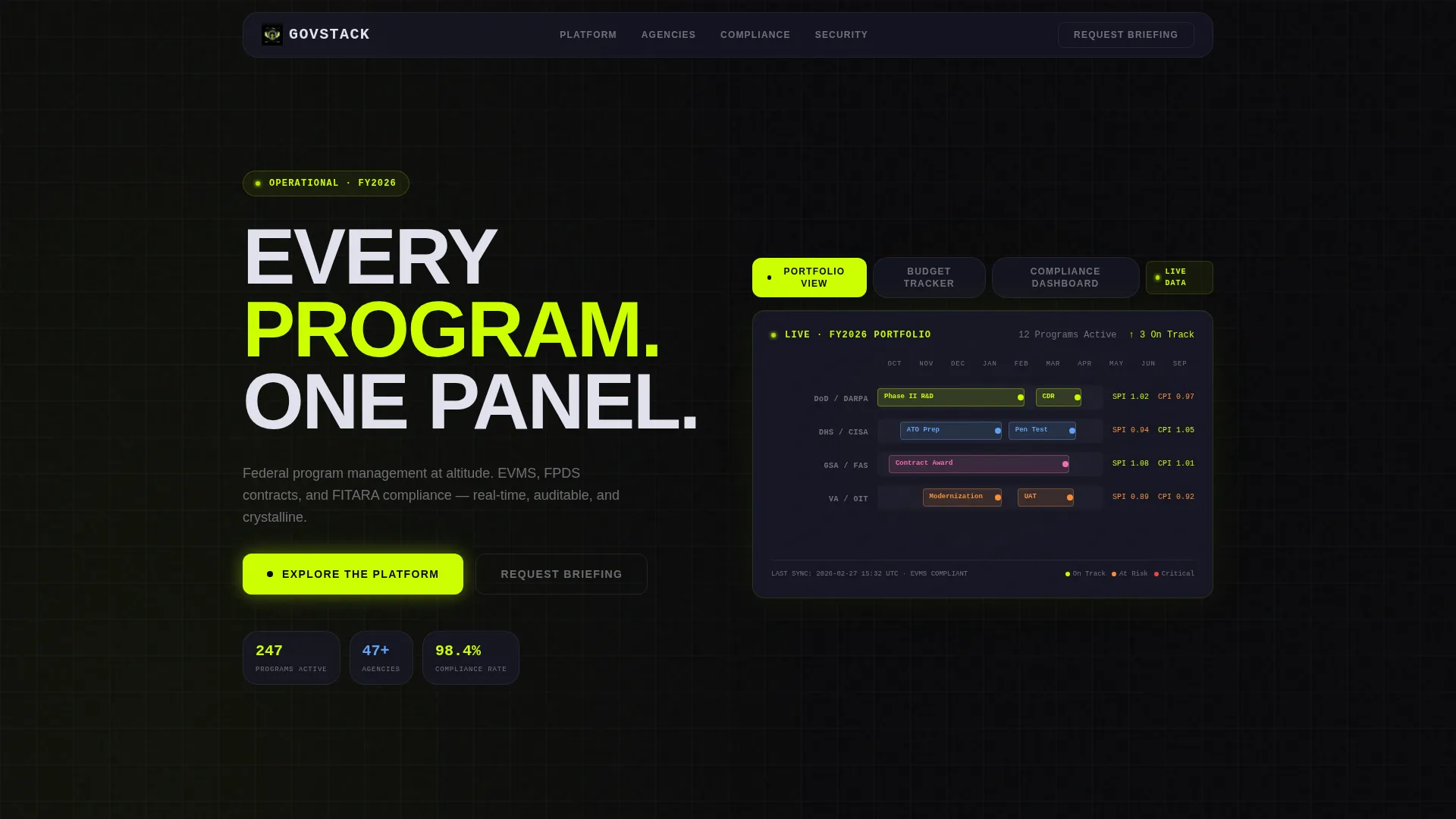
- A Feature Tab Switcher header with three glass-morphism tabs: "Portfolio View," "Budget Tracker," and "Compliance Dashboard," each revealing a live-feeling user interface screenshot with a smooth crossfade transition
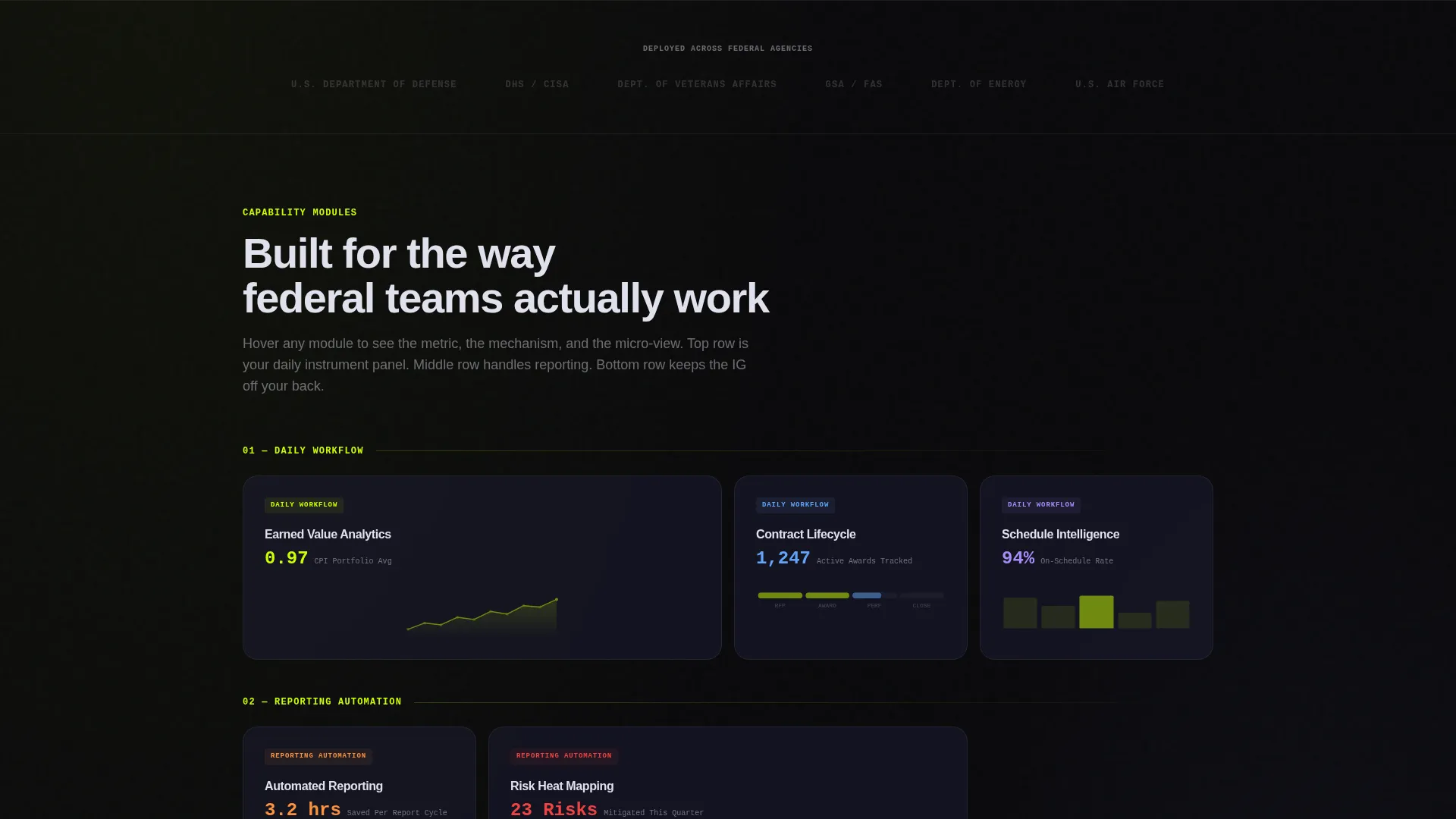
- An Interactive Explorer card grid featuring capability modules such as "Earned Value Analytics," "Contract Lifecycle," "Risk Heat Mapping," and "ATO Tracker," each expanding on hover with a metric, a two-line explanation, and a micro-animation
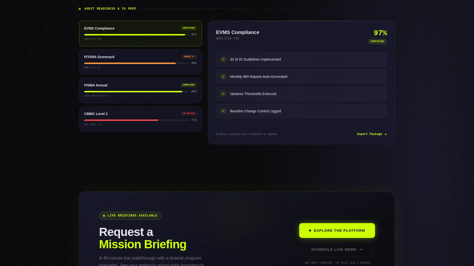
- Two conversion touchpoints: a floating "Explore the Platform" primary call to action pinned after the first scroll, and a "Request a Mission Briefing" secondary call to action beneath the final card row
Feature list
This template delivers a precise set of interactive and visual features grounded in the source brief. Each one is designed to serve a specific function in the visitor journey.
Feature Tab Switcher Header
Three glass-morphism tabs labeled "Portfolio View," "Budget Tracker," and "Compliance Dashboard" sit at the top of the page. Each tab reveals a different frosted-panel user interface screenshot. Switching between tabs triggers a smooth crossfade, so visitors are already navigating the product before they scroll.
Interactive Capability Card Grid
The core of the page is a modular card grid. Each card represents a platform capability and expands on hover to show a single key metric, a two-line feature explanation, and a micro-animation. The grid shifts subtly as visitors engage, rewarding exploration and making the page feel alive.
Escalating Stakes Layout
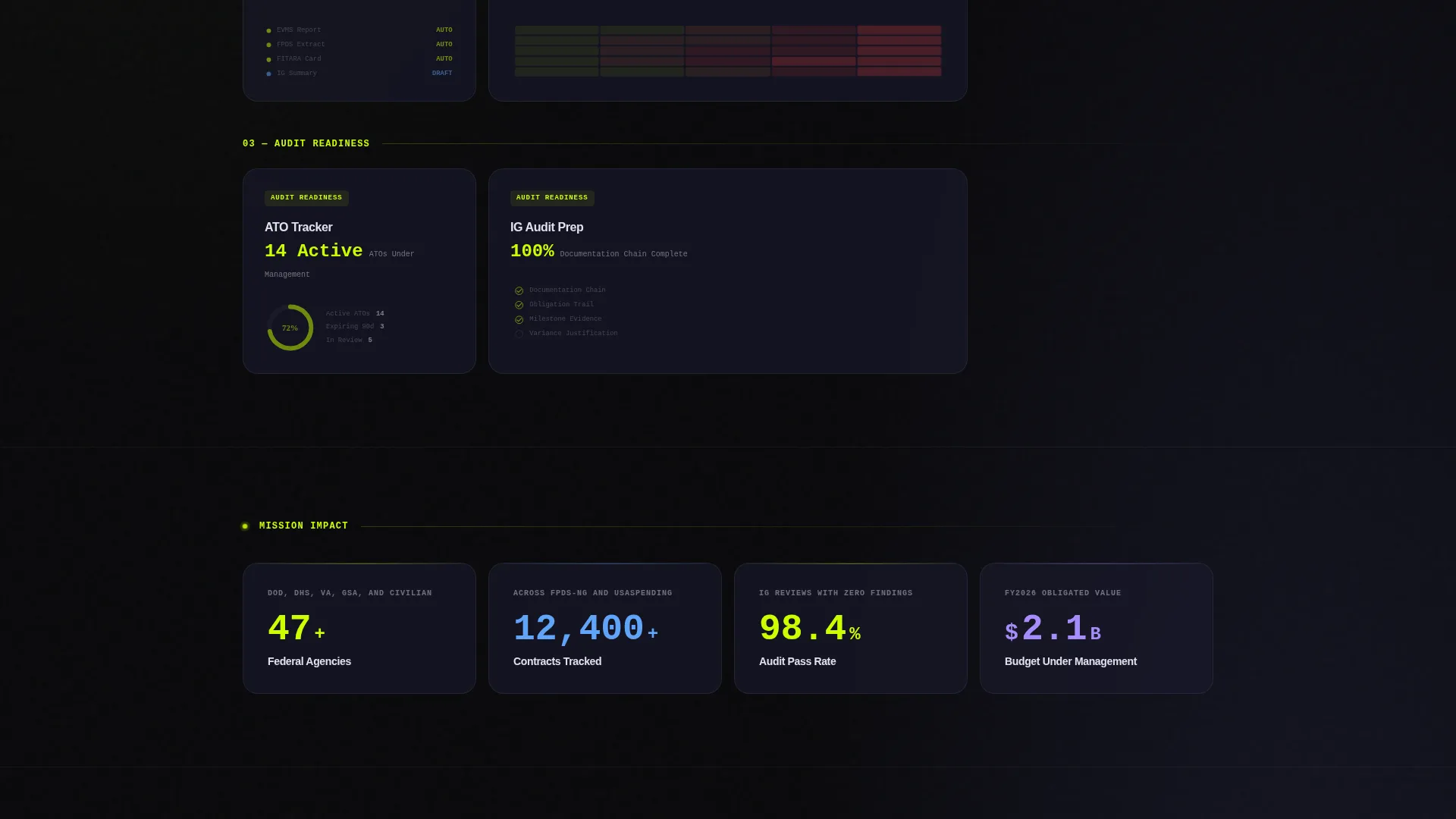
Cards are arranged in three strategic rows. The top row covers daily workflow features, the middle row focuses on reporting automation, and the bottom row addresses audit readiness and Inspector General preparation. This structure moves visitors from operational detail to strategic outcome as they scroll.
Floating Primary Call to Action
A chartreuse-on-void-black "Explore the Platform" button appears in a pinned navigation bar after the first scroll. It stays visible throughout the page, reducing the distance between intent and action at any point in the visitor's journey.
Mission Briefing Secondary Call to Action
A "Request a Mission Briefing" call to action sits beneath the final card row. It targets prospects who want a live walkthrough rather than a self-guided tour, giving the page two distinct conversion paths for different buyer readiness levels.
Tech Glass Visual System
The full page is built on a heads-up display aesthetic using void black, translucent panel gray with glass-blur cards, electric chartreuse active states, and cool interface white body text. The palette is designed for long screen sessions without visual fatigue.
Page sections overview
| Section | Purpose |
|---|---|
| Feature Tab Switcher | Puts three core platform views on screen immediately via crossfade tabs |
| Portfolio View Tab | Shows a Gantt-style layout with color-coded agency swim lanes and chartreuse milestones |
| Budget Tracker Tab | Displays a live-feeling budget management user interface inside a frosted panel |
| Compliance Dashboard Tab | Presents a compliance checkpoint interface as an active screenshot |
| Daily Workflow Row | Top card row covering operational features like Earned Value Analytics and Contract Lifecycle |
| Reporting Automation Row | Middle card row showing automation capabilities for program reporting |
| Audit Readiness Row | Bottom card row focused on ATO Tracker, Risk Heat Mapping, and Inspector General prep |
| Floating Navigation Bar | Pinned bar with the primary "Explore the Platform" call to action |
| Mission Briefing call to action | Secondary conversion point beneath the final card row for live walkthrough requests |
Design & branding system
The visual identity is built on a Tech Glass theme using the Acid Digital color system. Every element is calibrated to feel like a heads-up display projected onto smoked glass, dark enough for extended use, sharp enough that critical data reads instantly.
- Color palette: void black (#09090B) as the base, translucent panel gray (#1A1A2E) at 60% opacity for glass-blur cards, electric chartreuse (#CCFF00) for active states and data highlights, and cool interface white (#E0E0EC) for body text
- Card style: frosted glass-morphism panels with blur effects create depth without clutter, keeping the interface readable across all card states including hover expansions
Mobile & speed optimization
The card grid layout is modular by design, which supports clean reflow across screen sizes. The template's structure keeps visual complexity manageable without sacrificing the cockpit-panel aesthetic on smaller displays.
- Modular card components are individually contained, making them straightforward to stack or resize for narrower viewports
- The floating navigation bar and pinned call to action are designed to remain accessible without obstructing content as viewport dimensions change
How this template helps you convert
Every structural and visual decision in Govstack points visitors toward one of two conversion actions. The page is built to reduce hesitation and create momentum from the first second.
- The Feature Tab Switcher places a working product simulation at the very top of the page. Visitors engage with the interface before they read a single line of copy, building confidence through interaction rather than persuasion.
- The floating "Explore the Platform" call to action stays pinned throughout the scroll, so the path to a sandbox environment is always one click away. The sandbox uses a single-field email gate requiring a.gov address, which reduces friction while qualifying leads by domain.
Other information about this template
Govstack is designed specifically for the government technology software market, where trust, clarity, and audit-readiness are not optional features but baseline expectations. The template's Interactive Explorer creative direction and Click-Through landing page structure are matched to this niche's decision-making pace.
- Template style is Card Grid (Modular), allowing individual capability modules to be updated or reordered without rebuilding the full page layout
- The header concept is a Feature Tab Switcher, a pattern well-suited to platforms with multiple distinct capability areas that each need their own visual proof point
- The Click-Through landing page direction means no form is presented on the page itself; the single-field.gov email gate lives in the sandbox environment, keeping the page friction-free
- The Acid Digital color system and Tech Glass theme are purpose-built for government technology contexts where dark interfaces and high-contrast data displays align with professional expectations
Theme
Tech Glass
Creative direction
Interactive Explorer
Color system
Acid Digital
Style
Card Grid (Modular)
Direction
Click-Through
Page Sections
Feature Tab Switcher Header
Interactive Capability Card Grid
Escalating Three-row Layout
Floating Primary Call to Action
Mission Briefing Secondary Call to Action
Tech Glass Visual Identity
Related questions
Who is the target audience for this landing page template?
Does this template include a contact form or lead capture form?
Can I customize the capability cards and tab labels?
What makes the header different from a standard navigation menu?
Is this template suitable for a platform covering multiple federal agencies?



