Cloud & DevOps Reviews Website Template
Burnrate is a Bold Brutalist landing page template built for cloud cost management platforms. It opens with a live-data dashboard preview, guides visitors through five anchor-linked pain-point sections, and drives free trial sign-ups with a no-form onboarding flow. The design uses a Midnight Blue console palette to make every dollar of recoverable waste feel urgent and real.
by Rocket studio
Quick summary
Burnrate is a single-page, hub-and-spoke landing page template for cloud cost management tools. It drops visitors straight into a live console preview showing real waste data, then walks them through five brutalist content spokes before converting them with a frictionless "Connect Your Cloud, Free" flow. The design feels like a live operations screen: dark, sharp, and data-first.
Who this template is for
This template is built for teams launching or marketing a cloud cost management platform. It speaks directly to the people who feel the pain of uncontrolled cloud spend every day.
- DevOps leads and platform engineers who need to justify infrastructure costs
- CFOs and finance stakeholders who see cloud bills as an unexplained black hole
- SaaS founders and product marketers positioning a multi-cloud cost visibility tool
What problem this template solves
Cloud cost tools struggle to convert skeptical technical buyers. The usual approach, feature lists and pricing tables, does not work when your audience has already sat through three vendor demos. Burnrate flips the script by showing the problem in motion before asking for anything.
- Visitors arrive unconvinced; the template leads with a populated dashboard instead of a pitch
- Engineering and finance audiences need different proof; the spoke structure addresses both
- Freemium sign-up flows often leak users; the two-step no-form onboarding removes that friction
What you get with this template
You get a fully structured, single-page layout built around a persistent spoke navigation system. Every section is pre-designed and pre-populated with realistic cloud cost data so you can see exactly how it performs before you customize a word.
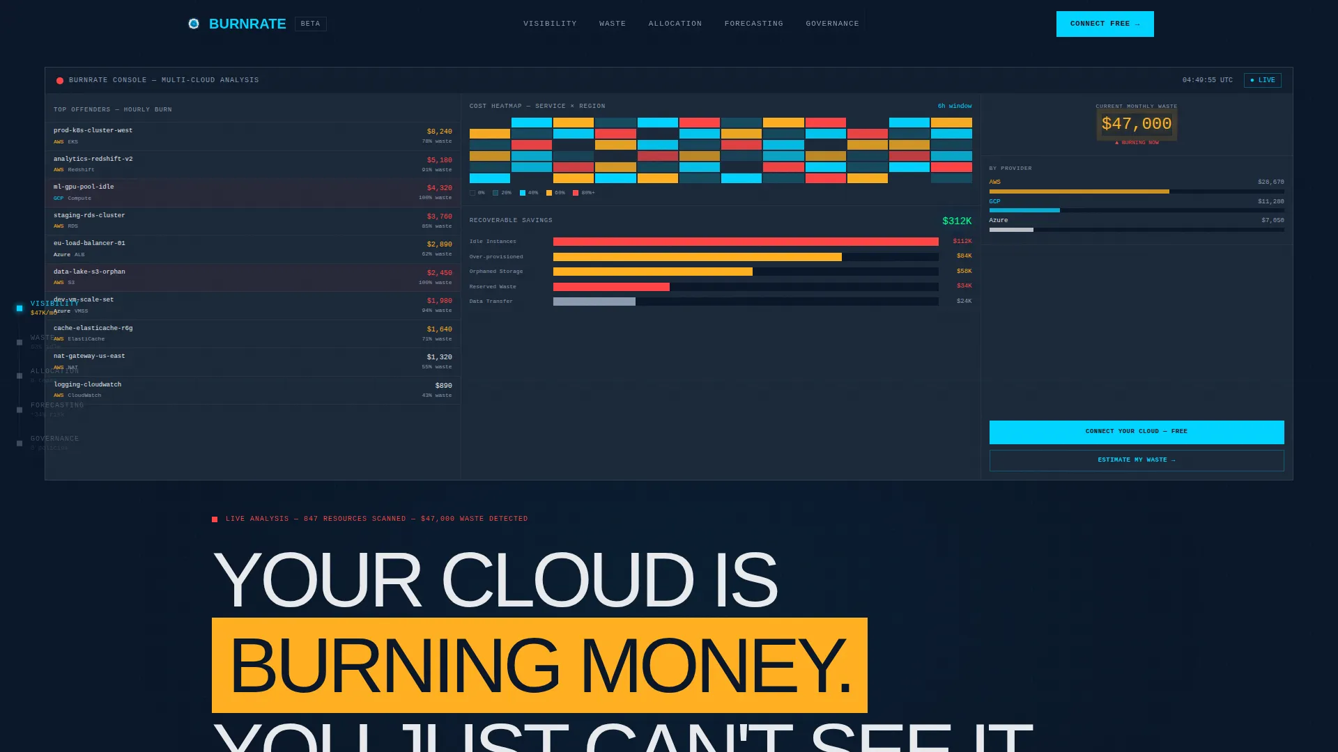
- A full-viewport dashboard header block with a cost heatmap, savings waterfall chart, and top-ten offending resources list
- Five brutalist anchor spoke sections covering Visibility, Waste, Allocation, Forecasting, and Governance
- A two-step cloud provider onboarding flow and a secondary savings calculator with email capture
Feature list
This template includes the following built-in design and layout capabilities.
Full-Viewport Dashboard Header
The header renders a pixel-accurate console preview mid-analysis. It shows a cost heatmap pulsing across services, a savings waterfall chart totaling a bold recoverable figure, and a sidebar listing the top ten offending resources with exact hourly burn rates. The primary call to action overlays the waste total as a brutalist button.
Persistent Spoke Navigation Rail
A left-rail anchor navigation stays pinned as users scroll. Each spoke is labeled with a raw pain-point term: Visibility, Waste, Allocation, Forecasting, and Governance. Clicking any spoke scrolls instantly to its matching content block, keeping long-page orientation effortless.
Problem-to-Solution Spoke Blocks
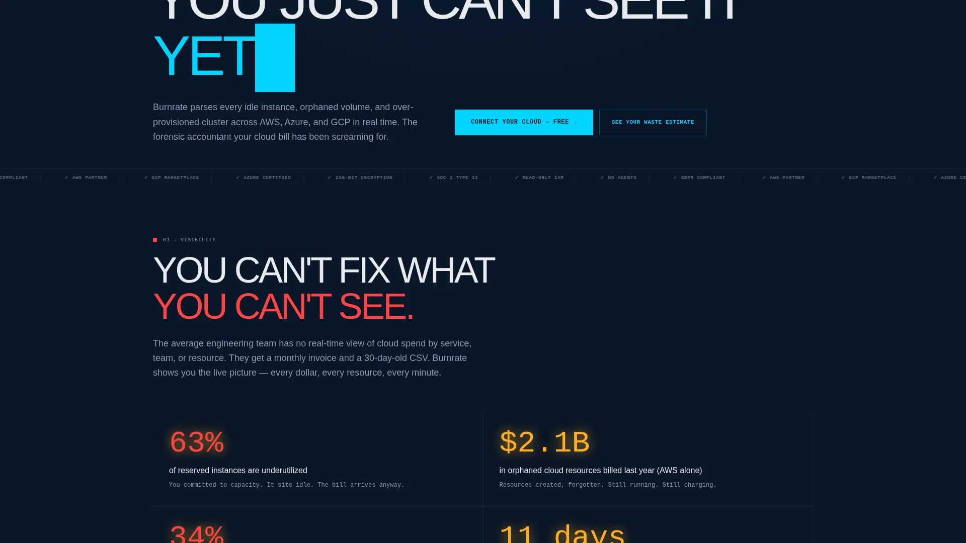
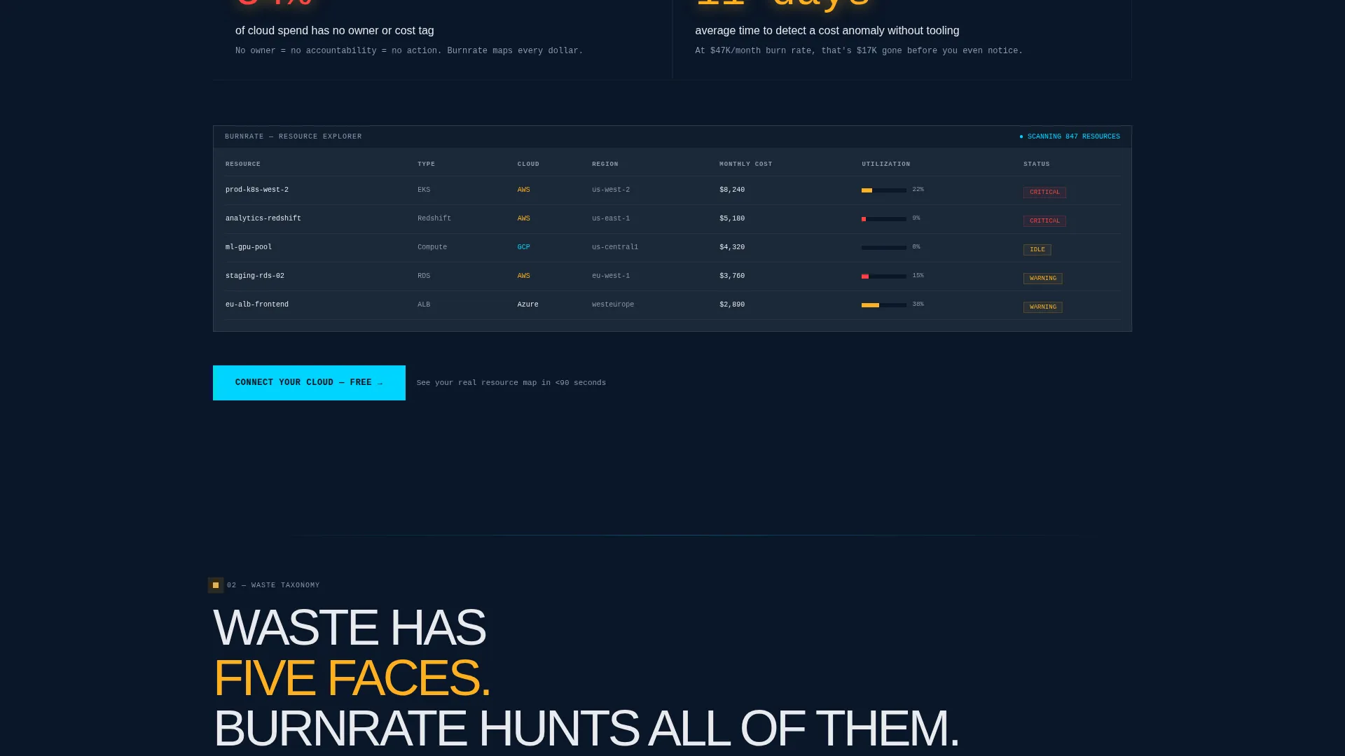
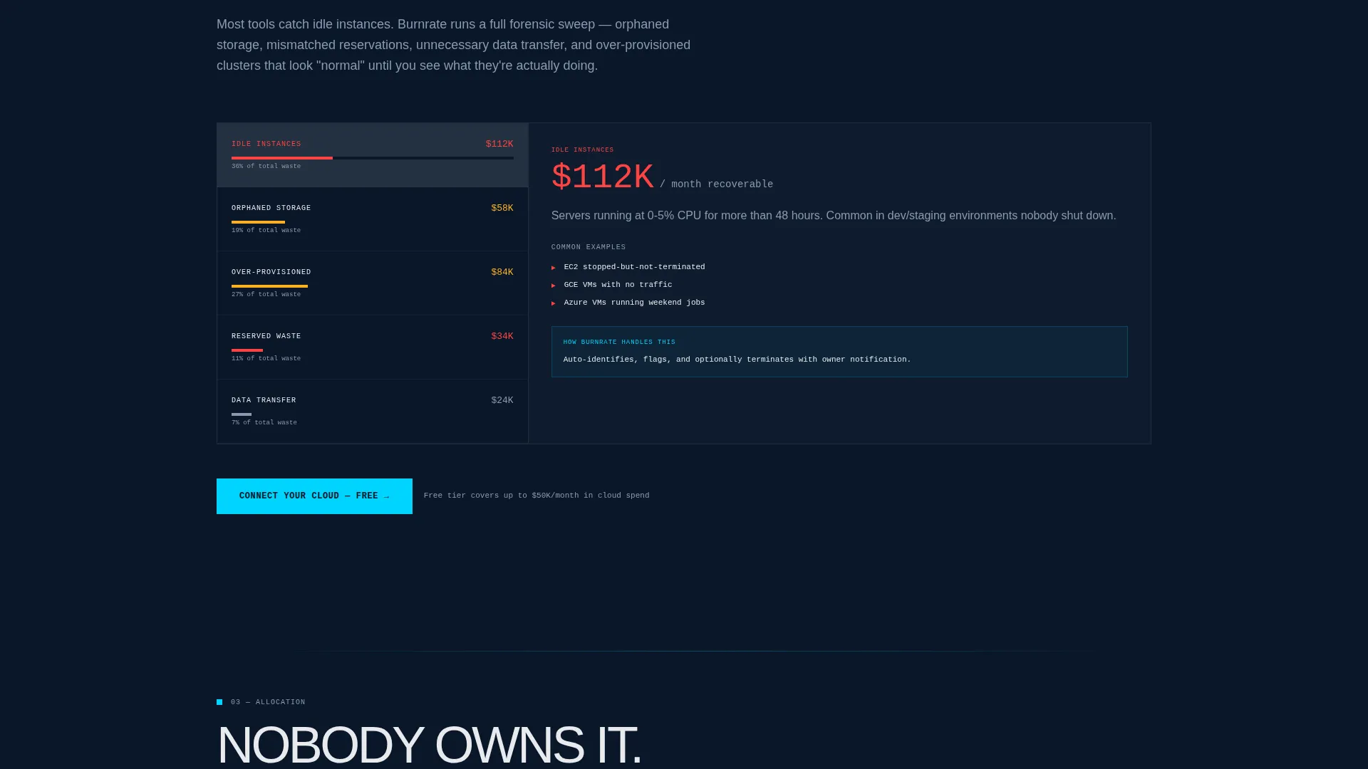
Each of the five spokes opens with a blunt, uncomfortable statistic that names the problem. It then transitions to an embedded product screenshot and a single proof metric. The structure escalates in intensity from diagnosis to resolution as the visitor scrolls deeper.
Two-Step Cloud Onboarding Flow
The primary conversion path skips email forms entirely. Visitors select their cloud provider, AWS (Amazon Web Services), Azure, or GCP (Google Cloud Platform), via bold icon toggles, then authenticate through a read-only IAM (Identity and Access Management) role using a one-click CloudFormation or Terraform deploy link.
Savings Estimate Calculator
A secondary conversion path lets visitors input their monthly cloud spend and instance count. The calculator returns an instant projected savings number. It captures an email address only to deliver the full report, keeping the top-of-funnel experience friction-free.
Bold Brutalist Typography System
Headings appear in oversized, heavy, all-caps type. Data fields use monospaced fonts to reinforce the console aesthetic. Body text in white hits the navy background with maximum contrast, and warning amber is reserved exclusively for cost anomaly callouts.
Page sections overview
| Section | Purpose |
|---|---|
| Dashboard Header Block | Opens with live console preview and primary call to action |
| Spoke Nav Rail | Persistent left-rail anchor links to all five pain-point spokes |
| Visibility Spoke | Exposes lack of real-time multi-cloud cost visibility |
| Waste Spoke | Quantifies idle instances and orphaned resource spend |
| Allocation Spoke | Clarifies which teams and services own which costs |
| Forecasting Spoke | Shows how unpredictable spend becomes projected and controlled |
| Governance Spoke | Addresses policy gaps that let overspend go undetected |
| Savings Calculator | Secondary conversion path with projected savings estimate |
| Onboarding Flow | Two-step provider select and IAM authentication module |
Design & branding system
The visual identity is Bold Brutalist and built around a Midnight Blue color system. Every color carries a specific job, nothing is decorative.
- Background uses abyssal navy (#0A1628) with terminal slate (#1B2838) for card surfaces, electric cerulean (#00D4FF) for interactive elements, and warning amber (#FFB020) reserved for cost anomaly and overspend indicators only
- Typography is oversized and unapologetically heavy for headings, monospaced for all data fields, and set in white (#E8EAED) for maximum contrast against the dark background
- The layout uses raw concrete blocks of information with no gradients, no soft shadows, and no illustration or stock photography anywhere on the page
Mobile & speed optimization
The template is designed so the brutalist layout translates cleanly across screen sizes without losing its visual authority.
- The full-viewport dashboard header and spoke navigation resize to maintain data legibility on smaller screens
- The two-step onboarding flow and savings calculator are touch-friendly and remain usable without a keyboard or mouse
How this template helps you convert
The conversion architecture follows a strict proof-first logic. The visitor sees the product working before they are asked for anything.
- The header dashboard shows a real multi-cloud environment with $47,000 per month in waste visible on load, making the problem impossible to ignore before any copy is read
- Each spoke terminus repeats the primary call to action after delivering its proof block, so the invitation to connect appears at the exact moment the visitor's skepticism is lowest
- The no-form onboarding path removes the biggest drop-off point in freemium sign-up flows by replacing the email gate with a direct cloud provider connection
Other information about this template
This template is built for the Cloud and DevOps category and is suited to teams in the cloud cost management niche who need to convert technical and financial buyers in a single scroll.
- The hub-and-spoke layout with anchor navigation suits content-heavy single-page flows where visitors need orientation without a traditional multi-page menu
- The Problem-to-Solution Arc creative direction is well-matched to tools that need to demonstrate ROI before asking for a commitment
- The Freemium and free-trial landing page direction is reinforced throughout: proof appears before permission is requested at every stage of the page
Theme
Bold Brutalist
Creative direction
Problem→Solution Arc
Color system
Midnight Blue
Style
Hub & Spoke (Anchor Nav)
Direction
Freemium/Trial
Page Sections
Full-viewport Dashboard Header
Persistent Spoke Navigation Rail
Escalating Problem-to-solution Blocks
Two-step No-form Onboarding Flow
Projected Savings Calculator
Bold Brutalist Typography System
Related questions
Who is this landing page template designed for?
Can I customize the dashboard preview and data figures in the header?
Does setting up the two-step onboarding flow require a developer?
What makes the hub-and-spoke layout effective for a cloud cost tool?
Is the savings calculator section included in the template?



