Bus Tracker - Real-Time Fleet Management Landing Page Template
Bustracker is a single-page comparison landing page built for education fleet management platforms. It walks transportation directors and district administrators through a clear Problem-to-Solution arc, using a structured comparison table to show exactly where modern GPS-based fleet tools outperform spreadsheets, radio dispatch, and legacy systems. The design feels like a live dispatch console, grounded, institutional, and ready for action before the first bell rings.
by Rocket studio
Quick summary
Bustracker is a comparison table landing page designed for education fleet management platforms. It opens with a trust-building logo bar, moves through a problem-framing section with amber warning indicators, and delivers a detailed feature-by-feature comparison table. The page closes with a district-specific demo request form and a downloadable comparison PDF option.
Who this template is for
This template is built for teams selling or evaluating fleet management software in the K-12 school transportation space. It speaks directly to the people who feel the pressure of managing hundreds of routes before sunrise.
- Transportation directors managing 50 to 200-plus bus routes across a school district
- Superintendents and operations managers dealing with compliance reporting, aging vehicles, and parent communication
- Software vendors or platform teams who need a high-converting comparison page to win district procurement decisions
What problem this template solves
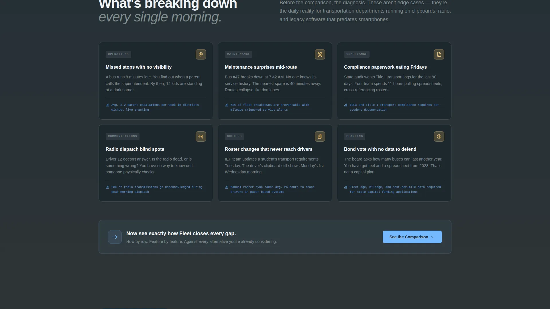
School district transportation teams still rely on clipboards, radio static, and spreadsheets to track dozens or hundreds of buses each morning. When a bus runs late or a stop gets missed, the consequences reach parents, principals, and school boards fast. This template frames that pain clearly before presenting the solution.
- Missed stops, delayed routes, and manual roster management create daily operational stress
- Compliance paperwork for programs such as Title I reporting and IDEA transport requirements is time-consuming and error-prone
- Legacy radio dispatch and spreadsheet tools cannot provide the real-time visibility that modern districts need
What you get with this template
This is a fully structured, single-page comparison landing page. Every section serves a specific role in the buyer's journey, from initial recognition of the problem to a confident request for a demo.
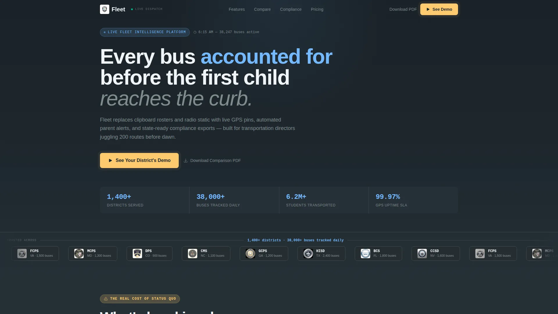
- A credibility-first header with a horizontal logo bar of school district seals and a trust stat line rendered in sky blue
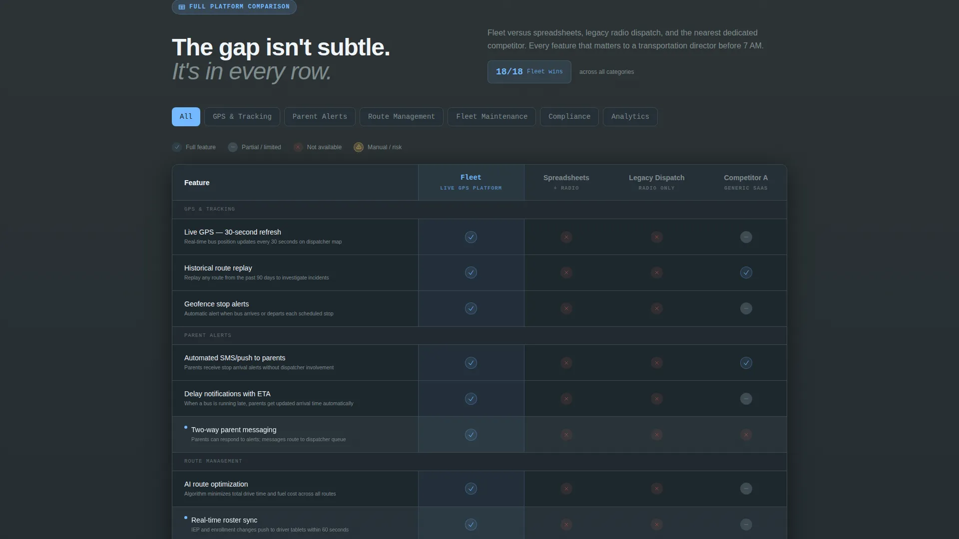
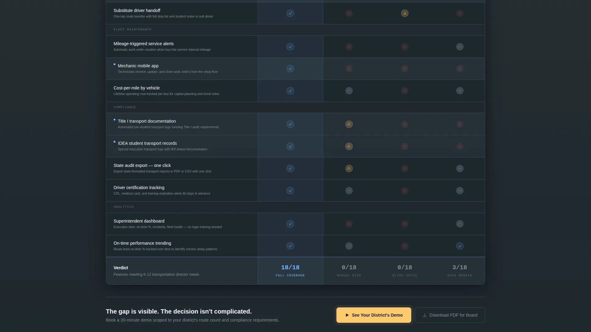
- A full multi-column comparison table covering GPS tracking, route optimization, compliance exports, and competitor gaps
- Two conversion paths: a two-field demo request form and a downloadable comparison PDF for board-meeting use
Feature list
This template includes several purpose-built components that reflect how district procurement decisions actually happen.
Trust-Led Logo Bar Header
The header opens with a horizontal scroll of school district seals and transportation department badges. Each logo is slightly desaturated to feel documentary rather than promotional. A single stat line in sky blue reads: "Trusted across 1,400+ districts. 38,000+ buses tracked daily." No hero image competes with this credibility signal.
Problem Framing Section
Before the comparison table appears, a single-column section names the core operational pain points. Slate backgrounds and amber warning icons highlight missed stops, maintenance surprises, and compliance paperwork. This section sets up the emotional and logical case before any feature is listed.
Multi-Column Comparison Table
The comparison table is the centerpiece of the page. It runs from basic capabilities like GPS tracking and route optimization all the way to district-specific concerns like Title I reporting, IDEA transport compliance, and state audit exports. Sky blue checkmarks stack on the platform's side while empty cells and caution icons accumulate on the competitor columns.
Sticky Demo call to action Bar
After a visitor scrolls past 60 percent of the page, a sticky amber bar appears anchored at the bottom of the viewport. It repeats the primary call to action: "See Your District's Demo." The bar stays visible without interrupting the comparison table reading experience.
Two-Field Demo Request Form
Clicking the primary call to action opens a focused two-field form. The first field is a district name input with autocomplete pulling from National Center for Education Statistics data. The second is a fleet size range dropdown with three tiers: under 50, 50 to 200, and 200 or more buses.
Comparison PDF Download Path
A secondary conversion path lets visitors download a printable comparison PDF. This option is designed for transportation directors who need board-meeting ammunition before they can book a call. It captures intent from buyers who are still in the evaluation phase.
Page sections overview
| Section | Purpose |
|---|---|
| Logo Bar Header | Establish trust with district seals and a live stat line |
| Pain Point Intro | Frame operational problems before presenting the solution |
| Comparison Table | Compare platform features against spreadsheets, radio dispatch, and competitors |
| Primary call to action Block | Drive demo requests with the amber "See Your District's Demo" button |
| Sticky call to action Bar | Reinforce demo action after 60 percent scroll depth |
| PDF Download Path | Offer a secondary conversion for early-stage evaluators |
Design & branding system
The visual identity follows a Directory and Discovery theme built around the Slate and Sky color system. The palette is designed to feel like a school district office on a clear September morning: grounded and institutional, but forward-looking.
- Dispatcher-console charcoal (#2D3436) and chalkboard slate (#636E72) dominate backgrounds and table rows, creating a dense, console-like reading environment
- Open-morning sky (#74B9FF) marks active states, winning-feature checkmarks, and the trust stat line in the header
- Safety-vest amber (#FDCB6E) is reserved exclusively for calls to action and alert indicators, ensuring it commands attention every time it appears
Mobile & speed optimization
The comparison table layout and sticky call to action bar are structured for readability across screen sizes. Horizontal scroll behavior on smaller screens keeps the table intact without breaking the visual logic.
- The sticky demo bar activates at 60 percent scroll depth, keeping the primary action accessible on both desktop and mobile viewports
- The two-field form is minimal by design, reducing friction on touchscreen devices where long forms create drop-off
- Slate-heavy backgrounds and flat color blocks keep the visual weight light, supporting fast paint times without relying on large imagery
How this template helps you convert
The conversion strategy is built into the page's structure. Every scroll section earns the next action rather than asking for attention before delivering value.
- The logo bar and stat line establish credibility immediately, so visitors trust the platform before reading a single feature claim
- The comparison table builds a verdict row by row, making the gap between the platform and alternatives undeniable before the call to action appears
- Two distinct conversion paths, the demo form and the PDF download, capture both ready buyers and early-stage evaluators in the same page flow
Other information about this template
This template is built specifically for the education fleet management niche, where procurement decisions involve multiple stakeholders and long evaluation cycles. The design and copy architecture reflect that reality.
- The National Center for Education Statistics autocomplete in the demo form signals to district administrators that the platform understands their institutional context
- The comparison table rows escalate intentionally from general fleet features to district-specific compliance requirements, matching how transportation directors actually evaluate software
- This template works well for teams preparing for conference season, board presentations, or competitive displacement campaigns where a clear side-by-side view accelerates the decision
Theme
Directory & Discovery
Creative direction
Problem→Solution Arc
Color system
Slate & Sky
Style
Comparison Table
Direction
Comparison/Versus
Page Sections
Trust-led Logo Bar Header
Problem Framing Section
Multi-column Comparison Table
Sticky Demo Call to Action Bar
Two-field Demo Request Form
Comparison PDF Download Path
Related questions
Who is the primary audience for this landing page template?
Can I adapt the comparison table rows for my specific platform?
What are the two conversion options on this page?
Does the sticky call to action bar appear immediately on page load?
Is this template suited for a single-page layout or a multi-page site?



