Elite Hospitality Landing Page Template
Concierge is a Bold Brutalist hospitality CRM landing page built for comparison-led conversion. It pairs a live-data dashboard header with a relentless evidence-first scroll rhythm, stacking stat breakers and feature comparison tables to prove platform superiority. Designed for boutique hotel GMs, resort revenue managers, and hospitality group COOs, it turns complex guest intelligence into a compelling buying argument.
by Rocket studio
Quick summary
Concierge is a single-page hospitality CRM landing page template built around one goal: winning the comparison. A full-viewport dashboard header pulls visitors in immediately. Below, a rhythm of stat breakers and feature comparison tables dismantles the case for any competing platform, row by row, number by number.
Who this template is for
This template is built for hospitality software teams and SaaS founders who need to convert informed, skeptical buyers. It speaks directly to the people actually living the problem it solves.
- Boutique hotel general managers overwhelmed by disconnected spreadsheets and siloed guest data
- Resort revenue managers looking to surface upsell opportunities across multiple departments
- Hospitality group chief operating officers who need portfolio-wide guest intelligence without adding headcount
What problem this template solves
Hospitality operations teams lose revenue and guest loyalty because their tools do not talk to each other. Reservation data sits in one system, housekeeping in another, spa bookings somewhere else entirely. This template makes that chaos visible and then immediately positions your platform as the solution.
- Fragmented guest profiles scattered across reservation, service, and billing systems
- No clear comparison tool that shows buyers exactly what they are switching away from
- Internal buying committees that need documented proof before approving a new platform
What you get with this template
You get a complete, conversion-focused landing page structure built specifically for a hospitality CRM product. Every section earns its place by advancing the buying argument.
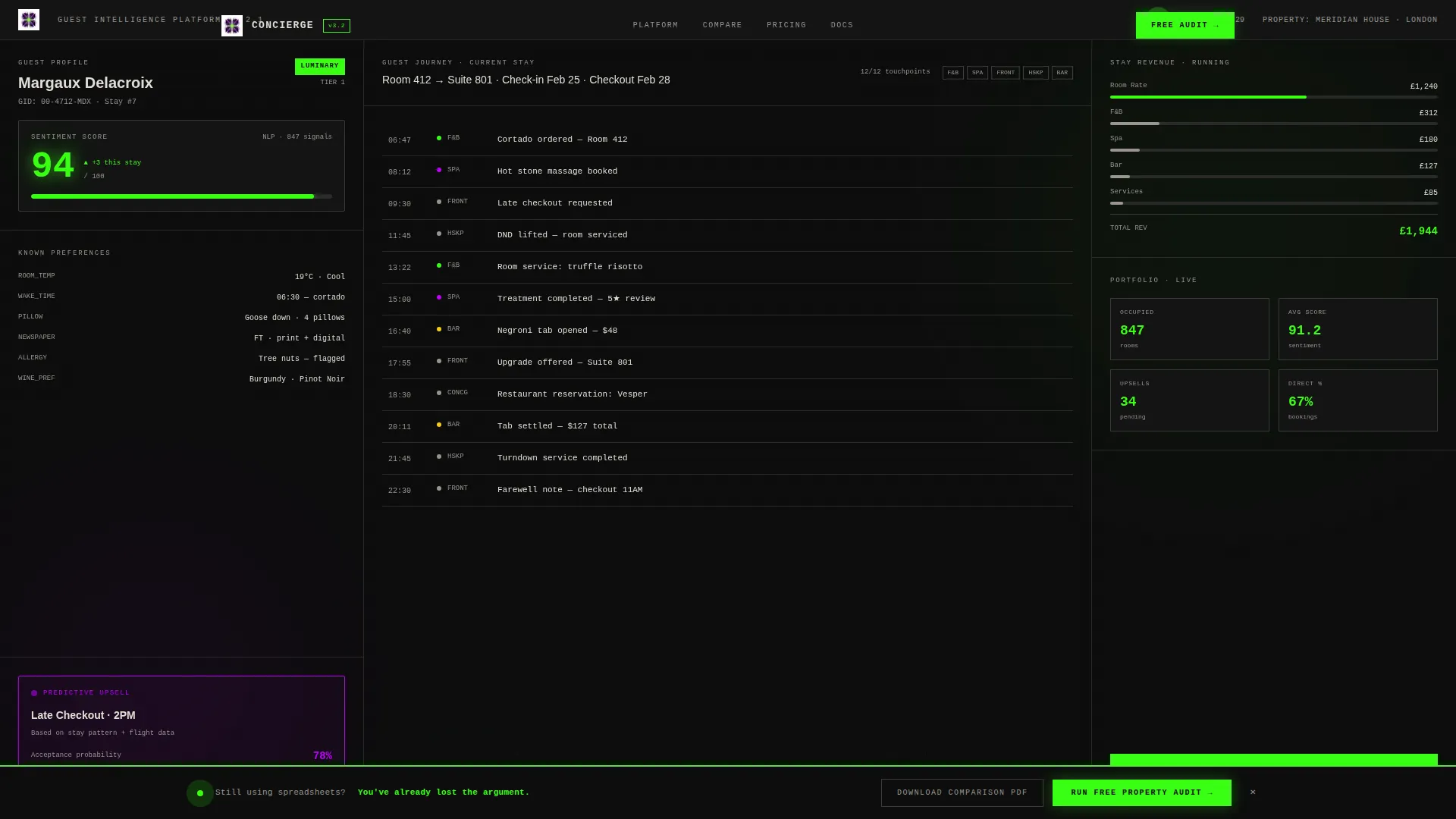
- A full-viewport animated dashboard header showing a real guest profile mid-stay, including loyalty tier, sentiment score, touchpoint timeline, and a predictive upsell card
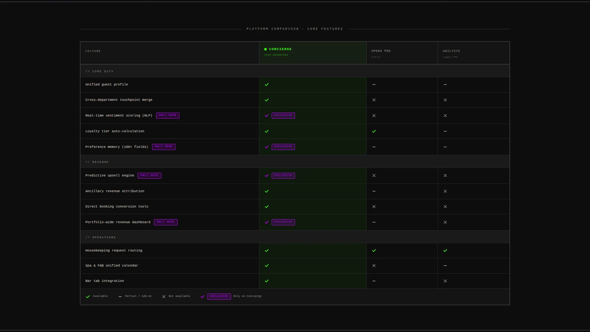
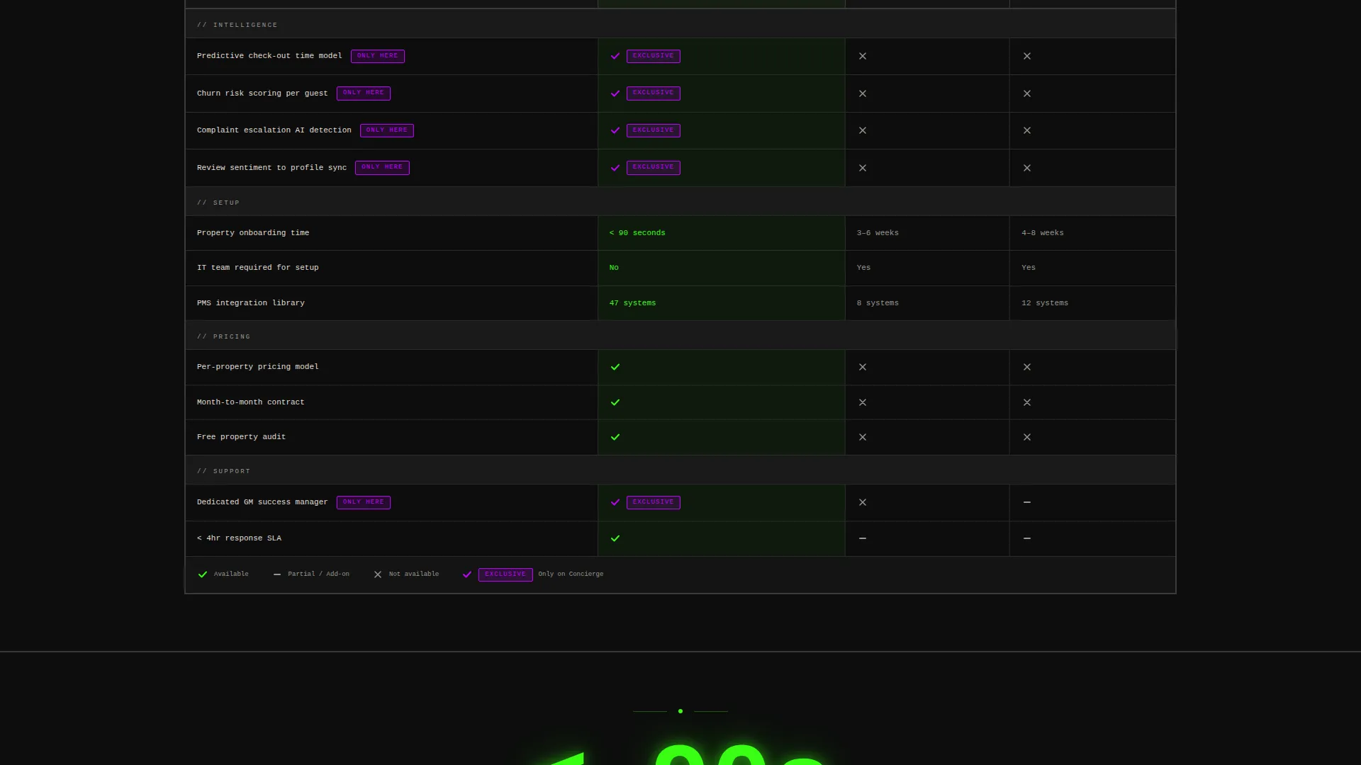
- A brutalist comparison table pitting your platform against two legacy competitors, with green checkmarks and violet exclusive badges stacking in your favor
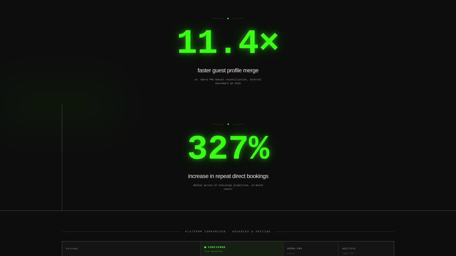
- Stat breaker sections displaying metrics like 11.4x faster guest profile merging, 327% increase in repeat direct bookings, and under 90 seconds to full property onboarding
- A pinned bottom-bar call to action reading "Run Your Free Property Audit," activating after the visitor scrolls past the first comparison table
- A two-step audit form capturing property type, current CRM, work email, and property count
- A secondary conversion path offering a downloadable comparison PDF gated behind email capture
Feature list
This template ships with a tightly coordinated set of purpose-built components. Each one is designed to move a skeptical hospitality buyer closer to a decision.
Animated Dashboard Header
The header renders a live-feeling guest profile at full viewport width. It shows a name, loyalty tier, a sentiment score of 94, a twelve-touchpoint timeline across three departments, and a predictive upsell card with a 78% acceptance probability. A subtle animation pulses the sentiment score upward as a new review populates in real time.
Evidence-First Stat Breakers
Between comparison table sections, full-width stat breakers interrupt the scroll with enormous phosphor green figures. Each stat is paired with a small source citation in off-white below. The rhythm keeps the visitor inside a closing argument rather than a marketing brochure.
Brutalist Comparison Table
The comparison table drops immediately below the fold and runs your platform against the two legacy tools hospitality teams actually use. Brutalist column headers, green checkmarks, and violet exclusive badges make Concierge's advantages impossible to miss at a glance.
Pinned Audit call to action Bar
A brutalist black bar with green text stays pinned to the bottom of the viewport. It activates only after the visitor scrolls past the first comparison table, ensuring the call to action appears when intent is highest. The label reads "Run Your Free Property Audit."
Two-Step Qualification Form
Clicking the pinned bar opens a two-step form. Step one asks for property type and current CRM from a dropdown that lists the exact competitors from the table. Step two requests work email and property count. This segmentation helps sales teams prioritize follow-up immediately.
PDF Comparison Download Gate
A secondary conversion path offers the full comparison document in PDF format. It is gated behind email capture only, making it low-friction for visitors who need internal buying-committee ammunition without committing to a full audit conversation.
Page sections overview
| Section | Purpose |
|---|---|
| Dashboard Header | Immersive animated guest profile as visual proof |
| Stat Breaker One | First evidence hit after the fold |
| Comparison Table One | Head-to-head legacy platform comparison |
| Stat Breaker Two | Mid-scroll proof to sustain conviction |
| Comparison Table Two | Second feature category comparison |
| Stat Breaker Three | Final evidence before conversion zone |
| PDF Download Gate | Email capture for internal committee buyers |
| Pinned Audit Bar | Persistent primary call to action |
| Two-Step Audit Form | Segmented lead qualification overlay |
Design & branding system
The visual identity follows a Bold Brutalist theme using an Acid Digital color system. The palette treats black as infrastructure, green as signal, and violet as proof of superiority.
- Void black (#0D0D0D) dominates every background slab, giving the interface a mainframe-screen weight
- Terminal phosphor green (#39FF14) fires on live data points, stat figures, primary interactive states, and the pinned call to action bar text
- Ultraviolet highlight (#BF00FF) marks competitive differentiators and winning checkmarks throughout the comparison tables
- Raw concrete off-white (#E0DDD5) holds all readable body text and table cell backgrounds in brutalist monospaced blocks
Mobile & speed optimization
The template is structured to maintain visual impact and readability on smaller screens. The brutalist grid adapts without losing the stat-first hierarchy.
- Full-viewport dashboard header scales responsively, keeping the guest profile data legible on mobile displays
- Comparison tables reflow into a scrollable format so no feature row is hidden on narrow viewports
- The pinned audit bar remains accessible at the bottom of the screen across device sizes
How this template helps you convert
Every design and copy decision in this template is engineered to reduce resistance and accelerate a decision. The scroll experience functions like a structured argument.
- The animated dashboard header delivers product proof in the first three seconds, before a visitor has read a single word of copy, establishing immediate credibility through visible functionality.
- The alternating stat breaker and comparison table rhythm keeps the visitor inside a forward-moving proof sequence, making it psychologically harder to return to their current fragmented system.
- The dual conversion paths serve two distinct buyer types at once: the decision-maker ready to act gets the pinned audit call to action, while the committee researcher gets the PDF download gate.
Other information about this template
This template is category-specific to hospitality CRM and is not a general-purpose SaaS comparison page. It carries strong contextual signals for buyers in hotel technology and property management software evaluation.
- The template style is a Comparison Table layout, purpose-built for competitive displacement selling in the hospitality software market
- The creative direction is Stats-First Impact, meaning numerical proof always precedes narrative explanation throughout the page
- The header concept is a Dashboard Preview, which makes the product experience self-evident before any feature description is read
- The landing page direction is Comparison/Versus, designed to win buyers who are actively evaluating alternatives
- This template fits naturally within a hospitality software and SaaS product category, particularly for hotel management platforms and guest experience tools
Theme
Bold Brutalist
Creative direction
Stats-First Impact
Color system
Acid Digital
Style
Comparison Table
Direction
Comparison/Versus
Page Sections
Animated Live Dashboard Header
Brutalist Comparison Table Layout
Evidence-first Stat Breaker Sections
Pinned Audit Call-to-action Bar
Two-step Qualification Form Overlay
Gated PDF Comparison Download
Related questions
Who is this landing page template designed for?
Can I customize the competitor names in the comparison table?
What is the purpose of the two-step audit form?
Does the template include the PDF comparison document itself?
Can this template work for a single boutique hotel or only for large portfolios?


