Storage Digital Presence Advanced Professional Website Template
Stash is a modular landing page template built for self-storage facility managers who need ready-to-publish social media content. It showcases a full digital toolkit of unit tours, climate-control explainers, packing tip carousels, and seasonal promo graphics. The design runs on a dark Carbon Fiber palette with electric accents, and the layout uses a card grid structure to put every template front and center.
by Rocket studio
Quick summary
Stash is a dynamic landing page template designed for the storage industry's social media needs. It gives independent facility operators a visual toolkit of post types, unit tours, packing tips, flash-sale countdowns, and seasonal graphics, all ready to customize. The dark Carbon Fiber design and animated card grid make the offer feel immediate, engineered, and worth clicking.
Who this template is for
This template speaks directly to people running self-storage operations who know social media matters but never have enough hours in the day. It is built for operators who are stretched thin and need a practical shortcut to consistent content.
- Independent storage operators managing three to fifteen locations
- Facility managers who handle gate codes and move-in specials before they ever think about posting
- Storage brand owners ready to close the gap between their content output and their competitors'
What problem this template solves
Most storage facilities go quiet on social media not because they lack ideas, but because the day swallows every spare minute. Generic graphic templates made for every industry solve nothing, they require too much rework and produce zero niche credibility.
- Storage managers lose potential occupancy when their social presence goes silent for weeks at a time
- Off-the-shelf design tools produce generic results that do not speak the language of the self-storage customer
- There is no fast, low-effort path from "I should post something" to a published, on-brand piece of content
What you get with this template
The template delivers a fully structured landing page built around a modular card grid. Every section is designed to show, compare, and convert, turning a casual browser into someone who wants the toolkit in their hands today.
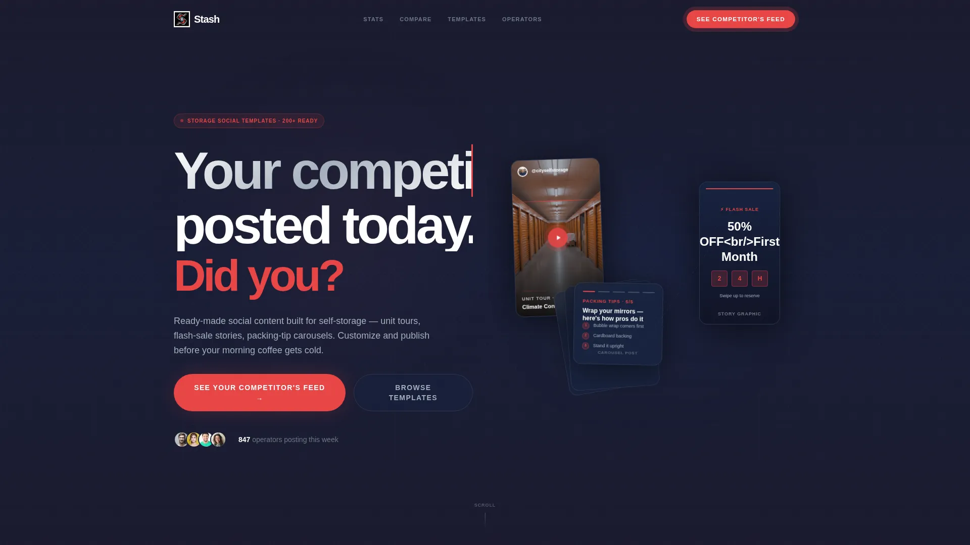
- A Dark Glass Panels header with frosted cards displaying social post previews in mid-animation
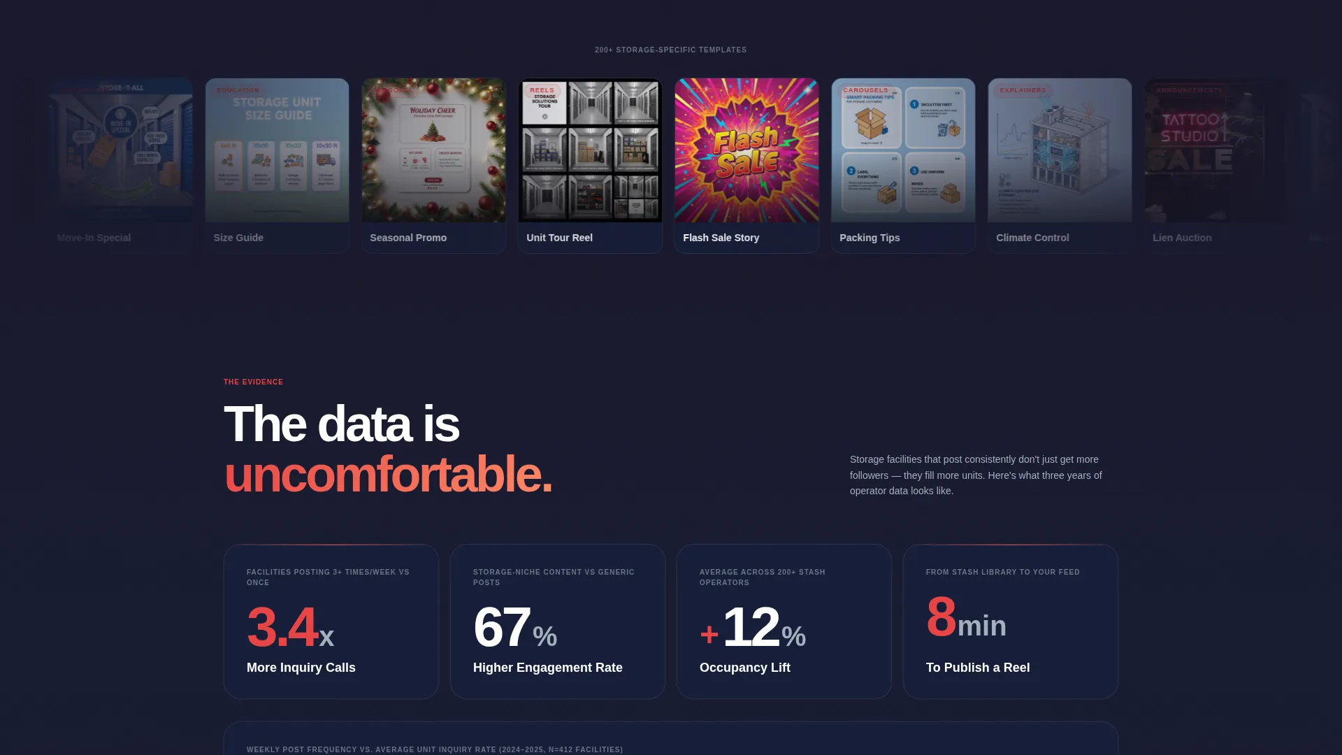
- An evidence-wall scroll experience with stat cards, side-by-side comparison grids, and occupancy impact data
- A Comparison/Versus conversion model anchored by a primary call to action that triggers a competitor feed modal and a persistent secondary call to action bar
Feature list
This template is built on five deliberate design and content decisions. Each one serves the storage operator's real workflow and the landing page's job of converting skeptics into buyers.
Animated Dark Glass Panel Header
The header opens with a grid of frosted, semi-transparent cards floating over a pitch-black background. Each card previews a different post type in motion, a Reel thumbnail, a Story countdown, a fanning carousel. Subtle parallax layers make the panels feel suspended in space. A letter-by-letter headline etches itself in: "Your competitor posted today. Did you?"
Modular Card Grid Layout
The page is built on a card grid system so every content block is visually self-contained and easy to scan. Each card can display a template preview, a stat, or a feature callout without breaking the overall rhythm of the page.
Industry Report Evidence Wall
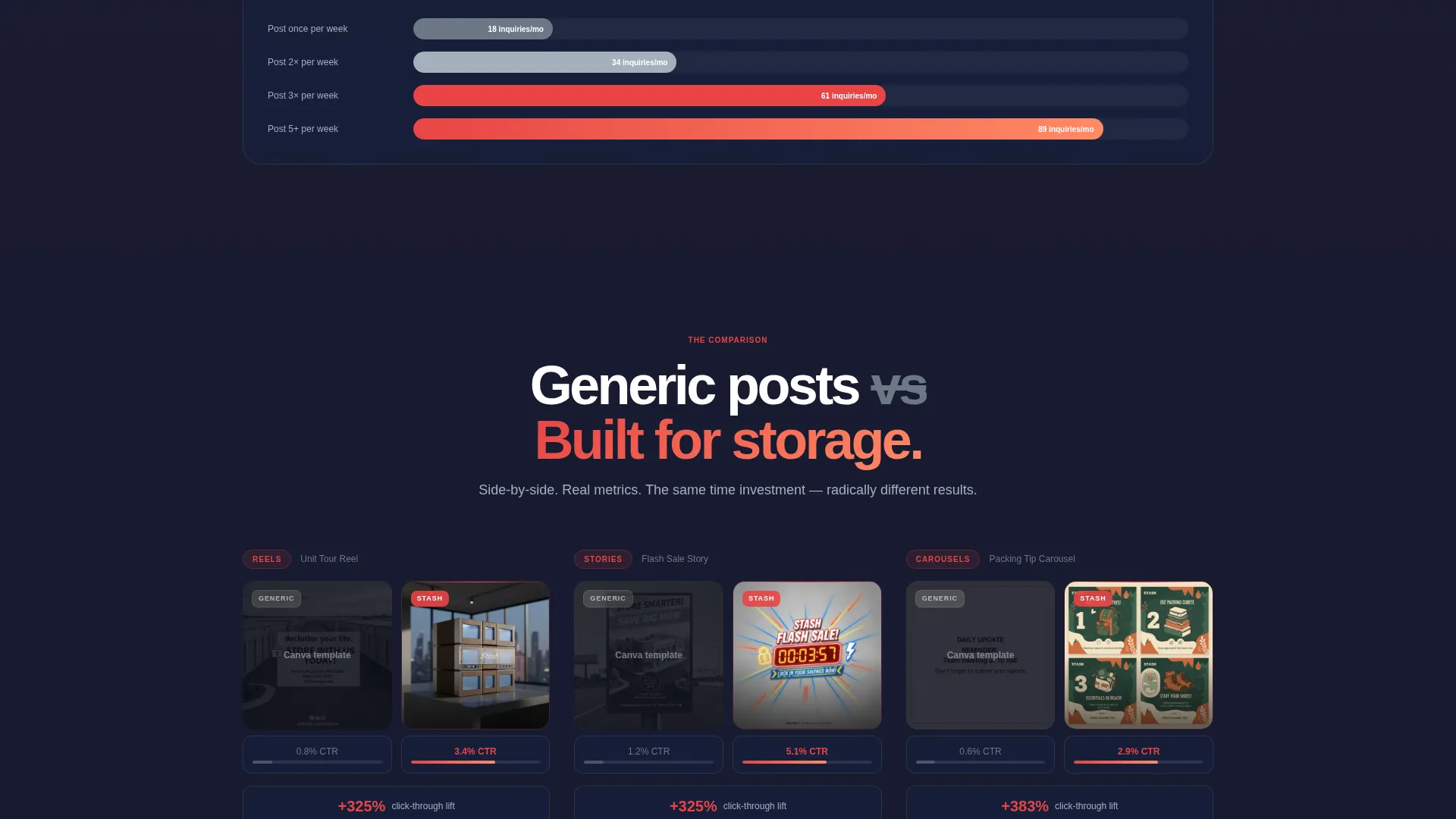
After the header, the scroll becomes a case file. Stat cards show engagement lift data for storage brands posting three or more times per week. A side-by-side comparison grid puts generic templates on the left and niche-specific Stash layouts on the right, with real click-through differences shown beneath each pair.
Competitor Feed Modal call to action
The primary call to action, "See Your Competitor's Feed," triggers a modal where a visitor enters their facility zip code. The modal returns a live-pulled snapshot of nearby competitors' recent social activity alongside a preview of templates matched to their market. Inaction becomes visible and tangible.
Persistent Secondary call to action Bar
A "Browse All Templates" bar floats at the bottom of the page throughout the entire scroll. It stays accessible no matter where the visitor is in the evidence wall, so the path to the template library is never more than one tap away.
Page sections overview
| Section | Purpose |
|---|---|
| Dark Glass Header | Opens with animated frosted card grid and letter-by-letter headline hook |
| Stat Card Block | Delivers engagement lift data comparing posting frequency outcomes |
| Comparison Grid | Shows generic versus niche templates side by side with metric callouts |
| Occupancy Impact Panel | Connects social silence to lost occupancy and posting consistency to franchise gains |
| Competitor Feed call to action | Primary modal call to action triggered by zip code entry for competitor snapshot |
| Persistent call to action Bar | Floating secondary bar keeping "Browse All Templates" always within reach |
Design & branding system
The visual identity follows a Dynamic Motion theme built on a Carbon Fiber color system. The palette is engineered rather than decorated, every surface implies speed beneath stillness.
- Deep matte black (#1A1A2E) and woven graphite (#16213E) form the base, creating the tactile darkness of a flagship device back panel
- Brushed aluminum (#A4B0BD) handles body text, card borders, and secondary labels for a machined, razor-thin finish
- Electric tangerine (#E84545) is reserved exclusively for calls to action, hover states, and stat callouts, making every interactive moment impossible to miss
Mobile & speed optimization
The template is designed to feel like swiping through a phone screen at midnight, everything glowing, everything moving, everything one tap away. The card grid layout adapts naturally to narrower viewports without losing visual hierarchy.
- Frosted glass cards and parallax layers are structured to render cleanly on mobile screens where tap targets replace hover states
- The persistent call to action bottom bar is especially effective on mobile, staying visible throughout the full scroll without interrupting content
- Animated elements such as the letter-by-letter headline and fanning carousel previews are designed for smooth motion rather than heavy rendering
How this template helps you convert
The Comparison/Versus conversion model is the engine behind this template. Every scroll deeper raises the stakes and makes inaction feel expensive rather than comfortable.
- The competitor feed modal makes the cost of not posting visible the moment a visitor enters their zip code, turning curiosity into urgency before they leave the page.
- The evidence wall stacks data point by data point, engagement rates, click-through differences, and occupancy impact, so by the time the visitor reaches the call to action, they feel the weight of the case rather than a sales pitch.
Other information about this template
Stash is part of a broader storage digital presence category inside the technology template collection. It is purpose-built for the storage social media template niche and is a strong fit for any brand looking to market self-storage services through consistent, professional content.
- The template style is Card Grid (Modular), making it straightforward to expand, rearrange, or repurpose sections as the product offer grows
- The creative direction follows an Industry Report structure, which is well suited to buyers who respond to data and competitive evidence rather than lifestyle imagery
- The header concept, Dark Glass Panels, is a distinctive visual system that sets this template apart from standard service-industry landing pages

Theme
Dynamic Motion
Creative direction
Industry Report
Color system
Carbon Fiber
Style
Card Grid (Modular)
Direction
Comparison/Versus
Page Sections
Animated Dark Glass Panel Header
Modular Card Grid Layout
Industry Report Evidence Wall
Competitor Feed Modal Call to Action
Persistent Secondary Call to Action Bar
Related questions
Who is this template actually built for?
What types of social media content does this toolkit cover?
How does the competitor feed modal work?
Can I adjust the card grid layout to fit more or fewer template previews?
Is this template suitable for multi-location storage brands as well as single facilities?



