Micro-SaaS & Developer Tools Comparison Website Template
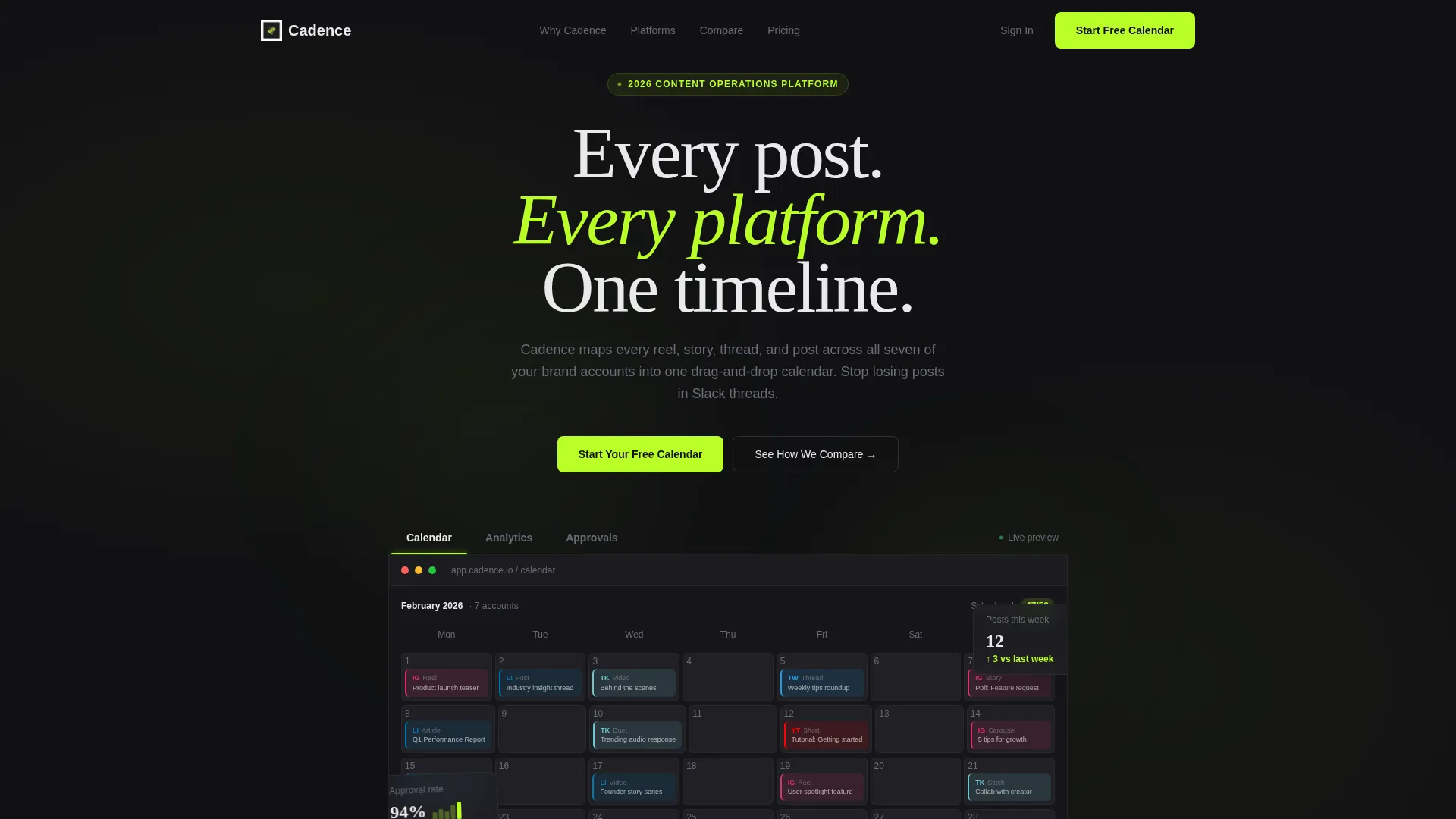
Cadence is a bento grid landing page template built for content calendar tools. It combines a Feature Tab Switcher header, an Industry Report data section, and a Comparison table into one dark, high-motion layout. Designed for social media teams and agency strategists, the page moves visitors from benchmark data to signup with minimal friction.
by Rocket studio
Quick summary
Cadence is a single-page template that sells a content calendar scheduling tool. It opens with a three-tab product preview, moves through a data-heavy benchmark section, and closes with a sticky competitor comparison table. The Carbon Fiber color system and Dynamic Motion theme give every section a dark, instrumented feel that feels built for professionals.
Who this template is for
This template was designed for teams and individuals who manage high volumes of social content across multiple platforms. The layout speaks directly to people who already know the pain of scattered scheduling.
- Social media managers running several brand accounts simultaneously
- Startup founders who batch-create content in a single weekly session
- Agency strategists building month-long campaigns across multiple platforms
What problem this template solves
Managing content across platforms without a unified view leads to missed posts, approval delays, and inconsistent publishing. This template frames those exact pain points as the argument for switching tools.
- Scattered scheduling across spreadsheets, direct messages, and disconnected apps
- No clear picture of what is published, pending, or overdue across teams
- Slow approval workflows that stall campaigns and frustrate collaborators
What you get with this template
You get a complete bento grid landing page layout that guides visitors through product value, benchmark evidence, and a conversion-ready comparison section. Every section is pre-built and purposeful.
- A Feature Tab Switcher header with three interactive product views and crossfade animations
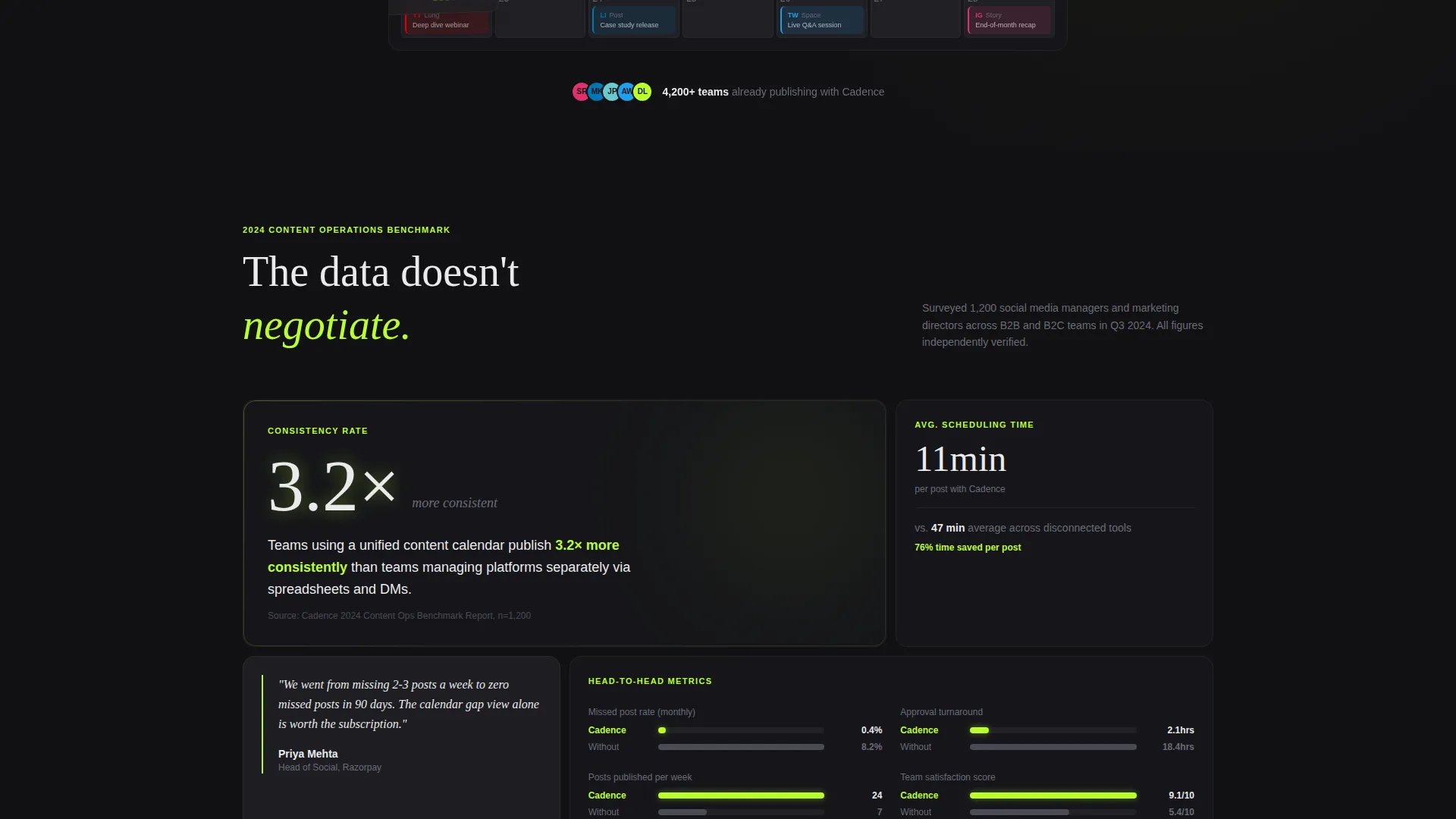
- An Industry Report section with stat tiles, bar charts, and quote blocks
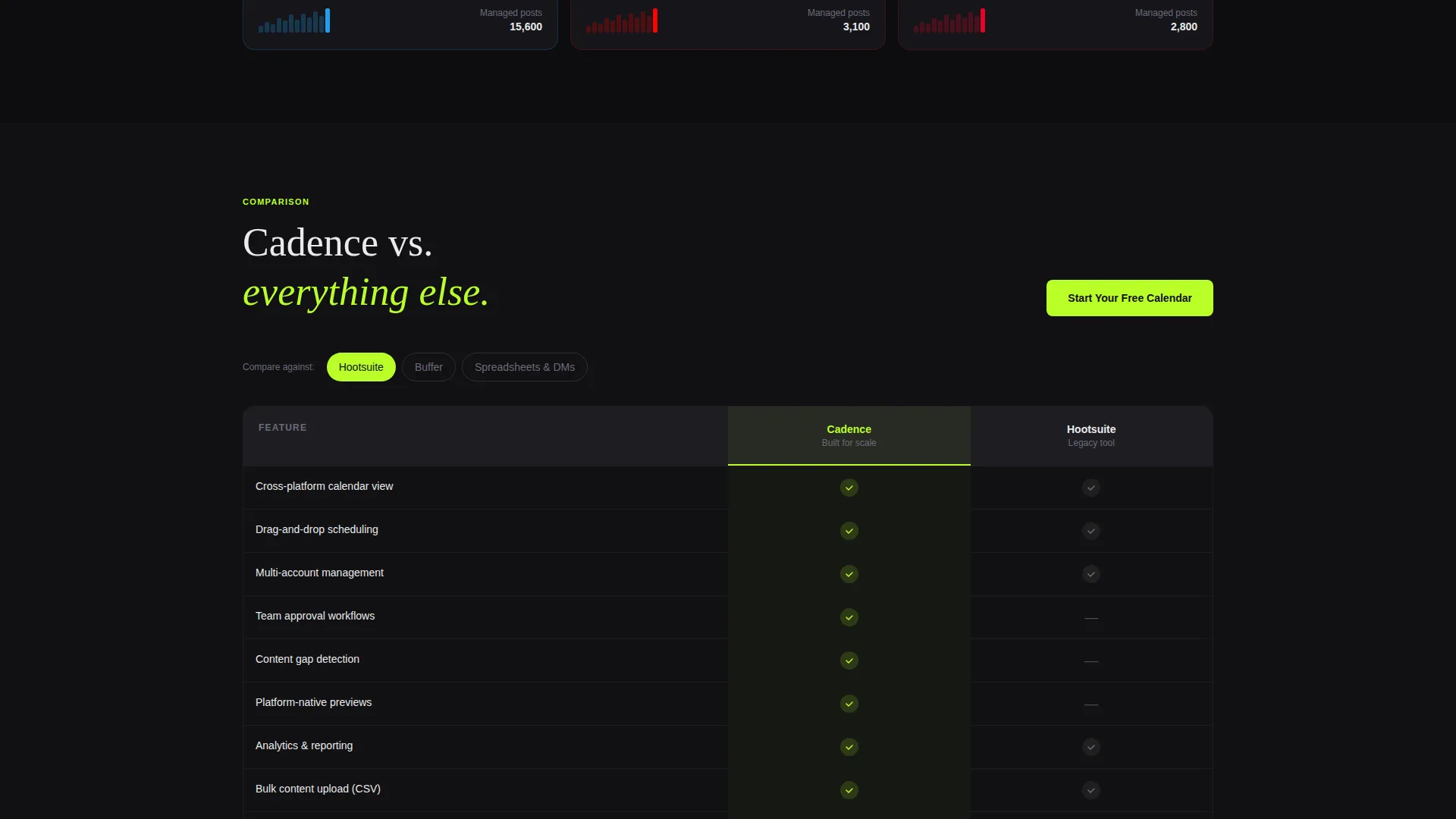
- A sticky side-by-side comparison table with chartreuse checkmarks and a low-friction signup form
Feature list
This template is built around a specific set of components that work together to inform, persuade, and convert. Each one is described below.
Feature Tab Switcher Header
Three clickable tabs labeled "Calendar," "Analytics," and "Approvals" sit above a bento-style product screenshot. Each tab swap uses a smooth crossfade with a spring animation, so cards slide and rescale like a deck being reshuffled. The header communicates product depth before the visitor scrolls.
Industry Report Data Section
A "2024 Content Operations Benchmark" block opens with a bold stat tile showing that teams using unified calendars publish 3.2 times more consistently. Below it, bento cells hold comparison data points covering scheduling time, missed-post rate, and approval bottleneck duration. Count-up number animations and scroll-triggered bar charts keep the eye moving through the evidence wall.
Sticky Comparison Table
A side-by-side table in the lower third pits the tool against spreadsheets, direct messages, and two named competitors across twelve feature rows. Chartreuse checkmarks mark wins clearly. Muted gray dashes mark gaps just as clearly. The table stays sticky so visitors can scroll feature rows without losing context.
Bento Grid Layout
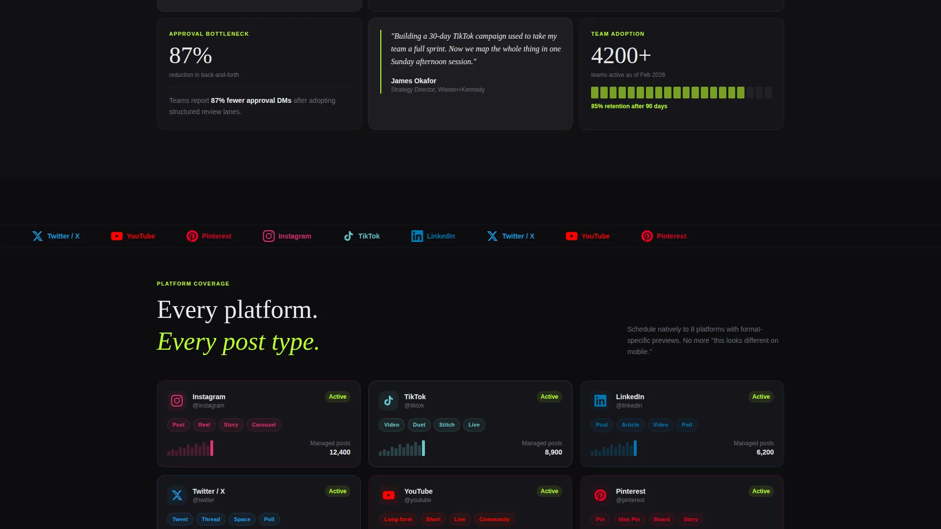
The page uses a bento grid structure throughout, grouping related content into cells of varying size. Dense data cells alternate with breathing-room quote blocks from named marketing directors. The rhythm prevents fatigue while maintaining a sense of depth and information density.
Low-Friction Signup Form
The primary call to action reads "Start Your Free Calendar" and appears both above and below the comparison table. The form asks only for a work email and team size, with three options: solo, 2 to 10, and 11 or more. No credit card field is included.
Dynamic Motion System
Scroll-triggered animations include count-up number sequences and horizontal bar charts that fill as sections enter the viewport. Tab transitions use spring physics. Every motion element is intentional and tied to a content reveal, so the page feels alive without feeling distracting.
Page sections overview
| Section | Purpose |
|---|---|
| Tab Switcher Header | Previews Calendar, Analytics, and Approvals product views |
| Benchmark Stat Tile | Opens data argument with a single bold publishing consistency figure |
| Bento Data Cells | Presents scheduling time, missed-post rate, and approval delay comparisons |
| Quote Blocks | Adds credibility through named marketing directors at recognizable brands |
| Comparison Table | Pits tool against spreadsheets and competitors across twelve feature rows |
| Primary call to action Block (top) | Captures early-intent visitors above the comparison section |
| Primary call to action Block (bottom) | Re-engages convinced visitors after the comparison table |
| Competitor Breakdown Links | Routes interested visitors to one-on-one comparison pages |
Design & branding system
The template uses a Carbon Fiber color system built around four values that work together to create a dark, performance-vehicle aesthetic. Chartreuse accents appear only where attention is required, making every highlight feel earned.
- Deep cockpit black (#111113) and woven graphite (#1E1E22) form the background range, keeping the layout dark and focused
- Signal white (#EAEAEC) handles all body text and labels for clean legibility against dark surfaces
- Electric chartreuse (#BAFF29) marks every interactive element, hover state, metric highlight, progress bar, and checkmark in the comparison table
Mobile & speed optimization
The bento grid layout is structured to reflow cleanly across screen sizes. Motion elements are designed to remain purposeful at smaller viewports without overwhelming the layout.
- Bento cells stack vertically on smaller screens, preserving readable hierarchy without horizontal overflow
- Scroll-triggered animations activate based on viewport entry, so they behave predictably on both desktop and mobile devices
How this template helps you convert
The page is designed around a Comparison/Versus conversion strategy. Every section builds toward a moment of clarity where signing up is the logical next step.
- The Feature Tab Switcher gives visitors a hands-on product preview within the first viewport, establishing credibility before a single scroll.
- The Industry Report section uses benchmark data, count-up animations, and quote blocks to build an evidence wall that persuades through facts rather than claims.
- The sticky comparison table and low-friction signup form remove every remaining obstacle, making "Start Your Free Calendar" the obvious and easy conclusion.
Other information about this template
This template is categorized under Technology, specifically within the Micro-SaaS and Developer Tools subcategory. It was built to serve the content calendar tool niche and is matched to an intersection of Dynamic Motion theme, Industry Report creative direction, Carbon Fiber color system, Bento Grid template style, Comparison/Versus landing-page direction, and Feature Tab Switcher header concept.
- The template is built as a single landing page, not a multi-page website
- The Intersection Match Score for this template's niche and design combination is 13
- The secondary conversion path uses "See How We Compare to [Competitor]" links that route to dedicated one-on-one breakdown pages
- The signup form intentionally omits a credit card field to reduce friction at the point of conversion
- Quote blocks use named marketing directors at recognizable brands to add social proof without relying on generic testimonials
Theme
Dynamic Motion
Creative direction
Industry Report
Color system
Carbon Fiber
Style
Bento Grid
Direction
Comparison/Versus
Page Sections
Feature Tab Switcher Header
Industry Report Data Section
Sticky Comparison Table
Bento Grid Page Structure
Low-friction Signup Form
Dynamic Motion Animation System
Related questions
Who is this landing page template designed for?
Can I customize the tab labels and product screenshots in the header?
Does the comparison table support more or fewer than twelve feature rows?
Is the signup form connected to any email or CRM platform?
What makes this template different from a generic SaaS landing page?



