Music Theory Education Reviews Website Template
Cadence is a precision music theory landing page template built for flashcard and spaced-repetition review apps. It pairs a live stats dashboard header with a zigzag Timeline Progression layout, guiding visitors from a cold start to a personalized study plan through a ten-card diagnostic quiz. The Corporate Precision theme and Dopamine Pop color system make every interaction feel earned.
by Rocket studio
Quick summary
Cadence is a single-page landing page template designed for music theory flashcard and review apps. It opens with a live-style stats dashboard, walks visitors through a learner's journey in alternating sections, and closes every visit with a no-signup-required diagnostic quiz. The result screen does the selling.
Who this template is for
This template is built for founders, indie developers, and educators launching a music theory review or flashcard product. It speaks directly to learners who need structured, repeatable practice rather than passive video lessons.
- Conservatory students preparing for jury examinations who need measurable progress tracking
- Bedroom producers fluent in a digital audio workstation but struggling with staff notation and chord theory
- Gigging musicians who want to move beyond faking chart readings and build real harmonic fluency
What problem this template solves
Most music theory landing pages describe features without proving value. They rely on screenshots and bullet points that any competing product could copy. Visitors leave unconvinced because they never experience the product before being asked to sign up.
- Visitors have no way to self-assess their current theory level before committing
- Generic landing pages fail to show the progression from beginner drills to advanced harmonic analysis
- There is no natural hook that turns a curious visitor into an engaged, motivated lead
What you get with this template
You get a fully structured, single-page layout that combines a data-rich header, alternating content sections, and an embedded quiz flow designed to convert through proof rather than persuasion.
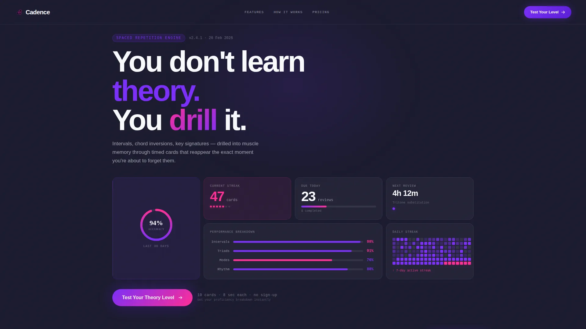
- A live-style Stats and Metrics header displaying accuracy rings, streak counters, a heat calendar, and a performance breakdown bar across intervals, triads, and modes
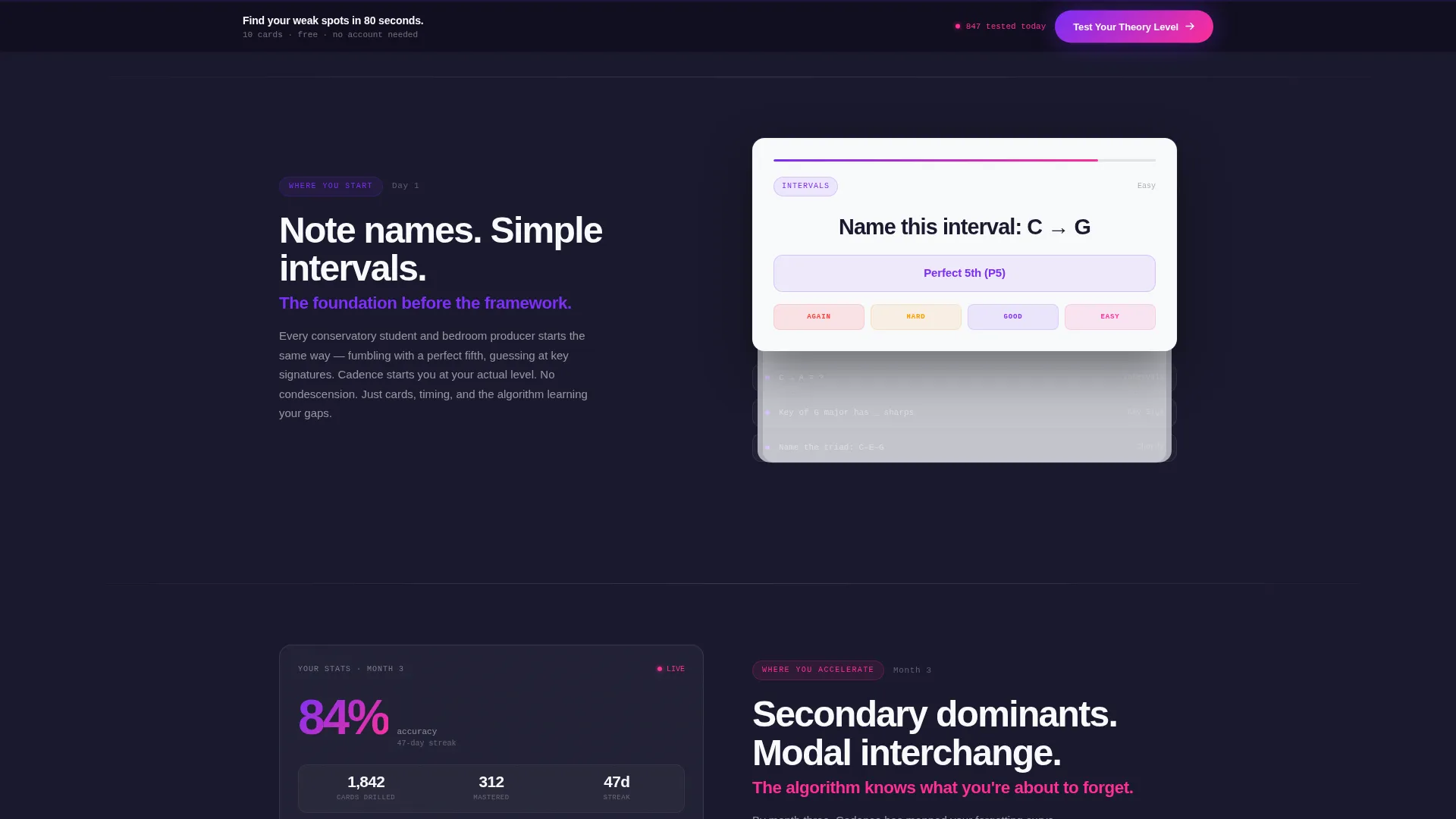
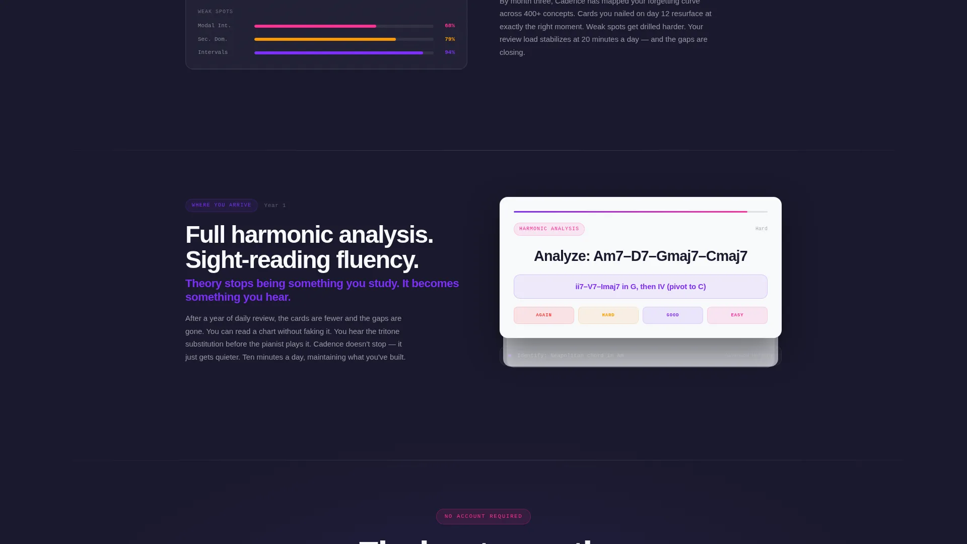
- A zigzag Timeline Progression layout moving from Day 1 note naming through Month 3 secondary dominants to Year 1 harmonic analysis and sight-reading fluency
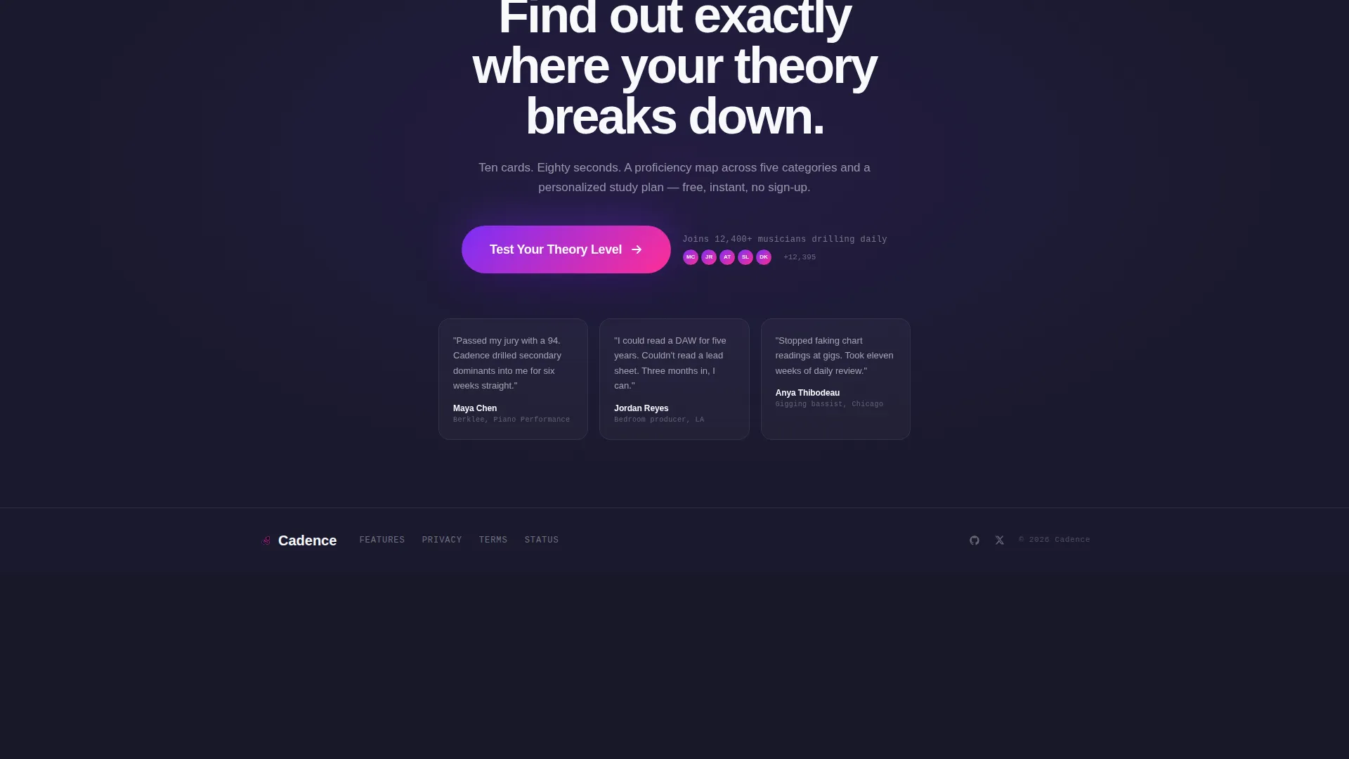
- A ten-card diagnostic quiz with timed cards, a results screen showing a five-category proficiency breakdown, and a personalized study plan preview that gates the email capture
Feature list
This section covers the core built-in components that define the Cadence template experience.
Live Stats Dashboard Header
The header renders a mid-session dashboard frozen at peak engagement. It includes a circular accuracy ring at 94 percent, a streak counter showing 47 cards, a five-month heat calendar of daily review activity, and a performance breakdown bar splitting scores across intervals at 98 percent, triads at 91 percent, and modes at 76 percent. The numbers feel like a real user's account rather than a mockup placeholder.
Zigzag Timeline Progression Layout
Each alternating section represents one stage in the learner's journey. Left-aligned sections show the flashcard interface at that stage. Right-aligned sections show the metrics dashboard evolving as accuracy climbs and weak spots shrink. The scroll compresses months of practice into seconds of reading, and the difficulty and stakes both rise with each section.
No-Signup Diagnostic Quiz
The primary conversion path is a ten-card assessment covering intervals, chord quality, and key signature identification. Each card runs on an eight-second timer. No account or email is required to start. The quiz itself demonstrates the product's core mechanic, making the experience the proof of value.
Personalized Results and Email Gate
After the quiz, visitors receive a proficiency breakdown across five theory categories and a preview of a personalized study plan. The email capture appears only at this moment, anchored to a concrete reward. This sequencing reduces friction and increases the perceived value of submitting an address.
Floating call to action Bar
After the second section, a pinned bottom bar carries the primary call to action: "Test Your Theory Level." It stays visible as the visitor scrolls, providing a persistent re-entry point to the quiz without interrupting the reading experience.
Dopamine Pop Color System
Correct answers and streak milestones trigger magenta highlights at reward moments. Violet marks progress indicators and interactive elements throughout. Charcoal anchors all backgrounds and body text. White gives every flashcard surface the crispness of fresh manuscript paper. The palette delivers discipline and reward in the same visual grammar.
Page sections overview
| Section | Purpose |
|---|---|
| Stats Dashboard Header | Opens with a live-style metrics display to establish credibility instantly |
| Primary Quiz call to action | Invites visitors to test their theory level directly below the header |
| Day 1 Flashcard Stage | Shows beginner note naming and interval drills in the product interface |
| Day 1 Metrics View | Displays the starting accuracy baseline and initial review schedule |
| Month 3 Flashcard Stage | Introduces secondary dominants and modal interchange at the interface level |
| Month 3 Metrics View | Shows accuracy climbing and weak-spot categories shrinking over time |
| Year 1 Flashcard Stage | Presents full harmonic analysis and sight-reading fluency in the interface |
| Year 1 Metrics View | Demonstrates a stabilized review load and high overall accuracy score |
| Floating Bottom Bar | Pins the quiz call to action after the second section for persistent visibility |
| Diagnostic Quiz Flow | Runs the ten-card timed assessment with no sign-up required to start |
| Results and Email Gate | Reveals a proficiency breakdown and study plan preview before asking for email |
Design & branding system
The visual identity follows a Corporate Precision theme executed through the Dopamine Pop color palette. Every design decision reinforces the tension between disciplined structure and dopamine reward, exactly the feeling of a practice session where focus and satisfaction coexist.
- Deep charcoal (#1A1A2E) anchors backgrounds and body text, keeping the reading environment focused and calm
- Electric violet (#7B2FF7) marks all interactive elements and progress indicators throughout the layout
- Reward-hit magenta (#FF2E97) fires exclusively on correct answers and streak milestones, preserving its impact as a reward signal
- Clean white (#F8F9FC) surfaces every flashcard panel to give it the clarity of manuscript paper
Mobile & speed optimization
The template is built for single-page performance. The alternating layout stacks cleanly on smaller screens, and the quiz flow remains fully usable without requiring a wide viewport. Every section is designed to load without unnecessary visual complexity.
- The zigzag layout collapses to a single-column stacked flow on mobile screens, preserving readability and section hierarchy
- The stats dashboard renders as compact metric tiles on smaller viewports so no key data point disappears from view
- The floating call to action bar adapts its position for touch-first navigation, staying accessible without covering critical content
How this template helps you convert
The conversion strategy is built around proof before commitment. The template removes friction at every stage before the email ask, so the only thing standing between a visitor and a lead is the quality of the quiz experience itself.
- The stats dashboard header establishes immediate credibility by showing specific, realistic performance data rather than abstract feature claims, giving visitors a reason to keep scrolling
- The Timeline Progression layout builds desire progressively, letting visitors see their future progress as concrete metrics before they have ever touched the product
- The diagnostic quiz delivers a real taste of the product mechanic, making the results screen and personalized study plan feel earned rather than generic, which raises the perceived value of the email gate
Other information about this template
Cadence is designed for the Music Theory Education subcategory within the broader Education and Training space. It is purpose-built for the music theory flashcard and review app niche, where spaced repetition and measurable progress are the core product promises.
- The template style is Zigzag and Alternating, which suits any product that benefits from showing a before-and-after or a progression narrative
- The header concept is Stats and Metrics, making it a strong fit for any app that tracks user performance over time
- The landing-page direction is Quiz and Assessment, a conversion pattern well suited to products where the experience itself is the strongest sales argument
- The creative direction is Timeline Progression, allowing the page to tell a structured story from first use to advanced fluency without relying on testimonials or stock imagery
- The theme is Corporate Precision paired with the Dopamine Pop color system, a combination that communicates reliability and reward simultaneously
Theme
Corporate Precision
Creative direction
Timeline Progression
Color system
Dopamine Pop
Style
Zigzag/Alternating
Direction
Quiz/Assessment
Page Sections
Live Stats Dashboard Header
Zigzag Timeline Progression Layout
No-signup Diagnostic Quiz
Personalized Results and Email Gate
Persistent Floating Call to Action Bar
Dopamine Pop Reward Color System
Related questions
Does the quiz require visitors to create an account first?
Can I adapt the timeline sections for a different skill progression?
What makes this template different from a standard app landing page?
Who benefits most from the Dopamine Pop color system?
Is this template suitable for a professional or conservatory-facing platform?



